Why em instead of px?
The reason I asked this question was that I forgot how to use em's as it was a while I was hacking happily in CSS. People didn't notice that I kept the question general as I wasn't talking about sizing fonts per se. I was more interested in how to define styles on any given block element on the page.
As Henrik Paul and others pointed out em is proportional to the font-size used in the element. It's a common practice to define sizes on block elements in px, however, sizing up fonts in browsers usually breaks this design. Resizing fonts is commonly done with the shortcut keys Ctrl++ or Ctrl+-. So a good practice is to use em's instead.
Using px to define the width
Here is an illustrating example. Say we have a div-tag that we want to turn into a stylish date box, we may have HTML-code that looks like this:
<div class="date-box">
    <p class="month">July</p>
    <p class="day">4</p>
</div>
A simple implementation would defining the width of the date-box class in px:
* { margin: 0; padding: 0; }

p.month { font-size: 10pt; }

p.day { font-size: 24pt; font-weight: bold; }

div.date-box {
    background-color: #DD2222;
    font-family: Arial, sans-serif;
    color: white;
    width: 50px;
}
The problem
However, if we want to size the text up in our browser the design will break. The text will also bleed outside the box which is almost the same what happens with SO's design as flodin points out. This is because the box will remain the same size in width as it is locked to 50px.
Using em instead
A smarter way is to define the width in ems instead:
div.date-box {
    background-color: #DD2222;
    font-family: Arial, sans-serif;
    color: white;
    width: 2.5em;
}

* { margin: 0; padding: 0; font-size: 10pt; }

// Initial width of date-box = 10 pt x 2.5 em = 25 pt
// Will also work if you used px instead of pt
That way you have a fluid design on the date-box, i.e. the box will size up together with the text in proportion to the font-size defined for the date-box. In this example, the font-size is defined in * as 10pt and will size up 2.5 times to that font size. So when you're sizing the fonts in the browser, the box will have 2.5 times the size of that font-size.
Font size in CSS - % or em?
There's a really good article on web typography on A List Apart.
Their conclusion:
Sizing text and line-height in ems,
with a percentage specified on the
body (and an optional caveat for
Safari 2), was shown to provide
accurate, resizable text across all
browsers in common use today. This is
a technique you can put in your kit
bag and use as a best practice for
sizing text in CSS that satisfies both
designers and readers.
What is the difference between px, em and ex?
- Pixels (
px) are browser dependent. It is the absolute size that you would see on your screen. Emare sort of like percentages.Ems is referring to the base text size. The value of1 emmeans the same thing as a value of100 percent. But you can also say it in the opposite way: A percentage value is just anemmultiplied by 100.- Points(
pt) are what you would want to use in print media.
CSS - Percentages or Pixels?
Mobile webpages. %'s rock for that. As it will (obviously) adjust to suit.
However when you want a fixed width for say example an article of text that you want displayed in a certain way, px's is the winner.
Both have many plus's and minus's over each other :)
Border-radius in percentage (%) and pixels (px) or em
Border-radius :
First, you need to understand that the border-radius property takes 2 values. These values are the radii on the X/Y axis of a quarter ellipse defining the shape of the corner.
If only one of the values is set then the second value is equal to the first one. So border-radius: x is equivalent to border-radius:x/x;.
Percentages values
Refering to the W3C specs : CSS Backgrounds and Borders Module Level 3 border-radius property this is what we can read concerning percentage values:
Percentages: Refer to corresponding dimension of the border box.
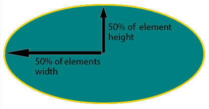
So border-radius:50%; defines the raddi of the ellipse this way :
- the radii on the X axis is 50% of the containers width
- the radii on the Y axis is 50% of the containers height
Pixel and other units
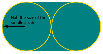
Using one value other than a percentage for border radius (em, in, viewport related units, cm...) will always result in an ellipse with the same X/Y radii. In other words, a circle.
When you set border-radius:999px; the radii of the circle should be 999px. But another rule is applied when the curves overlap reducing the radii of the circle to half the size of the smallest side. So in your example it is equal to half the height of the element : 50px.
For this example (with a fixed size element) you can obtain the same result with both px and percentages. As the element is 230px x 100px, border-radius: 50%; is equivalent to border-radius:115px/50px; (50% of both sides) :
div {

  display: inline-block;

  background: teal;

  width: 230px;

  height: 100px;

  padding: 40px 10px;

  box-sizing: border-box;

  font-family: courier;

  font-size: 0.8em;

  color: #fff;

}

.percent {

  border-radius: 50%;

}

.pixels {

  border-radius: 115px/50px;

}
<div class="percent">border-radius:50%;</div>
<div class="pixels">border-radius:115px/50px;</div>When to use %, px, em, etc...?
Using percentages to have a layout work in different size viewports is a very advanced technique, and is often done dynamically using javascript. Until you are more familiar with CSS, and can look at working percentage based layouts and understand enough to replicate it, you are better sticking to PX.
If you are going the javascript route it is really quite simple. For a start use jQuery as it makes resizing your layout a breeze compared to trying to do it with native javascript. Then $(window).height(); gives you the height of the viewport; $(window).width(); gives you the width. You set a default px width for your container, and then use percentages for all other block level elements (containers, within the container, sidebar, main etc) and do this:
function percentagize() {
var height = $(window).height()-100;
var width = $(window).width()-20;
$("div#container").css({
'height' : height+'px',
'width' : width+'px',
'margin': '0 auto'
});
}

$(document).ready(function() {
percentagize();
$(window).bind('resize','percentagize');
})
Related Topics
How to Make a Transparent Border with CSS
How to See the Print Media CSS in Firebug
Stretch a Background Image in IE8
Is CSS Faster When You Are Specific
Angular - Material: Progressbar Custom Color
How to Make One Circle Inside of Another Using CSS
All About Choosing the Right Font for a Website
Match Colors in Fecolormatrix Filter
I Need a Max-Margin CSS Property, But It Doesn't Exist. How Could I Fake It
Are There Specific CSS Selectors Targeting Ie10
Position Element Over Background Image. But the Bg Img Changes Size with the Window. CSS
Why Do Flexbox Item Images Resize Differently According to Their Initial Size
How to Get Only One Rounded Corner with Border-Radius Htc Hack and Msie V:Roundrect