Aligning two divs side-by-side
If you wrapped your divs, like this:
<div id="main">
  <div id="sidebar"></div>
  <div id="page-wrap"></div>
</div>
You could use this styling:
#main {
    width: 800px;
    margin: 0 auto;
}
#sidebar    {
    width: 200px;
    height: 400px;
    background: red;
    float: left;
}

#page-wrap  {
    width: 600px;
    background: #ffffff;
    height: 400px;
    margin-left: 200px;
}
This is a slightly different look though, so I'm not sure it's what you're after. This would center all 800px as a unit, not the 600px centered with the 200px on the left side. The basic approach is your sidebar floats left, but inside the main div, and the #page-wrap has the width of your sidebar as it's left margin to move that far over.
Update based on comments: For this off-centered look, you can do this:
<div id="page-wrap">
  <div id="sidebar"></div>
</div>
With this styling:
#sidebar    {
    position: absolute;
    left: -200px;
    width: 200px;
    height: 400px;
    background: red;
}

#page-wrap  {
    position: relative;
    width: 600px;
    background: #ffffff;
    height: 400px;
    margin: 0 auto;
}
Align div elements side by side
Apply float:left; to both of your divs should make them stand side by side.
How to make two div align side by side?
You need to add display: inline-block on the elements you wish to align side by side, as div elements have a default style of display: block, meaning they will stack vertically instead of horizontally (not the behaviour you want).
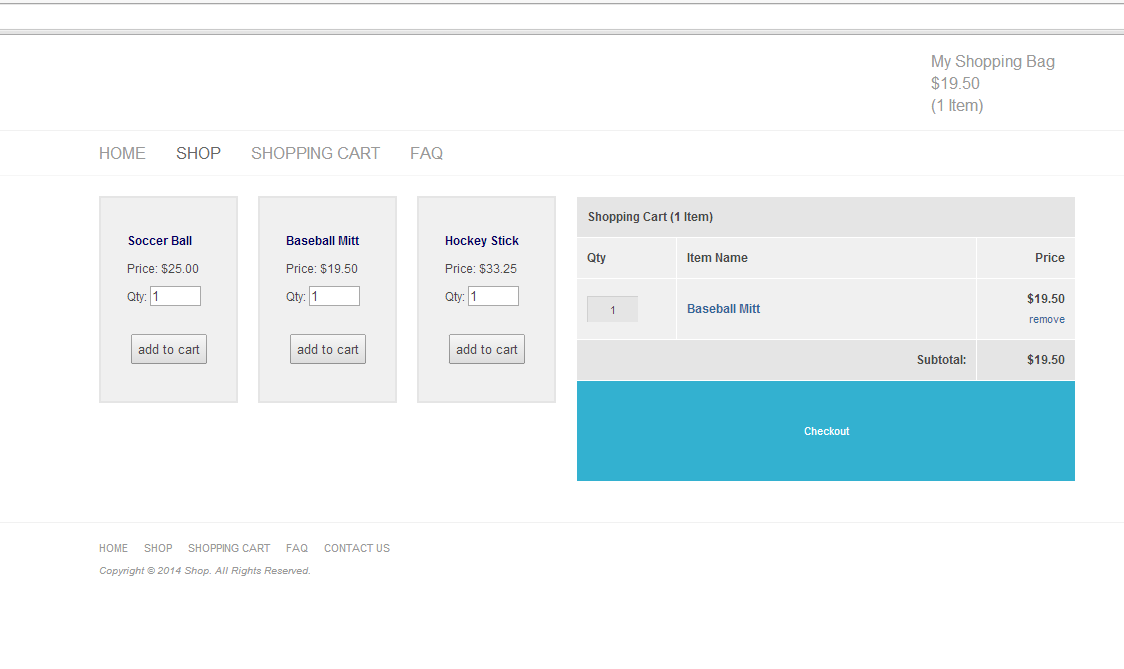
From the looks of it; the shopping cart box is too wide to fit side by side in the content container as well. Make the div with the id centre wider (possibly to 1000px instead of 960px), and coupled with the addition of changing the display property, that should do it.
In terms of the code you need to write directly in order to get this to change, do the following:
#centre {
    width: 1000px;
}

.cartbox {
    display: inline-block;
}
EDIT: I modified these changes to your website locally and it appears to have worked.
Align 2 Divs side by side
#content {  background:#eee;  width: 300px;  height:auto;  float: left;}
#sidebar {  background:#c00;  width: 200px;  height:auto;  float:left;}
<div id="content">Content</div><div id="sidebar">Sidebar</div>Is it possible to align two DIVs side by side if one is fixed?
I tried to write this code and it is responsive too.
* {
    padding: 0px;
    margin: 0px;
}
#one {
    float: left;
    position: fixed;
    width: 25%;
    background: #666;
    height: 100%;
}
#two {
    box-sizing: border-box;
    padding: 20px;
    position: absolute;
    left: 25%;
    right: 0%;
    float: right;
    width: 75%;
    background: #333;
}
I hope this helps.
CSS align 2 divs side by side
One solution is to use display: flex to container and set width: 100% to purple div:
.sub-row-wrapper { background: #f00; text-align: left; width: auto; position: relative; padding: 12px; margin-bottom: 12px; border-bottom: 1px; border-style: solid; border-color: #ccc; display: flex;/*set display to flex*/}.sub-row-left-col { background: #ff0; display: inline-block; width: 25%; text-align: left;}.sub-row-right-col { background: #f0f; display: inline-block; width: 100%;/*set width to 100%*/}<body>
<div class="sub-row-wrapper">
<div class="sub-row-left-col"> <p>Left img</p> </div>
<div class="sub-row-right-col"> <div class="post-content"> <p>This should be positioned right of 'left img' and should not go underneath the left img</p> </div> </div>
</div>
<div class="sub-row-wrapper">
<div class="sub-row-right-col"> <div class="post-content"> <p>This should be full width when I put enough content in to make it full width</p> </div> </div>
</div>
</body>align two divs side by side with floating (responsive)
I think this is what you are after. display: flex; is very powerful property and useful when it comes to take up rest of the space and centering.
Modification
here is a demo, I would not suggest this approach with using max-width as it's not "mobile-first". But if this is what you want for this project then ok.
.container {
  display: flex;
  flex-direction: row;
  background-color: deepskyblue;
}

#img {
  width: 140px;
  height: 140px;
}

#text {
  display: flex;
  align-items: center;
  justify-content: center;
  flex-grow: 1;
  background-color: deeppink;
  min-height: 100px;
}

@media screen and (max-width: 700px) {
  .container {
    flex-direction: column;
  }

  #img {
    width: 100%;
    height: auto;
  }
}
.container {  display: flex;  background-color: deepskyblue;}
#img {  width: 140px;  height: 140px;}
#text {  display: flex;  align-items: center;  justify-content: center;  flex-grow: 1;  background-color: deeppink;}
<div class="container"> <img id="img" src="https://www.archlinux.org/static/vector_tux.864e6cdcc23e.png" /> <div id="text">text on the left, next to the img</div></div>CSS layout - center & align two divs side by side
Try http://jsfiddle.net/htajL17y/2/
.social-tw, .social-fb
{
    display: inline-block;
    margin: 0 auto;
}
Simply, I gave the items margin: 0 auto. that will force even margins left and right.
Note that centers based on the 400px width you set. By taking away these widths and setting the items to display: inline-block it will size the div to the content more accurately. Obviously, this provides different a appearance, but more accurately centers the buttons.
How can i place two divs side by side and a third div aligning with the second
You can do this with below:
.wrapper { display: flex; flex-wrap: wrap; justify-content: flex-end; } .div { flex-basis: 50%; min-height: 100px; } .div1 { background: red; } .div2 { background: blue; } .div3 { background: aqua; }<div class="wrapper"> <div class="div div1">div1</div> <div class="div div2">div2</div> <div class="div div3">div3</div></div>Related Topics
Can The SASS Minifier Remove Duplicate Styles
Float Variable Height Containers
Eliminate Ghost Margin Below HTML5 Canvas Element
How to Make Bootstrap Table Rows Clickable
Div Background Color Not Showing with Body Color
How to Control 'Div' Overlapping in HTML
What CSS Tools (Framework,Grids System, Ide,..) Do I Need for Starting Web Design
How to Avoid Content of Span Break in Two Lines
Button Border Radius and Cursor
Custom Fields for Shopify User Registration Form
Two Divs; Left Should Be Fixed Width, Right Should Fill Rest of Space
Equal Height Divs (Two Column)