Container div ignores height of floated elements
You are looking for the so-called clearfix.
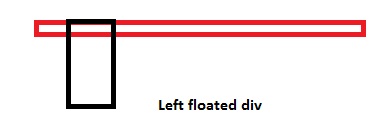
Why doesn't the height of a container element increase if it contains floated elements?
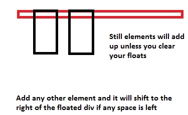
The floated elements do not add to the height of the container element, and hence if you don't clear them, container height won't increase...
I'll show you visually:
More Explanation:
<div>
  <div style="float: left;"></div>
  <div style="width: 15px;"></div> <!-- This will shift
                                        besides the top div. Why? Because of the top div
                                        is floated left, making the
                                        rest of the space blank -->

  <div style="clear: both;"></div>
  <!-- Now in order to prevent the next div from floating beside the top ones,
       we use `clear: both;`. This is like a wall, so now none of the div's
       will be floated after this point. The container height will now also include the
       height of these floated divs -->
  <div></div>
</div>
You can also add overflow: hidden; on container elements, but I would suggest you use clear: both; instead.
Also if you might like to self-clear an element you can use
.self_clear:after {
  content: "";
  clear: both;
  display: table;
}
How Does CSS Float Work?
What is float exactly and what does it do?
The
floatproperty is misunderstood by most beginners. Well, what exactly doesfloatdo? Initially, thefloatproperty was introduced to flow text around images, which are floatedleftorright. Here's another explanation by @Madara Uchicha.So, is it wrong to use the
floatproperty for placing boxes side by side? The answer is no; there is no problem if you use thefloatproperty in order to set boxes side by side.Floating an
Demoinlineorblocklevel element will make the element behave like aninline-blockelement.If you float an element
leftorright, thewidthof the element will be limited to the content it holds, unlesswidthis defined explicitly ...You cannot
floatan elementcenter. This is the biggest issue I've always seen with beginners, usingfloat: center;floatproperty.floatis generally used tofloat/move content to the very left or to the very right. There are only four valid values forfloatproperty i.eleft,right,none(default) andinherit.Parent element collapses, when it contains floated child elements, in order to prevent this, we use
clear: both;property, to clear the floated elements on both the sides, which will prevent the collapsing of the parent element. For more information, you can refer my another answer here.(Important) Think of it where we have a stack of various elements. When we use
float: left;orfloat: right;the element moves above the stack by one. Hence the elements in the normal document flow will hide behind the floated elements because it is on stack level above the normal floated elements. (Please don't relate this toz-indexas that is completely different.)
Taking a case as an example to explain how CSS floats work, assuming we need a simple 2 column layout with a header, footer, and 2 columns, so here is what the blueprint looks like...
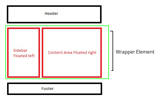
In the above example, we will be floating only the red boxes, either you can float both to the left, or you can float on to left, and another to right as well, depends on the layout, if it's 3 columns, you may float 2 columns to left where another one to the right so depends, though in this example, we have a simplified 2 column layout so will float one to left and the other to the right.
Markup and styles for creating the layout explained further down...
<div class="main_wrap">
    <header>Header</header>
    <div class="wrapper clear">
        <div class="floated_left">
            This<br />
            is<br />
            just<br />
            a<br />
            left<br />
            floated<br />
            column<br />
        </div>
        <div class="floated_right">
            This<br />
            is<br />
            just<br />
            a<br />
            right<br />
            floated<br />
            column<br />
        </div>
    </div>
    <footer>Footer</footer>
</div>

* {
    -moz-box-sizing: border-box;       /* Just for demo purpose */
    -webkkit-box-sizing: border-box;   /* Just for demo purpose */
    box-sizing: border-box;            /* Just for demo purpose */
    margin: 0;
    padding: 0;
}

.main_wrap {
    margin: 20px;
    border: 3px solid black;
    width: 520px;
}

header, footer {
    height: 50px;
    border: 3px solid silver;
    text-align: center;
    line-height: 50px;
}

.wrapper {
    border: 3px solid green;
}

.floated_left {
    float: left;
    width: 200px;
    border: 3px solid red;
}

.floated_right {
    float: right;
    width: 300px;
    border: 3px solid red;
}

.clear:after {
    clear: both;
    content: "";
    display: table;
}
Let's go step by step with the layout and see how float works..
First of all, we use the main wrapper element, you can just assume that it's your viewport, then we use header and assign a height of 50px so nothing fancy there. It's just a normal non floated block level element which will take up 100% horizontal space unless it's floated or we assign inline-block to it.
The first valid value for float is left so in our example, we use float: left; for .floated_left, so we intend to float a block to the left of our container element.
Column floated to the left
And yes, if you see, the parent element, which is .wrapper is collapsed, the one you see with a green border didn't expand, but it should right? Will come back to that in a while, for now, we have got a column floated to left.
Coming to the second column, lets it float this one to the right
Another column floated to the right
Here, we have a 300px wide column which we float to the right, which will sit beside the first column as it's floated to the left, and since it's floated to the left, it created empty gutter to the right, and since there was ample of space on the right, our right floated element sat perfectly beside the left one.
Still, the parent element is collapsed, well, let's fix that now. There are many ways to prevent the parent element from getting collapsed.
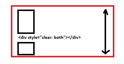
- Add an empty block level element and use
clear: both;before the parent element ends, which holds floated elements, now this one is a cheap solution toclearyour floating elements which will do the job for you but, I would recommend not to use this.
Add, <div style="clear: both;"></div> before the .wrapper div ends, like
<div class="wrapper clear">
    <!-- Floated columns -->
    <div style="clear: both;"></div>
</div>
Demo
Well, that fixes very well, no collapsed parent anymore, but it adds unnecessary markup to the DOM, so some suggest, to use overflow: hidden; on the parent element holding floated child elements which work as intended.
Use overflow: hidden; on .wrapper
.wrapper {
    border: 3px solid green;
    overflow: hidden;
}
Demo
That saves us an element every time we need to clear float but as I tested various cases with this, it failed in one particular one, which uses box-shadow on the child elements.
Demo (Can't see the shadow on all 4 sides, overflow: hidden; causes this issue)
So what now? Save an element, no overflow: hidden; so go for a clear fix hack, use the below snippet in your CSS, and just as you use overflow: hidden; for the parent element, call the class below on the parent element to self-clear.
.clear:after {
    clear: both;
    content: "";
    display: table;
}

<div class="wrapper clear">
    <!-- Floated Elements -->
</div>
Demo
Here, shadow works as intended, also, it self-clears the parent element which prevents to collapse.
And lastly, we use footer after we clear the floated elements.
Demo
When is float: none; used anyways, as it is the default, so any use to declare float: none;?
Well, it depends, if you are going for a responsive design, you will use this value a lot of times, when you want your floated elements to render one below another at a certain resolution. For that float: none; property plays an important role there.
Few real-world examples of how float is useful.
- The first example we already saw is to create one or more than one column layouts.
- Using
imgfloated insidepwhich will enable our content to flow around.
Demo (Without floating img)
Demo 2 (img floated to the left)
- Using
floatfor creating horizontal menu - Demo
Float second element as well, or use `margin`
Last but not the least, I want to explain this particular case where you float only single element to the left but you do not float the other, so what happens?
Suppose if we remove float: right; from our .floated_right class, the div will be rendered from extreme left as it isn't floated.
Demo
So in this case, either you can float the to the left as well
OR
You can use margin-left which will be equal to the size of the left floated column i.e 200px wide.
CSS container div not getting height
Add the following property:
.c{
    ...
    overflow: hidden;
}
This will force the container to respect the height of all elements within it, regardless of floating elements.
http://jsfiddle.net/gtdfY/3/
UPDATE
Recently, I was working on a project that required this trick, but needed to allow overflow to show, so instead, you can use a pseudo-element to clear your floats, effectively achieving the same effect while allowing overflow on all elements.
.c:after{
    clear: both;
    content: "";
    display: block;
}
http://jsfiddle.net/gtdfY/368/
How to make a floated div 100% height of its parent?
For #outer height to be based on its content, and have #inner base its height on that, make both elements absolutely positioned.
More details can be found in the spec for the css height property, but essentially, #inner must ignore #outer height if #outer's height is auto, unless #outer is positioned absolutely. Then #inner height will be 0, unless #inner itself is positioned absolutely.
<style>
    #outer {
        position:absolute;
        height:auto; width:200px;
        border: 1px solid red;
    }
    #inner {
        position:absolute;
        height:100%;
        width:20px;
        border: 1px solid black;
    }
</style>

<div id='outer'>
    <div id='inner'>
    </div>
    text
</div>
However... By positioning #inner absolutely, a float setting will be ignored, so you will need to choose a width for #inner explicitly, and add padding in #outer to fake the text wrapping I suspect you want. For example, below, the padding of #outer is the width of #inner +3. Conveniently (as the whole point was to get #inner height to 100%) there's no need to wrap text beneath #inner, so this will look just like #inner is floated.
<style>
    #outer2{
        padding-left: 23px;
        position:absolute;
        height:auto;
        width:200px;
        border: 1px solid red;
    }
    #inner2{
        left:0;
        position:absolute;
        height:100%;
        width:20px;
        border: 1px solid black;
   }
</style>

<div id='outer2'>
    <div id='inner2'>
    </div>
    text
</div>
I deleted my previous answer, as it was based on too many wrong assumptions about your goal.
Why does a div take the dimensions of a floated element?
When elements are floated, they are removed from the normal flow of the document. To understand it completely, that means you need to think about elements being placed in the normal flow, first, and then you can think about removing them with the float property.
Because the #navigation and #content elements are both floated, they are removed from the normal document flow. This moves the #footer element up to the top of the #container element. It's effectively positioned 'underneath' the two floated elements now.
The reason you're seeing the "footer" text still is that all un-cleared text wraps around floated elements (remember, float was designed to be used for wrapping article text around embedded images, like in a magazine article). In this case, the full width of the text's container is filled from side-to-side with floated elements, so the text is pushed to a new line.
It's hard to intuit from your example, so take a look with this one:
body { margin: 0; padding: 0; background: #ccc;}#container { width: 600px; margin: 0 auto;}#header { padding: 30px; background: #bbb;}#content { float: left; width: 460px; height: 190px; background: #fff;}#navigation { float: right; width: 140px; height: 220px; background: #eee;}#footer { background: #aaa;}<!DOCTYPE html PUBLIC "-//W3C//DTD XHTML 1.0 Strict//EN" "http://www.w3.org/TR/xhtml1/DTD/xhtml1-strict.dtd"><html lang="en"> <head> <meta http-equiv="content-type" content="text/html; charset=utf-8"> <title>CSS Floats 101</title>
</head> <body> <div id="container"> <div id="header"> <h1>Header</h1> </div> <div id="content"> Content </div> <div id="navigation"> navigation </div> <div id="footer"> Curabitur feugiat feugiat purus. Aenean eu metus. Nulla facilisi. Veni quis justo vel massa suscipit sagittis. Class aptent taciti sociosqu ad litora torquent per conubia nostra, per inceptos hymenaeos. Quisque mollis, justo vel rhoncus aliquam, urna tortor varius lacus, ut tincidunt metus arcu vel lorem. </div> </div> </body></html>Floating elements within a div, floats outside of div. Why?
The easiest is to put overflow:hidden on the parent div and don't specify a height:
#parent { overflow: hidden }
Another way is to also float the parent div:
#parent { float: left; width: 100% }
Another way uses a clear element:
<div class="parent">
   <img class="floated_child" src="..." />
   <span class="clear"></span>
</div>
CSS
span.clear { clear: left; display: block; }
Expand the parent div of floated elements to fit their total width?
Is this what you expected? http://jsfiddle.net/GE5Hf/4/

Just use white-space: nowrap together with the inline-block and vertical-align: top. You don't need your .inner div to achieve the desired effect - just use one container with overflow-x: auto:
<div class="container">
        <div id="i1"></div>
        <div id="i2"></div>
        <div id="i3"></div>
</div>
CSS
.container {
    width: 100%;
    height: 100%;
    overflow-x: auto;
    white-space: nowrap;
}

.container > div {
    display:inline-block;
    vertical-align: top;
}
Note: it is better to use overflow-x: auto than scroll just in case the scrollbar is not needed.
EDIT: We were speculating whether you actually need that .inner div. If you need it, you can just add it back with no special style required: http://jsfiddle.net/GE5Hf/5/
EDIT 2: To have the .inner div the width as its children, simply give it display:inline-block: http://jsfiddle.net/GE5Hf/8/
EDIT 3: Tried what you suggested in your last deleted comment, i.e. remove the fixed width of the child. This was really tricky, I had to wrap each child element to special div with display: table-cell and the inner div gets dislay: table-row: http://jsfiddle.net/GE5Hf/12/
Floated div does not expand to full width of parent div. Why?
Why it works in Brainjar.com is because the floats are filled with content, and as such they expand to its parent width if width is omitted on the floated element.
So the statement
Otherwise, it will fill its containing block horizontally, just like
non-floated content, leaving no room for other content to flow around
it.
will be wrong if the floated element is empty or with content less than to fill its container's width.
More about floats here: https://developer.mozilla.org/en-US/docs/Web/CSS/float
And filling your sample with more content show that it works like that.
#container { border:1px solid red} #blue, #aqua, #yellow { border:1px solid green; float:left;}   #pink { width:150px; border:1px solid blue; }
#pink { clear: left }
<div id="container"> <div id="aqua">aqua aqua aqua aqua aqua aqua aqua aqua aqua aqua aqua aqua aqua aqua aqua aqua aqua aqua aqua aqua aqua aqua aqua aqua aqua aqua aqua aqua aqua aqua aqua aqua aqua aqua aqua aqua aqua aqua aqua aqua aqua aqua aqua aqua aqua aqua aqua aqua aqua aqua aqua aqua aqua aqua aqua aqua aqua aqua aqua aqua aqua aqua aqua aqua aqua aqua aqua aqua aqua aqua aqua aqua aqua aqua aqua aqua aqua aqua</div> <div id="yellow">yellow</div> <div id="blue">blue</div> <div id="pink">pink</div></div>Related Topics
Creating Triangles Using Borders
Create a Complex CSS Shape (Speaking Bubble)
How to Seamlessly Align Block Divs of Different Sizes
How to Make Vertically Rotated Links in HTML
How to Have 2 Floating Divs Have The Same Height
A Singleton List of List Is Automatically Decomposed
Can You Overlay a Transparent Div on an Image
How to Make a Responsive (Row Fluid) Mixin for Bootstrap
Fixed Element in Transform Translate Container Not Working
Freeze Keyframe Animation for Debugging
Overflow-X: Hidden Also Hides Vertical Content Too
Onmouseout Event Not Triggered When Moving Mouse Fast (Gwt - All Browsers)
Style Children of Shadow Dom: :Part Element
CSS3 Onclick Activate Another Div's Animation
How to Horizontally Center-Crop Div Inside Other Div