triangle with border with pure css
Here FIDDLE. :after and :before are called pseudo elements.
<div id="message-holder"></div>
#message-holder {
    margin-top:50px;
    width:300px;
    height:300px;
    background: #F9EDEF;
    position:relative;
    border:1px solid #edb2b7;
}

#message-holder:before,#message-holder:after{
    content:"";
    position:absolute;
    top:-24px;
    left:25px;
    border-bottom:25px solid #f9edef;
    border-left:25px solid transparent;
    border-right:25px solid transparent;
}
#message-holder:before{
    top:-25px;
    border-bottom-color:#edb2b7;
}
Add a border to a triangle using pure CSS
The only way you could do something like this is to create another arrow just like it and put it behind the first to fake the border like this:
.arrow-tip {    width: 0;     height: 0;     border-left: 15px solid transparent;    border-right: 15px solid transparent;    border-bottom: 15px solid #222;    position: relative;}
.arrow-tip:after {    content: "";    display: block;    width: 0;     height: 0;     position: absolute;    bottom: -16px;    left: -17px;    z-index: -1;    border-left: 17px solid transparent;    border-right: 17px solid transparent;    border-bottom: 17px solid red;}
<div class="arrow-tip"></div>Adding borders to triangle built as borders
You can add the triangle borders with another pseudo element.
.dropdown-content:before,
.dropdown-content:after {
  position: absolute;
  left: 70%;
  width: 0;
  height: 0;
  content: '';
  border-left: 20px solid transparent;
  border-right: 20px solid transparent;
  border-bottom-width: 20px;
  border-bottom-style: solid;
}
.dropdown-content:before {
  top: -21px; /* extra -1 pixel offset at the top */
  border-bottom-color: red;
}
.dropdown-content:after {
  top: -20px;
  border-bottom-color: yellow;
}
.dropdown { position: relative; vertical-align: middle; display: inline-block;}
.dropdown-content { position: absolute; min-width: 160px; background-color: yellow; padding: 12px 16px; margin-top: 20px; z-index: 1; border-color: red; border-width: thin; border-style: solid;}
.dropdown-content a { display: block;}
.dropdown-content:before,.dropdown-content:after { position: absolute; left: 70%; width: 0; height: 0; content: ''; border-left: 20px solid transparent; border-right: 20px solid transparent; border-bottom-width: 20px; border-bottom-style: solid;}
.dropdown-content:before { top: -21px; /* extra -1 pixel offset at the top */ border-bottom-color: red;}
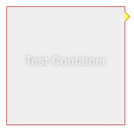
.dropdown-content:after { top: -20px; border-bottom-color: yellow;}<div class='dropdown'> <div class="dropdown-content"> <a href="#">Link 1</a> <a href="#">Link 2</a> <a href="#">Link 3</a> </div></div>How to put a border on a triangle shape using css?
jsBin demo

ul{
  list-style:none;
  background:#ddd;
  border-bottom: 1px solid #555;
}
ul li{
  display:inline-block;
}
ul li a{
  color:#555;
  display:inline-block;
  padding:10px;
  text-decoration:none;
  position:relative;
}
a.selected{
  color:#fff;
}
a.selected:after{                    /* Our arrow */
  position:absolute;
  -webkit-transform: rotate(45deg);
          transform: rotate(45deg);
  content:" ";
  width:8px;
  height:8px;
  border: 0 solid #555;
  border-width: 1px 0  0 1px;
  background:#fff;
  /* Now let's auto-center our arrow inside the pos. relative A parent */
  left:0;
  right:0;
  bottom:-5px;
  margin:0 auto;
}
Using :after on your a element, just set two borders and the same background color (in order to cover the bottom border of the ul), than rotate your little square by 45° and you're done.
Add border to 2 sides of CSS triangle?
100% pure CSS, no... but add an extra div in there and:
HTML
<div class="arrow-right">
  <div></div>
</div>
CSS
.arrow-right {
    width: 0;
    height: 0;
    border-top: 60px solid transparent;
    border-bottom: 60px solid transparent;
    border-left: 60px solid black;
}
.arrow-right > div {
    width: 0;
    position: relative;
    left: -60px;
    top: -59px;
    border-top: 59px solid transparent;
    border-bottom: 59px solid transparent;
    border-left: 59px solid green;
}
http://jsfiddle.net/qJJxm/
(replace every instance of 59 with a smaller number to make a wider border - all four should always be the same number)
How to make a pure css triangle which has a white center
To create triangles with only CSS we use a zero width/height element with borders:
.arrow-up {
    width  : 0;
    height : 0;

    border-left   : 50px solid transparent;
    border-right  : 50px solid transparent;
    border-bottom : 50px solid black;
}
Since we are using borders to create the arrow, we can't just give it a border, but we can overlay one arrow on top of a slightly larger arrow to make the appearance of a border:
HTML --
<div class="top"></div>
<div class="bottom"></div>
CSS --
.top {
position : absolute;
top : 6px;
left : 10px;
width : 0;
height : 0;
z-index : 100;
border-left : 50px solid transparent;
border-right : 50px solid transparent;
border-bottom : 50px solid black;
}
.bottom {
position : absolute;
width : 0;
height : 0;
z-index : 99;
border-left : 60px solid transparent;
border-right : 60px solid transparent;
border-bottom : 60px solid red;
}
Here is a demo: http://jsfiddle.net/jasper/qnmpb/1/
Update
You can then put both of the triangle DIV elements inside a container and move that container however you want:
HTML --
<div id="container">
    <div class="top"></div>
    <div class="bottom"></div>
</div>
CSS --
#container {
    position : relative;
    top      : 25px;
    left     : 25px;
}
Here is a demo: http://jsfiddle.net/jasper/qnmpb/3/
EDIT (2014):
I just came back to this answer and noticed that separate HTML elements are not necessary to create your double-triangle. You can use pseudo-elements, :before and :after. I.e. replace the .top selector with something like .my-element-that-needs-a-triangle:before and the .bottom selector with something like .my-element-that-needs-a-triangle:after.
Triangle with CSS with border
Someone already posted a pretty good answer to this question: https://stackoverflow.com/a/18607208/1320911
http://jsfiddle.net/wmDNr/3/
 .triangle {
     position: relative;
     width: 20px;
     margin-top: 100px;
 }
 .triangle>div {
     width: 20px;
     height: 2px;
     background: red;
     margin-top: 100px;
 }

 .triangle>div:before {
     content: " ";
     display: block;
     width: 20px;
     height: 2px;
     background: red;
     -webkit-transform: rotate(56deg);
     -moz-transform: rotate(56deg);
     -ms-transform: rotate(56deg);
     transform: rotate(56deg);
     position: absolute;
     top: -8px;
     right: -5px;
 }
 .triangle>div:after {
     content: " ";
     display: block;
     width: 20px;
     height: 2px;
     background: red;
     -webkit-transform: rotate(-56deg);
     -moz-transform: rotate(-56deg);
     -ms-transform: rotate(-56deg);
     transform: rotate(-56deg);
     position: absolute;
     top: -8px;
     left: -5px;
 }
Creating a triangle with only CSS
I believe you are looking for triangles with borders and a transparent cut in between (which none of the existing answers seem to address) and so here is an example. It's absolutely possible to achieve with but takes a lot of hacking around.
Using CSS Transforms:
The below snippet uses pseudo-elements and transforms to produce the triangles effect. The output is responsive but the usage of skew transforms mean that if the container's shape becomes a rectangle then the skew angles would need modification and more tweaking of the positioning attributes etc.
.container {  position: relative;  overflow: hidden;  height: 200px;  width: 200px;}.div-1,.div-2 {  position: absolute;  top: 0px;  left: 0px;  height: 100%;  width: 100%;  overflow: hidden;}.div-1 {  top: calc(-100% - 5px);  transform: skewY(45deg);  transform-origin: left top;  border-bottom: 2px solid;}.div-1:after {  position: absolute;  content: '';  height: calc(100% - 2px);  width: calc(100% - 2px);  top: calc(100% + 7px);  left: 0px;  transform: skewY(-45deg);  transform-origin: left top;  border: 1px solid;}.div-2 {  top: 5px;  transform: skewY(45deg);  transform-origin: left bottom;  border-top: 1px solid;}.div-2:after {  position: absolute;  content: '';  height: calc(100% - 7px);  width: calc(100% - 7px);  top: 0px;  left: 0px;  transform: skewY(-45deg);  transform-origin: left bottom;  border: 1px solid;}* {  box-sizing: border-box;}
/* just for demo */.container{  transition: all 1s;}.container:hover{  width: 400px;  height: 400px;}body{  background: radial-gradient(circle at center, aliceblue, mediumslateblue);  min-height: 100vh;}
<script src="https://cdnjs.cloudflare.com/ajax/libs/prefixfree/1.0.7/prefixfree.min.js"></script><div class='container'> <div class='div-1'></div> <div class='div-2'></div></div>CSS triangle custom border color
You actually have to fake it with two triangles....
.container {
    margin: 15px 30px;
    width: 200px;
    background: #fff;
    border: 1px solid #a00;
    position: relative;
    min-height: 200px;
    padding: 20px;
    text-align: center;
    color: #fff;
    font: bold 1.5em/180px Helvetica, sans-serif;
    text-shadow: 0 0 1px #000;
}

.container:after,
.container:before {
    content: '';
    display: block;
    position: absolute;
    left: 100%;
    width: 0;
    height: 0;
    border-style: solid;
}

.container:after {
    top: 10px;
    border-color: transparent transparent transparent #fdd;
    border-width: 10px;
}

.container:before {
    top: 9px;
    border-color: transparent transparent transparent #a00;
    border-width: 11px;
}
Updated Fiddle here
Related Topics
Image Downscaling with CSS … Images Are Blurry in Several Browsers
How to Place a Badge in Lower Right Corner of a "Media" in Bootstrap
CSS Pseudo Element (Triangle Outside The Tr) Position Misaligned When Scrollbar Appears
Bootstrap 3 Full Width Image and Div in Container
Why Does Chrome Read The Svg Circle Radius from The Style Attribute
Ie 11 Ignores Min-Width When Using Flex Width
Repeat Dots in Less/Sass for Content Property
Why Doesn't Blur(0) Remove All Text Blur in Webkit/Chrome on Retina Screens
CSS Floats and Its Stack Order
Integrating Angularjs and Bootstrap in Legacy Web Application
Style Dojox Grid Row Depending on Data
CSS - Underline Text But Ignore The Spaces
How to Align One Item in The Ol to The Right While The Others Are on The Left
Move The Vertical Scroll Bar of a Scroll Panel to The Left Side