IE 11 ignores min-width when using flex width
Since there seems to be no way to resolve this in IE11, I added a temporary media query to change the behavior for the specific dimensions.
In the case where we want 90% width up to 959px screen size, then 55% after 960px screen size -- I did calculation to determine that we want the <ul> element width to be 864px (960px x 90%) when screen is between 960px and 1570px (864px / 55%). So for this dimension range, I force a width and max-width of 864px.
Then for screens larger than 1571px, the flexbox 55% continues to apply again.
Using this method, I can completely ignore min-width.
@media (min-width: 960px) and (max-width: 1570px) {
  ul {
    flex-basis: 100%;
    max-width: 864px;
    width: 864px;
  }
}
IE 10 & 11 interpret min-width incorrectly in flexbox
You could set the flex-basis to auto aka content-size and make the divs' width: 100%.
Fiddle: https://jsfiddle.net/jofjmwz6/
#wrapper {
  width: 300px;
  height: 100px;
  background: yellow;
  display: flex;
  display: -ms-flexbox;
}

#wrapper div {
  flex: 0 1 auto;
  -ms-flex: 0 1 auto;
  width: 100%;
}

#div1 {
  background: green;
  min-width: 200px;
}

#div2 {
  background: red;
}
Basically both div try to take the full width of the parent, but #div1 "wins" because of the min-width, and they won't overflow the parent since you allow them to shrink: flex-shrink: 1 (i.e. flex: 0 1 auto;)
Could you please test on IE10, I only have IE11.
IE 11 flexbox child width not respecting content (Safari too)
Instead of flex: 1 use flex-grow: 1; flex-basis: 0; or specify all 3 values that you want for the shorthand. And if you specify flex-basis make sure you specify a unit. https://jsbin.com/ketolifuhu/edit?html,css,output
Here's a good article that covers some of the bugs and inconsistencies https://philipwalton.com/articles/normalizing-cross-browser-flexbox-bugs/
:root {    --dark-primary-color: #303F9F;    --default-primary-color: #3F51B5;    --light-primary-color: #C5CAE9;    --text-primary-color: #FFFFFF;    --accent-color: #FF4081;    --primary-text-color: #212121;    --secondary-text-color: #757575;    --divider-color: #BDBDBD;    --box-size: 150px;    font-family: Roboto, 'sans-serif';    font-size: 20px;    letter-spacing: 1.25px;    font-weight: 100;    color: white;}
body {  background-color: #BDBDBD;}
.flex-container {  display: flex;  flex-flow: row wrap;  justify-content: space-between;}
.flex-container > div {  flex-grow: 1;  margin: 10px;  box-shadow: 2px 2px 6px 1px rgba(0,0,0,.2);  padding: 30px;  flex-basis: 0;}
.left {  background-color: #3F51B5;}
.right {  background-color: #3F51B5;}
.heading {  letter-spacing: .5px;  font-weight: 400;  white-space: nowrap;}
.sub-text {  margin-top: 20px;  font-size: 14px;}
<!DOCTYPE html><html><head> <meta charset="utf-8"> <meta name="viewport" content="width=device-width"> <link href="https://fonts.googleapis.com/css?family=Roboto:100,400" rel="stylesheet"> <title>JS Bin</title></head><body>
<div class="flex-container"> <div class="left"> <div class="heading">Here is a heading that shouldn't wrap</div> <div class="sub-text">This is just some content that should wrap just fine and I don't really care what it says, but it'll just wrap just fine and that behavior should be handled by the heading.</div> </div> <div class="right"> <div class="heading">Here is a heading that shouldn't wrap</div> <div class="sub-text">This is just some content that should wrap just fine and I don't really care what it says, but it'll just wrap just fine and that behavior should be handled by the heading.</div> </div> </div> </body></html>Parent flexbox container ignores child's flexbox min-width
To understand this, simply add border with different colors to your items and you will see that you have overflow at different levels. More precesily, we have only one overflow that is moving to a lower lever after adding each min-width.
.body {  width: 300px;  border: 1px solid black;  padding: 8px;  background-color: #ccc;}
.flex {  display: flex;}
.flex-column {  display: flex;}
.item {  padding: 8px;  background-color: #fff;  overflow-wrap: break-word;}
<div class="body"> <div class="flex" style="border:5px solid red;"> <div class="flex" style="border:5px solid green;"> <div class="flex" style="border:5px solid blue;"> <div class="flex-column" style="border:5px solid yellow;"> <div class="item" style="border:5px solid pink;"> This is SpIe 11 Ignores Min-Width When Using Flex WidthIe 11 Ignores Min-Width When Using Flex WidthrrrrrrrrrrrrrttttttttttttttIe 11 Ignores Min-Width When Using Flex WidthIe 11 Ignores Min-Width When Using Flex Widthaaaaaa!11 It's not a bug. Firefox is correctly implementing min-width: auto for flex items. When you change it to min-width: 0, you're just using a different value for min-width to get your example looking how you want it to look. But both values are being rendered correctly. </div> </div> </div> </div> </div></div>display: flex not working on Internet Explorer
Internet Explorer doesn't fully support Flexbox due to:
Partial support is due to large amount of bugs present (see known
issues).
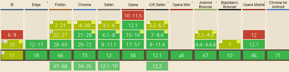
Screenshot and infos taken from caniuse.com
Notes
Internet Explorer before 10 doesn't support Flexbox, while IE 11 only supports the 2012 syntax.
Known issues
- IE 11 requires a unit to be added to the third argument, the flex-basis property see MSFT documentation.
- In IE10 and IE11, containers with
display: flexandflex-direction: columnwill not properly calculate their flexed childrens' sizes if the container hasmin-heightbut no explicitheightproperty. See bug. - In IE10 the default value for
flexis0 0 autorather than0 1 autoas defined in the latest spec. - IE 11 does not vertically align items correctly when
min-heightis used. See bug.
Workarounds
Flexbugs is a community-curated list of Flexbox issues and cross-browser workarounds for them. Here's a list of all the bugs with a workaround available and the browsers that affect.
- Minimum content sizing of flex items not honored
- Column flex items set to
align-items: centeroverflow their container min-heighton a flex container won't apply to its flex itemsflexshorthand declarations with unitlessflex-basisvalues are ignored- Column
flexitems don't always preserve intrinsic aspect ratios - The default flex value has changed
flex-basisdoesn't account forbox-sizing: border-boxflex-basisdoesn't supportcalc()- Some HTML elements can't be flex containers
align-items: baselinedoesn't work with nested flex containers- Min and max size declarations are ignored when wrapping flex items
- Inline elements are not treated as flex-items
- Importance is ignored on flex-basis when using flex shorthand
- Shrink-to-fit containers with
flex-flow: column wrapdo not contain their items - Column flex items ignore
margin: autoon the cross axis flex-basiscannot be animated- Flex items are not correctly justified when
max-widthis used
css flexbox IE11 flex item content breaks out of container
Add flex: 1 0 auto; to .content (in css).
See Codepen.
From michaPau's comment. Doing it on his behalf so this question can be resolved since he was unresponsive, and for the solution to be more accessible/explicit to people looking for it.
Related Topics
How to Keep CSS Style for Only One Element
What Exactly Happens When a Browser Doesn't Support Media Queries
Is There an Equivalent to Jquery's: First Selector in CSS3
Bootstrap 4 Float-Right Not Working with The Navbar
How to Get Page Content to Stretch and Stick Footer to Bottom of Page
How to Target Chrome Only, Not All Webkit Powered Browsers
Compile Less to Multiple CSS Files, Based on Variable Value
Best Way to Add Background Image with CSS3 Filters
Hide List with One Element with Pure CSS
CSS Column-Count Not Respected
CSS Target Just Class Name Starts with and Ends with String
How to Do Math Within a Less CSS String Interpolation
CSS Select Second Level Elements
Why Is Themeprovider (Material UI) Not Working for Me Here
Bundletable.Enableoptimizations True Breaks Jquery-Ui All.CSS