Why doesn't blur(0) remove all text blur in Webkit/Chrome on retina screens?
I had to deal with this some time ago because I had to do a filter transition, so I needed it to go zero and not none. Actually, it is kind of a known WebKit bug that only affects retina screens, no matter if it's a @2x image, text or whatever.
To make it work you'll need to add -webkit-transform: translateZ(0);
Works like magic. But don't take my word for it, you can check it out here: http://jsbin.com/OnebuKU/2/edit
WebKit: Blurry text with css scale + translate3d
Webkit treats 3d transformed elements as textures instead of vectors in order to provide hardware 3d acceleration. The only solution to this would be to increase the size of the text and downscaling the element, in essence creating a higher res texture.
See here:
http://jsfiddle.net/SfKKv/
Note that antialiasing is still underpar (stems are lost) so I'm beefing up the text with a bit of text shadow.
Blurry text in Internet Explorer
Did you try to add translateZ(0) for your popup? In your case it could be:
.popup {
    ...
    -webkit-transform: translate3d(-50%, -50%, 0);
    transform: translate3d(-50%, -50%, 0);
    ...
}
In IE11 on Windows 8.1 the font looks better: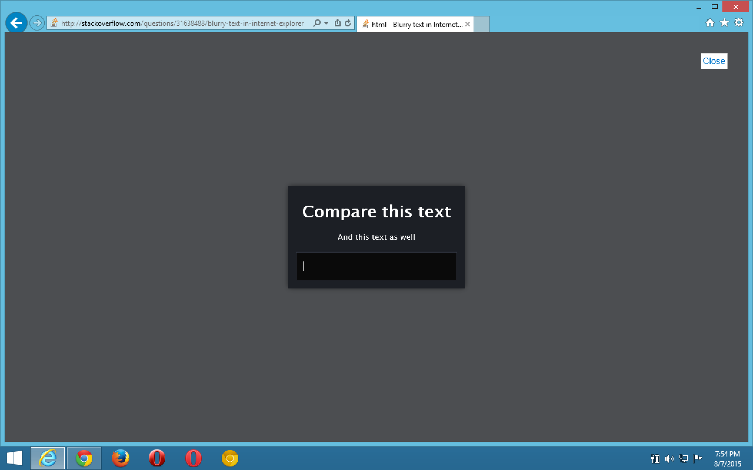
html, body {    margin: 0;    height: 100%;    font: normal 14px/24px "Lucida Sans Unicode", "Lucida Grande", "Arial", sans-serif;}
.popup {    position: relative;    top: 50%;    left: 50%;    text-align: center;    vertical-align: middle;    display: inline-block;    white-space: nowrap;    background-color: rgb(28, 31, 37);    color: white;    padding: 1em;    z-index: 2;
    -webkit-filter: blur(0);    -webkit-transform: translate3d(-50%, -50%, 0);    transform: translate3d(-50%, -50%, 0);
    -webkit-box-shadow: 0px 0px 14px -2px rgba(0, 0, 0, 0.75);    -moz-box-shadow: 0px 0px 14px -2px rgba(0, 0, 0, 0.75);    box-shadow: 0px 0px 14px -2px rgba(0, 0, 0, 0.75);}
p {    font-size: small;}
input {    padding: 16px 12px;    width: 250px;    border: 0;    background: #0A0A0A;    color: #eee;    font-size: 14px;    font-family: "Open Sans", sans-serif;
    -webkit-box-shadow: inset 0 0 0 1px #323742;    -moz-box-shadow: inset 0 0 0 1px #323742;    box-shadow: inset 0 0 0 1px #323742;}
#blackout {    background: rgba(17, 19, 23, 0.5);    position: fixed;    top: 0;    right: 0;    bottom: 0;    left: 0;    z-index: 1;    cursor: pointer;}
<div id="blackout"></div><div class="popup"> <h1>Compare this text</h1> <p>And this text as well</p> <input type="text" placeholder="Even placeholders are blurry"></div>Blurry downscaled images in Chrome
I found the exact same issue on Mac: Firefox downscales the image really well, while Chrome makes it look blurry, which is very bad.
I couldn't care less about rendering time or speed, I need the logo to look GOOD!
I found the following CSS rule fixing Chrome for Mac
image-rendering: -webkit-optimize-contrast;
CSS transition effect makes image blurry / moves image 1px, in Chrome?
2020 update
- If you have issues with blurry images, be sure to check answers from below as well, especially the
image-renderingCSS property. - For best practice accessibility and SEO wise you could replace the background image with an
<img>tag using object-fit CSS property.
Original answer
Try this in your CSS:
.your-class-name {
    /* ... */
    -webkit-backface-visibility: hidden;
    -webkit-transform: translateZ(0) scale(1, 1);
}
What this does is it makes the division to behave "more 2D".
- Backface is drawn as a default to allow flipping things with rotate
and such. There's no need to that if you only move left, right, up, down, scale or rotate (counter-)clockwise. - Translate Z-axis to always have a zero value.
- Chrome now handles
backface-visibilityandtransformwithout the-webkit-prefix. I currently don't know how this affects other browsers rendering (FF, IE), so use the non-prefixed versions with caution.
Related Topics
How to Make Header Image Responsive
How to Make a Series of <P> Elements Display Horizontally
Compile Less to Multiple CSS Files, Based on Variable Value
Turn Off Alt Tags on Links with CSS
Repeat Dots in Less/Sass for Content Property
Yii Chtml::Radiobuttonlist - CSS to Align Horizontally
CSS Cursors Are Not Working in Webkit Browsers
Bootstrap Grid with Different Image Heights
Flexbox Does Not Work in Safari, Striked Out in Web Inspector
Best Way to Add Background Image with CSS3 Filters
Fullwidth and Multiple Columns Using Flexbox
Overflow with Absolute/Relative Positioning Layout
Firefox Not Displaying Properly: Before and: After Pseudo-Elements
How to Edit My Angular Project's CSS Files Directly from Chrome Devtools