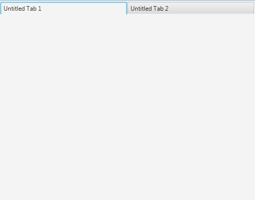
Change Tab's Size of TabPane in JavaFX
As far as I know the width and height of elements are read-only. You
can set -fx-pref-width, -fx-pref-height, -fx-max-width, -fx-min-width,
-fx-max-height, -fx-min-height ,-fx-border-width and -fx-border-height to adjust the size of Java FX elements.
You can do what you want by using Css:
.tab {

    -fx-pref-width: 250
}
.tab-header-background {
    -fx-background-color:transparent
}

.tab-pane{
    -fx-padding: 0 -1 -1 -1
}
Fill all the TabPane width with tabs in JavaFx
Potential approaches
Three possible solutions:
Style the existing tabs the way you want using CSS.
- As you have seen this is difficult.
- It is also brittle if the default tab styles and skin implementations change in future versions.
Create a new TabPaneSkin and associated CSS.
- This is potentially less brittle as now you have your own skin implementation.
- However the existing TabPaneSkin implementation is really complex and even trivial customization of it is very, very difficult.
Implement your own custom layout, controls, and CSS for managing switching panes.
- This is very stable as you are just relying on the basic standard public controls like buttons and layout panes.
- This is extremely customizable as you are starting with a blank slate and then adding the functionality you desire.
- The TabPane control has lots of in-built functionality around menus, dragging tabs, adding tabs, animating tabs, keyboard input support, etc.
- In a custom implementation, you will lose all of this additional functionality.
- But, you probably don't need or want that additional functionality anyway for many applications.
- If you actually do need the additional functionality, then use either of the first two approaches, otherwise I suggest you use this approach.
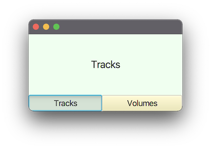
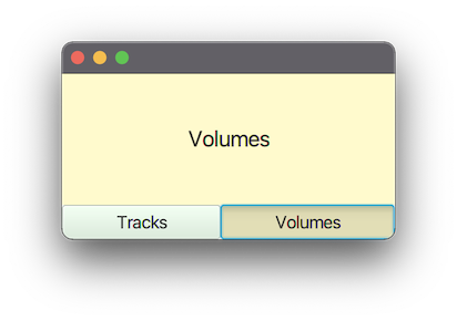
Custom pane switch implementation
Structure
VBox(contentPane, controlPane)
contentPane contains your switchable panes and is set to:
VBox.setVgrow(contentPane, Priority.ALWAYS);controlPane provides the tab switching buttons:
HBox(new RadioButton("Tracks"), new RadioButton("Volumes"));
When a radio button is actioned, the contentPane is replaced by the appropriate pane for the button.
RadioButtons are used rather than ToggleButtons, so that, when a toggle group is assigned to the buttons, only one is selectable at a time.
The radio buttons have their radio-button style removed and are styled like toggle buttons (via CSS) so they appear a bit more like a standard button.
Example Code
This example inlines the CSS rather than supplying a separate file, it also uses the fx:root construct. You could have a separate CSS file and not use the fx:root construct if you wish.
The fx:root and inline CSS constructs lack some useful tool support. If these features are not used, you get nicer WYSIWYG viewing in scene builder and improved intelligent editing in your IDE.
pom.xml
<?xml version="1.0" encoding="UTF-8"?>
<project xmlns="http://maven.apache.org/POM/4.0.0"
         xmlns:xsi="http://www.w3.org/2001/XMLSchema-instance"
         xsi:schemaLocation="http://maven.apache.org/POM/4.0.0 https://maven.apache.org/xsd/maven-4.0.0.xsd">
    <modelVersion>4.0.0</modelVersion>

    <groupId>com.example</groupId>
    <artifactId>mixer</artifactId>
    <version>1.0-SNAPSHOT</version>
    <name>mixer</name>

    <properties>
        <project.build.sourceEncoding>UTF-8</project.build.sourceEncoding>
    </properties>

    <dependencies>
        <dependency>
            <groupId>org.openjfx</groupId>
            <artifactId>javafx-controls</artifactId>
            <version>17.0.2</version>
        </dependency>
        <dependency>
            <groupId>org.openjfx</groupId>
            <artifactId>javafx-fxml</artifactId>
            <version>17.0.2</version>
        </dependency>
    </dependencies>

    <build>
        <plugins>
            <plugin>
                <groupId>org.apache.maven.plugins</groupId>
                <artifactId>maven-compiler-plugin</artifactId>
                <version>3.8.1</version>
                <configuration>
                    <source>17</source>
                    <target>17</target>
                </configuration>
            </plugin>
        </plugins>
    </build>
</project>
module-info.java
module com.example.mixer {
    requires javafx.controls;
    requires javafx.fxml;

    opens com.example.mixer to javafx.fxml;
    exports com.example.mixer;
}
MixerApp.java
package com.example.mixer;

import javafx.application.Application;
import javafx.scene.Scene;
import javafx.stage.Stage;

public class MixerApp extends Application {
    @Override
    public void start(Stage stage) {
        stage.setScene(new Scene(new Mixer()));
        stage.show();
    }

    public static void main(String[] args) {
        launch(args);
    }
}
Mixer.java
package com.example.mixer;

import javafx.fxml.*;
import javafx.scene.control.*;
import javafx.scene.layout.*;

import java.io.IOException;
import java.util.Map;

public class Mixer extends VBox {

    private final Map<Toggle, Pane> paneMap;

    private static final String CSS = """
        data:text/css,
        .mixer {
             tracks-color: honeydew;
             volumes-color: lemonchiffon;
        }
        .tracks-pane {
             -fx-background-color: tracks-color;
             -fx-font-size: 20px;
        }
        .volumes-pane {
             -fx-background-color: volumes-color;
             -fx-font-size: 20px;
        }
        .tracks-pane-selector {
             -fx-base: tracks-color;
             -fx-font-size: 16px;
        }
        .volumes-pane-selector {
             -fx-base: volumes-color;
             -fx-font-size: 16px;
        }
        """;

    public Mixer() {
        FXMLLoader fxmlLoader = new FXMLLoader(getClass().getResource("mixer.fxml"));
        fxmlLoader.setRoot(this);
        fxmlLoader.setController(this);

        try {
            fxmlLoader.load();
        } catch (IOException exception) {
            throw new RuntimeException(exception);
        }

        getStylesheets().add(CSS);

        // we want the pane selectors styled as toggle-buttons rather than radio-buttons,
        // so we remove their radio styles.
        tracksPaneSelector.getStyleClass().remove("radio-button");
        volumesPaneSelector.getStyleClass().remove("radio-button");

        StackPane tracksPane = new StackPane(new Label("Tracks"));
        tracksPane.getStyleClass().add("tracks-pane");

        StackPane volumesPane = new StackPane(new Label("Volumes"));
        volumesPane.getStyleClass().add("volumes-pane");

        paneMap = Map.of(
                tracksPaneSelector, tracksPane,
                volumesPaneSelector, volumesPane
        );

        displaySelectedPane();
        paneToggleGroup.selectedToggleProperty().addListener((observable, oldValue, newValue) ->
                displaySelectedPane()
        );
    }

    private void displaySelectedPane() {
        contentPane.getChildren().setAll(
                paneMap.get(paneToggleGroup.getSelectedToggle())
        );
    }

    // FXML fields generated from skeleton.

    @FXML
    private StackPane contentPane;

    @FXML
    private HBox paneControls;

    @FXML
    private ToggleGroup paneToggleGroup;

    @FXML
    private RadioButton tracksPaneSelector;

    @FXML
    private RadioButton volumesPaneSelector;
}
mixer.fxml
<?xml version="1.0" encoding="UTF-8"?>

<?import java.lang.String?>
<?import javafx.scene.control.RadioButton?>
<?import javafx.scene.control.ToggleGroup?>
<?import javafx.scene.layout.HBox?>
<?import javafx.scene.layout.StackPane?>
<?import javafx.scene.layout.VBox?>

<fx:root fx:id="mixerLayout" maxHeight="-Infinity" maxWidth="-Infinity" minHeight="-Infinity" minWidth="-Infinity" prefHeight="150.0" prefWidth="300.0" styleClass="mixer" type="VBox" xmlns="http://javafx.com/javafx/17" xmlns:fx="http://javafx.com/fxml/1">
   <children>
      <StackPane fx:id="contentPane" VBox.vgrow="ALWAYS" />
      <HBox fx:id="paneControls">
         <children>
            <RadioButton fx:id="tracksPaneSelector" maxWidth="1.7976931348623157E308" mnemonicParsing="false" selected="true" text="Tracks" HBox.hgrow="SOMETIMES">
               <toggleGroup>
                  <ToggleGroup fx:id="paneToggleGroup" />
               </toggleGroup>
               <styleClass>
                  <String fx:value="toggle-button" />
                  <String fx:value="tracks-pane-selector" />
               </styleClass>
            </RadioButton>
            <RadioButton fx:id="volumesPaneSelector" maxWidth="1.7976931348623157E308" mnemonicParsing="false" text="Volumes" toggleGroup="$paneToggleGroup" HBox.hgrow="SOMETIMES">
               <styleClass>
                  <String fx:value="toggle-button" />
                  <String fx:value="volumes-pane-selector" />
               </styleClass>
            </RadioButton>
         </children>
      </HBox>
   </children>
</fx:root>
JavaFx - increase space between text and tab header area edge
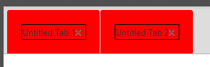
If you want a border around the tab (not the label), you have to use this:
.tab-pane > .tab-header-area > .headers-region > .tab {
    -fx-background-color: red;
    -fx-padding: 20px;
    -fx-border-color: black;
    -fx-border-width: 1px;
}
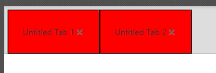
If you want to manipulate the tab-container (where the label is in) itself you need this:
.tab-pane > .tab-header-area > .headers-region > .tab  > .tab-container{
    -fx-border-color: black;
    -fx-border-width: 1px;
}
.tab-pane > .tab-header-area > .headers-region > .tab {
    -fx-padding: 20px;
    -fx-background-color: red;
}
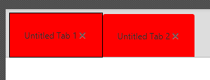
UPDATE
Default for a selected tab is that:
.tab-pane:focused > .tab-header-area > .headers-region > .tab:selected .focus-indicator {
    -fx-border-width: 1, 1;
    -fx-border-color: -fx-focus-color, -fx-faint-focus-color;
    -fx-border-insets: -4 -4 -6 -5, -2 -2 -5 -3;
    -fx-border-radius: 2, 1; /* looks sharper if outer border has a tighter radius (2 instead of 3) */
}
And this it how it goes:
.tab-pane > .tab-header-area > .headers-region > .tab {
    -fx-padding: 20px;
    -fx-background-color: red;
}

.tab-pane > .tab-header-area > .headers-region > .tab:selected {
    -fx-padding: 20px;
    -fx-background-color: red;
    -fx-border-width: 1px;
    -fx-border-color: black;
}

.tab-pane > .tab-header-area > .headers-region >.tab:selected .focus-indicator{
    -fx-border-width: 0px;
}
Look at the modena.css (default JavaFX stylesheet) file for info on things to change.
Font size will not change dynamic, you have to take care of font size with a listener on size/width/height property of the tab (in relation to font size).
And there are a lot of pseudo tags like .tab:selected .tab:top etc. So be aware of this kind of things if you want the default behavior only with new design.
And finally have a look at css selectors, you missed the descending selectors ('>'): http://www.w3schools.com/cssref/sel_element_gt.asp
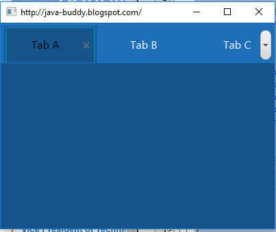
Show some tabs ahead from selected tab in a JavaFx 8 TabPane header
I finally did it.
Found out the class I was looking for was com.sun.javafx.scene.control.skin.TabPaneSkin @ jfxrt.jar, it has a method to make the selected tab visible, it runs everytime a selected tab at a TabPane is not fully visible, I overwrote it.
TabPaneSkin is the default Skin of TabPane, it applies some behaviours to the TabPane control.
/*
* Copyright (c) 2011, 2014, Oracle and/or its affiliates. All rights reserved.
* ORACLE PROPRIETARY/CONFIDENTIAL. Use is subject to license terms.
*
Hopefully Oracle will not mind...
Pick your TabPane, and make...
tabPane.setSkin(new TabPaneNewSkin(tabPane));
... to overwrite Oracle's default TabPaneSkin with this one I wrote that shows nearby tabs.
Original Oracle's code for repositioning tabs when one is selected to make it visible:
    private void ensureSelectedTabIsVisible() {
            // work out the visible width of the tab header
            double tabPaneWidth = snapSize(isHorizontal() ? getSkinnable().getWidth() : getSkinnable().getHeight());
            double controlTabWidth = snapSize(controlButtons.getWidth());
            double visibleWidth = tabPaneWidth - controlTabWidth - firstTabIndent() - SPACER;

            // and get where the selected tab is in the header area
            double offset = 0.0;
            double selectedTabOffset = 0.0;
            double selectedTabWidth = 0.0;
            for (Node node : headersRegion.getChildren()) {
                TabHeaderSkin tabHeader = (TabHeaderSkin)node;

                double tabHeaderPrefWidth = snapSize(tabHeader.prefWidth(-1));

                if (selectedTab != null && selectedTab.equals(tabHeader.getTab())) {
                    selectedTabOffset = offset;
                    selectedTabWidth = tabHeaderPrefWidth;
                }
                offset += tabHeaderPrefWidth;
            }

            final double scrollOffset = getScrollOffset();
            final double selectedTabStartX = selectedTabOffset;
            final double selectedTabEndX = selectedTabOffset + selectedTabWidth;

            final double visibleAreaEndX = visibleWidth;

            if (selectedTabStartX < -scrollOffset) {
                setScrollOffset(-selectedTabStartX);
            } else if (selectedTabEndX > (visibleAreaEndX - scrollOffset)) {
                setScrollOffset(visibleAreaEndX - selectedTabEndX);
            }
        }
Code I wrote into my custom TabPane skin:
    // This function was overwritten
    private void ensureSelectedTabIsVisible() {
        // work out the visible width of the tab header
        double tabPaneWidth = snapSize(isHorizontal() ? getSkinnable().getWidth() : getSkinnable().getHeight());
        double controlTabWidth = snapSize(controlButtons.getWidth());
        double visibleWidth = tabPaneWidth - controlTabWidth - firstTabIndent() - SPACER;

        // and get where the selected tab is in the header area
        double offset = 0.0;
        double selectedTabOffset = 0.0;
        double selectedTabWidth = 0.0;

        // OVERWRITE
        // Makes the nearby 3 tabs for each side of the selected tab visible.
        ObservableList<Node> headersRegionChildren = headersRegion.getChildren();
        boolean nextTabs = false;
        int nextTabsCount = 0;
        int current = 0;
        int numOfTabsToShowNext = 3;
        int numOfTabsToShowBefore = 3;
        double tabHeaderPrefWidth;
        TabHeaderSkin tabHeader;

        for (Node node : headersRegionChildren) {
            tabHeader = (TabHeaderSkin)node;

            tabHeaderPrefWidth = snapSize(tabHeader.prefWidth(-1));

           if (selectedTab != null && selectedTab.equals(tabHeader.getTab())) {
                    selectedTabWidth = tabHeaderPrefWidth;

                // OVERWRITE: Finds the offset of the first tab in the limit numOfTabsToShowBefore before the selected one to be shown
                for(int i = current - 1; i >= 0 && numOfTabsToShowBefore > 1; i--, numOfTabsToShowBefore--){
                    tabHeader = (TabHeaderSkin)headersRegionChildren.get(i);
                    tabHeaderPrefWidth = snapSize(tabHeader.prefWidth(-1));
                    offset -= tabHeaderPrefWidth;
                    selectedTabWidth += tabHeaderPrefWidth;
                }

                selectedTabOffset = offset;
                // OVERWRITE: Sets the flag to start counting in the next 3 nearby tabs.
                nextTabs = true;
            }
            // OVERWRITE: Sums the width of the next nearby tabs with the
            // width of the selected tab, so it will scroll enough to show
            // them too.
            if(nextTabs && nextTabsCount < numOfTabsToShowNext){
                selectedTabWidth += tabHeaderPrefWidth;
                nextTabsCount++;
            }else if(nextTabsCount == numOfTabsToShowNext){
                break;
            }

            offset += tabHeaderPrefWidth;
            current++;
        }
        // END OVERWRITE

        final double scrollOffset = getScrollOffset();
        final double selectedTabStartX = selectedTabOffset;
        final double selectedTabEndX = selectedTabOffset + selectedTabWidth;

        final double visibleAreaEndX = visibleWidth;

        if (selectedTabStartX < -scrollOffset) {
            setScrollOffset(-selectedTabStartX);
        } else if (selectedTabEndX > (visibleAreaEndX - scrollOffset)) {
            setScrollOffset(visibleAreaEndX - selectedTabEndX);
        }
    }
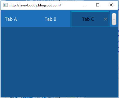
Code above reveals the 3 nearest tabs at each side from the selected tab (if one of those is out of the screen and exists), for every tab selection.
So that was it. com.sun.javafx.scene.control.skin.TabPaneSkin was not supposed to be extended, almost every method is private, so I made a copy of it and changed only the function mentioned above, and renamed it to TabPaneNewSkin, and it is at my package.
Change JavaFx Tab default Look
You should also override the CSS:
.tab-pane:top *.tab-header-area {
    -fx-background-insets: 0, 0 0 1 0;
 /* -fx-padding: 0.416667em 0.166667em 0.0em 0.833em; /* 5 2 0 10 */
    -fx-padding: 0.416667em 0.166667em 0.0em 0.0em; /* overridden as 5 2 0 0 */
}
Here the left padding value of the tab-header-area changed from 10 to 0. In addition you need to override other CSS selectors: .tab-pane:bottom, .tab-pane:left and .tab-pane:right in the same manner for different javafx.geometry.Sides of the TabPane.
JavaFX Tab Text and Size Issues
Key code:
.tab-pane .tab:selected
{
    -fx-background-color: #15558c;
}

.tab:selected .tab-label
{
    -fx-text-fill: #000;
    -fx-background-color: #15558c;
}
Full code:
.tab {
    -fx-background-color: #1c6fb8;
    -fx-font: 16px "Helvetica Neue" ;
    -fx-background-radius: 0;
}

.tab-label {
    -fx-text-fill: #fff;
}

.tab:focused .tab-label {
    -fx-text-fill: #000;
}

.tab-header-background {
    -fx-background-color: #1c6fb8;
}

.tab-pane {
    -fx-tab-min-width:120px;
    -fx-tab-max-width:120px;
    -fx-tab-min-height:50px;
    -fx-tab-max-height:50px;
    -fx-background-color: #15558c;
}

/*.tab:selected {
    -fx-text-fill: #000;
    -fx-background-color: #15558c;
}*/

.tab-pane .tab:selected
{
    -fx-background-color: #15558c;
}

.tab:selected .tab-label {
    -fx-text-fill: #000;
    -fx-background-color: #15558c;
}
First Open:
First Click:
Related Topics
Place Tab in Shiny Tabsetpanel on The Right
How to Automatically Add Browser Prefix to CSS3 Properties
Remove Scollbar When No Need to Scroll
To Change Text-Color in Mat-List-Option
How to Add Multiple Browser Specific Values into a CSS Style in React
Background-Size 100% Not Working in Ie8 and Ie7
CSS Cursors Are Not Working in Webkit Browsers
CSS Background to Stretch to Window Bottom
My Less Math Operations Aren't Working in My Media Query Definitions
Stop Firefox Rendering Inline Colours in Rgb() Form
Issue with: Global() CSS-Module Selectors Not Being Pure in Nextjs
CSS3 Selector Last Element That Is Not of Class X
How to Set a Javafx Static Property in CSS
How to Write Multiple CSS Selectors in One Line
How to Integrate a Thunderbird Extension with Lightning