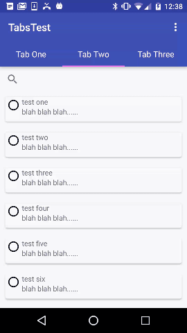
Whatsapp like Collapsing Toolbar
In order to achieve this functionality a CollapsingToolbarLayout is actually not needed, you can just collapse the Toolbar that is set as the ActionBar.
Here is sample code using a Toolbar for the ActionBar that will collapse, and a TabLayout with a ViewPager.
First ensure that the style used for MainActivity is one that does not have an ActionBar, e.g.:
<style name="AppTheme" parent="@style/Theme.AppCompat.Light.NoActionBar">
    <!-- ....... -->
</style>
MainActivity.java, that has the FragmentPagerAdapter and sets up the tabs:
public class MainActivity extends AppCompatActivity {

    @Override
    protected void onCreate(Bundle savedInstanceState) {
        super.onCreate(savedInstanceState);
        setContentView(R.layout.activity_main);

        Toolbar toolbar = (Toolbar) findViewById(R.id.toolbar);
        setSupportActionBar(toolbar);

        // Get the ViewPager and set it's PagerAdapter so that it can display items
        ViewPager viewPager = (ViewPager) findViewById(R.id.viewpager);
        PagerAdapter pagerAdapter =
                new PagerAdapter(getSupportFragmentManager(), MainActivity.this);
        viewPager.setAdapter(pagerAdapter);

        // Give the TabLayout the ViewPager
        TabLayout tabLayout = (TabLayout) findViewById(R.id.tab_layout);
        tabLayout.setupWithViewPager(viewPager);

        // Iterate over all tabs and set the custom view
        for (int i = 0; i < tabLayout.getTabCount(); i++) {
            TabLayout.Tab tab = tabLayout.getTabAt(i);
            tab.setCustomView(pagerAdapter.getTabView(i));
        }

    }

    @Override
    public void onResume() {
        super.onResume();
    }
    @Override
    public boolean onCreateOptionsMenu(Menu menu) {
        // Inflate the menu; this adds items to the action bar if it is present.
        getMenuInflater().inflate(R.menu.menu_main, menu);
        return true;
    }

    @Override
    public boolean onOptionsItemSelected(MenuItem item) {
        int id = item.getItemId();

        if (id == R.id.action_settings) {
            return true;
        }

        return super.onOptionsItemSelected(item);
    }

    class PagerAdapter extends FragmentPagerAdapter {

        String tabTitles[] = new String[] { "Tab One", "Tab Two", "Tab Three" };
        Context context;

        public PagerAdapter(FragmentManager fm, Context context) {
            super(fm);
            this.context = context;
        }

        @Override
        public int getCount() {
            return tabTitles.length;
        }

        @Override
        public Fragment getItem(int position) {

            switch (position) {
                case 0:
                    return new BlankFragment();
                case 1:
                    return new BlankFragment();
                case 2:
                    return new BlankFragment();
            }

            return null;
        }

        @Override
        public CharSequence getPageTitle(int position) {
            // Generate title based on item position
            return tabTitles[position];
        }

        public View getTabView(int position) {
            View tab = LayoutInflater.from(MainActivity.this).inflate(R.layout.custom_tab, null);
            TextView tv = (TextView) tab.findViewById(R.id.custom_text);
            tv.setText(tabTitles[position]);
            return tab;
        }

    }
}
activity_main.xml
The important parts:
- Use a CoordinatorLayout
- Use
app:layout_scrollFlags="scroll|enterAlways|snap"in the Toolbar
properties - Use
app:layout_behavior="@string/appbar_scrolling_view_behavior"in
the ViewPager properties
Here is the activity_main.xml file:
<android.support.design.widget.CoordinatorLayout
    android:id="@+id/main_layout"
    xmlns:android="http://schemas.android.com/apk/res/android"
    xmlns:app="http://schemas.android.com/apk/res-auto"
    xmlns:tools="http://schemas.android.com/tools"
    android:layout_width="match_parent"
    android:layout_height="match_parent"
    tools:context=".MainActivity">

    <android.support.design.widget.AppBarLayout
        android:id="@+id/appBarLayout"
        android:layout_width="match_parent"
        android:layout_height="wrap_content"
        app:elevation="6dp">
    <android.support.v7.widget.Toolbar
        android:id="@+id/toolbar"
        android:layout_width="match_parent"
        android:layout_height="wrap_content"
        android:layout_alignParentTop="true"
        android:background="?attr/colorPrimary"
        android:minHeight="?attr/actionBarSize"
        android:theme="@style/ThemeOverlay.AppCompat.Dark.ActionBar"
        app:popupTheme="@style/ThemeOverlay.AppCompat.Light"
        app:elevation="0dp"
        app:layout_scrollFlags="scroll|enterAlways|snap"
        />

    <android.support.design.widget.TabLayout
        android:id="@+id/tab_layout"
        app:tabMode="fixed"
        android:layout_below="@+id/toolbar"
        android:layout_width="match_parent"
        android:layout_height="wrap_content"
        android:background="?attr/colorPrimary"
        app:elevation="0dp"
        app:tabTextColor="#d3d3d3"
        app:tabSelectedTextColor="#ffffff"
        app:tabIndicatorColor="#ff00ff"
        android:minHeight="?attr/actionBarSize"
        />

    </android.support.design.widget.AppBarLayout>

    <android.support.v4.view.ViewPager
        android:id="@+id/viewpager"
        android:layout_below="@+id/tab_layout"
        android:layout_width="match_parent"
        android:layout_height="wrap_content"
        app:layout_behavior="@string/appbar_scrolling_view_behavior"
        />

</android.support.design.widget.CoordinatorLayout>
custom_tab.xml:
<?xml version="1.0" encoding="utf-8"?>

<LinearLayout xmlns:android="http://schemas.android.com/apk/res/android"
    android:orientation="vertical" android:layout_width="match_parent"
    android:layout_height="match_parent">
    <TextView
        android:id="@+id/custom_text"
        android:layout_width="wrap_content"
        android:layout_height="match_parent"
        android:background="?attr/selectableItemBackground"
        android:gravity="center"
        android:textSize="16dip"
        android:textColor="#ffffff"
        android:singleLine="true"
        />
</LinearLayout>
BlankFragment.java, this simply adds enough items to make it scroll:
import android.support.v4.app.Fragment;
import android.support.v7.widget.LinearLayoutManager;
import android.support.v7.widget.RecyclerView;
import android.view.LayoutInflater;
import android.view.View;
import android.view.ViewGroup;;

public class BlankFragment extends Fragment {

    public BlankFragment() {
        // Required empty public constructor
    }

    @Override
    public void onCreate(Bundle savedInstanceState) {
        super.onCreate(savedInstanceState);

    }

    @Override
    public View onCreateView(LayoutInflater inflater, ViewGroup container,
                             Bundle savedInstanceState) {
        // Inflate the layout for this fragment
        View rootView = inflater.inflate(R.layout.fragment_blank, container, false);

        RecyclerView rv = (RecyclerView) rootView.findViewById(R.id.rv_recycler_view);
        rv.setHasFixedSize(true);
        MyAdapter adapter = new MyAdapter(new String[]{"test one", "test two", "test three", "test four", "test five" , "test six" , "test seven", "test eight" , "test nine"});
        rv.setAdapter(adapter);

        LinearLayoutManager llm = new LinearLayoutManager(getActivity());
        rv.setLayoutManager(llm);

        return rootView;
    }

}
fragment_blank.xml, it's important to use a RecyclerView, or any other View that supports nested scrolling, such as a NestedScrollView
(side note: you can call setNestedScrollingEnabled(true) on api-21 and up to make it work with a ListView):
<?xml version="1.0" encoding="utf-8"?>
<RelativeLayout
    xmlns:android="http://schemas.android.com/apk/res/android"
    android:layout_width="match_parent"
    android:layout_height="match_parent">

    <android.support.v7.widget.SearchView
        android:id="@+id/sv_search"
        android:layout_width="match_parent"
        android:layout_height="wrap_content"
        android:hint="Search!"
        android:singleLine="true"
        android:inputType="textNoSuggestions"
        android:layout_gravity="start"
        android:layout_marginRight="18dp"
        android:ems="10" >
    </android.support.v7.widget.SearchView>

    <android.support.v7.widget.RecyclerView
        android:id="@+id/rv_recycler_view"
        android:layout_below="@+id/sv_search"
        android:layout_width="match_parent"
        android:layout_height="match_parent" >
    </android.support.v7.widget.RecyclerView>
</RelativeLayout>
MyAdapter.java, the RecyclerView Adapter:
import android.support.v7.widget.CardView;
import android.support.v7.widget.RecyclerView;
import android.view.LayoutInflater;
import android.view.View;
import android.view.ViewGroup;
import android.widget.TextView;

public class MyAdapter extends RecyclerView.Adapter<MyAdapter.MyViewHolder> {
    private String[] mDataset;

    // Provide a reference to the views for each data item
    // Complex data items may need more than one view per item, and
    // you provide access to all the views for a data item in a view holder
    public static class MyViewHolder extends RecyclerView.ViewHolder {
        public CardView mCardView;
        public TextView mTextView;
        public MyViewHolder(View v) {
            super(v);

            mCardView = (CardView) v.findViewById(R.id.card_view);
            mTextView = (TextView) v.findViewById(R.id.tv_text);
        }
    }

    // Provide a suitable constructor (depends on the kind of dataset)
    public MyAdapter(String[] myDataset) {
        mDataset = myDataset;
    }

    // Create new views (invoked by the layout manager)
    @Override
    public MyAdapter.MyViewHolder onCreateViewHolder(ViewGroup parent,
                                                     int viewType) {
        // create a new view
        View v = LayoutInflater.from(parent.getContext())
                .inflate(R.layout.card_item, parent, false);
        // set the view's size, margins, paddings and layout parameters
        MyViewHolder vh = new MyViewHolder(v);
        return vh;
    }

    @Override
    public void onBindViewHolder(MyViewHolder holder, int position) {
        holder.mTextView.setText(mDataset[position]);
    }

    @Override
    public int getItemCount() {
        return mDataset.length;
    }
}
card_item.xml, the circle image and the "blah blah blah" String are both static content, only the tv_text TextView is updated from the data source for this simple example:
<?xml version="1.0" encoding="utf-8"?>
<RelativeLayout xmlns:android="http://schemas.android.com/apk/res/android"
    android:layout_width="match_parent"
    android:layout_height="68dp" >

    <android.support.v7.widget.CardView
        android:id="@+id/card_view"
        xmlns:card_view="http://schemas.android.com/apk/res-auto"
        android:layout_width="match_parent"
        android:layout_margin="10dp"
        android:layout_height="62dp"
        card_view:cardCornerRadius="4dp"
        card_view:elevation="14dp">

        <RelativeLayout
            android:layout_width="match_parent"
            android:layout_height="match_parent">

        <ImageView
            android:id="@+id/iv_image"
            android:layout_height="wrap_content"
            android:layout_width="wrap_content"
            android:src="@drawable/abc_btn_radio_material">
        </ImageView>

        <TextView
            android:id="@+id/tv_text"

            android:layout_toRightOf ="@+id/iv_image"
            android:layout_width="wrap_content"
            android:layout_height="wrap_content"
            android:gravity="center" >
        </TextView>

            <TextView
                android:id="@+id/tv_blah"
                android:layout_width="wrap_content"
                android:layout_height="wrap_content"
                android:text="blah blah blah......"
                android:layout_below="@+id/tv_text"
                android:layout_toRightOf="@+id/iv_image"
                android:layout_toEndOf="@+id/iv_image">
            </TextView>

        </RelativeLayout>
    </android.support.v7.widget.CardView>

</RelativeLayout>
build.gradle dependencies:
dependencies {
    compile fileTree(dir: 'libs', include: ['*.jar'])
    compile 'com.android.support:appcompat-v7:23.0.1'
    compile 'com.android.support:design:23.0.1'
    compile 'com.android.support:cardview-v7:23.0.1'
    compile 'com.android.support:recyclerview-v7:23.0.1'
}
Result:
Collapsing/resizing image on scroll like Whatsapp profile
The way you want to do this is with CoordinatorLayout and AppBarLayout and use all that Material Design scrolling goodness.
So essentially what you do is create a specialized layout similar to CollapsingToolbarLayout. For my demo, I used code from that class as inspiration to get my collapsing image layout to work.
What makes it work is adding the layout as a direct child of AppBarLayout, then creating an AppBarLayout.OnOffsetChangeListener and registering it with the AppBarLayout. When you do this, you will get notifications when the user scrolls and the layout is scrolled up.
Another big part of this is setting a minimum height. AppBarLayout uses the minimum height to determine when to stop scrolling your layout, leaving you with a collapsed layout area.
Here's a code excerpt:
    class OnOffsetChangedListener implements AppBarLayout.OnOffsetChangedListener {

        @Override
        public void onOffsetChanged(AppBarLayout appBarLayout, int verticalOffset) {

            final int insetTop = mLastInsets != null ? mLastInsets.getSystemWindowInsetTop() : 0;
            final int scrollRange = appBarLayout.getTotalScrollRange();
            float offsetFactor = (float) (-verticalOffset) / (float) scrollRange;
            Log.d(TAG, "onOffsetChanged(), offsetFactor = " + offsetFactor);

            int childCount = getChildCount();
            for (int i = 0; i < childCount; i++) {
                View child = getChildAt(i);
                final ViewOffsetHelper offsetHelper = getViewOffsetHelper(child);

                if (child instanceof Toolbar) {
                    if (getHeight() - insetTop + verticalOffset >= child.getHeight()) {
                        offsetHelper.setTopAndBottomOffset(-verticalOffset); // pin
                    }
                }

                if (child.getId() == R.id.background) {
                    int offset = Math.round(-verticalOffset * .5F);
                    offsetHelper.setTopAndBottomOffset(offset); // parallax
                }

                if (child.getId() == R.id.avatar) {

                    float scaleFactor = 1F - offsetFactor * .5F ;
                    child.setScaleX(scaleFactor);
                    child.setScaleY(scaleFactor);

                    int topOffset = (int) ((mImageTopCollapsed - mImageTopExpanded) * offsetFactor) - verticalOffset;
                    int leftOffset = (int) ((mImageLeftCollapsed - mImageLeftExpanded) * offsetFactor);
                    child.setPivotX(0);
                    child.setPivotY(0);
                    offsetHelper.setTopAndBottomOffset(topOffset);
                    offsetHelper.setLeftAndRightOffset(leftOffset);
                }

                if (child.getId() == R.id.title) {

                    int topOffset = (int) ((mTitleTopCollapsed - mTitleTopExpanded) * offsetFactor) - verticalOffset;
                    int leftOffset = (int) ((mTitleLeftCollapsed - mTitleLeftExpanded) * offsetFactor);
                    offsetHelper.setTopAndBottomOffset(topOffset);
                    offsetHelper.setLeftAndRightOffset(leftOffset);
                    Log.d(TAG, "onOffsetChanged(), offsetting title top = " + topOffset + ", left = " + leftOffset);
                    Log.d(TAG, "onOffsetChanged(), offsetting title mTitleLeftCollapsed = " + mTitleLeftCollapsed + ", mTitleLeftExpanded = " + mTitleLeftExpanded);
                }

                if (child.getId() == R.id.subtitle) {

                    int topOffset = (int) ((mSubtitleTopCollapsed - mSubtitleTopExpanded) * offsetFactor) - verticalOffset;
                    int leftOffset = (int) ((mSubtitleLeftCollapsed - mSubtitleLeftExpanded) * offsetFactor);
                    offsetHelper.setTopAndBottomOffset(topOffset);
                    offsetHelper.setLeftAndRightOffset(leftOffset);
                }
            }
        }
    }
The lines child.setScaleX() and child.setScaleY() are the code that actually changes the size of the image.
Demo app is on GitHub at https://github.com/klarson2/Collapsing-Image. Enjoy.
EDIT: After adding a TabLayout I realized one mistake I made in my layout, which was to make the AppBarLayout a fixed height, then make the custom collapsing component height be match_parent. This makes it so you can't see the TabLayout that is added to the app bar. I changed the layout so that AppBarLayout height was wrap_content and the custom collapsing component had the fixed height. This makes it possible to add additional components like a TabLayout to the AppBarLayout. This has been corrected in the latest revision on GitHub.
android Whatsapp like profile interface
Recycler view must be moved outside to AppBarLayout. and Try this way
<android.support.design.widget.CoordinatorLayout
     xmlns:android="http://schemas.android.com/apk/res/android"
     xmlns:app="http://schemas.android.com/apk/res-auto"
     android:id="@+id/main_content"
     android:layout_width="match_parent"
     android:layout_height="match_parent"
     android:background="#f1f1f1"
     android:fitsSystemWindows="true">

<android.support.design.widget.AppBarLayout
    android:id="@+id/appbar"
    android:layout_width="match_parent"
    android:layout_height="wrap_content"
    android:background="#f1f1f1"
    android:fitsSystemWindows="true"
    android:theme="@style/ThemeOverlay.AppCompat.Dark.ActionBar">

    <android.support.design.widget.CollapsingToolbarLayout
        android:id="@+id/collapsing_toolbar"
        android:layout_width="match_parent"
        android:layout_height="wrap_content"
        android:fitsSystemWindows="true"
        app:contentScrim="?attr/colorPrimary"
        app:expandedTitleMarginBottom="20dp"
        app:expandedTitleMarginEnd="64dp"
        app:expandedTitleMarginStart="48dp"
        app:layout_scrollFlags="scroll|exitUntilCollapsed">

        <org.test.myapp.objects.SquareImageView_OBJ
            android:id="@+id/avatar"
            android:layout_width="match_parent"
            android:layout_height="match_parent"
            android:background="#ffff336c"
            android:fitsSystemWindows="true"
            android:scaleType="centerCrop"
            app:layout_collapseMode="parallax" />

        <android.support.v7.widget.Toolbar
            android:id="@+id/anim_toolbar"
            android:layout_width="match_parent"
            android:layout_height="?attr/actionBarSize"
            app:layout_collapseMode="pin"
            app:popupTheme="@style/ThemeOverlay.AppCompat.Light" />
    </android.support.design.widget.CollapsingToolbarLayout>
</android.support.design.widget.AppBarLayout>

    <android.support.v7.widget.RecyclerView
        android:id="@+id/rv"
        app:layout_behavior="@string/appbar_scrolling_view_behavior"
        android:layout_width="match_parent"
        android:layout_height="match_parent"
        android:cacheColorHint="@android:color/transparent"
        android:clipToPadding="false"
        android:fadeScrollbars="true"
        android:paddingTop="?attr/actionBarSize"
        android:scrollbars="vertical"
        android:scrollbarThumbVertical="@drawable/scrollbar_color"
        />
</android.support.design.widget.CoordinatorLayout>
How to blur the Collapsing toolbar image whan expanded like WhatsApp?
I figured it out by referring to this answer. I just added two views within CollapsingToolbarLayout. One has the layout_gravity as top and the other at the bottom. Like below,
<android.support.design.widget.CollapsingToolbarLayout
        android:id="@+id/toolbar_layout"
        android:layout_width="match_parent"
        android:layout_height="match_parent"
        android:fitsSystemWindows="true"
        app:contentScrim="?attr/colorPrimary"
        app:layout_scrollFlags="scroll|exitUntilCollapsed"
        app:toolbarId="@+id/toolbar">

        <ImageView
            android:id="@+id/iv_cover_photo"
            android:layout_width="match_parent"
            android:layout_height="match_parent"
            android:fitsSystemWindows="true"
            app:layout_collapseMode="parallax" />

        <View
            android:layout_width="match_parent"
            android:layout_height="120dp"
            android:layout_gravity="center_horizontal|bottom"
            android:background="@drawable/image_gradient_bottom" />

        <View
            android:layout_width="match_parent"
            android:layout_height="100dp"
            android:layout_gravity="top"
            android:background="@drawable/image_gradient_top" />

        <android.support.v7.widget.Toolbar
            android:id="@+id/toolbar"
            android:layout_width="match_parent"
            android:layout_height="?attr/actionBarSize"
            app:layout_collapseMode="pin"
            app:popupTheme="@style/AppTheme.PopupOverlay" />
Now, this looks almost similar to the Whats' App android profile page image.
collapsable toolbar like whatsapp in react native
If you have searched and didn't find anything, then you may create it yourself.
For instance, let's say you want to reproduce exactly the same behavior as Android Whatsapp, in this case you will need something like:
<View> to hold your content
<TouchableWithoutFeedback> to call your openMenu method
<Icon> with something like fontawesome to add the vertically dots
<View> another one to hold your options
<TouchableHighlight> to call your onItemPress method
<Text> to hold your texts
And your work will be styling it with flexbox, transition and opacity to make it looks like what you want.
If you find that this component can be reused in more than one place in your project, then you can create it in a separated file like toolbar.js to export it and then import wherever you need like
import Toolbar from './toolbar'
...
render() {
...
<Toolbar />
...
}
For more information about everything I mentioned you can check the official docs: https://facebook.github.io/react-native/docs/getting-started.html
From there you can learn about all components I mentioned, tips of how to style it and how to export/import components.
Hope it helps
Related Topics
Android Beginner Difference Between Padding and Margin
Android Screen Lock/ Unlock Programmatically
Map View Draw Directions Using Google Directions API - Decoding Polylines
Programmatic Screencapture on Mobile Device
Error Type 3: Activity Class {...} Does Not Exist
Trying to Uninstall_Shortcut But Shortcut Won't Go Away
Android: Backspace in Webview/Baseinputconnection
Convert Time Value to Format "Hh:Mm Am/Pm" Using Android
Move Up Text View Only When Virtual Keyboard Open on Android
How to Record Video from Background of Application:Android
Start Activity Using Custom Action
How to Get Each Device's Ip Address in Wi-Fi Direct Scenario
How to Pop Fragment Off Backstack
Broadcast Receiver to Detect Application Start
Android Overlay to Grab All Touch, and Pass Them On