Jetpack Compose - Order of Modifiers
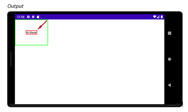
- In Android Compose resulting Image is being constructed from the outside layer toward the Composable in the center.
This means that first defined Green border is outer border and the last defined Red border is inner border .
This is very confusing since Green Modifier that is closest to Text Composable in the Code is furthest from it in the result. - This is in contrast to SwiftUI where Modifiers appear in the same order both in the Code and in the resulting Image.
Modifier that is closest to the Composable in the Code is also closest to it in the resulting Image. - If you want to imagine that resulting Image is being constructed from the center where your Composable is positioned (like in SwiftUI) then Modifiers are applied in the opposite order from which they are given (from the bottom upward).
- So if you have Text Composable with two border Modifiers
- border Modifier that is furthest away from the Text Composable in the Code (the bottom Red one)
- will be closest to the Text Composable in the resulting Image
- Modifiers are applied from outer toward inner layer
- Applying .border(2.dp, Color.Green) to the outmost layer
- Applying .padding(50.dp) going inward
- Applying .border(2.dp, Color.Red) to the innermost layer
package com.example.myapplication

import android.os.Bundle
import androidx.appcompat.app.AppCompatActivity
import androidx.compose.foundation.*
import androidx.compose.foundation.layout.padding
import androidx.compose.ui.Modifier
import androidx.compose.ui.graphics.Color
import androidx.compose.ui.platform.setContent
import androidx.compose.ui.unit.dp

class MainActivity : AppCompatActivity() {
  override fun onCreate(savedInstanceState: Bundle?) {
    super.onCreate(savedInstanceState)
    setContent {
      Text("Hi there!",
        Modifier
          .border(2.dp, Color.Green)
          .padding(50.dp)
          .border(2.dp, Color.Red)
      )
    }
  }
}
Jetpack Compose - How can add multiple modifier to a composable and is the order important?
It's really simple;
You can chain multiple modifiers.
Column(modifier = Modifier.preferredHeight(500.dp).padding(100.dp)) {
Text("Hello")  }
And The order is important; Modifier elements to the left are applied before modifier elements to the right.
Inner padding in jetpack compose
Modifier.padding() in Jetpack Compose acts as padding or margin depending on order.
Modifier.padding(10.dp).size(200.dp) adds space before setting size you have a Composable with 200.dp size
Modifier.size(200.dp).padding(10.dp) adds padding which you have 180.dp width and height after setting 10.dp padding on each side.
You can try this with Modifier.background, Modifier.border, Modifier.clickble{} to see how order changes area with color, border or which user can click.
You can also refer codelab's documentation about Modifiers to see how to apply padding.
Modifiers depending on other modifier's values in Jetpack Compose?
You can use BoxWithConstraints for this particular usecase, it provides constraints imposed by parent to its children:
@Composable
fun View() {
   MyComposable(modifier = Modifier.size(40.dp))
}

@Composable
fun MyComposable(modifier: Modifier) {
  BoxWithConstraints(modifier) { // this: BoxWithConstraintsScope
    val childHeightModifier = Modifier.height(maxHeight * 0.5f)
    Box(childHeightModifier) {
       ...
    }
  }
}
As for communication between Modifiers, there's a ModifierLocal system in the works, which will allow doing exactly that.
How to add Margin in Jetpack Compose?
You can consider padding and margin as the same thing (imagine it as "spacing"). A padding can be applied twice (or more) in the same composable and achieve the similar behavior you would get with margin+padding. For example:
val shape = CircleShape
Text(
    text = "Text 1",
    style = TextStyle(
        color = Color.White,
        fontWeight = FontWeight.Bold,
        textAlign = TextAlign.Center),
    modifier = Modifier.fillMaxWidth()
        .padding(16.dp)
        .border(2.dp, MaterialTheme.colors.secondary, shape)
        .background(MaterialTheme.colors.primary, shape)
        .padding(16.dp)
)
Will result on this:
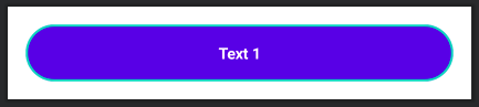
As you can see, the first padding is adding a space between the component and its border. Then the background and border are defined. Finally, a new padding is set to add space between the border and the text.
Kotlin Jetpack Compose: How to remove dp or sizefrom the Modifier fillMaxHeight
For the specific question, you can always include a width percentage inside fillMaxHeight(...).
That being said, what you probably want to do here is have a main Scafford with your content, then add your nav bar as a bottomBar property. You may want to update your NavBar components to a BottomAppBar, but it should work.
Scaffold(
    topBar = { /* Top toolbar, if you want it. */ },
    bottomBar = { /* Bottom Nav bar, which is what you want to add. */ },
) {
    /* App content goes here */
}
Related Topics
How to Start an Activity from a Service
How to Downsample Images Correctly
Android Startcamera Gives Me Null Intent and ... Does It Destroy My Global Variable
How to Find Android Source Code Online
React Native Android Build Failed. Sdk Location Not Found
How to Create a Signed APK File Using Cordova Command Line Interface
How to Create Standard Borderless Buttons (Like in the Design Guideline Mentioned)
How to Set Id of Dynamic Created Layout
Jetpack Compose - Order of Modifiers
Does Alarm Manager Persist Even After Reboot
How to Start Android Service on Installation
Using Asynctask to Load Images in Listview
Using Gson to Parse a JSON with Dynamic "Key" and "Value" in Android
Adjustpan Not Preventing Keyboard from Covering Edittext
How to Get the List of Running Applications
Android Timepickerdialog Set Max Time
Adding Button Action in Custom Notification
Why Do I Get "Unresolved Reference" Error for My View's Name/Id When I Type It in Kotlin