How to make custom dialog with rounded corners in android
Create an XML file in drawable, say dialog_bg.xml:
<?xml version="1.0" encoding="utf-8"?>
<shape xmlns:android="http://schemas.android.com/apk/res/android">
    <solid
        android:color="@color/white"/>
    <corners
        android:radius="30dp" />
    <padding
        android:left="10dp"
        android:top="10dp"
        android:right="10dp"
        android:bottom="10dp" />
</shape>
set it as the background in your layout XML:
android:background="@drawable/dialog_bg"
Set the background of the dialog's root view to transparent, because Android puts your dialog layout within a root view that hides the corners in your custom layout.
Java:
dialog.getWindow().setBackgroundDrawable(new ColorDrawable(Color.TRANSPARENT));
Kotlin:
dialog.window?.setBackgroundDrawable(ColorDrawable(Color.TRANSPARENT))
Rounded corners for custom AlertDialog
Please take a look at this guide for how to customize dialogs.
In short, you need to create a dialog like normal, but set the background resource before you show it:
val builder = AlertDialog.Builder(context)
builder.setView(R.layout.item_dialog)
val dialog = builder.create()
dialog.window?.decorView?.setBackgroundResource(R.drawable.dialog_background) // setting the background
dialog.show()
where dialog_background is defined like so:
<shape xmlns:android="http://schemas.android.com/apk/res/android">
    <corners android:radius="16dp" />
    <solid android:color="?android:colorBackground" />
</shape>
Android Dialog with rounded corners - still showing the background without corners radius
Solution with AlertDialog with same layout (tested On Kitkat).
 AlertDialog.Builder dialogBuilder= new AlertDialog.Builder(this);
 dialogBuilder.setView(R.layout.temp);
 final AlertDialog alertDialog= dialogBuilder.create();
 alertDialog.getWindow().setBackgroundDrawable(new ColorDrawable(Color.TRANSPARENT));
 alertDialog.show();
To appear Dialog as same you need set the width of dialog. Here is a reference. Otherwise it will take the Content width . Do all dialog.getWindow() operation before setting Content view to Dialog.
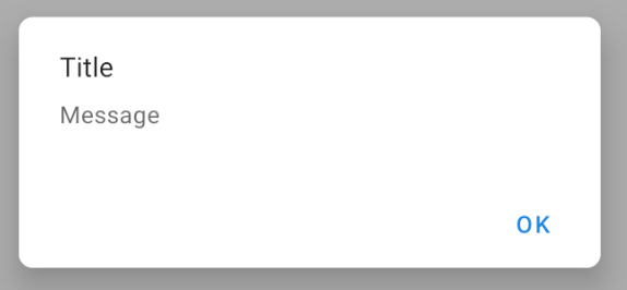
How to set round corners for a custom Dialog?
You can use the MaterialAlertDialogBuilder included in the Material Components library:
import androidx.fragment.app.DialogFragment;

public class CustomDialog extends DialogFragment {

    //...

    @NonNull
    @Override
    public Dialog onCreateDialog(@Nullable Bundle savedInstanceState) {

        return  new MaterialAlertDialogBuilder(getActivity(),R.style.MaterialAlertDialog_rounded)
                .setTitle("Title")
                .setMessage("Message")
                .setPositiveButton("OK", null)
                .create();

    }
}
with:
<style name="MaterialAlertDialog_rounded" parent="@style/ThemeOverlay.MaterialComponents.MaterialAlertDialog">
    <item name="shapeAppearanceOverlay">@style/ShapeAppearanceOverlay.MyApp.Dialog.Rounded</item>
</style>

<style name="ShapeAppearanceOverlay.MyApp.Dialog.Rounded" parent="">
    <item name="cornerFamily">rounded</item>
    <item name="cornerSize">8dp</item>
</style>
Dialog with rounded corner in android
If you want rounded corner you can try apply custom shape using xml to your custom dialog backgroud. Following code will help you out.
<shape xmlns:android="http://schemas.android.com/apk/res/android">

     <solid android:color="#FFFFFF" />
        <corners
            android:radius="10dp"/>

    </shape>
You can remove cardview as top element because dialog has its on shadow and depth.
Add this line before you set contentview to dialog
dialog.getWindow().setBackgroundDrawable(new ColorDrawable(android.graphics.Color.TRANSPARENT));
Android AlertDialog with rounded corners
You can do it using the following code:
CustomDialog.java:
public class MainActivity extends Activity{

    private static final int ALERT_DIALOG = 1;

    @Override
    public void onCreate( Bundle savedInstanceState )
    {
        super.onCreate( savedInstanceState );
        setContentView( R.layout.main );

        ( (Button) findViewById( R.id.button1 ) )
            .setOnClickListener( new OnClickListener()
                {
                    public void onClick( View v )
                    {
                        showDialog( ALERT_DIALOG );
                    }
                }
            );
    }

    @Override
    protected Dialog onCreateDialog( int id ){
        Dialog dialog = null;
        if ( id == ALERT_DIALOG )
        {
            ContextThemeWrapper ctw = new ContextThemeWrapper( this, R.style.MyTheme );
            AlertDialog.Builder builder = new AlertDialog.Builder( ctw );
            builder.setMessage( "Hello World" )
                .setTitle( "Alert Dialog" )
                .setIcon( android.R.drawable.ic_dialog_alert )
                .setCancelable( false )
                .setPositiveButton( "Close", new DialogInterface.OnClickListener()
                    {
                        public void onClick( DialogInterface dialog, int which )
                           {
                                dialog.dismiss();
                           }
                        }
                    );
            dialog = builder.create();
        }
        if ( dialog == null )
        {
            dialog = super.onCreateDialog( id );
        }
        return dialog;
     }
 }
dialog_title.xml
<?xml version="1.0" encoding="utf-8"?>
<inset xmlns:android="http://schemas.android.com/apk/res/android" android:insetBottom="-1dp">
    <shape android:shape="rectangle">
        <solid android:color="#000000" />
        <corners android:topLeftRadius="20dp" android:topRightRadius="20dp" />
        <stroke android:color="#7F7F7F" android:width="1dp" />
    </shape>
</inset>
dialog_footer.xml
<?xml version="1.0" encoding="utf-8"?>
<shape xmlns:android="http://schemas.android.com/apk/res/android"
    android:shape="rectangle">
    <solid android:color="#7F7F7F" />
    <corners android:bottomLeftRadius="20dp" android:bottomRightRadius="20dp" />
    <stroke android:color="#7F7F7F" android:width="1dp" />
</shape>
Just change the radius amount in:
dialog_title.xml
and
dialog_footer.xml
and that'll generate the following output:
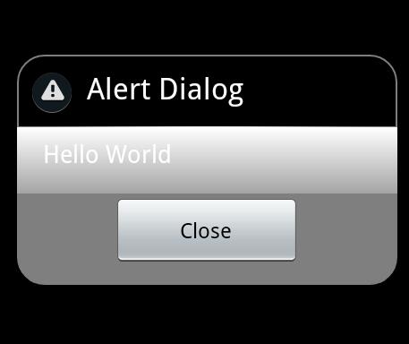
hope this will help you.
UPDATE:
I'm not an expert but this is what I found. It may be right or wrong.
After many attempts I ended up with the following:
1- ContextThemeWrapper is not applicable for API 14, it works fine on Gingerbread and older versions but with API > 10 it doesn't work.
2- to overcome the above issue and make it work on API > 10 as requested, I replace this line:
ContextThemeWrapper ctw = new ContextThemeWrapper( this, R.style.MyTheme );
AlertDialog.Builder builder= new AlertDialog.Builder( ctw );
with this:
AlertDialog.Builder builder= new AlertDialog.Builder( this,R.style.MyTheme );
but you need to change:
android:minSdkVersion="8"
to
android:minSdkVersion="11"
the result will be as shown in the following image on ICS (API 14):
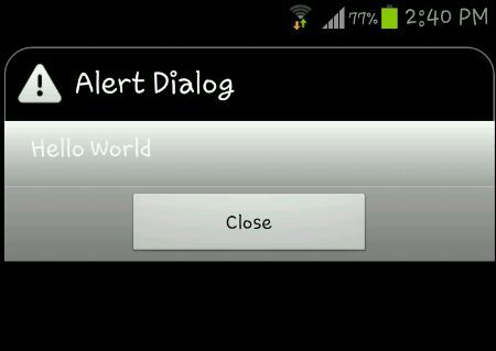
This image is from a Samsung Galaxy S3 running ICS.
Note: modified project initiated with API 14 SO manifest sdk will be:
<uses-sdk
  android:minSdkVersion="11"
  android:targetSdkVersion="15" />
FINAL WORD:
As my little knowledge in Android development (I'm not an expert),
1- custom alert dialog runs smoothly in API < 10 but not > 10 with the same Java code,
if we want it to run in ICS with the same effect as appeared in API < 10, we need to modify the code, so it will run on ICS but will not run in any version down API 11.
2- even the result in ICS is not satisfactory, the round corner applies only to the title but not the footer.
SECOND UPDATE:
FINALLY I get all corners round,
JUST apply padding to dialog_footer.xml as follows:
<?xml version="1.0" encoding="utf-8"?>
<shape xmlns:android="http://schemas.android.com/apk/res/android"
android:shape="rectangle">
    <solid android:color="#7F7F7F" />
    <corners android:bottomLeftRadius="20dp" android:bottomRightRadius="20dp" />
    <stroke android:color="#7F7F7F" android:width="1dp" />
    <padding android:left="10dp" android:top="10dp" android:right="10dp"
android:bottom="10dp" />
</shape>
Output image:
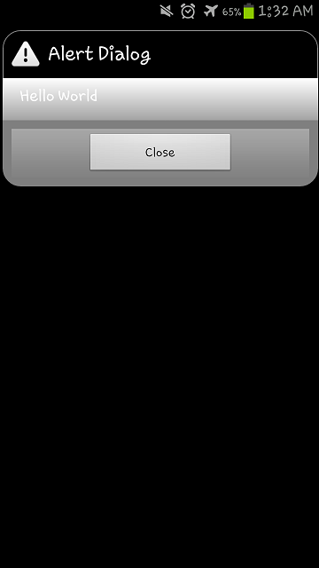
This image is from a Samsung Galaxy S3 running ICS.
Making a rounded custom alert dialog: tinted area is incorrect
I had the same problem. Making the background transparent can solve this problem .
<style name="Theme_Dialog" parent="Theme.AppCompat.Light.Dialog">

  <item name="android:background">@android:color/transparent</item>
</style>
Add this style while initialing your dialog .
val dialog = Dialog(context, R.style.Theme_Dialog)
Not sure about your @drawable/rounded_corners". Instead, you can have card view and put this constraint layout inside card view . With app:cardCornerRadius="@dimen/space_18" you have set the radius as required .
<androidx.cardview.widget.CardView xmlns:android="http://schemas.android.com/apk/res/android"
xmlns:app="http://schemas.android.com/apk/res-auto"
android:layout_width="match_parent"
android:layout_height="match_parent"
xmlns:toots="http://schemas.android.com/tools"
android:orientation="vertical"
android:background="@color/white_color"
app:cardCornerRadius="@dimen/space_18">

<androidx.constraintlayout.widget.ConstraintLayout
    android:layout_width="match_parent"
    android:layout_height="wrap_content">

  ..

</androidx.constraintlayout.widget.ConstraintLayout>
Related Topics
Versioncode VS Versionname in Android Manifest
Custom Cut/Copy Action Bar for Edittext That Shows Text Selection Handles
Android Open External Storage Directory(Sdcard) for Storing File
Android Type_Linear_Acceleration Sensor - What Does It Show
How to Change the Fontsize in an Android Webview
Android Kitkat Securityexception When Trying to Read from Mediastore
Retrieving a List of Users Who Have Registered Using Firebase Auth
How to Exclude Certain Messages by Tag Name Using Android Adb Logcat
How to Get the Uuid of My Android Phone in an Application
Java.Lang.Noclassdeffounderror:Failed Resolution of :Lorg/Apache/Http/Protocolversion
Disable Edittext Blinking Cursor
Actionbar Logo Centered and Action Items on Sides
How to Get Android Device Screen Size
How to Get Screen Coordinates from Marker in Google Maps V2 Android
How to Make an Http Request Using Cookies on Flutter