Custom title with image
It's possible to set your own custom title layout, however the order of execution matters. You must do things in this order:
requestWindowFeature(Window.FEATURE_CUSTOM_TITLE);
setContentView(R.layout.my_layout);
getWindow().setFeatureInt(Window.FEATURE_CUSTOM_TITLE, R.layout.my_custom_title);
Additionally, you may need to increase the size of the title; if you don't, then the bottom of your custom layout may just be covered up by your Activity. You can change the size by adding a theme that specifies the title's size. This would go into a values XML file:
<resources>
    <style name="LargeTitleTheme">
        <item name="android:windowTitleSize">40dip</item>
    </style>
</resources>
Then you'd need to set the theme for your Activity (or Application, if you want the entire application to have this custom title bar) in AndroidManifest.xml:
<activity android:name=".MyCustomTitleActivity" android:theme="@style/LargeTitleTheme" />
Custom title with image in admin on rest
I found the answer to this and thought I'd share it on stackoverflow for the next developer facing this question.
The title prop on <Admin /> accepts a node. So this works:
import {Admin} from 'admin-on-rest';

const App = () => (
  <Admin title={<AppTitle />}>
    // Resources
  </Admin>
);

// Default styles
const appTitleStyles = {
  whiteSpace        : 'nowrap',
  overflow          : 'hidden',
  WebkitTextOverflow: 'ellipsis',
  textOverflow      : 'ellipsis',
  margin            : 0,
  letterSpacing     : 0,
  fontSize          : 24,
  fontWeight        : '400',
  color             : 'rgb(255, 255, 255)',
  height            : 44,
  paddingTop        : 10,
  paddingBottom     : 10,
  WebkitFlex        : '1 1 0%',
  MsFlex            : '1 1 0%',
  flex              : '1 1 0%'
};

const AppTitle = () => (
  <img style={appTitleStyles} src="./my-cool-logo.png" />
);

export default App;
Custom TitleView with Description and Preview Image Android TV (FireTV)
So, I have solved this somehow. My activity_main.xml looks like this.
<?xml version="1.0" encoding="utf-8"?>
<LinearLayout xmlns:android="http://schemas.android.com/apk/res/android"
    android:layout_width="match_parent"
    android:layout_height="match_parent"
    android:background="@color/default_background"
    android:orientation="vertical"
    >
  <fragment
      android:id="@+id/title_layout"
      android:name="com.kalpnik.vrdevotee.fragment.MainTitleFragment"
      android:layout_width="match_parent"
      android:layout_height="0dp"
      android:layout_alignParentTop="true"
      android:layout_weight="1"
      />
  <FrameLayout xmlns:android="http://schemas.android.com/apk/res/android"
      xmlns:tools="http://schemas.android.com/tools"
      android:id="@+id/main_fragment"
      android:layout_width="match_parent"
      android:layout_height="0dp"
      android:layout_below="@+id/title_layout"
      android:layout_weight="1"
      tools:deviceIds="tv"
      />
</LinearLayout>
In the FrameLayout I will load a fragment which extended from BrowseFragment, so this gives me the necessary rows.
And at the top, I am loading MainTitleFragment which is extended from Fragment and the layout looks like below.
fragment_main_title.xml
<?xml version="1.0" encoding="utf-8"?>
<LinearLayout xmlns:android="http://schemas.android.com/apk/res/android"
    android:layout_width="match_parent"
    android:layout_height="match_parent"
    xmlns:tools="http://schemas.android.com/tools"
    android:background="#000000"
    android:orientation="horizontal"
    >
  <LinearLayout
      android:layout_width="0dp"
      android:layout_height="match_parent"
      android:layout_weight="1"
      android:background="@color/icon_background"
      android:orientation="vertical"
      android:paddingTop="16dp"
      >
    <TextView
        android:id="@+id/title_content_name"
        android:layout_width="wrap_content"
        android:layout_height="wrap_content"
        android:layout_marginHorizontal="16dp"
        tools:text=""
        android:textColor="@color/colorPrimaryDark"
        android:textSize="28sp"
        android:textStyle="bold"
        />
    <TextView
        android:id="@+id/title_content_description"
        android:layout_width="wrap_content"
        android:layout_height="wrap_content"
        android:layout_marginBottom="8dp"
        android:layout_marginHorizontal="16dp"
        android:layout_marginTop="16dp"
        android:ellipsize="end"
        android:text=""
        android:textSize="15sp"

        />
  </LinearLayout>
  <FrameLayout
      android:layout_width="0dp"
      android:layout_height="match_parent"
      android:layout_weight="1"
      >

    <android.support.v7.widget.AppCompatImageView
        android:id="@+id/title_content_thumbnail"
        android:layout_width="match_parent"
        android:layout_height="match_parent"
        android:adjustViewBounds="true"
        android:scaleType="centerCrop"
        />
    <View
        android:layout_width="100dp"
        android:layout_height="match_parent"
        android:layout_gravity="left|start"
        android:background="@drawable/transparent_bg"
        />
    <View
        android:layout_width="match_parent"
        android:layout_height="100dp"
        android:layout_gravity="bottom"
        android:background="@drawable/transparent_bg_bottom"
        />
  </FrameLayout>

</LinearLayout>
And this worked for me. Hope this helps.
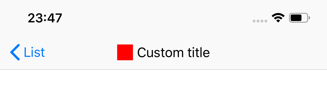
Custom Navigation Title in iOS 12
Creating your custom titleView and assigning it to navigationItem.titleView is what you want. On older systems (pre iOS 11) you just might need to call sizeToFit() on the titleView.
This way you can create this titleView
Swift
override func viewDidLoad() {
    super.viewDidLoad()

    let imageView = UIImageView()
    NSLayoutConstraint.activate([
        imageView.heightAnchor.constraint(equalToConstant: 20),
        imageView.widthAnchor.constraint(equalToConstant: 20)
    ])
    imageView.backgroundColor = .red

    let titleLabel = UILabel()
    titleLabel.text = "Custom title"

    let hStack = UIStackView(arrangedSubviews: [imageView, titleLabel])
    hStack.spacing = 5
    hStack.alignment = .center

    navigationItem.titleView = hStack
}
Obj-C
- (void)viewDidLoad {
    [super viewDidLoad];

    UIImageView *imageView = [[UIImageView alloc] init];
    [NSLayoutConstraint activateConstraints:@[
        [imageView.heightAnchor constraintEqualToConstant:20],
        [imageView.widthAnchor constraintEqualToConstant:20]
    ]];
    imageView.backgroundColor = [UIColor redColor];

    UILabel *titleLabel = [[UILabel alloc] init];
    titleLabel.text = @"Custom title";

    UIStackView *hStack = [[UIStackView alloc] initWithArrangedSubviews:@[imageView, titleLabel]];
    hStack.spacing = 5;
    hStack.alignment = UIStackViewAlignmentCenter;

    self.navigationItem.titleView = hStack;
}
You might also need to have the right set of autolayout constraints or use UIStackView.
UITabBarItem default with custom title
From Apple docs (https://developer.apple.com/documentation/uikit/uitabbaritem/systemitem):
The title and image of system tab bar items cannot be changed.
Presumably, this is because Apple likes apps to be consistent. They don't want users to be confused by seeing a common system Icon that doesn't do what it's expected to do.
Sharing webpage posts with custom title, image, description
You can achieve this by meta tags facebook has a tool where you can even test out the content.
Add the meta tags dynamically to your news page based on the id.
<meta property="og:url" content="http://www.nytimes.com/2015/02/19/arts/international/when-great-minds-dont-think-alike.html" />
<meta property="og:type" content="article" />
<meta property="og:title" content="When Great Minds Don’t Think Alike" />
<meta property="og:description" content="How much does culture influence creative thinking?" />
<meta property="og:image" content="http://static01.nyt.com/images/2015/02/19/arts/international/19iht-btnumbers19A/19iht-btnumbers19A-facebookJumbo-v2.jpg" />
More details are given here :
https://developers.facebook.com/docs/sharing/webmasters
Can I set image as a title to UINavigationBar?
You can use an UIImageView for the UINavigationItem.titleView property, something like:
self.navigationItem.titleView = myImageView;
Related Topics
Installation Failed with Message Invalid File
How to Change the Android Startactivity() Transition Animation
The Item You Requested Is Not Available for Purchase
How to Create Topic in Fcm Notifications
How to Declare Git Repository as Dependency in Android Gradle
How to Change the Android App Package Name When Assembling with Gradle
Don't Keep Activities - What Is It For
Mylib.So Has Text Relocations. This Is Wasting Memory and Is a Security Risk. Please Fix
Setrotation(90) to Take Picture in Portrait Mode Does Not Work on Samsung Devices
How to Add Button in Actionbar(Android)
How to Add Action Bar Options Menu in Android Fragments
Understanding Android's <Layer-List>
Camera.Setparameters Failed in Android
Androidstudio - Module Dependencies in Gradle
Can't Upgrade Android Sdk Tools
Android Sdk Cut/Trim Video File
Avoiding Content Type Issues When Downloading a File via Browser on Android