ConstraintLayout Chains and Text Ellipsis + Image on the Right
UPDATE JULY 2020: What does constrainedWidth/Height do?
A lot of people kept asking me what exactly does this constrainedWidth/Height do when set to true (defaults to false).
I finally have an answer (from a Google employee), so in lieu of clearing up all the doubts people coming to this post keep having, here's what I gathered (some are my words, some are direct quotes from the original Google issue quote.
ConstraintLayout needs to determine the dimension of every view involved, and depending on how said view is constrained, it has to perform different calculations.
Given a view:
- if it's a fixed dimension, CL will just use that dimension.
- if it's
match_parent, CL will use the exact dimension of parent - if it's
wrap_content, CL will ask the widget for its size, but then use it as a fixed dimension - if it's
0dp, CL will apply constraints to the dimension
1) Fixed Dimension
This is a view whose width/height are fixed, say 24dp. In this case, CL will simply use that value, no other calculation needed for that widget in regards of sizing.
2) match_parent
I always thought this was not valid for CL, but turns out that it behaves like it used to in previous versions, it grabs the dimensions of the parent and uses that as "fixed". Unlike #1 above, I assume this may be more computationally expensive since CL now needs to ensure the parent dimensions are known to be able to use them here. I don't have proof of this nor a lot of experience, since I always thought this wasn't really valid so never used it.
3) wrap_content
As expected, the view has to determine its "required size", so if it's say an ImageView it will ask the imageView for its dimensions based on its source. After said number is obtained, it's used as a Fixed Size, like #1.
4) 0dp
This is where CL shines, by applying the constrains to each dimension (width, and height), and letting the dimension's value be determined by the outcome of the algorithm.
So why is this needed (constrainedWidth/Height)?
The first thing to understand is that 0dp has a spread and wrap behavior (and percent); in order to wrap, the engine starts with the dimension of the view's wrap_content (#3 above) but waits for constrains to change it if/when needed. Say you use wrap for the width of a text view, and its constrains pin it to the edges of the screen (start/end to parent).
Those can be pulling in different directions; the text view will likely want to be small to wrap the text and the constrains will pull the edges of the widget to reach the parent start/end. There's a battle here. (if the text is larger than the space, the battle still exists, but in the opposite direction).
The reason why this attribute exists, is because some widgets (_Like textView), take some shortcuts and when there's a 0dp, they may not always correctly update. It's important to note that LinearLayouts with 0dp + weights did the same thing (hence why this was an issue with LL too); by using constrainedWidth/Height, a widget like a TextView can correctly use 0dp with wrapping behavior when needed; it gives the view a chance to correctly remeasure itself.
This problem mostly manifests when you reuse TexViews (I don't know exactly which other views benefit from this, but I assume anything that has text is prone to have calculation shortcuts/hacks and may need this extra bit of info to correctly trigger a remeasure). Reusing a Widget with Text like a TextView, is where this is mostly needed, think of a RecyclerView where your ViewHolder is in a ConstraintLayout (quite common), when you scroll, the ViewHolder is reused and re-bound to another "data model" and without this attribute, the TextView will/may fail to recalculate its size for the new text that may be coming.
I hope this makes sense.
tl;dr: it's a workaround to fix potential issues with some widgets that fail to recompute their dimensions when reused, notably in a RecyclerView, but most likely not limited to it.
There you have it. :)
UPDATE JULY 2018:
If you are using ConstraintLayout 1.1.0, the correct property to use is app:layout_constrainedWidth="true" in place of the old app:layout_constraintWidth_default="wrap" (and the height counterpart)
UPDATE NOVEMBER 2017
I’m using Constraint Layouts 1.0.2 and I have found a less nested solution using app:layout_constraintWidth_default="wrap" (a property that got introduced in 1.0.0 but the Beta this post was using didn’t have).
Instead of the FrameLayout that contains a LinearLayout you can now remove all that and have it this way:
    <android.support.constraint.ConstraintLayout
      android:id="@+id/new_way_container"
      android:layout_height="wrap_content"
      android:layout_width="0dp" // THIS GUY USES ALL THE WIDTH.
      app:layout_constraintEnd_toEndOf="parent"
      app:layout_constraintStart_toStartOf="parent"
      app:layout_constraintTop_toTopOf="parent">

      <TextView
        android:ellipsize="end"
        android:id="@+id/some_text"
        android:layout_height="wrap_content"
        android:layout_width="0dp" //NO WRAP CONTENT, USE CONSTRAINTS
        android:lines="1"
        android:maxLines="1"
        app:layout_constraintEnd_toStartOf="@+id/disclosure_arrow"
        app:layout_constraintHorizontal_bias="0.0"
        app:layout_constraintHorizontal_chainStyle="packed" //CHAIN IT for biasing.
        app:layout_constraintStart_toStartOf="parent"
        app:layout_constraintTop_toTopOf="parent"
        app:layout_constraintWidth_default="wrap" /> //THIS IS THE KEY THAT WILL CAUSE THIS TO WORK

      <ImageView
        android:id="@+id/disclosure_arrow"
        android:layout_height="wrap_content"
        android:layout_width="10dp"
        app:layout_constraintBottom_toTopOf="@id/some_text"
        app:layout_constraintEnd_toEndOf="parent"
        app:layout_constraintStart_toEndOf="@id/some_text"
        app:layout_constraintTop_toBottomOf="@id/some_text"
        app:srcCompat="@drawable/your_vector_image" />
    </android.support.constraint.ConstraintLayout>
This effectively does exactly what I want, without hacks or guidelines or hardcoded sizes.
The TextView will use the size provided by the Constraints (which under normal circumstances would mean it would either be wrong or will grow beyond the ‘parent’), but thanks to the new attribute, those constraints are allowed to be bent/broken if the content is smaller/larger.
I have to say it works much better than iOS Priorities. (At least it’s a lot easier to grasp to me). Thumbs up for Google on this one :)
OLD ANSWER (in case you still need it).
Based upon Nicolas Roard's answer, I was going to create a custom container that would basically calculate the available space, and programmatically set the maxWidth on the TextView. Instead of adding another class, unit test, possible set of bugs, etc., to the project, I tried a slightly less efficient method of nesting a couple of layouts; considering we've been nesting layouts since the age of dawn and that this is not going to be on any scrolling list view or moving too much (or at all) and that I am using ConstraintLayouts to flatten most of the hierarchy (like never before!), then I don't think a little nesting until this is better supported is that bad.
So what I did was basically, use a FrameLayout, which is by design optimized (or thought) to have one child (tho it can contain more). This FrameLayout is the one that has the ConstraintLayout rules applied like so:
  <FrameLayout
      android:id="@+id/hostTextWithCaretContainer"
      android:layout_width="0dp"
      android:layout_height="wrap_content"
      app:layout_constraintLeft_toLeftOf="parent"
      app:layout_constraintTop_toTopOf="parent"
      app:layout_constraintRight_toRightOf="parent">

      <!-- MY CONTENT GOES HERE -->

  </FrameLayout>
So in my real app, this FrameLayout is inside another ConstraintLayout that has an icon to its left and some other stuff, but for the sake of this example, imagine you have to "pin" the left/right of this FrameLayout to whatever space you want to occupy. In this example you can see I'm using parent in all constraints, but there could be other widgets left and right of this FrameLayout; thanks to ConstraintLayout's magic, this will occupy all that available space.
Now here comes the 2nd part of the trick… since ConstraintLayout guarantees that the FrameLayout will use "all the space" we have and never more (or less), I can now use a LinearLayout inside… like so…
     <LinearLayout
        android:layout_width="wrap_content"
        android:layout_height="wrap_content"
        android:orientation="horizontal">

      <TextView
          android:id="@+id/textView"
          android:layout_height="wrap_content"
          android:layout_width="0dp"
          tools:text="Some Text"
          android:text="Some Text"
          android:textAlignment="viewStart"
          android:layout_gravity="center_vertical"
          android:gravity="start"
          android:ellipsize="end"
          android:maxLines="1"
          android:layout_weight="1"/>

      <ImageView
          android:id="@+id/caret"
          android:layout_width="8dp"
          android:layout_height="8dp"
          app:srcCompat="@drawable/ic_selection"
          android:contentDescription=""
          android:layout_gravity="center_vertical"
          android:layout_marginStart="8dp"
          android:layout_marginEnd="8dp" />

    </LinearLayout>
Astute readers will notice that the LinearLayout has wrap_content in its width, that's very important for then the child TextView can have a width of 0dp and a weight of 1, meaning it will take all available free space after all the other widgets have calculated their width.
In this particular case the other child (ImageView) caret has no weight specified and a fixed width, therefore the TextView doesn't have to share/split the free space with anybody else and it can take it all (but only free space, remember its width is 0dp).
This less efficient approach, effectively achieves exactly what I wanted, albeit with less ConstraintLayout Magic if you will.
On the plus side, I didn't have to create a custom view, perform math and issue a requestLayout() after all my math was done; this less efficient approach will/should scale and until ConstraintLayout offers a valid alternative, it may be enough as it is.
Shoutout to the Google engineer(s) who replied on social media and eventually took the time to think about this. Maybe in the future, when they are writing tasks and story points about ConstraintLayout 1.1, they remember this and come up with a good solution
How to chain two text with ConstraintLayout
Instead of using a ConstraintLayout, you can use a simple Row applying a weight(1f,false) modifier to the Text.
Using fill=false the element will not occupy the whole width allocated.
   Row(Modifier.fillMaxWidth()) {

        Text(
            text = "Whatever",
            overflow = TextOverflow.Ellipsis,
            maxLines = 1,
            modifier = Modifier
                .padding(start = 16.dp)
                .weight(1f, false)
        )

       repeat(dynamicNumber) {
            Image(
             painter = painterResource...
             modifier = Modifier.padding(horizontal = 3.dp)
            )
       }
   }

Android - TextView inside a ConstraintLayout goes off to infinity to the right - how to pin with ImageView and have ellipsis too
You can achieve that by adding the below to the TextView:
- Enabling width constraints.
- Using a packed chain with a 0 horizontal bias.
- Constraint the end to the start of the right view (
imageview)
And constraint the end of the info imageview to the start of the secondView
So, you need to add the following to the textview:
    app:layout_constrainedWidth="true"
    app:layout_constraintHorizontal_bias="0"
    app:layout_constraintHorizontal_chainStyle="packed"
    app:layout_constraintEnd_toStartOf="@id/secondView"
And to the imageview:
app:layout_constraintEnd_toStartOf="@+id/secondView"
Now the entire layout:
<?xml version="1.0" encoding="utf-8"?>
<androidx.constraintlayout.widget.ConstraintLayout xmlns:android="http://schemas.android.com/apk/res/android"
    xmlns:app="http://schemas.android.com/apk/res-auto"
    android:layout_width="match_parent"
    android:layout_height="70dp">

    <!-- This view does not move or change size. -->
    <View
        android:id="@+id/firstView"
        android:layout_width="35dp"
        android:layout_height="35dp"
        android:background="@android:color/holo_red_dark"
        app:layout_constraintBottom_toBottomOf="parent"
        app:layout_constraintStart_toStartOf="parent"
        app:layout_constraintTop_toTopOf="parent">

    </View>

    <!-- This view's width is dynamic and changes size based on it's text length.
     If the length of text is too long to fit, it uses an ellipsize. -->
    <TextView
        android:id="@+id/textview"
        android:layout_width="wrap_content"
        android:layout_height="wrap_content"
        android:layout_marginStart="8dp"
        android:ellipsize="end"
        android:maxLines="1"
        android:text="thisIsVeryLongTextThatIsTooLongAndIsLong"
        android:textColor="@color/primary_text_dark"
        android:textSize="16sp"
        app:layout_constrainedWidth="true"
        app:layout_constraintBottom_toBottomOf="parent"
        app:layout_constraintEnd_toStartOf="@id/imageview"
        app:layout_constraintHorizontal_bias="0"
        app:layout_constraintHorizontal_chainStyle="packed"
        app:layout_constraintStart_toEndOf="@id/firstView"
        app:layout_constraintTop_toTopOf="parent" />

    <!-- This view is pinned to the end of textView. -->
    <ImageView
        android:id="@+id/imageview"
        android:layout_width="20dp"
        android:layout_height="20dp"
        android:layout_marginStart="8dp"
        android:layout_marginEnd="8dp"
        android:background="@android:color/holo_purple"
        android:src="@android:drawable/ic_dialog_info"
        app:layout_constraintBottom_toBottomOf="parent"
        app:layout_constraintEnd_toStartOf="@+id/secondView"
        app:layout_constraintStart_toEndOf="@id/textview"
        app:layout_constraintTop_toTopOf="parent" />

    <!-- This view does not move or change size. -->
    <View
        android:id="@+id/secondView"
        android:layout_width="80dp"
        android:layout_height="35dp"
        android:layout_marginStart="8dp"
        android:layout_marginEnd="8dp"
        android:background="@android:color/holo_blue_light"
        app:layout_constraintBottom_toBottomOf="parent"
        app:layout_constraintEnd_toStartOf="@id/thirdView"
        app:layout_constraintTop_toTopOf="parent" />

    <!-- This view does not move or change size. -->
    <View
        android:id="@+id/thirdView"
        android:layout_width="35dp"
        android:layout_height="35dp"
        android:background="@android:color/holo_orange_dark"
        app:layout_constraintBottom_toBottomOf="parent"
        app:layout_constraintEnd_toEndOf="parent"
        app:layout_constraintTop_toTopOf="parent" />

</androidx.constraintlayout.widget.ConstraintLayout>
Preview:

Constraint layout chains
ConstrataintLayout version 1.1.0-beta5 offers some better dimension control that you are looking for. See the release notes.
Specifically, you can make use of layout_constraintWidth_default = wrap which will force a TextView to wrap once it meets the limits of its constraints.
Wrap provides a significant new behaviour, with the widget resizing as if wrap_content was used, but limited by the connected constraints. A widget will thus not grow beyond the endpoints.
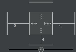
The following XML places tv1 and iv1 in a packed chain constrained by the parent on the left and tv2 on the right. tv1 has app:layout_constraintWidth_default="wrap" set.
<android.support.constraint.ConstraintLayout
    android:layout_width="match_parent"
    android:layout_height="match_parent">

    <TextView
        android:id="@+id/tv1"
        android:layout_width="0dp"
        android:layout_height="wrap_content"
        android:layout_marginEnd="16dp"
        android:layout_marginStart="8dp"
        android:ellipsize="end"
        android:lines="1"
        android:text="This is some very long text. How does it behave?"
        app:layout_constraintBottom_toBottomOf="parent"
        app:layout_constraintEnd_toStartOf="@id/iv1"
        app:layout_constraintHorizontal_bias="0.0"
        app:layout_constraintHorizontal_chainStyle="packed"
        app:layout_constraintStart_toStartOf="parent"
        app:layout_constraintTop_toTopOf="parent"
        app:layout_constraintWidth_default="wrap"
        tools:ignore="HardcodedText" />

    <ImageView
        android:id="@+id/iv1"
        android:layout_width="16dp"
        android:layout_height="16dp"
        android:layout_marginEnd="8dp"
        android:background="#ff9d00"
        app:layout_constraintBottom_toBottomOf="@+id/tv1"
        app:layout_constraintEnd_toStartOf="@id/tv2"
        app:layout_constraintStart_toEndOf="@+id/tv1"
        app:layout_constraintTop_toTopOf="@+id/tv1"
        tools:ignore="ContentDescription" />

    <TextView
        android:id="@+id/tv2"
        android:layout_width="0dp"
        android:layout_height="wrap_content"
        android:layout_marginEnd="8dp"
        android:text="18 000 000 Dollar"
        android:textAlignment="viewEnd"
        app:layout_constraintBottom_toBottomOf="parent"
        app:layout_constraintEnd_toEndOf="parent"
        app:layout_constraintTop_toTopOf="parent"
        tools:ignore="HardcodedText" />

    <android.support.v4.widget.Space
        android:id="@+id/spacer"
        android:layout_width="wrap_content"
        android:layout_height="wrap_content"
        app:layout_constraintBottom_toBottomOf="@id/tv2"
        app:layout_constraintEnd_toStartOf="@id/tv2"
        app:layout_constraintTop_toTopOf="@id/tv2" />

</android.support.constraint.ConstraintLayout>
Here is how things look with this layout with long text...

... and some short text...

How to make middle view sit in bound of between two images? (JetpackCompose)
You can use a simple Row applying a weight(1f) modifier to the Text
    Row(Modifier.fillMaxWidth()) {
        Image(
            painter = painterResource(id = R.drawable.xxx),
            contentDescription = ""
        )

        Text(
            text = "LONGTEXTLONGTEXTLONGTEXTLONGTEXTLONGTEXT",
            textAlign = TextAlign.Left,
            modifier = Modifier
                .padding(start = 8.dp).weight(1f),
            maxLines = 1,
            overflow = TextOverflow.Ellipsis,
            color = Color.Red
        )

        Image(
            painter = painterResource(id = R.drawable.ic_xxx),
            contentDescription = ""
        )
    }

ConstraintLayout does not ellipsize long text in TextView
Use app:layout_constraintEnd_toEndOf="parent" to your file_title TextView
Try this
<android.support.constraint.ConstraintLayout xmlns:android="http://schemas.android.com/apk/res/android"
    xmlns:app="http://schemas.android.com/apk/res-auto"
    android:layout_width="match_parent"
    android:layout_height="wrap_content"
    android:layout_marginBottom="8dp"
    android:layout_marginLeft="8dp"
    android:layout_marginRight="8dp"
    android:layout_marginTop="8dp">

    <ImageView
        android:id="@+id/file_icon"
        android:layout_width="250px"
        android:layout_height="250px"
        android:layout_gravity="center"
        android:clickable="true"
        android:scaleType="centerInside"
        android:src="@drawable/abc"
        app:layout_constraintBottom_toBottomOf="parent"
        app:layout_constraintTop_toTopOf="parent" />

    <TextView
        android:id="@+id/file_title"
        android:layout_width="0dp"
        android:layout_height="wrap_content"
        android:ellipsize="end"
        android:maxLines="1"
        android:text="This is a very long title and I hope I have the dots to break it"
        android:textAppearance="@style/TextAppearance.AppCompat.Medium"
        app:layout_constraintBottom_toTopOf="@+id/file_type"
        app:layout_constraintStart_toEndOf="@+id/file_icon"
        app:layout_constraintTop_toTopOf="parent"
        app:layout_constraintVertical_chainStyle="packed"
        app:layout_constraintEnd_toEndOf="parent"

        />

    <TextView
        android:id="@+id/file_type"
        android:layout_width="wrap_content"
        android:layout_height="wrap_content"
        android:layout_marginTop="8dp"
        android:text="Type"
        android:textAppearance="@style/TextAppearance.AppCompat.Small"
        app:layout_constraintBottom_toBottomOf="parent"
        app:layout_constraintLeft_toRightOf="@+id/file_icon"
        app:layout_constraintTop_toBottomOf="@+id/file_title" />

    <ImageView
        android:id="@+id/file_download"
        android:layout_width="40dp"
        android:layout_height="40dp"
        android:layout_gravity="center"
        android:clickable="true"
        android:scaleType="centerInside"
        android:src="@drawable/abc"
        app:layout_constraintRight_toRightOf="parent"
        app:layout_constraintTop_toBottomOf="@+id/file_title" />

</android.support.constraint.ConstraintLayout>
OUTPUT

Evenly spacing views using ConstraintLayout
There are two ways to accomplish this using ConstraintLayout: Chains and Guidelines. To use Chains, make sure you are using ConstraintLayout Beta 3 or newer and if you want to use the visual layout editor in Android Studio, make sure you are using Android Studio 2.3 Beta 1 or newer.
Method 1 - Using Chains
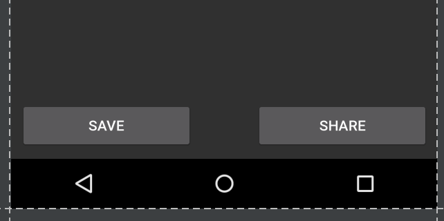
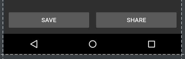
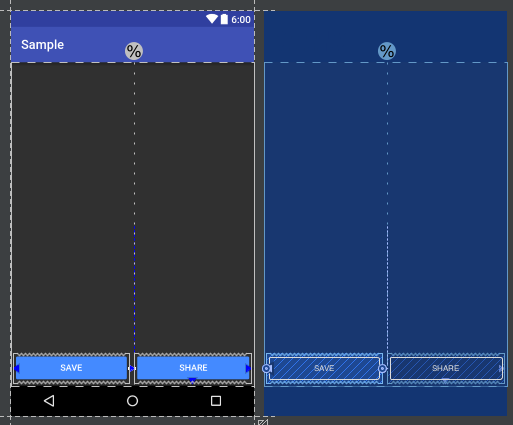
Open the layout editor and add your widgets as normal, adding parent constraints as needed. In this case, I have added two buttons with constraints to the bottom of the parent and side of the parent (left side for Save button and right side for Share button):
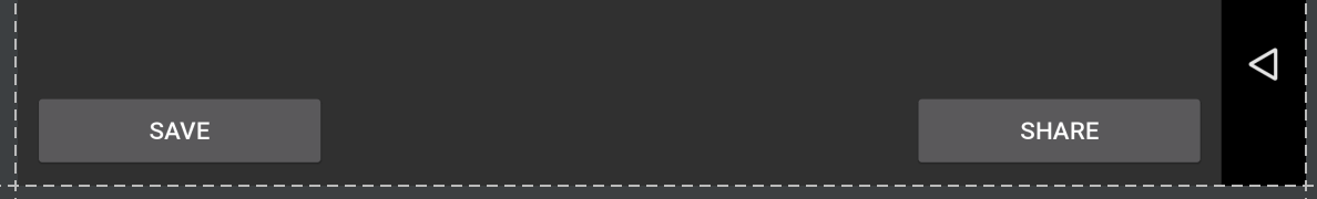
Note that in this state, if I flip to landscape view, the views do not fill the parent but are anchored to the corners:
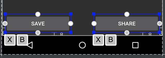
Highlight both views, either by Ctrl/Cmd clicking or by dragging a box around the views:
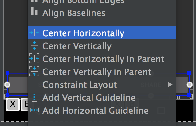
Then right-click on the views and choose "Center Horizontally":
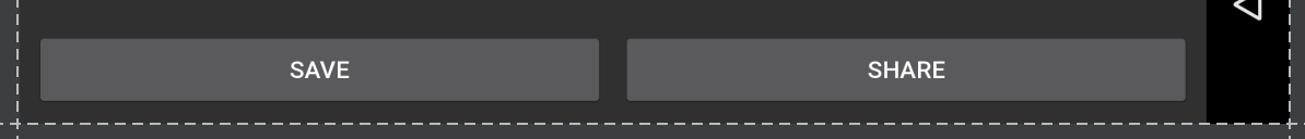
This sets up a bi-directional connection between the views (which is how a Chain is defined). By default the chain style is "spread", which is applied even when no XML attribute is included. Sticking with this chain style but setting the width of our views to 0dp lets the views fill the available space, spreading evenly across the parent:
This is more noticeable in landscape view:
If you prefer to skip the layout editor, the resulting XML will look like:
<android.support.constraint.ConstraintLayout
xmlns:android="http://schemas.android.com/apk/res/android"
xmlns:app="http://schemas.android.com/apk/res-auto"
android:layout_width="match_parent"
android:layout_height="match_parent">

<Button
    android:id="@+id/button_save"
    android:layout_width="0dp"
    android:layout_height="wrap_content"
    android:text="@string/button_save_text"
    android:layout_marginStart="8dp"
    android:layout_marginBottom="8dp"
    android:layout_marginEnd="4dp"
    app:layout_constraintLeft_toLeftOf="parent"
    app:layout_constraintBottom_toBottomOf="parent"
    app:layout_constraintRight_toLeftOf="@+id/button_share"
    app:layout_constraintHorizontal_chainStyle="spread" />

<Button
    android:id="@+id/button_share"
    android:layout_width="0dp"
    android:layout_height="wrap_content"
    android:text="@string/button_share_text"
    android:layout_marginStart="4dp"
    android:layout_marginEnd="8dp"
    android:layout_marginBottom="8dp"
    app:layout_constraintLeft_toRightOf="@+id/button_save"
    app:layout_constraintRight_toRightOf="parent"
    app:layout_constraintBottom_toBottomOf="parent" />

</android.support.constraint.ConstraintLayout>
Details:
- setting the width of each item to
0dporMATCH_CONSTRAINTlets the views fill the parent (optional) - the views must be linked together bidirectionally (right of save button links to share button, left of share button links to save button), this will happen automatically via the layout editor when choosing "Center Horizontally"
- the first view in the chain can specify the chain style via
layout_constraintHorizontal_chainStyle, see the documentation for various chain styles, if the chain style is omitted, the default is "spread" - the weighting of the chain can be adjusted via
layout_constraintHorizontal_weight - this example is for a horizontal chain, there are corresponding attributes for vertical chains
Method 2 - Using a Guideline
Open your layout in the editor and click the guideline button:
Then select "Add Vertical Guideline":
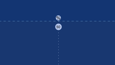
A new guideline will appear, that by default, will likely be anchored to the left in relative values (denoted by left-facing arrow):
Click the left-facing arrow to switch it to a percentage value, then drag the guideline to the 50% mark:
The guideline can now be used as an anchor for other views. In my example, I attached the right of the save button and the left of the share button to the guideline:
If you want the views to fill up the available space then the constraint should be set to "Any Size" (the squiggly lines running horizontally):
(This is the same as setting the layout_width to 0dp).
A guideline can also be created in XML quite easily rather than using the layout editor:
<android.support.constraint.Guideline
    android:layout_width="wrap_content"
    android:layout_height="wrap_content"
    android:id="@+id/guideline"
    android:orientation="vertical"
    app:layout_constraintGuide_percent="0.5" />
Related Topics
Convert Image to PDF in Android
Android - Set a Progressbar to Be a Vertical Bar Instead of Horizontal
How to Programmatically Pair a Bluetooth Device on Android
Viewpager Update Fragment on Swipe
Android Service Startservice() and Bindservice()
How to Store Files Generated from App in "Downloads" Folder of Android
Replace Fragment with Another Fragment Inside Viewpager
Android View Layout_Width - How to Change Programmatically
How to Pick Image for Crop from Camera or Gallery in Android 7.0
How to Execute Background Task When Android App Is Closed/Set to Background
Android Studio: "Use Default Gradle Wrapper" VS. "Use Customizable Gradle Wrapper"
Detecting The Scrolling Direction in The Adapter (Up/Down)
Changing Numberpicker Divider Color
How to Fix Android Studio Getting Stuck Executing Gradle Tasks
How to Get The Dimensions of a Drawable in an Imageview
App Links Intent Filters in Assetlinks.JSON Not Working on Android