CardView Corner Radius
Unless you try to extend the Android CardView class, you cannot customize that attribute from XML.
Nonetheless, there is a way of obtaining that effect.
Place a CardView inside another CardView and apply a transparent background to your outer CardView and remove its corner radius ("cornerRadios = 0dp"). Your inner CardView will have a cornerRadius value of 3dp, for example. Then apply a marginTop to your inner CardView, so its bottom bounds will be cut by the outer CardView. This way, the bottom corner radius of your inner CardView will be hidden.
The XML code is the following:
 <android.support.v7.widget.CardView
    xmlns:card_view="http://schemas.android.com/apk/res-auto"
    android:id="@+id/card_view_outer"
    android:layout_width="match_parent"
    android:layout_height="200dp"
    android:layout_gravity="center"
    card_view:cardBackgroundColor="@android:color/transparent"
    card_view:cardCornerRadius="0dp"
    card_view:cardElevation="3dp" >

    <android.support.v7.widget.CardView
        xmlns:card_view="http://schemas.android.com/apk/res-auto"
        android:id="@+id/card_view_inner"
        android:layout_width="match_parent"
        android:layout_height="200dp"
        android:layout_gravity="center"
        android:layout_marginTop="3dp"
        card_view:cardBackgroundColor="@color/green"
        card_view:cardCornerRadius="4dp"
        card_view:cardElevation="0dp" >
    </android.support.v7.widget.CardView>
</android.support.v7.widget.CardView>
And the visual effect is the following:
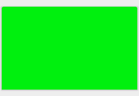
Always put your content in your Inner CardView. Your outer CardView serves only the purpose of "hiding" the bottom Rounded Corners of the inner CardView.
Android CardView: Why the corners are not round?
your CardView are round corner but not displayed rounded because you set the background of the inner layout. just move that background inner layout to CardView
<?xml version="1.0" encoding="utf-8"?>
<ScrollView xmlns:android="http://schemas.android.com/apk/res/android"
    xmlns:app="http://schemas.android.com/apk/res-auto"
    xmlns:tools="http://schemas.android.com/tools"
    android:layout_width="match_parent"
    android:layout_height="match_parent"
    tools:context=".view.ViewRecipe"
    android:padding="16dp"
    android:background="@color/mainBackgroundColorRM">

    <LinearLayout
        android:layout_width="match_parent"
        android:layout_height="wrap_content"
        android:orientation="vertical"
        android:layout_gravity="center">

        <TextView
            android:layout_width="match_parent"
            android:layout_height="wrap_content"
            android:layout_marginStart="16dp"
            android:fontFamily="sans-serif"
            android:text="Spaghette"
            android:textAlignment="center"
            android:textColor="#000000"
            android:textSize="32sp" />

        <androidx.cardview.widget.CardView
            android:layout_width="match_parent"
            android:layout_height="wrap_content"
            android:layout_marginStart="8dp"
            android:layout_marginTop="12dp"
            android:layout_marginEnd="8dp"
            android:background="@color/buttonColorRM"
            app:cardPreventCornerOverlap="false"
            app:cardCornerRadius="8dp"
            app:cardElevation="20dp">

            <!-- Here add the Contact Details-->
            <RelativeLayout
                android:layout_width="match_parent"
                android:layout_height="wrap_content"

                android:paddingStart="32dp"
                android:paddingTop="8dp"
                android:paddingEnd="32dp"
                android:paddingBottom="8dp">
                <!-- Here add the time value -->
                <TextView
                    android:id="@+id/text_view_duration_value"
                    android:layout_width="wrap_content"
                    android:layout_height="wrap_content"
                    android:layout_alignParentEnd="true"
                    android:text="10 minute"
                    android:textAppearance="@android:style/TextAppearance.DeviceDefault.Medium"
                    android:textColor="#000000">
                </TextView>

                <!-- Here add the portii value -->
                <TextView
                    android:id="@+id/text_view_servings_value"
                    android:layout_width="wrap_content"
                    android:layout_height="wrap_content"
                    android:layout_below="@id/text_view_duration_value"
                    android:layout_alignParentEnd="true"
                    android:text="@string/Servings_VALUE_demo"
                    android:textAppearance="@android:style/TextAppearance.DeviceDefault.Large"
                    android:textColor="#000000">
                </TextView>

                <!-- Duration is here-->
                <TextView
                    android:id="@+id/text_view_duration"
                    android:layout_width="wrap_content"
                    android:layout_height="wrap_content"
                    android:text="@string/text_duration_ViewRecipe"
                    android:layout_toStartOf="@id/text_view_duration_value"
                    android:layout_alignParentStart="true"
                    android:textAppearance="@android:style/TextAppearance.DeviceDefault.Large"
                    android:textColor="#000000"
                    android:textStyle="bold">
                </TextView>

                <!-- Time is here-->
                <TextView
                    android:id="@+id/text_view_portii"
                    android:layout_width="wrap_content"
                    android:layout_height="wrap_content"
                    android:layout_below="@id/text_view_duration"
                    android:text="@string/text_servings_ViewRecipe"
                    android:textAppearance="@android:style/TextAppearance.DeviceDefault.Large"
                    android:textColor="#000000"
                    android:textStyle="bold">

                </TextView>

            </RelativeLayout>

        </androidx.cardview.widget.CardView>

        <!-- Ingredients -->
        <androidx.cardview.widget.CardView
            android:layout_width="match_parent"
            android:layout_height="wrap_content"
            android:layout_marginEnd="8dp"
            android:layout_marginStart="8dp"
            android:layout_marginTop="12dp"
            android:background="@color/buttonColorRM"
            app:cardElevation="20dp"
            app:cardPreventCornerOverlap="false"
            app:cardCornerRadius="8dp">

            <!-- Here add the Contact Details-->
            <RelativeLayout
                android:layout_width="match_parent"
                android:layout_height="wrap_content"
                android:paddingTop="8dp"
                android:paddingBottom="8dp"
                android:paddingStart="32dp"
                android:paddingEnd="32dp"
                >

                <!-- Duration is here-->
                <TextView
                    android:id="@+id/text_view_ingredients"
                    android:layout_width="wrap_content"
                    android:layout_height="wrap_content"
                    android:text="  Incrediente:"
                    android:layout_alignParentStart="true"
                    android:ellipsize="end"
                    android:textAppearance="@android:style/TextAppearance.DeviceDefault.Large"
                    android:textColor="#000000"
                    android:textStyle="bold"
                    android:drawableStart="@drawable/list_icon">
                </TextView>

                <!-- Time is here-->
                <TextView
                    android:id="@+id/text_view_ingredients_value"
                    android:layout_width="wrap_content"
                    android:layout_height="wrap_content"
                    android:layout_below="@id/text_view_ingredients"
                    android:text="Incredient 1, incredient 2, altul mai unul si ai unul"
                    android:textAppearance="@android:style/TextAppearance.DeviceDefault.Medium"
                    android:textColor="#000000">

                </TextView>

            </RelativeLayout>
        </androidx.cardview.widget.CardView>

        <!-- Recipe -->
        <androidx.cardview.widget.CardView
            android:layout_width="match_parent"
            android:layout_height="wrap_content"
            android:layout_marginEnd="8dp"
            android:layout_marginStart="8dp"
            android:layout_marginTop="12dp"
            android:background="@color/buttonColorRM"
            app:cardElevation="20dp"
            app:cardPreventCornerOverlap="false"
            app:cardCornerRadius="8dp">

            <!-- Recipe description is here-->
            <RelativeLayout
                android:layout_width="match_parent"
                android:layout_height="wrap_content"
                android:paddingTop="8dp"
                android:paddingBottom="8dp"
                android:paddingStart="32dp"
                android:paddingEnd="32dp"
                >

                <!-- Duration is here-->
                <TextView
                    android:id="@+id/text_view_recipe"
                    android:layout_width="wrap_content"
                    android:layout_height="wrap_content"
                    android:text="@string/text_view_descriere_ViewRecipe"
                    android:layout_alignParentStart="true"
                    android:ellipsize="end"
                    android:textAppearance="@android:style/TextAppearance.DeviceDefault.Large"
                    android:textColor="#000000"
                    android:textStyle="bold"
                    android:drawableStart="@drawable/description_icon">
                </TextView>

                <!-- Time is here-->
                <TextView
                    android:id="@+id/text_view_recipe_value"
                    android:layout_width="wrap_content"
                    android:layout_height="wrap_content"
                    android:layout_below="@id/text_view_recipe"
                    android:text="@string/demo_reteta"
                    android:textAppearance="@android:style/TextAppearance.DeviceDefault.Medium"
                    android:textColor="#000000">
                </TextView>

            </RelativeLayout>
        </androidx.cardview.widget.CardView>

    </LinearLayout>

</ScrollView>
CardView with different corner radius
It requires the official MaterialCardView (which extends the androidx.cardview.widget.CardView) and at least the version 1.1.0 of the Material components library.
Add to your layout the MaterialCardView:
    <com.google.android.material.card.MaterialCardView
        style="@style/CustomCardViewStyle"
        ...>

    </com.google.android.material.card.MaterialCardView>
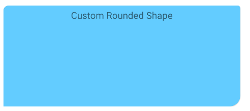
Define a custom style inheriting a material card style (for example Widget.MaterialComponents.CardView) and use the shapeAppearanceOverlay attribute:
  <style name="CustomCardViewStyle" parent="@style/Widget.MaterialComponents.CardView">
     <item name="shapeAppearanceOverlay">@style/ShapeAppearanceOverlay_card_custom_corners</item>
  </style>

  <style name="ShapeAppearanceOverlay_card_custom_corners" parent="">
    <item name="cornerFamily">rounded</item>
    <item name="cornerSizeTopRight">4dp</item>
    <item name="cornerSizeTopLeft">8dp</item>
    <item name="cornerSizeBottomRight">16dp</item>
    <item name="cornerSizeBottomLeft">0dp</item>
  </style>
You can also achieve it programmatically.
Just apply a custom ShapeAppearanceModel to the corners of the card.
Something like:
float radius = getResources().getDimension(R.dimen.my_corner_radius);
cardView.setShapeAppearanceModel(
  cardView.getShapeAppearanceModel()
      .toBuilder()
      .setTopLeftCorner(CornerFamily.ROUNDED,..)
      .setTopRightCorner(CornerFamily.ROUNDED,..)
      .setBottomRightCorner(CornerFamily.ROUNDED,radius)
      .setBottomLeftCornerSize(0)
      .build());
Note: it requires the version 1.1.0 of the library.
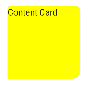
With Jetpack compose you can use the shape parameter in the Card.
Something like:
Card(
    shape = RoundedCornerShape(
        topStart = 4.dp,
        topEnd = 8.dp,
        bottomEnd = 16.dp,
        bottomStart = 2.dp,
    )
){
    Text("Content Card")
}
Round only top corner of cardview
We can set the marginBottom of the card view in negative value.Margin should be same value as card radius.
For Example,
    <FrameLayout
        android:id="@+id/rootview"
        android:layout_width="match_parent"
        android:layout_height="match_parent">

   <android.support.v7.widget.CardView
         android:id="@+id/card_view"
         android:layout_marginBottom="-3dp"
         project:cardCornerRadius="3dp"
         android:layout_width="match_parent"
         android:layout_height="match_parent">

         <!--The child view inside the cardview should have extra padding,so that negative margin will not affect the bottom padding of its child.Here normally we have 16dp bottom padding for child + margin bottom of the parent is 3dp=19dp comes.-->

       <FrameLayout
            android:layout_width="match_parent"
            android:layout_height="match_parent"
            android:paddingBottom="19dp"/>

   </android.support.v7.widget.CardView>
   </FrameLayout>
It works for me.But I am in doubt whether it is the proper way of doing.Any suggestions are welcome.
Remove CardView corner radius background in Android
With the help of @ADM, the problem was in the popup window setup, and not the layout itself.
So, adding the following line to the popup initialization fixed the issue:
popup.setBackgroundDrawable(ColorDrawable(android.graphics.Color.TRANSPARENT))
Rounded corners in a card view won't work at the bottom of image with a text view
Try to put this code in your "@drawable/background_shape". Just tried it and it all working fine.
<?xml version="1.0" encoding="UTF-8"?>
<shape xmlns:android="http://schemas.android.com/apk/res/android">
     <corners android:bottomLeftRadius="20dp" android:bottomRightRadius="20dp"/>
</shape>
Why is the Jetpack Compose card radius corner not even
Your cards height is too small to display the shape correctly. It should be at least twice as large as your radius
Card(
    modifier = Modifier.preferredHeight(100.dp),
    shape = RoundedCornerShape(50.dp),
    backgroundColor = Color(0xFFFF0000),
)
or set the radius of your shape in percent:
Card(
    shape = RoundedCornerShape(50),
    backgroundColor = Color(0xFFFF0000),
    )
Android CardView with rounded corners displays grey corners
It is because of shadow, you need to give space to cardview to show full shadow. Add android:layout_margin="5dp" to CardView and you will see that the "grey" color is cut shadow.
Solution is adding app:cardUseCompatPadding="true" to CardView and it will give needed spacing.
Related Topics
How to Add Buttons at Top of Map Fragment API V2 Layout
Find Out If Listview Is Scrolled to the Bottom
Set the Layout Weight of a Textview Programmatically
How to Run Code on a Background Thread on Android
Sending a Notification from a Service in Android
Actionbar - Custom View with Centered Imageview, Action Items on Sides
Android Fade in and Fade Out with Imageview
How to Add Footer to Navigationview - Android Support Design Library
Android - Volume Buttons Used in My Application
Detecting When User Has Dismissed the Soft Keyboard
How to Make Circle Custom Progress Bar in Android
Taking Pictures with Camera on Android Programmatically