SwiftUI: Understanding .sheet / .fullScreenCover lifecycle when using constant vs @Binding initializers
See comments and print statements. Especially the red
import SwiftUI

struct SegueTest: View {

    @State var showSheet: Bool = false{
        didSet{
            print("showSheet :: didSet")
        }
        willSet{
            print("showSheet :: willSet")
        }
    }
    @State var color: Color = .gray{
        didSet{
            print("color :: didSet :: \(color.description)")
        }
        willSet{
            print("color :: willSet :: \(color.description)")
        }
    }
    @State var refresh: Bool = false
    init(){
        print("SegueTest " + #function)
    }
    var body: some View {
        print(#function)
        return HStack {
            //Just to see what happens when you recreate the View
            //Text(refresh.description)
            Text(color.description)
            RoundedRectangle(cornerRadius: 25)
                .fill(Color.red)
                .frame(width: 100, height: 100)
                .onTapGesture {
                    print("SegueTest :: onTapGesture :: red")
                    //Changing the color
                    color = .red
                    //Refreshed SegueTest reloads function
                    //refresh.toggle()
                    showSheet.toggle()
                }

            RoundedRectangle(cornerRadius: 25)
                .fill(Color.green)
                .frame(width: 100, height: 100)
                .onTapGesture {
                    print("SegueTest :: onTapGesture :: green")
                    //Changing the color
                    color = .green
                    showSheet.toggle()
                }

            RoundedRectangle(cornerRadius: 25)
                .fill(Color.orange)
                .frame(width: 100, height: 100)
                .onTapGesture {
                    print("SegueTest :: onTapGesture :: orange")
                    //Changing the color
                    color = .orange
                    showSheet.toggle()
                }

        }
        //This part is likely created when SegueTest is created and since a struct is immutable it keeps the original value
        .fullScreenCover(isPresented: $showSheet, content: {
            SecondView(selectedColor: color)
        })
    }
}

struct SecondView: View {

    @Environment(\.presentationMode) var presentationMode
    //struct is immutable
    let selectedColor: Color // Should change to @Binding
    init(selectedColor: Color){
        print("SecondView " + #function)
        self.selectedColor = selectedColor
        print("SecondView :: struct :: selectedColor = \(self.selectedColor.description)" )
        print("SecondView :: parameter :: selectedColor = \(selectedColor.description)" )
    }
    var body: some View {
        ZStack {
            Color.black.edgesIgnoringSafeArea(.all)

            RoundedRectangle(cornerRadius: 25)
                .fill(selectedColor)
                .frame(width: 300, height: 300)
        }
        .onTapGesture {
            presentationMode.wrappedValue.dismiss()
        }
    }

}

struct SegueTest_Previews: PreviewProvider {
    static var previews: some View {
        SegueTest()
    }
}
Present a new view in SwiftUI
To show a modal (iOS 13 style)
You just need a simple sheet with the ability to dismiss itself:
struct ModalView: View {
    @Binding var presentedAsModal: Bool
    var body: some View {
        Button("dismiss") { self.presentedAsModal = false }
    }
}
And present it like:
struct ContentView: View {
    @State var presentingModal = false

    var body: some View {
        Button("Present") { self.presentingModal = true }
        .sheet(isPresented: $presentingModal) { ModalView(presentedAsModal: self.$presentingModal) }
    }
}
Note that I passed the presentingModal to the modal so you can dismiss it from the modal itself, but you can get rid of it.
To make it REALLY present fullscreen (Not just visually)
You need to access to the ViewController. So you need some helper containers and environment stuff:
struct ViewControllerHolder {
    weak var value: UIViewController?
}

struct ViewControllerKey: EnvironmentKey {
    static var defaultValue: ViewControllerHolder {
        return ViewControllerHolder(value: UIApplication.shared.windows.first?.rootViewController)

    }
}

extension EnvironmentValues {
    var viewController: UIViewController? {
        get { return self[ViewControllerKey.self].value }
        set { self[ViewControllerKey.self].value = newValue }
    }
}
Then you should use implement this extension:
extension UIViewController {
    func present<Content: View>(style: UIModalPresentationStyle = .automatic, @ViewBuilder builder: () -> Content) {
        let toPresent = UIHostingController(rootView: AnyView(EmptyView()))
        toPresent.modalPresentationStyle = style
        toPresent.rootView = AnyView(
            builder()
                .environment(\.viewController, toPresent)
        )
        NotificationCenter.default.addObserver(forName: Notification.Name(rawValue: "dismissModal"), object: nil, queue: nil) { [weak toPresent] _ in
            toPresent?.dismiss(animated: true, completion: nil)
        }
        self.present(toPresent, animated: true, completion: nil)
    }
}
Finally
you can make it fullscreen like:
struct ContentView: View {
    @Environment(\.viewController) private var viewControllerHolder: UIViewController?

    var body: some View {
        Button("Login") {
            self.viewControllerHolder?.present(style: .fullScreen) {
                Text("Main") // Or any other view you like
// uncomment and add the below button for dismissing the modal
            // Button("Cancel") {
            //       NotificationCenter.default.post(name: Notification.Name(rawValue: "dismissModal"), object: nil)
            //        }
            }
        }
    }
}
Presenting View Controller in SwiftUI
As there is no provided related code, so in pseudo-code it would look like the following
struct YourParentView: View {
   @State private var presented = false
   var body: some View {

      // some other code that activates `presented` state

      SomeUIElement()
         .sheet(isPresented: $presented) {
             YourMessageViewControllerRepresentable()
         }
   }
}
How can I pop to the Root view using SwiftUI?
Setting the view modifier isDetailLink to false on a NavigationLink is the key to getting pop-to-root to work. isDetailLink is true by default and is adaptive to the containing View. On iPad landscape for example, a Split view is separated and isDetailLink ensures the destination view will be shown on the right-hand side. Setting isDetailLink to false consequently means that the destination view will always be pushed onto the navigation stack; thus can always be popped off.
Along with setting isDetailLink to false on NavigationLink, pass the isActive binding to each subsequent destination view. At last when you want to pop to the root view, set the value to false and it will automatically pop everything off:
import SwiftUI
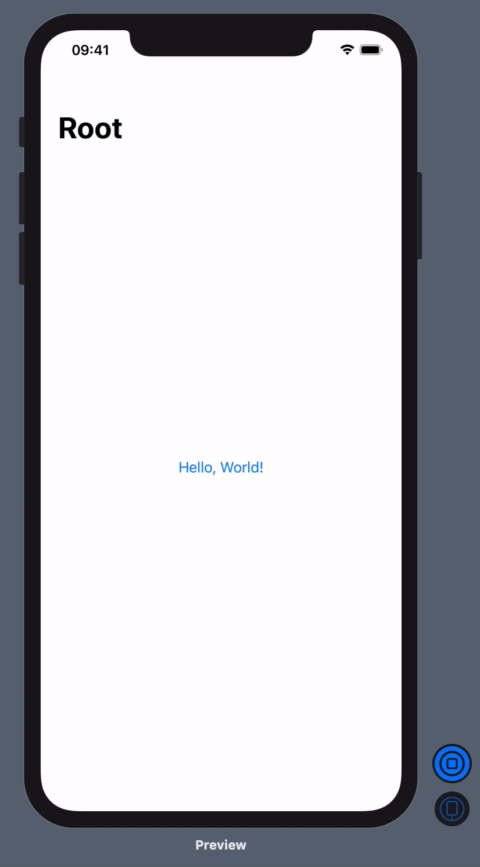
struct ContentView: View {
@State var isActive : Bool = false
var body: some View {
NavigationView {
NavigationLink(
destination: ContentView2(rootIsActive: self.$isActive),
isActive: self.$isActive
) {
Text("Hello, World!")
}
.isDetailLink(false)
.navigationBarTitle("Root")
}
}
}
struct ContentView2: View {
@Binding var rootIsActive : Bool
var body: some View {
NavigationLink(destination: ContentView3(shouldPopToRootView: self.$rootIsActive)) {
Text("Hello, World #2!")
}
.isDetailLink(false)
.navigationBarTitle("Two")
}
}
struct ContentView3: View {
@Binding var shouldPopToRootView : Bool
var body: some View {
VStack {
Text("Hello, World #3!")
Button (action: { self.shouldPopToRootView = false } ){
Text("Pop to root")
}
}.navigationBarTitle("Three")
}
}
struct ContentView_Previews: PreviewProvider {
static var previews: some View {
ContentView()
}
}
Related Topics
Swift Subclasses Used in Generics Don't Get Called When Inheriting from Nsobject
Button State Activates on Wrong Cells
Tvos Textfield Transparent Background
Swift: Generic Overloads, Definition of "More Specialized"
Creating a Subclass of Skshapenode
How to Prompt for Accessibility Features in a MACos App (From the Appdelegate)
How to Wait for Http Requests to Finish
Swift Realm: After Writing Transaction Reference Set to Nil
Saving Highscores with Nsuserdefaults
Drag a Cgrect Using Uipangesturerecognizer
Explicitly Unwrapping Optional Nil Does Not Cause Crash
Navigationview Swiftui Shows Split View in iPad
Resizing Uimage When Using Sf Symbols - Uiimage(Systemname:)
Does the Initializer of an 'Open' Class Need to Be Open as Well