Rounded corners for UITabBar
Hey I used a simple property of the tabBar which is backgroundImage.
So, I added in the appDelegate in didFinisLaunchingWithOptions:
let tabBarController = window?.rootViewController as! UITabBarController
    let image = UIImage(named: "bar")
    let tabBarImage = resize(image: image!, newWidth: tabBarController.view.frame.width)
    tabBarController.tabBar.backgroundImage = tabBarImage
and my custom method to change the size of the image:
func resize(image: UIImage, newWidth: CGFloat) -> UIImage {

    UIGraphicsBeginImageContext(CGSize(width: newWidth, height: image.size.height))
    image.draw(in: CGRect(x: 0, y: 0, width: newWidth, height: image.size.height)) // image.drawInRect( CGRect(x: 0, y: 0, width: newWidth, height: image.size.height))  in swift 2
    let newImage = UIGraphicsGetImageFromCurrentImageContext()
    UIGraphicsEndImageContext()

    return newImage!
}
I used a png image as the background, the same that you posted but with clear color instead of the black color.
Hope this helps
how can I create a rounded tab with swift?
Based on this answer: https://stackoverflow.com/a/58941827/5753078
Subclass UITabBar like following. This solution takes into account the safeArealayout guides for devices with notch. I find 65 to be a sweet spot height for top rounded tabBar.
@IBDesignable class TabBarWithCorners: UITabBar {
    @IBInspectable var color: UIColor?
    @IBInspectable var radii: CGFloat = 15.0

    private var shapeLayer: CALayer?

    override func draw(_ rect: CGRect) {
        addShape()
    }

    private func addShape() {
        let shapeLayer = CAShapeLayer()

        shapeLayer.path = createPath()
        shapeLayer.strokeColor = UIColor.gray.withAlphaComponent(0.1).cgColor
        shapeLayer.fillColor = color?.cgColor ?? UIColor.white.cgColor
        shapeLayer.lineWidth = 2
        shapeLayer.shadowColor = UIColor.black.cgColor
        shapeLayer.shadowOffset = CGSize(width: 0   , height: -3);
        shapeLayer.shadowOpacity = 0.2
        shapeLayer.shadowPath =  UIBezierPath(roundedRect: bounds, cornerRadius: radii).cgPath


        if let oldShapeLayer = self.shapeLayer {
            layer.replaceSublayer(oldShapeLayer, with: shapeLayer)
        } else {
            layer.insertSublayer(shapeLayer, at: 0)
        }

        self.shapeLayer = shapeLayer
    }

    private func createPath() -> CGPath {
        let path = UIBezierPath(
            roundedRect: bounds,
            byRoundingCorners: [.topLeft, .topRight],
            cornerRadii: CGSize(width: radii, height: 0.0))

        return path.cgPath
    }
    override func layoutSubviews() {
        super.layoutSubviews()
        self.isTranslucent = true
        var tabFrame            = self.frame
        tabFrame.size.height    = 65 + (UIApplication.shared.keyWindow?.safeAreaInsets.bottom ?? CGFloat.zero)
        tabFrame.origin.y       = self.frame.origin.y +   ( self.frame.height - 65 - (UIApplication.shared.keyWindow?.safeAreaInsets.bottom ?? CGFloat.zero))
        self.layer.cornerRadius = 20
        self.frame            = tabFrame


        self.items?.forEach({ $0.titlePositionAdjustment = UIOffset(horizontal: 0.0, vertical: -5.0) })


    }

}
Result should look like this: 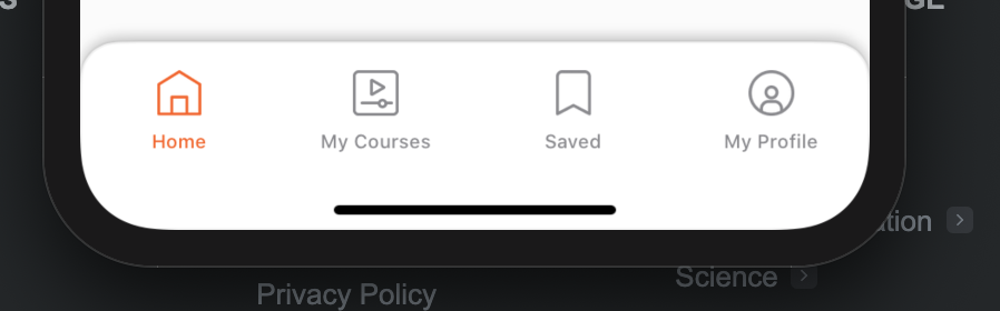
Adding Corner To UITabBarController
You can modify the existing tabBar in your UITabBarController.
func setUpBarStyle(){
    // Clipping needs to be enabled, otherwise rounded corners won't show.
    tabBarCnt.tabBar.clipsToBounds = true
    tabBarCnt.tabBar.layer.cornerRadius = 20
    // I guess you want to mask to top left and right corners. If not, change the maskedCorners to what you want.
    tabBarCnt.tabBar.layer.maskedCorners = [.layerMinXMinYCorner, .layerMaxXMinYCorner]
}
Change tab bar height and width and add rounded corners
Altering the tabbar may cause you to get trouble with app review.
For easier customisation try to use a custom tab bar control.
Take a look Here for a list of great open source list of tab bar components that are easily FULLY customisable.
Tell me if this solves your issue, otherwise we can make further customisation.
Edit:
Well, Here is what you need to do:
1- create a circular transparent png for the background: 
2- Create a custom uitabbarController class and put that code in ViewDidLoad:
[[UITabBar appearance] setBarTintColor:[UIColor clearColor]];
self.tabBarController.tabBar.translucent = YES;
UIImage *image = [self imageWithImage:[UIImage imageNamed:@"circle.png"]scaledToSize:CGSizeMake(self.tabBar.frame.size.height+1, self.tabBar.frame.size.height+1)];
UIEdgeInsets edgeInsets;
edgeInsets.left = image.size.width/2;
edgeInsets.top = 0.0f;
edgeInsets.right = image.size.width/2; //this will be the constant portion in your image
edgeInsets.bottom = 0.0f;
image = [image resizableImageWithCapInsets:edgeInsets];

[[UITabBar appearance] setBackgroundImage:image];
The image is resized to fit the UITabBar height using this method:
- (UIImage *)imageWithImage:(UIImage *)image scaledToSize:(CGSize)newSize {
    //UIGraphicsBeginImageContext(newSize);
    // In next line, pass 0.0 to use the current device's pixel scaling factor (and thus account for Retina resolution).
    // Pass 1.0 to force exact pixel size.
    UIGraphicsBeginImageContextWithOptions(newSize, NO, 0.0);
    [image drawInRect:CGRectMake(0, 0, newSize.width, newSize.height)];
    UIImage *newImage = UIGraphicsGetImageFromCurrentImageContext();
    UIGraphicsEndImageContext();
    return newImage;
}
The result looks like this:
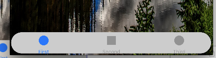
In case it is still unclear, I made you an xcode project and uploaded it to github, please feel free to use it to fit your needs :)
Custom UITabBarController by Sdiri Houssem on Github
Best regards
Rounded corners for Tab bar in swiftUI?
Firstly:
I created TabBarView.swift file.
Code:
import SwiftUI
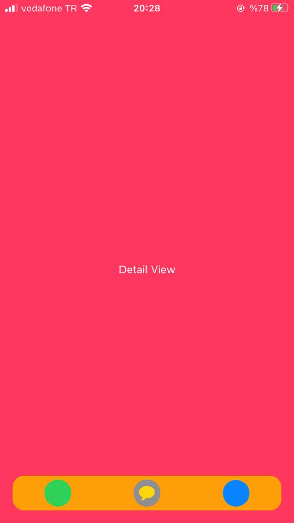
struct TabBarView: View {
@State var selectedTab = "Yeni Mesajlar"
@Binding var pages: [TabBarPage]
init(pages: Binding<[TabBarPage]>) {
UITabBar.appearance().isHidden = true
self._pages = pages
}
var body: some View {
ZStack(alignment: .bottom) {
TabView(selection: $selectedTab) {
ForEach(pages) { item in
AnyView(_fromValue: item.page)
.tabItem{
EmptyView()
}.tag(item.tag)
}
}
HStack {
ForEach(pages) { item in
Button(action: {
self.selectedTab = item.tag
}) {
ZStack {
Image(systemName: item.icon)
.foregroundColor(item.color)
.imageScale(.large)
.padding(7)
.background(self.selectedTab == item.tag ? Color.gray : item.color )
.mask(Circle())
}
}
.frame(maxWidth: .infinity)
}
}
.padding(5)
.background(Color.orange)
.cornerRadius(15)
.padding()
}
}
}
struct TabBarView_Previews: PreviewProvider {
static var previews: some View {
TabBarView(pages: .constant([TabBarPage(page: HomeView(), icon: "arrow.up.message.fill", tag: "Yeni Mesajlar", color: .green),
TabBarPage(page: DetailView(), icon: "message.fill", tag: "Mesajlar", color: .yellow),
TabBarPage(page: ProfileView(), icon: "person.crop.circle.fill", tag: "Profil", color: .blue)]))
}
}
struct TabBarPage: Identifiable {
var id = UUID()
var page: Any
var icon: String
var tag: String
var color: Color
}
Then:
I add the TabView I created to the ContentView.
Code:
struct ContentView: View {
    @State var tabBarPages: [TabBarPage] = [TabBarPage(page: NewMessageView(), icon: "arrow.up.message.fill", tag: "Yeni Mesajlar", color: .green),
                                            TabBarPage(page: MessageView(), icon: "message.fill", tag: "Mesajlar", color: .yellow),
                                            TabBarPage(page: ProfileView(), icon: "person.crop.circle.fill", tag: "Profil", color: .blue)]
    var body: some View {
        TabBarView(pages: $tabBarPages)
    }
}
Related Topics
Swift, Sprite Kit Game: Have Circle Disappear in Clockwise Manner? on Timer
Why Does the Following Code Crash on an iPhone 5 But Not an iPhone 5S
Accessor Gives the Wrong Value in Swift 1.2/2.0 Release Build Only
Swift: How to Get Form Values Using Eureka Form Builder
Making Swift Generics Play with Overloaded Functions
Arkit -Drop a Shadow of 3D Object on the Plane Surface
How to Make Swiftui Listmenu with Different Behaviors
Swiftui - Add Border to One Edge of an Image
Swift (iOS 8 Sdk) Convert Unmanaged<Abmultivalueref> to Abmultivalueref
How to Make Uitextfield Behave Like a Uisearchbar in Swift
System Volume Change Observer Not Working on iOS 15
Play Local Audio File with Avaudioplayer
How to Use Trailing Closure in If Condition
Collectionview Not Display Data After Parsing JSON
How to Assign an Array to a Class Property by Reference Rather Than a Copy
\N in the End of Line with Using Print
Perform Segue from Another Class with Helper Function
iOS 11 Large Title Navigation Bar Snaps Instead of Smooth Transition