Creating a Custom Tab Bar
A work around which I implemented.
Create a view to have the custom tab bar.
let tabView = UIView(frame: CGRect(x: 0, y: 0, width: self.view.frame.size.width, height: 60))
tabView.backgroundColor = UIColor(red: 45/255, green: 58/255, blue: 114/255, alpha: 1)
self.view.addSubview(tabView)
Depending on the number of buttons, decide the button size and add them as subview.(Taking 2 here)
firstButton = UIButton(type: .Custom)
firstButton.frame = CGRect(x: 0, y: 20, width: tabView.frame.size.width / 2, height: 30)
firstButton.setTitle("BUT 1", forState: .Normal)
firstButton.setTitleColor(UIColor(red: 0/255, green: 191/255, blue: 165/255, alpha: 1.0), forState: .Normal)
firstButton.addTarget(self, action: #selector(ViewController.firstButtonTapped), forControlEvents: .TouchUpInside)

tabView.addSubview(firstButton)

secondButton = UIButton(type: .Custom)
secondButton.frame = CGRect(x: tabView.frame.size.width / 2, y: 20, width: tabView.frame.size.width / 2, height: 30)
secondButton.setTitle("BUT 2", forState: .Normal)
secondButton.setTitleColor(UIColor.whiteColor(), forState: .Normal)
secondButton.addTarget(self, action: #selector(ViewController.secondButtonTapped), forControlEvents: .TouchUpInside)

tabView.addSubview(secondButton)
Add a small UIView which serves as a line below the buttons.
 lineView = UIView()
lineView.frame = CGRect(x: 0, y: CGRectGetMaxY(tabView.frame) - 3, width: tabView.frame.size.width / 2, height: 3)
lineView.backgroundColor = UIColor(red: 0/255, green: 191/255, blue: 165/255, alpha: 1.0)

tabView.addSubview(lineView)
Make the view below in a scrollview.
 self.scrollView.frame = CGRectMake(0, CGRectGetMaxY(tabView.frame), self.view.frame.width, self.view.frame.height)
self.scrollView.backgroundColor = UIColor.whiteColor()
self.scrollView.delegate = self
self.scrollView.pagingEnabled = true

self.view.addSubview(self.scrollView)

let aScrollViewWidth = self.scrollView.frame.width
let aScrollViewHeight = self.scrollView.frame.height
self.scrollView.contentSize = CGSizeMake(aScrollViewWidth * CGFloat(2), aScrollViewHeight)
Add your views one after the other. For the sake of the example, I am just adding a UITextView.
for anIndex in 0  ..< 2  {

    let anEssayTextView = UITextView(frame: CGRectMake(aScrollViewWidth * CGFloat(anIndex), 0, aScrollViewWidth, aScrollViewHeight))
    anEssayTextView.text = essays[anIndex]
    anEssayTextView.editable = false
    self.scrollView.addSubview(anEssayTextView)

}
ScrollView delegate function
 func scrollViewDidEndDecelerating(scrollView: UIScrollView) {

pageNumber = round(scrollView.contentOffset.x / scrollView.frame.size.width)

if (pageNumber == 0) {
    firstButtonTapped()
} else {
    secondButtonTapped()
}
}
Button actions
func firstButtonTapped() {

firstButton.setTitleColor(UIColor(red: 0/255, green: 191/255, blue: 165/255, alpha: 1.0), forState: .Normal)
secondButton.setTitleColor(UIColor.whiteColor(), forState: .Normal)

if (self.lineView.frame.origin.x != 0) {

    UIView.animateWithDuration(0.25) {

        self.lineView.frame.origin.x -= self.tabView.frame.size.width / 2

    }

}

scrollView.setContentOffset(CGPointMake(0, 0), animated: true)

pageNumber = 0

}

func secondButtonTapped() {

firstButton.setTitleColor(UIColor.whiteColor(), forState: .Normal)
secondButton.setTitleColor(UIColor(red: 0/255, green: 191/255, blue: 165/255, alpha: 1.0), forState: .Normal)

if (self.lineView.frame.origin.x != self.tabView.frame.size.width / 2) {

    UIView.animateWithDuration(0.25) {

        self.lineView.frame.origin.x += self.tabView.frame.size.width / 2

    }

}

scrollView.setContentOffset(CGPointMake(self.scrollView.frame.size.width, 0), animated: true)

pageNumber = 1

}
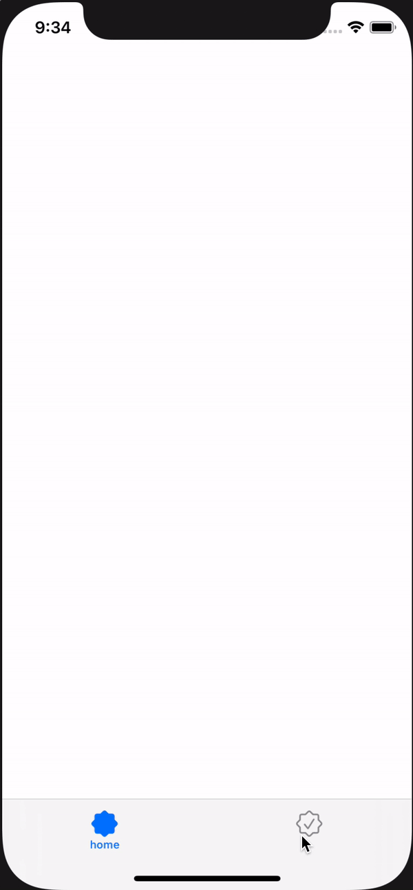
How to make Custom TabBar?
As an example, it was written with two items.
You can branch to the tag depending on the selected item in didSelect() method.
In viewWillAppear(), I wrote the title of first item because the first item is selected when the app is first launched. (initialization)
I hope my answer is helpful to you.
TabBarController.swift
import UIKit

class TabBarController: UITabBarController, UITabBarControllerDelegate {

    override func viewDidLoad() {
        super.viewDidLoad()

        self.delegate = self
    }

    override func viewWillAppear(_ animated: Bool) {
        super.viewWillAppear(true)

        //Setting the UITabBarItem

        let tab1 = UIStoryboard(name: "Main", bundle: nil).instantiateViewController(identifier: "ViewController")
        let tab1BarItem = UITabBarItem(title: "home", image: UIImage(systemName: "seal"), selectedImage: UIImage(systemName: "seal.fill"))
        tab1.tabBarItem = tab1BarItem
        tab1.tabBarItem.tag = 0

        let tab2 = UIStoryboard(name: "Main", bundle: nil).instantiateViewController(identifier: "SearchViewController")
        let tab2BarItem = UITabBarItem(title: "", image: UIImage(systemName: "checkmark.seal"), selectedImage: UIImage(systemName: "checkmark.seal.fill"))
        tab2.tabBarItem = tab2BarItem
        tab2.tabBarItem.tag = 1

        self.viewControllers = [tab1, tab2]
    }


    override func tabBar(_ tabBar: UITabBar, didSelect item: UITabBarItem) {

        if item.tag == 0 { // tab1(home)
            item.title = "home"
            tabBar.items?[1].title = ""
        }

        if item.tag == 1 { // tab2(search)
            item.title = "search"
            tabBar.items?[0].title = ""
        }
    }

}
Preview
How to create a custom tabBar in flutter
PageView and PageController
So this isn't exactly what you are looking for, instead of bottom bar you could do a horizontal scroll (scrollView), but I hope this pushes you in the right direction. This code basically uses pageView to display pages, and since there is a page controller you can animate any button or onPress to a specific page.
Let me know if you have any questions!
import 'package:flutter/material.dart';

class TestWidget extends StatefulWidget {
  TestWidget({Key key}) : super(key: key);

  @override
  _TestWidgetState createState() => _TestWidgetState();
}

class _TestWidgetState extends State<TestWidget> {
  int _selectedIndex = 0;

  PageController _pageController;

  @override
  void initState() {
    super.initState();
    _pageController = PageController();
  }

  @override
  void dispose() {
    _pageController.dispose();
    super.dispose();
  }

  Widget build(BuildContext context) {
    return Scaffold(
      appBar: AppBar(
        title: Text("Tab Bar"),
      ),
      body: Center(
        child: Column(
          children: <Widget>[
            Expanded(
              flex: 10,
              child: ButtonBar(
                alignment: MainAxisAlignment.center,
                children: <Widget>[
                  FlatButton(
                    splashColor: Colors.blueAccent,
                    color: Colors.blue,
                    onPressed: () {
                      _pageController.animateToPage(0, duration: Duration(milliseconds: 500), curve: Curves.ease);
                    },
                    child: Text("One",),
                  ),
                  FlatButton(
                    splashColor: Colors.blueAccent,
                    color: Colors.blue,
                    onPressed: () {
                      _pageController.animateToPage(1, duration: Duration(milliseconds: 500), curve: Curves.ease);
                    },
                    child: Text("Two",),
                  ),
                  FlatButton(
                    splashColor: Colors.blueAccent,
                    color: Colors.blue,
                    onPressed: () {
                      _pageController.animateToPage(2, duration: Duration(milliseconds: 500), curve: Curves.ease);
                    },
                    child: Text("Three",),
                  )
                ],
              ),
            ),
            Expanded(
              flex: 40,
              child: PageView(
                controller: _pageController,
                children: [
                  Text("Page One"),
                  Text("Page Two"),
                  Text("Page Three")
                ],
              ),
            ),
          ],
        ),
      ),
    );
  }
}
This basically allows you to use any tab bar or buttons you wont to switch page while keeping swipe functionality :-)
Flutter - How to make a custom TabBar
You can use the TabBar widget to achieve this. I added a full example demonstrating how you can create this using the TabBar widget:
CODE
class StackOver extends StatefulWidget {
  @override
  _StackOverState createState() => _StackOverState();
}

class _StackOverState extends State<StackOver>
    with SingleTickerProviderStateMixin {
  TabController _tabController;

  @override
  void initState() {
    _tabController = TabController(length: 2, vsync: this);
    super.initState();
  }

  @override
  void dispose() {
    super.dispose();
    _tabController.dispose();
  }

  @override
  Widget build(BuildContext context) {
    return Scaffold(
      appBar: AppBar(
        title: Text(
          'Tab bar',
        ),
      ),
      body: Padding(
        padding: const EdgeInsets.all(8.0),
        child: Column(
          children: [
            // give the tab bar a height [can change hheight to preferred height]
            Container(
              height: 45,
              decoration: BoxDecoration(
                color: Colors.grey[300],
                borderRadius: BorderRadius.circular(
                  25.0,
                ),
              ),
              child: TabBar(
                controller: _tabController,
                // give the indicator a decoration (color and border radius)
                indicator: BoxDecoration(
                  borderRadius: BorderRadius.circular(
                    25.0,
                  ),
                  color: Colors.green,
                ),
                labelColor: Colors.white,
                unselectedLabelColor: Colors.black,
                tabs: [
                  // first tab [you can add an icon using the icon property]
                  Tab(
                    text: 'Place Bid',
                  ),

                  // second tab [you can add an icon using the icon property]
                  Tab(
                    text: 'Buy Now',
                  ),
                ],
              ),
            ),
            // tab bar view here
            Expanded(
              child: TabBarView(
                controller: _tabController,
                children: [
                  // first tab bar view widget
                  Center(
                    child: Text(
                      'Place Bid',
                      style: TextStyle(
                        fontSize: 25,
                        fontWeight: FontWeight.w600,
                      ),
                    ),
                  ),

                  // second tab bar view widget
                  Center(
                    child: Text(
                      'Buy Now',
                      style: TextStyle(
                        fontSize: 25,
                        fontWeight: FontWeight.w600,
                      ),
                    ),
                  ),
                ],
              ),
            ),
          ],
        ),
      ),
    );
  }
}
OUTPUT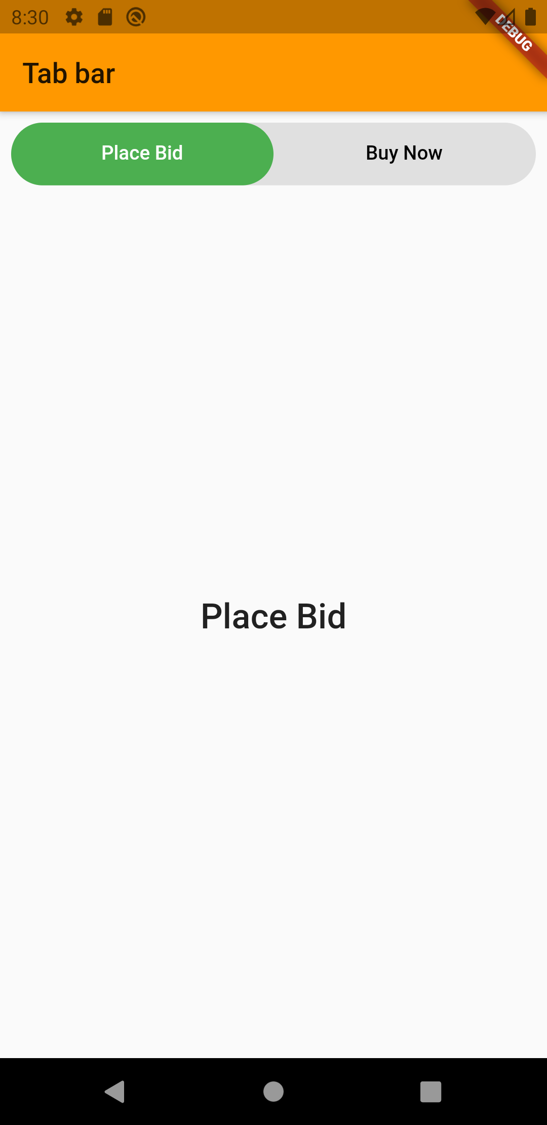
Custom Tab Bar, with central button which will be hide by pressed index
I am was created this tab bar, ours need few steps.
Create ViewController and Embed in "TabBarController", then need create TWO class first for "UITabBar" this class contain shape and what you want with "UITabBar", second class for "UITabBarController" for switch between ViewControllers inside we can add animation.... It's need because, my TabBar have 4 tabs and only on LAST tabs I am have Central FAB button with animation, and I am should animate position of my 2 and 3 ui tab bar element when button is appear.
Class for "UITabBar"
import UIKit

@IBDesignable
class CustomizedTabBar: UITabBar {

    // MARK:- Variables -
    @objc public var centerButtonActionHandler: ()-> () = {}

    @IBInspectable public var centerButton: UIButton?
    @IBInspectable public var centerButtonColor: UIColor?
    @IBInspectable public var centerButtonHeight: CGFloat = 50.0
    @IBInspectable public var padding: CGFloat = 5.0
    @IBInspectable public var buttonImage: UIImage?
    @IBInspectable public var buttonTitle: String?

    @IBInspectable public var tabbarColor: UIColor = UIColor.lightGray
    @IBInspectable public var unselectedItemColor: UIColor = .init(red: 0.58, green: 0.61, blue: 0.66, alpha: 1.0)
    @IBInspectable public var selectedItemColor: UIColor = UIColor.black

    public var arc: Bool = true {
        didSet {
            self.setNeedsDisplay()
        }
    }

    private var shapeLayer: CALayer?

    private func addShape() {

        let shapeLayer = CAShapeLayer()
        shapeLayer.path = createPath()


        shapeLayer.strokeColor = UIColor.white.cgColor
        shapeLayer.fillColor = #colorLiteral(red: 0.96, green: 0.96, blue: 0.96, alpha: 1)
        shapeLayer.lineWidth = 1.0

        if let oldShapeLayer = self.shapeLayer {
            self.layer.replaceSublayer(oldShapeLayer, with: shapeLayer)
        } else {
            self.layer.insertSublayer(shapeLayer, at: 0)
        }


        self.shapeLayer = shapeLayer
        self.tintColor = centerButtonColor
        self.unselectedItemTintColor = unselectedItemColor
        self.tintColor = selectedItemColor
        self.setupMiddleButton()

    }

    override func draw(_ rect: CGRect) {
        self.addShape()
    }

    override public func hitTest(_ point: CGPoint, with event: UIEvent?) -> UIView? {
        guard !clipsToBounds && !isHidden && alpha > 0 else { return nil }
        for member in subviews.reversed() {
            let subPoint = member.convert(point, from: self)
            guard let result = member.hitTest(subPoint, with: event) else { continue }
            return result
        }
        return nil
    }

    func createPath() -> CGPath {

        let padding: CGFloat = 5.0
        let centerButtonHeight: CGFloat = 53.0

        let f = CGFloat(centerButtonHeight / 2.0) + padding
        let h = frame.height
        let w = frame.width
        let halfW = frame.width/2.0
        let r = CGFloat(18)
        let path = UIBezierPath()
        path.move(to: .zero)

        if (!arc) {

            path.addLine(to: CGPoint(x: halfW-f-(r/2.0), y: 0))

            path.addQuadCurve(to: CGPoint(x: halfW-f, y: (r/2.0)), controlPoint: CGPoint(x: halfW-f, y: 0))

            path.addArc(withCenter: CGPoint(x: halfW, y: (r/2.0)), radius: f, startAngle: .pi, endAngle: 0, clockwise: false)

            path.addQuadCurve(to: CGPoint(x: halfW+f+(r/2.0), y: 0), controlPoint: CGPoint(x: halfW+f, y: 0))
        }
        path.addLine(to: CGPoint(x: w, y: 0))
        path.addLine(to: CGPoint(x: w, y: h))
        path.addLine(to: CGPoint(x: 0.0, y: h))
        path.close()

        return path.cgPath
    }

    private func setupMiddleButton() {

        centerButton = UIButton(frame: CGRect(x: (self.bounds.width / 2)-(centerButtonHeight/2), y: -16, width: centerButtonHeight, height: centerButtonHeight))
        centerButton!.setNeedsDisplay()
        centerButton!.layer.cornerRadius = centerButton!.frame.size.width / 2.0
        centerButton!.setTitle(buttonTitle, for: .normal)
        centerButton!.setImage(UIImage(named: "plus"), for: .normal)
        centerButton!.backgroundColor = .init(red: 0.07, green: 0.83, blue: 0.05, alpha: 1.0)
        centerButton!.tintColor = UIColor.white

        self.centerButton!.isHidden = true

        if (!self.arc) {

            DispatchQueue.main.async {

                UIView.transition(with: self.centerButton!, duration: 1,
                    options: .transitionCrossDissolve,
                    animations: {

                        self.centerButton!.isHidden = false

                })
            }
        }


        //add to the tabbar and add click event
        self.addSubview(centerButton!)
        centerButton!.addTarget(self, action: #selector(self.centerButtonAction), for: .touchUpInside)
    }

    override func point(inside point: CGPoint, with event: UIEvent?) -> Bool {
        let buttonRadius: CGFloat = 35
        return abs(self.center.x - point.x) > buttonRadius || abs(point.y) > buttonRadius
    }

    func createPathCircle() -> CGPath {

        let radius: CGFloat = 37.0
        let path = UIBezierPath()
        let centerWidth = self.frame.width / 2

        path.move(to: CGPoint(x: 0, y: 0))
        path.addLine(to: CGPoint(x: (centerWidth - radius * 2), y: 0))
        path.addArc(withCenter: CGPoint(x: centerWidth, y: 0), radius: radius, startAngle: CGFloat(180).degreesToRadians, endAngle: CGFloat(0).degreesToRadians, clockwise: false)
        path.addLine(to: CGPoint(x: self.frame.width, y: 0))
        path.addLine(to: CGPoint(x: self.frame.width, y: self.frame.height))
        path.addLine(to: CGPoint(x: 0, y: self.frame.height))
        path.close()
        return path.cgPath
    }

    // Menu Button Touch Action
    @objc func centerButtonAction(sender: UIButton) {
       self.centerButtonActionHandler()
    }

}

extension CGFloat {
    var degreesToRadians: CGFloat { return self * .pi / 180 }
    var radiansToDegrees: CGFloat { return self * 180 / .pi }
}
And class for UITabBarController
import UIKit
class MyTabBarController: UITabBarController {
    override func tabBar(_ tabBar: UITabBar, didSelect item: UITabBarItem) {
        let myTabBar = tabBar as! CustomizedTabBar
        if (myTabBar.items?[3] == item) {
            myTabBar.arc = false
        } else {
            myTabBar.arc = true
        }
    }
}
Custom tab bar items
Maybe this will help, I tried to recreate your app:
import UIKit

class ViewController: UIViewController {

    override func viewDidLoad() {
        super.viewDidLoad()
    }

    override func viewDidAppear(_ animated: Bool) {
        super.viewDidAppear(animated)
        let tabBarVc = UITabBarController()

        let vc1 = UINavigationController(rootViewController: vc1())
        let vc2 = UINavigationController(rootViewController: vc2())
        let vc3 = UINavigationController(rootViewController: vc3())
        let vc4 = UINavigationController(rootViewController: vc4())
        let vc5 = UINavigationController(rootViewController: vc5())

        vc1.title = "home"
        vc2.title = "contacts"
        vc3.title = "create"
        vc4.title = "contacts"
        vc5.title = "contacts"

        tabBarVc.setViewControllers([vc1,vc2,vc3,vc4,vc5], animated: false)
        tabBarVc.tabBar.backgroundColor = .white

        guard let items = tabBarVc.tabBar.items else {
            return
        }

        let images = ["house","person.crop.circle.fill","plus.rectangle.fill","person.crop.circle.fill","person.crop.circle.fill"]
        for x in 0..<items.count {
            items[x].image = UIImage(systemName: images[x])
        }

        tabBarVc.modalPresentationStyle = .fullScreen
        self.present(tabBarVc, animated: false, completion: nil)
    }

}

class vc1: UIViewController {
    override func viewDidLoad() {
        super.viewDidLoad()
        view.backgroundColor = .red
        let app = UINavigationBarAppearance()
            app.backgroundColor = .white
        self.navigationController?.navigationBar.scrollEdgeAppearance = app
        title = "home"

    }
}

class vc2: UIViewController {
    override func viewDidLoad() {
        super.viewDidLoad()
        view.backgroundColor = .purple
        title = "contacts"
    }
}

class vc3: UIViewController {
    override func viewDidLoad() {
        super.viewDidLoad()
        view.backgroundColor = .blue
        title = "Create"
    }
}

class vc4: UIViewController {
    override func viewDidLoad() {
        super.viewDidLoad()

        view.backgroundColor = .green
        title = "contacts"
    }
}

class vc5: UIViewController {
    override func viewDidLoad() {
        super.viewDidLoad()

        view.backgroundColor = .yellow
        title = "contacts"
    }
}
iOS - Creating a custom tab bar navigation controller
There are good third-party controls offering this functionality.
Try one of these:
Objective-C
- https://github.com/cwRichardKim/RKSwipeBetweenViewControllers
- https://github.com/dzenbot/DZNSegmentedControl
- https://github.com/HeshamMegid/HMSegmentedControl
My personal recommendation is first. It allows you to implement neat transmission between view controllers with gestures.
Swift
- https://github.com/Yalantis/Segmentio
Related Topics
How to Create Objects from Swiftyjson
Contextmenu on a Rounded Lineargradient Produces Sharp Edges in Swiftui
Typealias of Generic Class in Swift
Swift Protocol for String Interpolation
Realmswift + Multiple Predicate
Convert to Latest Swift Syntax' Breaks the Build Even When There Are No Changes
How to Integrate Uisearchcontroller with Swiftui
Calling Nsexception.Raise() in Swift
How to Make Swiftui Uiviewrepresentable View Hug Its Content
iOS Swift Didbegincontact Not Being Called
Using @Fetchrequest(Entity: ) for Swiftui MACos App Crashes
How to Subclass a Class Which Doesn't Have Any Designated Initializers
What Is the Slice Compare Logic in Swift
Uicollectionview Scrolltoitematindexpath, Not Loading Visible Cells Until Animation Complete
Consuming a Soap Web Service with Swift