Trees in Twitter Bootstrap
Building on Vitaliy's CSS and Mehmet's jQuery, I changed the a tags to span tags and incorporated some Glyphicons and badging into my take on a Bootstrap tree widget.
Example: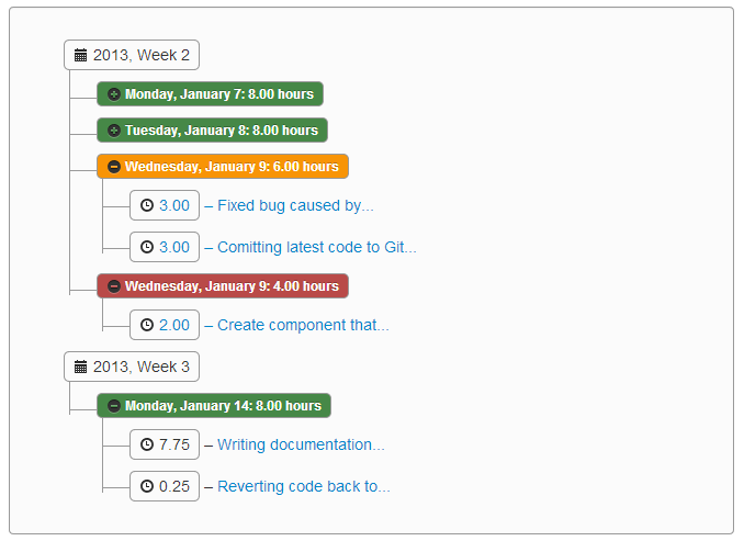
For extra credit, I've created a  GitHub project to host the jQuery and LESS code that goes into adding this tree component to Bootstrap. Please see the project documentation at http://jhfrench.github.io/bootstrap-tree/docs/example.html.
Alternately, here is the LESS source to generate that CSS (the JS can be picked up from the jsFiddle):
@import "../../../external/bootstrap/less/bootstrap.less"; /* substitute your path to the bootstrap.less file */
@import "../../../external/bootstrap/less/responsive.less"; /* optional; substitute your path to the responsive.less file */

/* collapsable tree */
.tree {
    .border-radius(@baseBorderRadius);
    .box-shadow(inset 0 1px 1px rgba(0,0,0,.05));
    background-color: lighten(@grayLighter, 5%);
    border: 1px solid @grayLight;
    margin-bottom: 10px;
    max-height: 300px;
    min-height: 20px;
    overflow-y: auto;
    padding: 19px;
    a {
        display: block;
        overflow: hidden;
        text-overflow: ellipsis;
        width: 90%;
    }
    li {
        list-style-type: none;
        margin: 0px 0;
        padding: 4px 0px 0px 2px;
        position: relative;
        &::before, &::after {
            content: '';
            left: -20px;
            position: absolute;
            right: auto;
        }
        &::before {
            border-left: 1px solid @grayLight;
            bottom: 50px;
            height: 100%;
            top: 0;
            width: 1px;
        }
        &::after {
            border-top: 1px solid @grayLight;
            height: 20px;
            top: 13px;
            width: 23px;
        }
        span {
            -moz-border-radius: 5px;
            -webkit-border-radius: 5px;
            border: 1px solid @grayLight;
            border-radius: 5px;
            display: inline-block;
            line-height: 14px;
            padding: 2px 4px;
            text-decoration: none;
        }
        &.parent_li > span {
            cursor: pointer;
            /*Time for some hover effects*/
            &:hover, &:hover+ul li span {
                background: @grayLighter;
                border: 1px solid @gray;
                color: #000;
            }
        }
        /*Remove connectors after last child*/
        &:last-child::before {
            height: 30px;
        }
    }
    /*Remove connectors before root*/
    > ul > li::before, > ul > li::after {
        border: 0;
    }
}
Tree built with Twitter Bootstrap and Backbone.js?
Here's a Bootstrap tree widget (from "Trees in Twitter Bootstrap"):
Building on Vitaliy's CSS and Mehmet's jQuery, I changed the a tags to span tags and incorporated some Glyphicons and badging into my take on a Bootstrap tree widget.
Example:
For extra credit, I've created a GitHub project to host the jQuery and LESS code that goes into adding this tree component to Bootstrap. Please see the project documentation at http://jhfrench.github.io/bootstrap-tree/docs/example.html.
Alternately, here is the LESS source to generate that CSS (the JS can be picked up from the jsFiddle):
@import "../../../external/bootstrap/less/bootstrap.less"; /* substitute your path to the bootstrap.less file */
@import "../../../external/bootstrap/less/responsive.less"; /* optional; substitute your path to the responsive.less file */

/* collapsable tree */
.tree {
    .border-radius(@baseBorderRadius);
    .box-shadow(inset 0 1px 1px rgba(0,0,0,.05));
    background-color: lighten(@grayLighter, 5%);
    border: 1px solid @grayLight;
    margin-bottom: 10px;
    max-height: 300px;
    min-height: 20px;
    overflow-y: auto;
    padding: 19px;
    a {
        display: block;
        overflow: hidden;
        text-overflow: ellipsis;
        width: 90%;
    }
    li {
        list-style-type: none;
        margin: 0px 0;
        padding: 4px 0px 0px 2px;
        position: relative;
        &::before, &::after {
            content: '';
            left: -20px;
            position: absolute;
            right: auto;
        }
        &::before {
            border-left: 1px solid @grayLight;
            bottom: 50px;
            height: 100%;
            top: 0;
            width: 1px;
        }
        &::after {
            border-top: 1px solid @grayLight;
            height: 20px;
            top: 13px;
            width: 23px;
        }
        span {
            -moz-border-radius: 5px;
            -webkit-border-radius: 5px;
            border: 1px solid @grayLight;
            border-radius: 5px;
            display: inline-block;
            line-height: 14px;
            padding: 2px 4px;
            text-decoration: none;
        }
        &.parent_li > span {
            cursor: pointer;
            /*Time for some hover effects*/
            &:hover, &:hover+ul li span {
                background: @grayLighter;
                border: 1px solid @gray;
                color: #000;
            }
        }
        /*Remove connectors after last child*/
        &:last-child::before {
            height: 30px;
        }
    }
    /*Remove connectors before root*/
    > ul > li::before, > ul > li::after {
        border: 0;
    }
}
How make tree on Twitter Bootstrap background like on Twitter?
Add no-repeat (to prevent repetition), top left (to keep the image at the desired location) and fixed (to keep the image fixed when you scroll):
background: url(http://...) no-repeat top left fixed;
I have written a demo on jsFiddle.
Twitter Bootstrap TreeView Plugin
Take a look at the FuelUX tree
var treeDataSource = new DataSource({
  data: [
    { name: 'Test Folder 1', type: 'folder', additionalParameters: { id: 'F1' } },
    { name: 'Test Folder 2', type: 'folder', additionalParameters: { id: 'F2' } },
    { name: 'Test Item 1', type: 'item', additionalParameters: { id: 'I1' } },
    { name: 'Test Item 2', type: 'item', additionalParameters: { id: 'I2' } },
    { name: 'Test Item 3', type: 'item', additionalParameters: { id: 'I3' } }
  ],
  delay: 400
});
$('#MyTree').tree({dataSource: treeDataSource});
Here is a working example with data source:
http://bootply.com/60761
If you want a folder or item to be selectable, you'll need to look at the methods/events exposed by the control.
fuelux tree with dynamic datasource
Here's a helper method which was provided in the Ace Admin Web App framework I'm using.. makes it very easy to use:
           //IN YOUR DOCUMENT.READY()

            var DataSourceTree = function (options) {
                this.url = options.url;
            }

            DataSourceTree.prototype.data = function (options, callback) {
                var self = this;
                var $data = null;

                var param = null

                if (!("name" in options) && !("type" in options)) {
                    param = 0;//load the first level
                }
                else if ("type" in options && options.type == "folder") {
                    if ("additionalParameters" in options && "children" in options.additionalParameters) {
                        param = options.additionalParameters["id"];
                    }
                }

                if (param != null) {
                    $.ajax({
                        url: this.url,
                        data: 'id=' + param,
                        type: 'POST',
                        dataType: 'json',
                        success: function (response) {
                            if (response.status == "OK")
                                callback({ data: response.data })
                        },
                        error: function (response) {
                            //console.log(response);
                        }
                    })
                }
            };

     $('#[YOURTREEVIEWID]').tree({
            dataSource: new DataSourceTree({ url: '[PATH TO SERVICE]' }),
            multiSelect: false,
            loadingHTML: '<div class="tree-loading"><i class="icon-refresh icon-spin blue"></i></div>',
            'open-icon': 'icon-minus',
            'close-icon': 'icon-plus',
            'selectable': true,
            'selected-icon': 'icon-ok',
            'unselected-icon': 'icon-remove'
        });
The sample Data should be returned something like this:
{"status":"OK","
    data":[
           {"id":1,"name":"label 1","type":"folder","additionalParameters":
                      {"id":1,"children":true,"itemSelected":false}},
           {"id":2,"name":"label 2","type":"item","additionalParameters":
                     {"id":2,"children":false,"itemSelected":false}},
           {"id":3,"name":"label 3","type":"item","additionalParameters":
                    {"id":3,"children":false,"itemSelected":false}}
            ]}
Bootstrap Collapse Tree View with Tree Levels (using CSS)
CSS Counters
The following tree pattern needs the counter-reset and counter-increment assigned to an ancestor element that all counter() of the particular level.
1_______1 = #acc1 { counter-reset: A 0; counter-increment: A; }
    |
    2     = #acc2 { counter-reset: B 1; counter-increment: B; }
 3__|__3  = #acc3 { counter-reset: C 2; counter-increment: C; }
 |
 4        = #acc4 { counter-reset: D 3; counter-increment: D; }
Note: the default value of
counter-resetis0and explicitly assigning it is optional. It is assigned in the example to show the increment pattern.
The rule set for the counter() on each level uses the child combinator: > because without it the last rule set will override the previous ones because each level is nested within the other. The following pattern will isolate each level:
#accN > .card > .card-header > h5 > button:before { content: counter(...); }
Bootstrap
The HTML layout and some of the BS classes were either missing or assigned in the wrong order. Bootstrap examples in the documentation uses a ton of <div>s which makes nesting elements several levels deep very difficult. The following demo uses <section> and <article> to break up the monotony. Also, proper placement of BS classes are implemented in the demo as well (see sections on card and accordion components).
Demo
body {
  overflow-y: scroll
}

#acc1 {
  counter-reset: A;
  counter-increment: A;
}

#acc1>.card>.card-header>h5>button:before {
  content: counter(A);
}

#acc2 {
  counter-reset: B 1;
  counter-increment: B;
}

#acc2>.card>.card-header>h5>button:before {
  content: counter(B);
}

#acc3 {
  counter-reset: C 2;
  counter-increment: C;
}

#acc3>.card>.card-header>h5>button:before {
  content: counter(C);
}

#acc4 {
  counter-reset: D 3;
  counter-increment: D;
}

#acc4>.card>.card-header>h5>button:before {
  content: counter(D);
}
<link href="https://stackpath.bootstrapcdn.com/bootstrap/4.1.3/css/bootstrap.min.css" rel="stylesheet" />
<main class='container'>
<div class='row'>
<div class='col-sm-12'>
<section id="acc1" class="accordion">
<article class="card">
<header id='hdr1a' class="card-header">
<h5 class="mb-0"><button class="btn btn-block btn-dark collapsed" type="button" data-toggle="collapse" data-target="#col1a" aria-expanded="true" aria-controls="col1a"></button></h5>
</header>
<section id="col1a" class="collapse hide" aria-labelledby="hdr1a" data-parent="#acc1">
<div class="card-body">
<p class='card-text'>Lorem ipsum dolor sit amet, consectetur adipisicing elit, sed do eiusmod tempor incididunt ut labore et dolore magna aliqua. Ut enim ad minim veniam, quis nostrud exercitation ullamco laboris nisi ut aliquip ex ea commodo consequat.</p>
<p class='card-text'>Duis aute irure dolor in reprehenderit in voluptate velit esse cillum dolore eu fugiat nulla pariatur. Excepteur sint occaecat cupidatat non proident, sunt in culpa qui officia deserunt mollit anim id est laborum.</p>
</div>
<footer class='card-footer'>
<section id="acc2" class="accordion">
<article class="card">
<header id='hdr2' class="card-header">
<h5 class="mb-0"><button class="btn btn-block btn-dark collapsed" type="button" data-toggle="collapse" data-target="#col2" aria-expanded="true" aria-controls="col2"></button></h5>
</header>
<section id="col2" class="collapse hide" aria-labelledby="hdr2" data-parent="#acc2">
<div class="card-body">
<p class='card-text'>Lorem ipsum dolor sit amet, consectetur adipisicing elit, sed do eiusmod tempor incididunt ut labore et dolore magna aliqua. Ut enim ad minim veniam, quis nostrud exercitation ullamco laboris nisi ut aliquip ex ea commodo consequat.</p>
<p class='card-text'>Duis aute irure dolor in reprehenderit in voluptate velit esse cillum dolore eu fugiat nulla pariatur. Excepteur sint occaecat cupidatat non proident, sunt in culpa qui officia deserunt mollit anim id est laborum.</p>
</div>
<footer class='card-footer'>
<section id="acc3" class="accordion">
<article class="card">
<header id='hdr3a' class="card-header">
<h5 class="mb-0"><button class="btn btn-block btn-dark collapsed" type="button" data-toggle="collapse" data-target="#col3a" aria-expanded="true" aria-controls="col3a"></button></h5>
</header>
<section id="col3a" class="collapse hide" aria-labelledby="hdr3a" data-parent="#acc3">
<div class="card-body">
<p class='card-text'>Lorem ipsum dolor sit amet, consectetur adipisicing elit, sed do eiusmod tempor incididunt ut labore et dolore magna aliqua. Ut enim ad minim veniam, quis nostrud exercitation ullamco laboris nisi ut aliquip ex ea commodo consequat.</p>
<p class='card-text'>Duis aute irure dolor in reprehenderit in voluptate velit esse cillum dolore eu fugiat nulla pariatur. Excepteur sint occaecat cupidatat non proident, sunt in culpa qui officia deserunt mollit anim id est laborum.</p>
</div>
<footer class='card-footer'>
<section id="acc4" class="accordion">
<article class="card">
<header id='hdr4' class="card-header">
<h5 class="mb-0"><button class="btn btn-block btn-dark collapsed" type="button" data-toggle="collapse" data-target="#col4" aria-expanded="true" aria-controls="col4"></button></h5>
</header>
<section id="col4" class="collapse hide" aria-labelledby="hdr4" data-parent="#acc4">
<div class="card-body">
<p class='card-text'>Lorem ipsum dolor sit amet, consectetur adipisicing elit, sed do eiusmod tempor incididunt ut labore et dolore magna aliqua. Ut enim ad minim veniam, quis nostrud exercitation ullamco laboris nisi ut aliquip ex ea commodo consequat.</p>
<p class='card-text'>Duis aute irure dolor in reprehenderit in voluptate velit esse cillum dolore eu fugiat nulla pariatur. Excepteur sint occaecat cupidatat non proident, sunt in culpa qui officia deserunt mollit anim id est laborum.</p>
</div>
<footer class='card-footer'></footer>
</section>
</article>
</section>
</footer>
</section>
</article>
<article class="card">
<header id='hdr3b' class="card-header">
<h5 class="mb-0"><button class="btn btn-block btn-dark collapsed" type="button" data-toggle="collapse" data-target="#col3b" aria-expanded="true" aria-controls="col3b"></button></h5>
</header>
<section id="col3b" class="collapse hide" aria-labelledby="hdr3b" data-parent="#acc3">
<div class="card-body">
<p class='card-text'>Lorem ipsum dolor sit amet, consectetur adipisicing elit, sed do eiusmod tempor incididunt ut labore et dolore magna aliqua. Ut enim ad minim veniam, quis nostrud exercitation ullamco laboris nisi ut aliquip ex ea commodo consequat.</p>
<p class='card-text'>Duis aute irure dolor in reprehenderit in voluptate velit esse cillum dolore eu fugiat nulla pariatur. Excepteur sint occaecat cupidatat non proident, sunt in culpa qui officia deserunt mollit anim id est laborum.</p>
</div>
<footer class='card-footer'></footer>
</section>
</article>
</section>
</footer>
</section>
</article>
</section>
</footer>
</section>
</article>
<article class="card">
<header id='hdr1b' class="card-header">
<h5 class="mb-0"><button class="btn btn-block btn-dark collapsed" type="button" data-toggle="collapse" data-target="#col1b" aria-expanded="true" aria-controls="col1b"></button></h5>
</header>
<section id="col1b" class="collapse hide" aria-labelledby="hdr1b" data-parent="#acc1">
<div class="card-body">
<p class='card-text'>Lorem ipsum dolor sit amet, consectetur adipisicing elit, sed do eiusmod tempor incididunt ut labore et dolore magna aliqua. Ut enim ad minim veniam, quis nostrud exercitation ullamco laboris nisi ut aliquip ex ea commodo consequat.</p>
<p class='card-text'>Duis aute irure dolor in reprehenderit in voluptate velit esse cillum dolore eu fugiat nulla pariatur. Excepteur sint occaecat cupidatat non proident, sunt in culpa qui officia deserunt mollit anim id est laborum.</p>
</div>
<footer class='card-footer'></footer>
</section>
</article>
</section>
</div>
</div>
</main>
<script src="https://cdnjs.cloudflare.com/ajax/libs/jquery/3.3.1/jquery.min.js"></script>
<script src="https://stackpath.bootstrapcdn.com/bootstrap/4.1.3/js/bootstrap.min.js"></script>
<script src="https://cdnjs.cloudflare.com/ajax/libs/popper.js/1.14.3/umd/popper.min.js"></script>Related Topics
How to Check If a Variable Is an Array in JavaScript
Is the JavaScript Date Object Always One Day Off
Getting JavaScript Object Key List
How to Make Console.Log Show the Current State of an Object
Why This JavaScript Regex Doesn't Work
Check If an Array Contains Any Element of Another Array in JavaScript
Ecmascript Template Literals Like 'Some ${String}' Are Not Working
Graph Visualization Library in JavaScript
Why Is It Necessary to Set the Prototype Constructor
Calling a Parent Window Function from an Iframe
How to Parse a CSV String With JavaScript, Which Contains Comma in Data
How to Match a Whole Word in JavaScript
How to Remove Item from Array by Value
For Loop For Htmlcollection Elements
Merge Two Array of Objects Based on a Key
JavaScript Function to Add X Months to a Date
Is There a JavaScript Function That Can Pad a String to Get to a Determined Length