Sticky Header Flickering on Safari Desktop Only When Anchor Scrolling
position: fixed does not work well in ios is a know issue. Seem like it is not fixed till now. Setting translate3d(0,0,0) for element is a walk around but it is not perfect. It is still weird when you scroll. So my advice is using position: absolute instead. Just move your bar out of your content container, then give it position: absolute. See the code snipet below:
html,body {  width: 100%;  height: 100%;  margin: 0;  padding: 0;}
.fixed-bar {  position: absolute;  top: 0;  left: 0;  width: 100%;  height: 50px;  background-color: #123;  color: #FFF;  text-align: center;  line-height: 50px;  z-index: 1;}
.content {  background-color: #ddd;  color: #333;  width: 100%;  padding-top: 50px;  position: absolute;  top: 0;  left: 0;  right: 0;  bottom: 0;  overflow: auto;}
.item {  width: 100%;  text-align: center;  height: 200px;  height: 30vh;  padding-top: 10vh;}
<div class="fixed-bar"> I am a fixed bar</div><div class="content"> <div class="item"> Your content goes here </div> <div class="item"> Your content goes here </div> <div class="item"> Your content goes here </div> <div class="item"> Your content goes here </div> <div class="item"> Your content goes here </div></div>Sticky nav bar flickers when scrolling slowly
In order to make it works, please make the next things:
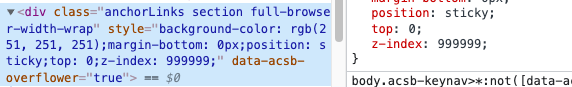
- Add position sticky (and other styles) to this element:
2A. Remove the code that toggle between .affix and .affix-top
OR:
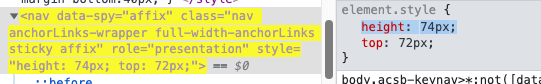
2B 1. If you can't do step 2A, you can add this height instead (in order to make affix and affix-top to be with the same height):
2B 2. Remove position: fixed from affix and position static from affix-top (they don't need positions cause we set position to their parent)
In addition, I don't know if it's third party code or not but please try to not use !important property. It's hard to set style for those elements.
Sticky header animating in from the left on Safari
Being on Linux I can't test this, but I suspect your header being the
problem. See, you're giving.header-home.stickyawidthof100%
and aposition:fixed, but it has no horizontal starting point, so
it just animates it from the left. Adding:.header-home.sticky {
left: 0;
right: 0;
}
Would make a lot of sense to me.
This doesn't work indeed. Actually at work now and since we have OS X I decided to test it for you. This does in fact work!
.header.header-home {
   width: 100%;
}
Make Sticky header of web page in Safari on iPad
In fact all you need to address this issue for iOS devices (iPad, iPhone, etc) is to add the following to your CSS:
#container {
  position:fixed;
  top:120px;
  bottom:0px;
  overflow:auto;
}
This example is assuming that:
- the part you want to scroll starts 120px below your header (ie the
header will be 120px high) - the div you want to have scrolling has an id='container'
- you will use 2 fingers to scroll it. If you use one finger then the
header will move as well.
This actually is pretty cool on iPad as it gives the user a choice (move the whole thing or keep the header visible by using one or two fingers). It also works for footers (change bottom value).
Finally note that this is for "Apple" browsers (I successfully tested it on iPad and Mac Safari and Chrome) so if you want to support something else you WILL have to create different codes using something like :
if (navigator.userAgent.match("Apple") == null) {
    /* use a different container id */
}
Edit on Oct 7, 2011: Thx to chris-barr.com I found this solution. Simply add this code:
<script>
function touchScroll(id){
    var el=document.getElementById(id);
    var scrollStartPos=0;

    document.getElementById(id).addEventListener("touchstart", function(event) {
        scrollStartPos=this.scrollTop+event.touches[0].pageY;
        event.preventDefault();
    },false);

    document.getElementById(id).addEventListener("touchmove", function(event) {
        this.scrollTop=scrollStartPos-event.touches[0].pageY;
        event.preventDefault();
    },false);
}
</script>

<body onload="touchScroll('container')">
and it will work in iOS (iPhone, iPad) AND Android WITH ONLY ONE FINGER !!!
Related Topics
Getting Last-Child of a Div in IE8
Bootstrap 3 > Trying to Create Columns with Equal Heights
Remove Url and Print Text from the Printed Page
How to Add a Drop Shadow to Chart.Js Line Chart
Tinymce: How to Display All Toolbars on a Single Row
How to Add Alpha Filter to Any HTML Element and Keep the Other Filters in Ie
Android Keyboard Shrinking the Viewport and Elements Using Unit Vh in CSS
Remove CSS Rules by JavaScript
Listing Known CSS Classes Using JavaScript
Image Slider: Maintaining Equal Height for All Images While Keeping Slider Responsive
How to Add a Classname to a CSS Variable
Skycons, Cant Display the Same Icon Twice
Color Every Character Differently
Angular 2 - How to Dynamically Change an Entire CSS Stylesheet Based on Url Queryparams