HTML - How do I generate a progress bar circle with a percentage in and set the value with JS or jQuery?
You might be looking for this one
var svg ;
function drawProgress(end){ d3.select("svg").remove()   if(svg){  svg.selectAll("*").remove();  }var wrapper = document.getElementById('radialprogress');var start = 0; var colours = {  fill: '#FF0000',  track: '#555555',  text: '#00C0FF',  stroke: '#FFFFFF',}
var radius = 80;var border = 12;var strokeSpacing = 4;var endAngle = Math.PI * 2;var formatText = d3.format('.0%');var boxSize = radius * 2;var count = end;var progress = start;var step = end < start ? -0.01 : 0.01;
//Define the circlevar circle = d3.svg.arc()  .startAngle(0)  .innerRadius(radius)  .outerRadius(radius - border);
//setup SVG wrappersvg = d3.select(wrapper)  .append('svg')  .attr('width', boxSize)  .attr('height', boxSize);
  // ADD Group containervar g = svg.append('g')  .attr('transform', 'translate(' + boxSize / 2 + ',' + boxSize / 2 + ')');
//Setup trackvar track = g.append('g').attr('class', 'radial-progress');track.append('path')  .attr('fill', colours.track)  .attr('stroke', colours.stroke)  .attr('stroke-width', strokeSpacing + 'px')  .attr('d', circle.endAngle(endAngle));
//Add colour fillvar value = track.append('path')  .attr('fill', colours.fill)  .attr('stroke', colours.stroke)  .attr('stroke-width', strokeSpacing + 'px');
//Add text valuevar numberText = track.append('text')  .attr('fill', colours.text)  .attr('text-anchor', 'middle')  .attr('dy', '.5rem');
  //update position of endAngle  value.attr('d', circle.endAngle(endAngle * end));  //update text value  numberText.text(formatText(end));  }
$('#submitClick').click(function(){  var val = parseInt($('#percent').val());   drawProgress(val/100)}) drawProgress(10/100)
<script src="https://cdnjs.cloudflare.com/ajax/libs/d3/3.4.11/d3.min.js"></script><script src="https://ajax.googleapis.com/ajax/libs/jquery/2.1.1/jquery.min.js"></script>
<label for="percent">Type a percent!</label><input id="percent" name="percent" value=10><button id='submitClick' name='submitButton' >Render</button>
<div id="radialprogress" </div> calculate percentage in progress circle
To have the progress circle redraw when the values are changed simply call the drawProgress() function within the input event handler.
Also note that there's a couple of other improvements you can make to the code:
- remove nested document.ready
- delegate is deprecated, use on instead
$('#percent').text()should be$('#percent').val(), and I would assume1000in the condition on that line should be100instead.
jQuery($ => {
  $('#submitClick').click(function() {
    var val = parseInt($('#percent').val());
    drawProgress(val / 100);
  }).trigger('click');

  $(".tags").on('input', function() {
    // needlessly using 2 loops here, amended
    //var calculated_total_sum = $(this).find(".ingredient:checked").map((i, el) => parseFloat($(el).closest("div").find(".txtCal").val())).get().reduce((a, b) => a + b) || 0;
    var calculated_total_sum = 0;
    $(this).find('div:has(.ingredient:checked) .txtCal').each((i, el) => calculated_total_sum += parseFloat(el.value));

    $("#percent")
      .val(calculated_total_sum)
      .css('color', parseFloat($("#percent").val()) > 1000 ? 'red' : 'green');

    drawProgress(calculated_total_sum / 100);
  });

  // ingrédients allergènes
  $('div.tags').on('change', 'input:checkbox', function() {
    $(this).parent().nextAll().slice(0, 2).hide().val('0');
    var list = $('.results > li').hide();

    $('input:checked').each(function() {
      list.filter('.' + $(this).attr('rel')).show();
      $(this).parent().nextAll().slice(0, 2).show();
    });
  }).find('input:checkbox').change();

  $(".tags").on('input', '.txtCal', function() {
    var calculated_total_sum = 0;
    $(".tags .txtCal").each(function() {
      var get_textbox_value = $(this).val();
      if ($.isNumeric(get_textbox_value)) {
        calculated_total_sum += parseFloat(get_textbox_value);
      }
    });
    $("#percent").val(calculated_total_sum);
  });

  var svg;

  function drawProgress(end) {
    d3.select("svg").remove()
    if (svg) {
      svg.selectAll("*").remove();
    }
    var wrapper = document.getElementById('radialprogress');
    var start = 0;

    var colours = {
      fill: '#FF0000',
      track: '#555555',
      text: '#00C0FF',
      stroke: '#FFFFFF',
    }

    var radius = 80;
    var border = 12;
    var strokeSpacing = 4;
    var endAngle = Math.PI * 2;
    var formatText = d3.format('.0%');
    var boxSize = radius * 2;
    var count = end;
    var progress = start;
    var step = end < start ? -0.01 : 0.01;

    //Define the circle
    var circle = d3.svg.arc()
      .startAngle(0)
      .innerRadius(radius)
      .outerRadius(radius - border);

    //setup SVG wrapper
    svg = d3.select(wrapper)
      .append('svg')
      .attr('width', boxSize)
      .attr('height', boxSize);

    // ADD Group container
    var g = svg.append('g')
      .attr('transform', 'translate(' + boxSize / 2 + ',' + boxSize / 2 + ')');

    //Setup track
    var track = g.append('g').attr('class', 'radial-progress');
    track.append('path')
      .attr('fill', colours.track)
      .attr('stroke', colours.stroke)
      .attr('stroke-width', strokeSpacing + 'px')
      .attr('d', circle.endAngle(endAngle));

    //Add colour fill
    var value = track.append('path')
      .attr('fill', colours.fill)
      .attr('stroke', colours.stroke)
      .attr('stroke-width', strokeSpacing + 'px');

    //Add text value
    var numberText = track.append('text')
      .attr('fill', colours.text)
      .attr('text-anchor', 'middle')
      .attr('dy', '.5rem');

    //update position of endAngle
    value.attr('d', circle.endAngle(endAngle * end));
    //update text value
    numberText.text(formatText(end));
  }
});
<div class="tags">
<div>
<label><input type="checkbox" checked rel="ingredient-1" class="ingredient"> ingredient 1 </label><br><input type="text" class='txtCal' /><br>
</div>
<div>
<label><input type="checkbox" checked rel="ingredient-2" class="ingredient"> ingredient 2 </label><br><input type="text" class='txtCal' /><br>
</div>
<div>
<label><input type="checkbox" checked rel="ingredient-3" class="ingredient"> ingredient 3 </label><br><input type="text" class='txtCal' /><br>
</div>
<span><b>TOTAL :</b></span><b><span id="total_sum_value"></span></b>
<label for="percent">Type a percent!</label>
<input id="percent" name="percent" value="0">
<button id='submitClick' name='submitButton'>Render</button>
<div id="radialprogress"></div>
</div>
<ul class="results">
<li class="ingredient-1 ingredient-3">Alpha isomethylionone</li>
<li class="ingredient-1">Amyl cinnamal (Jasmonal A)</li>
<li class="ingredient-1">Amylcinnamyl alcohol</li>
<li class="ingredient-1">Anisyl alcohol</li>
<li class="ingredient-1 ingredient-2">Benzyl alcohol</li>
<li class="ingredient-1 ingredient-2 ingredient-3">Benzyl benzoate</li>
<li class="ingredient-2">Benzyl cinnamate</li>
<li class="ingredient-2">Benzyl salicylate</li>
<li class="ingredient-2">Butylphenyl methylpropional (Lilial)</li>
<li class="ingredient-2 ingredient-3">Cinnamal</li>
<li class="ingredient-3">Cinnamyl alcohol</li>
<li class="ingredient-3">Citral</li>
<li class="ingredient-3">Citronellol</li>
<li class="ingredient-3">Coumarin</li>
</ul>
<script src="https://cdnjs.cloudflare.com/ajax/libs/d3/3.4.11/d3.min.js"></script>
<script src="https://ajax.googleapis.com/ajax/libs/jquery/2.1.1/jquery.min.js"></script>How do I create a circular progress bar that I can change the total amount from 100% to any other value?
I have forked your Codepen reference to make it fit your requirement.
pass current percentage and total percentage value to the function progressBar.
Example: progressBar(10,200);
I hope this resolves your problem: https://codepen.io/sheikzm/pen/BeyXpz
How to make a percentage circle using using html and css only with percentage written inside
I think this codepen link might help you by Andre Firchow. Although it uses SCSS
HTML
<div class="wrapper">
  <div class="c100 p99 blue">
      <span>90%</span>
      <div class="slice">
        <div class="bar"></div>
        <div class="fill"></div>
      </div>
  </div>
  <div class="c100 p75 pink">
      <span>75%</span>
      <div class="slice">
        <div class="bar"></div>
        <div class="fill"></div>
      </div>
  </div>
  <div class="c100 p70 green">
      <span>70%</span>
      <div class="slice">
        <div class="bar"></div>
        <div class="fill"></div>
      </div>
  </div>
  <div class="c100 p85 orange">
      <span>85%</span>
      <div class="slice">
        <div class="bar"></div>
        <div class="fill"></div>
      </div>
  </div>
</div>
CSS
// Compass utilities
@import "compass";
@import url('https://fonts.googleapis.com/css?family=Titillium+Web:200,200i,300,300i,400,400i,600,600i,700,700i,900');

body {
    font-family: "Titillium Web", sans-serif;
    margin: 0 auto;
}

// VARS
$circle-width: 0.09em;
$circle-width-hover: 0.07em;

// colors default
$primary-color: #000000; // czarny
$secondary-color: #dfe8ed; //szary bcg
$bg-color: #ffffff; //srodkowy bezowy

// colors customized
$primary-color-blue: #30bae7;
$primary-color-green: #15c7a8;
$primary-color-orange: #eb7d4b;
$primary-color-pink: #d74680;
$primary-color-span: #3c4761;

// CIRCLE
// classes 2 extend
.rect-auto{
    clip: rect(auto, auto, auto, auto);
}

.pie {
    position: absolute;
    border: $circle-width solid $primary-color;
    width: 1 - (2 * $circle-width);
    height: 1 - (2 * $circle-width);
    clip: rect(0em, 0.5em, 1em, 0em);
    border-radius: 50%;
    @include rotate(0deg);
}

.pie-fill {
    @include rotate(180deg);
}
.wrapper {
  width: 1200px;
  margin: 0 auto;
}

// main
.c100 {

    *, *:before, *:after {
        @include box-sizing(content-box);
    }

    position: relative;
    font-size: 160px;
    width: 1em;
    height: 1em;
    border-radius: 50%;
    float: left;
    margin: 0.4em;
    background-color: $secondary-color;

    // centered value inside circle
    > span {
        position: absolute;
        width: 100%;
        z-index: 1;
        left: 0;
        top: 0;
        width: 5em;
        line-height: 5em;
        font-size: 0.2em;
        color: $primary-color-span;
        display: block;
        text-align: center;
        white-space: nowrap;
        @include transition-property(all);
        @include transition-duration(0.2s);
        @include transition-timing-function(ease-out);
    }

    // background inside the circle
    &:after{
        position: absolute;
        top: $circle-width;
        left: $circle-width;
        display: block;
        content: " ";
        border-radius: 50%;
        background-color: $bg-color;
        width: 1 - (2 * $circle-width);
        height: 1 - (2 * $circle-width);
        @include transition-property(all);
        @include transition-duration(0.2s);
        @include transition-timing-function(ease-in);

    }

    // the slice (mask)
    .slice {
        position: absolute;
        width: 1em;
        height: 1em;
        clip: rect(0em, 1em, 1em, 0.5em);
    }

    // circle to show the status
    .bar {
        @extend .pie;
    }

    // loop to create all needed elements automatically
    @for $j from 51 through 100 {

        &.p#{$j} .slice {
            @extend .rect-auto;
        }

        &.p#{$j} .bar:after{
            @extend .pie-fill;
        }

        &.p#{$j} .fill{
            @extend .pie;
            @extend .pie-fill;
        }

    }

    // loop to rotate all 100 circles
    @for $j from 1 through 100 {
        &.p#{$j} .bar {
            @include rotate((360/100*$j) + deg);
        }
    }

    // hover styles
    &:hover{

        cursor: default;

        > span {
            width: 3.33em;
            line-height: 3.33em;
            font-size: 0.3em;
            color: $primary-color-span;
        }

        &:after{
            top: $circle-width-hover;
            left: $circle-width-hover;
            width: 1 - (2 * $circle-width-hover);
            height: 1 - (2 * $circle-width-hover);
        }

    }

    // blue
    &.blue{

        .bar, .fill { border-color: $primary-color-blue !important;}

        &:hover{
            > span { color: $primary-color-span;}
        }

    }

    // pink skin
    &.pink{

        .bar, .fill { border-color: $primary-color-pink !important;}

        &:hover{
            > span { color: $primary-color-span;}
        }

    }

    // green skin
    &.green{

        .bar, .fill { border-color: $primary-color-green !important;}

        &:hover{
            > span { color: $primary-color-span;}
        }

    }

    // orange skin
    &.orange{

        .bar, .fill { border-color: $primary-color-orange !important;}

        &:hover{
            > span { color: $primary-color-span;}
        }

    }

}
CSS / jQuery: Dynamically updated text appears right of instead of inside circular progress bar
Two problems. First, you are missing some CSS for the demo to work. The demo links to a page-styles.css file that contains some CSS for the circles. And that brings up the second problem. Even if you just pasted the CSS, it wouldn't work "as-is" because circle needs to be its own class. In your markup and code, you combined two classes by adding an underscore between first and circle:
<div class="first_circle">
Instead of:
<div class="first circle">
So for your way to work, you'll either need to modify the CSS, or just separate the classes.
Here's an example with the appropriate CSS added (I just copied the relevant CSS from the page-styles.css file, not the entire thing):
$(document).ready(function() {
  $('.first.circle').circleProgress({
    value: 0.35,
    animation: false,
    fill: {
      gradient: ['#ff1e41', '#ff5f43']
    }
  });
  $('.second.circle').circleProgress({
    value: 0.6
  }).on('circle-animation-progress', function(event, progress) {
    $(this).find('strong').html(parseInt(100 * progress) + '<i>%</i>');
  });
  $('.third.circle').circleProgress({
    value: 0.8,
    fill: {
      gradient: ['#0681c4', '#07c6c1']
    }
  }).on('circle-animation-progress', function(event, progress, stepValue) {
    $(this).find('strong').text(String(stepValue.toFixed(2)).substr(1));
  });
  $('.forth.circle').circleProgress({
    startAngle: -Math.PI / 4 * 3,
    value: .5,
    fill: {
      color: '#ffa500'
    }
  });
  $('.fifth.circle').circleProgress({
    value: 1,
    size: 60,
    thickness: 20,
    fill: {
      color: 'lime'
    }
  });
});
.circle {
width: 100px;
margin: 6px 6px 20px;
display: inline-block;
position: relative;
text-align: center;
line-height: 1.2;
}
.circle canvas {
vertical-align: top;
}
.circle strong {
position: absolute;
top: 30px;
left: 0;
width: 100%;
text-align: center;
line-height: 40px;
font-size: 30px;
}
.circle strong i {
font-style: normal;
font-size: 0.6em;
font-weight: normal;
}
.circle span {
display: block;
color: #aaa;
margin-top: 12px;
}<script src="https://ajax.googleapis.com/ajax/libs/jquery/1.11.1/jquery.min.js"></script>
<script src="https://www.jqueryscript.net/demo/Animated-Circular-Progress-Bar-with-jQuery-Canvas-Circle-Progress/dist/circle-progress.js"></script>
<div class="circles">
<div class="first circle">
<span>no <br/> animation</span>
</div>
<div class="second circle">
<strong></strong>
<span>animation <br/> progress</span>
</div>
<div class="third circle">
<strong></strong>
<span>value <br/> progress</span>
</div>
<div class="forth circle">
<span>solid fill, <br/> custom angle</span>
</div>
<div class="fifth circle">
<span>image fill, <br/> custom sizes</span>
</div>
</div>Radial progress bar
Two things may help you fix the issue.
First, the method document.getElementById() returns a DOM element that doesn't have a method getElementById, meaning that it cannot get called twice in a row like that. Also, ia-radial red1 are two class names, rather than ID names, so getElementById won't succeed in selecting <div class="ia-radial red1">. The best way to get around this, is to use one ID name per div in the document, which is the conventional way. Try setting <div id="precent"> to <div class="precent"> (and also don't forget to change #precent to .precent in the CSS file). Then assign a specific ID to both divs (e.g. id="precent1" and id="precent2"). Then you can select a div with document.getElementById('precent1').innerHTML = HappyCity;.
Second, the jQuery part gets called only once, when the page loads. You need to call it again after innerHTML is changed. Try wrapping it in a function like so, and adding an input idName so you can call the function on a particular element:
function updateProgressBar(idName) {
  $('.ia-radial').each(function(){
  var utilslider = parseInt($(this).find("#"+idName).html()), // Note the idName
    circle = $(this).find("#pie"),
    radius = parseInt(circle.attr('r')),
    circumf= 2 * radius * Math.PI,
    percentV = (utilslider / 100) * circumf;

    circle.css('strokeDasharray', percentV + " " + circumf);
  });
}
Now, putting the two things together, you can update each element like so:
updateProgressBar("precent1");

document.getElementById('precent1').innerHTML = HappyCity;

// Update progress bar after changing innerHTML
updateProgressBar("precent1");
Jquery Circle progress bar value more than 100%
Sometimes things are not as tidy as you imagine..
var value = 120$(document).ready(function() { $("#test-circle").circliful({ animationStep: 5, foregroundBorderWidth: 15, backgroundBorderWidth: 15, percent: value, }); if(value > 100){ var extra = value - 100; $("#test-circle-time").circliful({ animationStep: 5, foregroundBorderWidth: 0, backgroundBorderWidth: 0, percent: 100, percentageTextSize:0 },function(){ $("#test-circle-extra").circliful({ animationStep: 5, foregroundBorderWidth: 8, backgroundBorderWidth: 8, percent: extra, backgroundColor: "none", foregroundColor:'#a33', percentageTextSize:0 }); }); }});#circle-container{ postition:relative;}#circle-container > div{ position:absolute; top:0; left:0; width:200px;}<script src="https://ajax.googleapis.com/ajax/libs/jquery/2.1.1/jquery.min.js"></script><script src="https://cdnjs.cloudflare.com/ajax/libs/circliful/1.0.2/js/jquery.circliful.min.js"></script><div id="circle-container"> <div id="test-circle"></div> <div id="test-circle-time"></div> <div id="test-circle-extra"></div></div>jQuery circle progress bar and percentage text animation when screen visible
Ok, It was a pretty good experience. I've solved the problem by using jquery.appear plugin. I've insert my full code into this portion of code:
    var el = $('.circle'),
        inited = false;

    el.appear({ force_process: true });

    el.on('appear', function() {
      if (!inited) {
        el.circleProgress({ value: 0.7 });
        inited = true;
      }
    });
It's a nice plugin, which execute the code when the div(in my case .thirdDiv) on screen. My full JS code is below:
    var el = $('.thirdDiv'),
        inited = false;

    el.appear({ force_process: true });

    el.on('appear', function() {
      if (!inited) {
        $("#circle1").circleProgress({
        value: 0.7,
        size: 100,
        fill: {
          gradient: [ "#FD0000" , "#FD7300", "#FDBD00"]
            }
        });

        $("#circle2").circleProgress({
        value: 0.90,
        size: 100,
        fill: {
          gradient: ["#00B050", "#00CA00", "#9EEC00"]
        }
      });

      $("#circle3").circleProgress({
        value: 0.80,
        size: 100,
        fill: {
          gradient: ["#FDFD00", "#FDE700", "#CDF500"]
        }
      });

      $("#circle4").circleProgress({
        value: 0.70,
        size: 100,
        fill: {
          gradient: ["#123FAA", "#3914AE", "#0B63A3"]
        }
      });

        inited = true;
      }

});
Thanks everybody :)
Circular percent progress bar
Considering the shape of the progress bar (rounded end/start) I would suggest using SVG.
DEMO: Radial progress bar
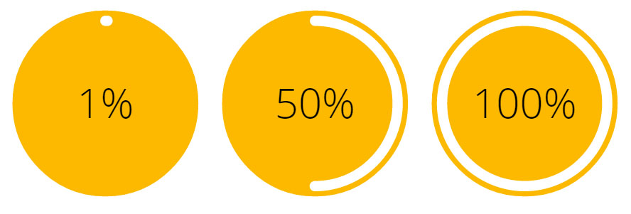
In the following example, the progress is animated with the stroke-dasarray attribute and the % numbers are incremented with jQuery:
var count = $(('#count'));
$({ Counter: 0 }).animate({ Counter: count.text() }, {
  duration: 5000,
  easing: 'linear',
  step: function () {
    count.text(Math.ceil(this.Counter)+ "%");
  }
});
body{text-align:center;font-family: 'Open Sans', sans-serif;}
svg{width:25%;}<script src="https://ajax.googleapis.com/ajax/libs/jquery/2.1.1/jquery.min.js"></script>
<svg id="animated" viewbox="0 0 100 100">
<circle cx="50" cy="50" r="45" fill="#FDB900"/>
<path fill="none" stroke-linecap="round" stroke-width="5" stroke="#fff"
stroke-dasharray="251.2,0"
d="M50 10
a 40 40 0 0 1 0 80
a 40 40 0 0 1 0 -80">
<animate attributeName="stroke-dasharray" from="0,251.2" to="251.2,0" dur="5s"/>
</path>
<text id="count" x="50" y="50" text-anchor="middle" dy="7" font-size="20">100%</text>
</svg>Related Topics
JavaScript Change Background Color on Click
When Loading an HTML Page via Ajax, Will Script Tags Be Loaded
Js: Get Array of All Selected Nodes in Contenteditable Div
Why Browser Is Returning Empty String on Style.Height ? How to Get Actual Height of an Element
How to Declare Hash.New(0) with 0 Default Value for Counting Objects in JavaScript
Sorting HTML Table with JavaScript
Declaring JavaScript Object Method in Constructor Function VS. in Prototype
How to Split a Long Array into Smaller Arrays, with JavaScript
Es6/Es2015 Object Destructuring and Changing Target Variable
How to Save and Restore a File Object in Local Storage
Browsers Automatically Evaluate Hex or Hsl Colors to Rgb When Setting via Element.Style.Background
Jquery CSS Rendering - Works in Firefox, Not in Chrome
Accessing JavaScript Variable from Ruby
How to Get First and Last Day of the Current Week in JavaScript