css blur effect on a live background
// Js only for drag the articles$(function() { $( "article" ).draggable();});html { background: url(https://2.bp.blogspot.com/-LwilPQw9Zc0/Unzm09oXDxI/AAAAAAAAHwo/30a7ZqSp3jE/s1600/blur-static+.jpg) no-repeat 50% fixed; background-size: cover;}body { width: 100%; min-height: 100%; background: inherit; overflow: hidden;}article { background: inherit; position: relative; width: 60%; margin: 10vh auto 15vh; border-radius: 15px; border: 10px solid rgba(255,255,255,.15); box-shadow: 1px 1px 4px rgba(0,0,0,.3); z-index: 5; font-size: 1.4rem; cursor: move;}article:before { content: ''; position: absolute; top: 0; left:0; right:0; bottom:0; background: inherit; filter: blur(5px); -webkit-filter: blur(6px); -moz-filter: blur(6px); -o-filter: blur(6px); -ms-filter: blur(6px); filter: url(#blur);filter:progid:DXImageTransform.Microsoft.Blur(PixelRadius='6');}<article><h2>Blur effect</h2></article>
<svg version="1.1" xmlns='http://www.w3.org/2000/svg'> <filter id='blur'> <feGaussianBlur stdDeviation='6' /> </filter></svg>
<script src="https://code.jquery.com/jquery-1.10.2.js"></script><script src="https://code.jquery.com/ui/1.10.4/jquery-ui.js"></script>How to create a frosted glass effect using CSS?
CSS
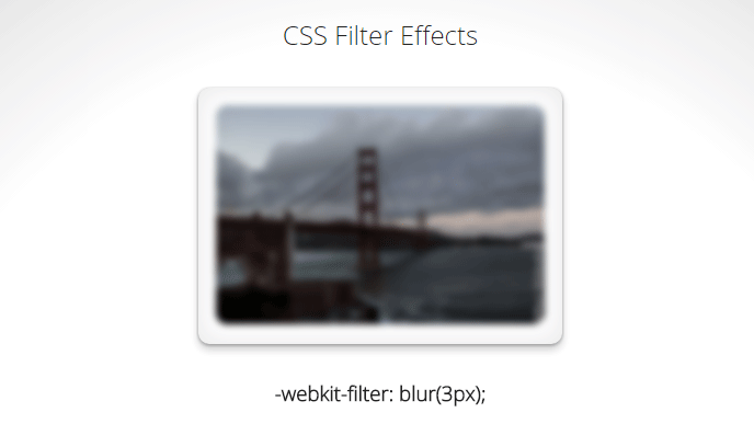
CSS 3 has a blur filter (only webkit at the moment Nov 2014):
-webkit-filter: blur(3px); /*chrome (android), safari (ios), opera*/
IE 4-9 supports a non-standard filter
filter:progid:DXImageTransform.Microsoft.Blur(PixelRadius='3')
See some nice demo for the blur and other filters here.
For future reference here is the compatibility table for CSS filter. Firefox seems to be getting the feature in v35+ while even IE11 does not seem to have any compatibility.
SVG
An alternative is using svg (safe for basically IE9 and up):
filter: url(blur.svg#blur);
SVG:
<svg version="1.1" xmlns="http://www.w3.org/2000/svg">
   <filter id="blur">
       <feGaussianBlur stdDeviation="3" />
   </filter>
</svg>
jsFiddle Demo
Javascript
You will achieve the highest browser compatibility with javascript, but usually the slowest performance and added complexity to your js.
- http://www.blurjs.com/ (jquery plugin, canvas solution so IE9+, FF, Chrome support)
- http://nbartlomiej.github.io/foggy/ (jquery plugin IE8+, FF,Chrome support)
How can I make a CSS glass/blur effect work for an overlay?
I was able to piece together information from everyone here and further Googling, and I came up with the following which works in Chrome and Firefox: http://jsfiddle.net/xtbmpcsu/. I'm still working on making this work for IE and Opera.
The key is putting the content inside of the div to which the filter is applied:
body {
    background: #300000;
    background: linear-gradient(45deg, #300000, #000000, #300000, #000000);
    color: white;
}
#mask {
    position: absolute;
    left: 0;
    top: 0;
    right: 0;
    bottom: 0;
    background-color: black;
    opacity: 0.5;
}
img {
    filter: blur(10px);
    -webkit-filter: blur(10px);
    -moz-filter: blur(10px);
  -o-filter: blur(10px);
  -ms-filter: blur(10px);
    position: absolute;
    left: 100px;
    top: 100px;
    height: 300px;
    width: auto;
}
<div id="mask">
<p>Lorem ipsum ...</p>
<img src="http://www.byui.edu/images/agriculture-life-sciences/flower.jpg" />
</div>Frosted glass look
A workaround is to use clip-path, filter and the same content twice then you will have the same result as backdrop-filter
.container {  width: 200px;  height: 200px;  position: relative;  padding:1px;}.container .glass, .container .filter {  background: url('https://lorempixel.com/400/200/') center/cover;  text-align:center;  color:#fff;  height:100%;}
.filter {  position: absolute;  top: 0;  bottom: 0;  right: 0;  left: 0;  filter: contrast(4) blur(3px);  z-index: 2;  clip-path: polygon(5% 15%, 82% 30%, 83% 71%, 17% 73%);}
<div class="container"> <div class="glass"> <h1>A title</h1> <p>Some content Some content</p> </div> <div class="filter"> <h1>A title</h1> <p>Some content Some content</p> </div></div>Konva/Canvas Background Blur / Frosted Glass effect
It may be very hard to get this effect using 2D canvas API.
If you have static shapes, you can try to "cut and copy" a part that you want to blur and apply the effect just on it.
Another possible solution is to use backdrop-filter from CSS and draw rectangle div over canvas and apply this filter on it, it will blur part of canvas content.
On the demo, you can try to drag red square to see how "cut and paste" is working.
And blue square is working in combination of div with CSS filters.
const stage = new Konva.Stage({
  container: 'container',
  width: window.innerWidth,
  height: window.innerHeight
});

const layer = new Konva.Layer();
stage.add(layer);

const rect1 = new Konva.Rect({
  x: 50,
  y: 50,
  width: 100,
  height: 100,
  fill: 'green'
});
layer.add(rect1);

const group = new Konva.Group({
  x: 100,
  y: 100,
  draggable: true,
})
layer.add(group);

const rect2 = new Konva.Rect({
  width: 50,
  height: 50,
  fill: 'green',
  filters: [Konva.Filters.Blur],
  blurRadius: 20,
});
group.add(rect2);
rect2.cache({ width: 70, height: 70 });

const rect3 = new Konva.Rect({
  width: 100,
  height: 100,
  fill: 'red',
  opacity: 0.4
});
group.add(rect3);


const rect4 = new Konva.Rect({
  y: 100,
  fill: 'blue',
  width: 100,
  height: 100,
  opacity: 0.5,
  draggable: true
});
layer.add(rect4);

const blurEl = document.createElement('div');
stage.content.appendChild(blurEl);
Object.assign(blurEl.style, {
  position: 'absolute',
  width: rect4.width()+ 'px',
    height: rect4.height()+ 'px',
  backdropFilter: 'blur(2px)',
  pointerEvents: 'none'
});

function updateBlur() {
   Object.assign(blurEl.style, {
    top: rect4.y() + 'px',
    left: rect4.x() + 'px'
  });
}
updateBlur();

rect4.on('dragmove', () => {
    updateBlur();
})
<script src="https://unpkg.com/konva@^8/konva.min.js"></script>
<div id="container"></div>CSS Frosted glass look without backdrop-filter but including radial-gradient
Use CSS variable to store the image and be able to add your gradient:
body {
  --img: url(https://images.unsplash.com/photo-1544306094-e2dcf9479da3);
  background: var(--img) center/cover fixed no-repeat;
  display: grid;
  place-items:center;
  height: 120vh;
}

.container {
  width: 30rem;
  height: 20rem;
  box-shadow: 0 0 1rem 0 rgba(0, 0, 0, .2);
  border-radius: 5px;
  position: relative;
  z-index: 1;
  overflow: hidden;
}

.container:before {
  content: "";
  position: absolute;
  background:
      radial-gradient(transparent, red), /* your background here */
      var(--img) center/cover fixed no-repeat;
  z-index: -1;
  inset:0;
  box-shadow: inset 0 0 2000px rgba(255, 255, 255, .5);
  filter: blur(10px);
  margin: -20px;
}
<div class="container"></div>Blur effect on div via CSS/javascript?
Using pure CSS
1. For rectangular images
Demo 1
2. For round corner images
Demo 2
Using HTML5
3. On Inspecting Elements of the site icloud.com i came to know that the blurred images are generated in an HTML5 Canvas tag .Therefore i googled it and found the following tutorial.Below is the code from that tutorial:
var grayscale = Filters.filterImage(Filter.grayscale, image);
// Note that ImageData values are clamped between 0 and 255, so we need
// to use a Float32Array for the gradient values because they
// range between -255 and 255.
var vertical = Filters.convoluteFloat32(grayscale,
  [ -1, 0, 1,
    -2, 0, 2,
    -1, 0, 1 ]);
var horizontal = Filters.convoluteFloat32(grayscale,
  [ -1, -2, -1,
     0,  0,  0,
     1,  2,  1 ]);
var final_image = Filters.createImageData(vertical.width, vertical.height);
for (var i=0; i<final_image.data.length; i+=4) {
  // make the vertical gradient red
  var v = Math.abs(vertical.data[i]);
  final_image.data[i] = v;
  // make the horizontal gradient green
  var h = Math.abs(horizontal.data[i]);
  final_image.data[i+1] = h;
  // and mix in some blue for aesthetics
  final_image.data[i+2] = (v+h)/4;
  final_image.data[i+3] = 255; // opaque alpha
}
Code from HTML5rocks.Also visit to know more
Related Topics
Full Text Search in HTML Ignoring Tags/&
Saving Binary Data as File Using JavaScript from a Browser
How to Connect HTML Divs With Lines
JavaScript Trick For 'Paste as Plain Text' in Execcommand
What Is the Cleanest Way to Disable CSS Transition Effects Temporarily
Find the Longest Common Starting Substring in a Set of Strings
Referenceerror: $ Is Not Defined
How to Run JavaScript Before the Whole Page Is Loaded
Html 5 Video or Audio Playlist
How to Make an HTML Text Box Show a Hint When Empty
How to Create a Sticky Navigation Bar That Becomes Fixed to the Top After Scrolling
Is It Possible For Flex Items to Align Tightly to the Items Above Them
Jqgrid Does Not Render Correctly in Chrome/Chrome Frame
"Uncaught Typeerror: A.Indexof Is Not a Function" Error When Opening New Foundation Project