Is it possible to apply CSS to half of a character?
Now on GitHub as a Plugin!
 Feel free to fork and improve.
Demo | Download Zip | Half-Style.com (Redirects to GitHub)
- Pure CSS for a Single Character
- JavaScript used for automation across text or multiple characters
- Preserves Text Accessibility for screen readers for the blind or visually
impaired
Part 1: Basic Solution
Demo: http://jsfiddle.net/arbel/pd9yB/1694/
This works on any dynamic text, or a single character, and is all automated. All you need to do is add a class on the target text and the rest is taken care of.
Also, the accessibility of the original text is preserved for screen readers for the blind or visually impaired.
Explanation for a single character:
Pure CSS. All you need to do is to apply .halfStyle class to each element that contains the character you want to be half-styled.
For each span element containing the character, you can create a data attribute, for example here data-content="X", and on the pseudo element use content: attr(data-content); so the .halfStyle:before class will be dynamic and you won't need to hard code it for every instance.
Explanation for any text:
Simply add textToHalfStyle class to the element containing the text.
// jQuery for automated modejQuery(function($) {    var text, chars, $el, i, output;
    // Iterate over all class occurences    $('.textToHalfStyle').each(function(idx, el) {    $el = $(el);    text = $el.text();    chars = text.split('');
    // Set the screen-reader text    $el.html('<span style="position: absolute !important;clip: rect(1px 1px 1px 1px);clip: rect(1px, 1px, 1px, 1px);">' + text + '</span>');
    // Reset output for appending    output = '';
    // Iterate over all chars in the text    for (i = 0; i < chars.length; i++) {        // Create a styled element for each character and append to container        output += '<span aria-hidden="true" class="halfStyle" data-content="' + chars[i] + '">' + chars[i] + '</span>';    }
    // Write to DOM only once    $el.append(output);  });});
.halfStyle { position: relative; display: inline-block; font-size: 80px; /* or any font size will work */ color: black; /* or transparent, any color */ overflow: hidden; white-space: pre; /* to preserve the spaces from collapsing */}
.halfStyle:before { display: block; z-index: 1; position: absolute; top: 0; left: 0; width: 50%; content: attr(data-content); /* dynamic content for the pseudo element */ overflow: hidden; color: #f00;}<script src="https://ajax.googleapis.com/ajax/libs/jquery/1.11.1/jquery.min.js"></script>
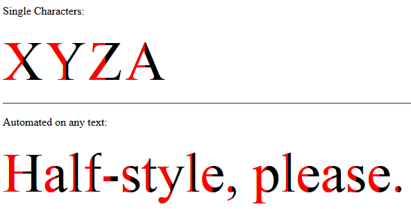
<p>Single Characters:</p><span class="halfStyle" data-content="X">X</span><span class="halfStyle" data-content="Y">Y</span><span class="halfStyle" data-content="Z">Z</span><span class="halfStyle" data-content="A">A</span>
<hr/><p>Automated:</p>
<span class="textToHalfStyle">Half-style, please.</span>Style half of a word, sentence, etc
Yep, JavaScript is the only way I can think of (as everyone else has already said!). Demo here.
$(function() {
    $('h2').each(function(){
        $(this).html( $(this).text().replace(/(^\w{3})/,'<span>$1</span>'));
    });
});
How to color parts of character in HTML?
You could achieve this by having 2 instances of 5 stars, 1 set is yellow stars and 1 is gray. Position the yellow one on top then set the width to a percentage and hide the overflow
.rating {  display: inline-block;  position: relative;  line-height: 1em; }  .rating__overlay {  color: yellow;  position: absolute;  top: 0;  left: 0;  width: 70%;  white-space: nowrap;  overflow: hidden;}
.rating__base {  color: #ccc;  white-space: nowrap;}
<link href="https://stackpath.bootstrapcdn.com/font-awesome/4.7.0/css/font-awesome.min.css" rel="stylesheet"/><div class="rating"> <div class="rating__overlay"> <i class="fas fa-star"></i> <i class="fas fa-star"></i> <i class="fas fa-star"></i> <i class="fas fa-star"></i> <i class="fas fa-star"></i> </div> <div class="rating__base"> <i class="fas fa-star"></i> <i class="fas fa-star"></i> <i class="fas fa-star"></i> <i class="fas fa-star"></i> <i class="fas fa-star"></i> </div></div>::first-letter also styles first character
simply float the first character and use :after not :before
p::first-letter {
  color: red;
}

p::after {
  content: '"';
  float:left;
}<p>Welcome!"</p>Applying CSS to single characters dynamically?
I am not sure if OP is asking for a means to split the characters into its own self-containing element only, or also for the CSS solution that approximates the screenshot. My answer does both — see demo fiddle here: http://jsfiddle.net/teddyrised/pv9601hj/4/
For splitting the date string, you will have to rely on JS, something like:
var monthNames = [ "JAN", "FEB", "MAR", "APR", "MAY", "JUN", "JUL", "AUG", "SEP", "OCT", "NOV", "DEC" ];
var dNow = new Date();
var date = (monthNames[dNow.getMonth()]) + ' '
         + ('0' + dNow.getDate()).slice(-2) + ' '
         + dNow.getFullYear();
var dateSplit = date.split("");
$('.date').html('<span>'+dateSplit.join('</span><span>')+'</span>');
For the CSS, it is simply a clever use of CSS3 flexbox specification and pseudo-elements:
.date {
    background-color: #000;
    display: flex;
}
.date span {
    border-radius: 4px;
    box-shadow: inset 0 0 1px 2px rgba(255,255,255,.125);
    color: #fff;
    font-family: 'Helvetica Neue', Helvetica, Arial, sans-serif;
    font-size: 2em;
    line-height: 2em;
    margin-right: 4px;
    overflow: hidden;
    position: relative;
    width: 1em;
    height: 2em;
    text-align: center;
}
.date span::before {
    background-color: rgba(255,255,255,.2);
    content: '';
    position: absolute;
    top: 50%;
    left: 0;
    right: 0;
    height: 1px;
}
.date span::after {
    background-image: linear-gradient(
        to bottom,
        rgba(0,0,0,.1) 0%,
        rgba(0,0,0,.25) 50%,
        rgba(255,255,255,.25) 50%,
        rgba(255,255,255,.1) 100%
        );
    content: '';
    position: absolute;
    top: 0;
    left: 0;
    bottom: 0;
    right: 0;
}
Color gradient for each line/character
Here is the solution of the effect you want:
HTML
<p class="text-gradient">
TaihouKai
</p>
CSS
.text-gradient {
    font-size: 20px;
    font-weight: 700;
    background-image: linear-gradient(to bottom, #9E9F9E, #ffffff);
    background-clip: text;
    -webkit-background-clip: text;
    color: transparent;
}
Explanation of background-clip CSS property (from MDN):
The background-clip CSS property sets whether an element's background extends underneath its border box, padding box, or content box.
This property allows the background gradient, image or colour to be "cast" onto the characters themselves.
JS Fiddle Demo
UPDATE If you want to deal with multiple lines which are separated with line break <br />, you can use JavaScript to achieve:
revised JSFiddle demo
Related Topics
Get Dom Content of Cross-Domain Iframe
Jquery/JavaScript Collision Detection
How to Calculate the Number of Days Between Two Dates
Adjust Width of Input Field to Its Input
Case Insensitive Xpath Contains() Possible
Html5 File API Read as Text and Binary
Angularjs - Value Attribute on an Input Text Box Is Ignored When There Is a Ng-Model Used
How to Hide the Html5 Number Input'S Spin Box
Why Is "Element.Innerhtml+=" Bad Code
Insert HTML With React Variable Statements (Jsx)
How to Apply the Required Attribute to ≪Select≫ Fields in Html5
Double Quote in JavaScript String
How to Cancel Form Submission in Submit Button Onclick Event
How to Perform a Real Time Search and Filter on a HTML Table