Divide semi circle with stroke-dasharray and on active color fill
Here's a working SVG example, with a little bit of javascript.
It's not clear from your question what exactly you want the coloured divisions
to look like. For now I've just made them solid red. But you can make them look however you'd like by changing the fill of the <rect id="meter-colours" .../>.
let METER_DIVISIONS = 10;
let METER_DIVISIONS_GAP = 4;

// Initialise meter
let meterDivisionsElem = document.getElementById("meter-divisions");
// Calculate size of each meter division
let totalLen = meterDivisionsElem.getAttribute("r") * Math.PI;
let numGaps = METER_DIVISIONS - 1;
let divLen = (totalLen - METER_DIVISIONS_GAP * numGaps) / METER_DIVISIONS;
// Set meter divisions dash pattern
let pat = divLen + ' ' + METER_DIVISIONS_GAP + ' ';
meterDivisionsElem.setAttribute("stroke-dasharray", pat.repeat(numGaps) + ' ' + divLen + ' ' + totalLen);

// The slider form element
let sliderElem = document.getElementById("slider");
// The slider label element
let sliderLabelElem = document.getElementById("lbl");
// The needle element
let needleElem = document.getElementById("needle");
// The black bar element
let blackBarElem = document.getElementById("black-bar");
let blackBarLen = blackBarElem.getAttribute("r") * Math.PI;
// The meter colours element
let meterColoursElem = document.getElementById("meter-colours");

function setMeterTo(value)
{
  // Update slider label
  sliderLabelElem.textContent = value + '%';

  // Update needle position
  let rotation = value * 180 / 100;
  needleElem.setAttribute("transform", "rotate(" + rotation + ")");

  // Update black bar length
  let barLen = value * blackBarLen / 100;
  blackBarElem.setAttribute("stroke-dasharray", barLen + ' ' + (2 * blackBarLen));

  // Update coloured division section of the meter
  meterColoursElem.setAttribute("transform", "rotate(" + rotation + ")");
}

// Add an input change handler to the slider
sliderElem.addEventListener("input", function(evt) {
  setMeterTo(evt.target.value);
});

// Initialise meter to start value
setMeterTo(25);
#wrapper {
width: 600px;
}
#slider {
width: 100%;
}
#needle {
stroke-linecap: round;
}<div id="wrapper">
<svg id="meter" viewBox="0 0 200 110">
<defs>
<circle id="meter-divisions" r="90" stroke-width="20" stroke-dasharray="282.7"/>
<mask id="meter-divisions-mask">
<use xlink:href="#meter-divisions" stroke="white"/>
</mask>
</defs>
<g transform="translate(100,100) scale(1,-1)" fill="none">
<!-- The grey meter divisions -->
<use xlink:href="#meter-divisions" stroke="lightgrey"/>
<!-- The inner semicircular black bar -->
<circle id="black-bar" r="74" stroke="black" stroke-width="4" stroke-dasharray="232.5"/>
<!-- the needle -->
<line id="needle" x2="70" y2="0" stroke="black" stroke-width="2" stroke-dasharray="282.7"/>
<!-- The coloured form of the ,meter divisions that gets rotated into view with the needle.
It is initially off screen but gets revealed as it rotates. It is masked by using
a shape matching the gray divisions -->
<g mask="url(#meter-divisions-mask">
<rect id="meter-colours" x="-100" y="-100" width="200" height="100" fill="red"/>
</g>
</g>
</svg>
<input id="slider" type="range" min="25" max="100" step="25" value="25" />
<label id="lbl" id="value" for="">0%</label>
</div>SVG gauge meter with dynamic strokes
It might be easier to do this as just an arc path with a pathLength set to 100 (or almost 100).
let data =[5 , 10 , 25  ,25 , 6 , 9  , 20];
let i=0;
let drawArray = "";
let arcPath = document.getElementById("meter");

function setupPath() {
    for (i=0; i < data.length; i++) {
      drawArray = drawArray + (data[i] - 0.5) + " 0.5 ";
    }
  arcPath.setAttribute("stroke-dasharray", drawArray);
}; setupPath();
<svg width="800px" height="600px" viewBox="0 0 200 200" preserveAspectRatio="xMinYMin meet">
<path id="meter" fill="none" stroke-dasharray="" stroke-width="20" stroke="blue" pathLength="99.5" d="M30 100 A 40 40 0 0 1 170 100" />
</svg>Why my SVG do not take the expected color?
To your code I'm adding [mask]{fill:white} meaning that I'm filling with white the paths with a mask attribute.
  [mask]{fill:white}

body {

  background-color: red;

 }

    mask path {

      fill: none;

      stroke: white;

      stroke-width: 20;

    }

    #maskH path,

    #maskH2 path {

      stroke-dasharray: 500;

      stroke-dashoffset: 500;

      animation: brush 2s linear 1 forwards;

      stroke-width: 19.5;


    }

    #maskI path,

    #maskT path,

    #maskT2 path,

    #maskF path,

    #maskU path,

    #maskU2 path,

    #maskE path,

    #maskE2 path,

    #maskG path,

    #maskR path,

    #maskS path,

    #maskT2 path,

    #maskA path,

    #maskN path,

    #maskP path,

    #maskT path {

      stroke-dasharray: 500;

      stroke-dashoffset: 500;

      animation: brush 3s linear 1 forwards;

      stroke-width: 19.5;

    }

    #maskT path {

      stroke-width: 9.6;

    }

    #maskT2 path {

      stroke-width: 9.8;

    }

    #maskA path {

      stroke-width: 18;

    }

    #maskP path {

      stroke-width: 19.4;

    }

    #maskN path {

      stroke-width: 20;

    }

    @keyframes brush {

      0% {

        stroke-dashoffset: 500;

      }

      20% {

        stroke-dashoffset: 500;

      }

      80% {

        stroke-dashoffset: 0;

      }

      100% {

        stroke-dashoffset: 0;

      }

    }
<svg height="300px" width="900px" id="FlorianCargouet" data-name="byflo-io" xmlns="http://www.w3.org/2000/svg"
viewBox="0 0 1107.2 69.56">
<mask id="maskS">
<path d="M73.9,30.26c-16.7-8.75-32.61-7.37-38.23,0.48c-3.28,4.58-4.06,12.76-0.44,17.78c1.5,2.07,3.31,3.01,13.03,6.19
c16.47,5.39,20.71,5.81,23.08,10.01c2.02,3.6,1.68,8.22,0.18,11.47c-1.89,4.08-5.57,5.92-7.45,6.85
c-12.88,6.41-34.08-3.11-36.75-4.34" />
</mask>
<mask id="maskH">
<path d="M92.2,22.2 92.2,89.5 92.2,16.5 150.2,16.5 150.2,89.5 90.6,81.4 90.6,54.8 153.2,54.8 " />
</mask>
<mask id="maskA">
<path d="M160.4,89.6 189.9,23.8 200.8,23.8 231.2,89.6 226.1,67.1 172.7,67.4 " />
</mask>
<mask id="maskP">
<path
d="M241.4,21.9 241.4,89.5 228.7,22.1 275.5,22.6 281.6,24 286.2,26.4 290.6,30.2 293.3,34 295.5,39.9
296.1,45.3 296,48.4 295.3,51.9 294,55.6 292.1,59 289.6,61.8 286.2,64.5 281.9,66.8 277.5,68 272,68.8 251.1,69.1 " />
</mask>
<mask id="maskI">
<path d="M315,22.1 315,55.8 315,89.5 " />
</mask>
<mask id="maskN">
<path d="M340.2,89.4 340.2,21.9 350,39.5 389.5,88.5 391.1,89.6 398.3,89.6 398.3,22.1 388.4,22.1 347.3,22 " />
</mask>
<mask id="maskT">
<path d="M537.5,22.1 537.5,89.5 497.3,26.5 565.4,26.5 " />
</mask>
<mask id="maskT2">
<path d="M900.3,22.1 900.3,90.2 863.5,26.3 929.1,26.3 " />
</mask>
<mask id="maskH2">
<!-- <path d="M576.1,22.1 576.1,89.5 563.7,55.8 622.1,54.7 605.2,53.1 605.2,14.3 629.6,14.3 629.6,89.5 " /> -->
<path d="M576.1,22.1c0,22.5,0,44.9,0,67.4V12.2h58.1v77.3l-61.9-8.4V54.8h64.5" />
</mask>
<mask id="maskF">
<path d="M794.4,22.1 745.4,22.1 745.4,89.5 741.7,53.8 788.7,53.8 " />
</mask>
<mask id="maskU">
<path d="M806,22c0.2,21.2,0.4,36.3,0.4,40.4c0,0.4,0,1.8,0.2,3.7c0.2,1.9,0.4,4.4,1.5,7.4c0.8,2.2,1.7,3.8,2,4.3
c0.9,1.6,1.8,2.7,2.4,3.4c0.6,0.8,1.9,2.2,3.8,3.6c0.5,0.4,2.2,1.6,4.7,2.8c3.1,1.4,5.8,1.9,7.6,2.2c1.5,0.3,5,0.8,9.4,0.4
c3.6-0.3,6.1-1,6.7-1.2c1.7-0.5,4.1-1.2,6.8-2.8c2.3-1.4,3.7-2.8,4.2-3.2c0.6-0.5,2.3-2.4,3.9-5.3c0.3-0.5,1.4-2.6,2.4-6.4
c0.8-3.2,1.2-6,1.4-9.7c0.4-6.6,0.2-11.5,0.2-11.5c-0.3-5.4-0.4-14-0.2-28.2" />
</mask>
<mask id="maskU2">
<path d="M936.5,21.8c0.2,21.2,0.4,36.3,0.4,40.4c0,0.4,0,1.8,0.2,3.7c0.2,1.9,0.4,4.4,1.5,7.4c0.8,2.2,1.7,3.8,2,4.3
c0.9,1.6,1.8,2.7,2.4,3.4c0.6,0.8,1.9,2.2,3.8,3.6c0.5,0.4,2.2,1.6,4.7,2.8c3.1,1.4,5.8,1.9,7.6,2.2c1.5,0.3,5,0.8,9.4,0.4
c3.6-0.3,6.1-1,6.7-1.2c1.7-0.5,4.1-1.2,6.8-2.8c2.3-1.4,3.7-2.8,4.2-3.2c0.6-0.5,2.3-2.4,3.9-5.3c0.3-0.5,1.4-2.6,2.4-6.4
c0.8-3.2,1.2-6,1.4-9.7c0.4-6.6,0.2-11.5,0.2-11.5c-0.3-5.4-0.4-14-0.2-28.2" />
</mask>
<mask id="maskE">
<path d="M702.2,22.1 654.6,22.1 654.6,89.5 703.6,89.5 650,89.5 664.4,59.4 698,59.4 " />
</mask>
<mask id="maskE2">
<path d="M1131.9,22.1 1084.3,22.1 1084.3,89.5 1133.3,89.5 1079.7,89.5 1094.1,59.4 1127.7,59.4 " />
</mask>
<mask id="maskG">
<path d="M475.4,31.4c-1.1-1.1-2.6-2.5-4.7-4c-6.6-4.7-13.2-5.7-15.9-6.1c-2.5-0.4-8.8-1-16.4,1.2
c-3.1,0.9-9.3,2.8-15.1,8.3c-1.5,1.4-4.6,4.6-7.1,9.7c-0.7,1.4-2.2,4.9-3,9.7c-1.2,7.6,0.4,13.7,1.1,15.9c1.7,5.5,4.4,9.2,5.8,11.1
c2,2.5,5.4,6.2,10.8,9.1c6.6,3.5,12.6,3.9,16.2,4.1c8.1,0.4,14.2-1.6,16.1-2.3c7-2.5,9.2-3.6,10.3-5.5c0.9-1.6,1.1-3.1,1.2-5.3
c0.3-4.7,0.3-7.9,0-15.6c-0.2-3.8-0.2-4.2-0.2-6.2c0-2.6,0.1-4.7,0.2-6.1" />
</mask>
<mask id="maskR">
<path d="M1014.1,21.4l0,68l-1-59.2c11.7,0.4,19.8,0.6,24.6,0.4c0,0,3.9-0.2,9.9,0.8c0.9,0.1,2.2,0.4,3.7,1.1
c0.8,0.4,2.7,1.4,4.3,3.4c2.3,2.8,2.8,5.8,3,7.4c0.6,4.3-0.6,7.8-1.4,9.4l-1.2,2l-2.6,2.6l-12.4,3.3l-17.2,0.1l20.5,8.5l0.6,0.4
l0.8,0.9l12.2,17.3l1.2,1.3l1.6,0.4l2.8,0l6.3,0" />
</mask>
<path mask="url(#maskN)"
d="M340.18,21.91c2.5,0,4.84-.15,7.13.08.8.08,1.64,1,2.23,1.71q18.6,23,37.15,46.13c.41.51.87,1,1.73,2V22.1h9.85V89.63c-2.4,0-4.8.15-7.15-.08-.8-.08-1.64-1-2.23-1.73q-18.28-22.65-36.51-45.36l-2.41-3V89.43h-9.78C340.18,67.07,340.18,44.71,340.18,21.91Z"
transform="translate(-26.12 -21.02)" />
<path mask="url(#maskR)"
d="M1014.06,21.39c12.23.53,24.39-.18,36.08,1.83,20.18,3.47,22,24.38,14.8,35.43-2.6,4-6.38,6.48-11.1,8.3l7.92,11.25,8,11.44c-3.64,0-6.75.08-9.86-.07-.63,0-1.37-.81-1.81-1.42-4.16-5.83-8.24-11.71-12.4-17.53-.48-.67-1.32-1.52-2-1.54-6.56-.12-13.12-.07-20-.07V89.52h-9.68C1014.06,67.05,1014.06,44.63,1014.06,21.39Zm9.84,8.78V60.7c4.79,0,9.36.08,13.92,0A59.93,59.93,0,0,0,1047,60c7.5-1.37,11.87-6.83,11.85-14.43s-4.28-13.37-11.89-14.29S1031.75,30.49,1023.9,30.17Z"
transform="translate(-26.12 -21.02)" />
<path mask="url(#maskH)" d="M150.16,89.53h-9.67V59.69H102V89.44H92.1V22.11h9.68V50.85h38.54V22.1h9.84Z"
transform="translate(-26.12 -21.02)" />
<path mask="url(#maskH2)" d="M634.23,89.53h-9.68V59.69h-38.7V89.51h-9.7V22.06h9.62V50.79H624.4V22.08h9.83Z"
transform="translate(-26.12 -21.02)" />
<path mask="url(#maskE)" d="M702.29,22.12V30.4H664.46V50.93H698v8.49H664.46V81h39.08v8.54H654.6V22.11Z"
transform="translate(-26.12 -21.02)" />
<path mask="url(#maskE2)" d="M1084.35,89.46V22.07h47.55v8.27h-37.76V51h33.62v8.36h-33.59V81h39.15v8.42Z"
transform="translate(-26.12 -21.02)" />
<path mask="url(#maskG)"
d="M465.42,55.44h9.21a8,8,0,0,1,.28,1.48c0,7.75.09,15.49-.07,23.24A4.61,4.61,0,0,1,473,83.28a40.36,40.36,0,0,1-22.76,7.15c-12,.16-22.33-3.62-29.91-13.24C405.43,58.32,413.55,27.36,440.8,22c10.94-2.15,21.4-.92,30.67,5.93,1.38,1,2.6,2.27,4,3.49l-6.23,5.92a28.06,28.06,0,0,0-14.08-7c-15.81-2.43-28.82,5.55-31.8,20.19C419.92,67.37,432.5,82,450.13,81.63a32.28,32.28,0,0,0,13.05-2.9,3.35,3.35,0,0,0,2.29-3.58C465.35,68.68,465.42,62.2,465.42,55.44Z"
transform="translate(-26.12 -21.02)" />
<path mask="url(#maskP)"
d="M241.44,21.9c3.73,0,7.3-.06,10.86,0,7.74.16,15.54-.16,23.2.72,10.68,1.23,18,8,19.95,17.26,3.12,14.61-5.19,26.62-20.36,28.58-6.57.85-13.3.49-19.95.67-1.24,0-2.48,0-4.06,0V89.49h-9.64Zm9.76,8.28V60.45c6.85,0,13.51.18,20.16-.07a16,16,0,0,0,10.12-3.76c4.9-4.31,5.55-9.85,4.06-15.77s-5.88-9-11.5-9.64C266.54,30.4,259,30.49,251.2,30.18Z"
transform="translate(-26.12 -21.02)" />
<path mask="url(#maskA)"
d="M231.22,89.64c-3.31,0-6.14.12-8.95-.08a3.11,3.11,0,0,1-2-1.71c-2-4.37-4-8.78-5.84-13.24a2.73,2.73,0,0,0-3-1.93c-10.5.07-21,.1-31.49,0-1.85,0-2.62.71-3.27,2.28-1.78,4.3-3.79,8.51-5.55,12.82a2.62,2.62,0,0,1-3,1.89c-2.49-.13-5,0-7.75,0,.26-.81.4-1.42.65-2Q175.52,55.71,190,23.77c.65-1.43,1.55-1.69,3-1.95,5.88-1,8.57,1.55,10.89,6.93,8.38,19.48,17.39,38.69,26.16,58C230.37,87.57,230.7,88.4,231.22,89.64Zm-21.1-24.8L195.65,32,181.21,64.84Z"
transform="translate(-26.12 -21.02)" />
<path mask="url(#maskU)"
d="M806,22h9.9v3.27c0,11.58-.08,23.15,0,34.73a42.2,42.2,0,0,0,1.13,9.37c1.21,5,4.14,8.92,9.15,10.77a23.2,23.2,0,0,0,17.3-.1c8.29-3.42,10.18-10.7,10.3-18.62.19-12.16,0-24.32.06-36.48V22.07h9.43c0,.9.12,1.71.12,2.52,0,12.41.18,24.82-.1,37.22a41.8,41.8,0,0,1-2.22,12.44c-2.64,7.64-8.24,12.58-16,14.8a37.77,37.77,0,0,1-19.74.25c-11-2.76-18.3-11.41-18.88-23.58-.63-13.13-.34-26.3-.45-39.46C806,25,806,23.64,806,22Z"
transform="translate(-26.12 -21.02)" />
<path mask="url(#maskU2)"
d="M936.85,22h9.74v2.8c0,11.91-.06,23.83,0,35.74,0,5.2.68,10.38,4,14.67A13.86,13.86,0,0,0,955,79.16c7.25,3.64,14.65,3.67,21.72-.37,5.24-3,7.23-8.26,7.54-13.92.43-7.81.33-15.65.39-23.48,0-5.66,0-11.33,0-17,0-.73.08-1.46.14-2.34h9.06a4.71,4.71,0,0,1,.24,1c0,13.91.3,27.84-.27,41.73-.62,15.18-10.06,24.51-25.16,25.35a43,43,0,0,1-14.27-1.4c-10.11-3-15.37-10.57-17-20.76a45.71,45.71,0,0,1-.56-7.21c-.05-12.16,0-24.33,0-36.49C936.85,23.61,936.85,23,936.85,22Z"
transform="translate(-26.12 -21.02)" />
<path mask="url(#maskS)"
d="M71.77,34.74c-6.56-3.74-13.5-5.86-21-5.1a28.51,28.51,0,0,0-8.16,2A8.81,8.81,0,0,0,37,40.08a7.85,7.85,0,0,0,5.36,7.71c4.31,1.7,8.84,2.84,13.29,4.19,3.18,1,6.42,1.75,9.55,2.86C73.87,57.91,78,63.15,78,71c0,8-4.61,14.68-12.93,17.35-12.91,4.16-25.29,2.42-37-4.46-1.85-1.09-2.65-2.26-1.27-4.35A36.43,36.43,0,0,0,29,75.05c.07-.13.24-.22.5-.45A36.06,36.06,0,0,0,44,81.23c5.87,1.15,11.74,1.4,17.49-.62,3.93-1.38,6.51-4,6.85-8.32s-2.18-7.17-5.92-8.58c-4.42-1.66-9-2.75-13.58-4.09-2.79-.83-5.61-1.56-8.36-2.51C31.62,54,27.42,48.69,27.39,40.65s4.74-14.82,13.1-17.52c11.2-3.62,22.16-2.49,32.73,2.67,1.54.75,2.12,1.6,1.24,3.29S73,32.45,72.31,34.14A5.75,5.75,0,0,1,71.77,34.74Z"
transform="translate(-26.12 -21.02)" />
<path mask="url(#maskF)"
d="M793.13,22.06c0,2.42,0,4.73,0,7,0,1.77-1.37,1.35-2.36,1.35q-16.24,0-32.48,0h-3.11V53.8h33.61v8.48H755.05V89.47h-9.56V22.06Z"
transform="translate(-26.12 -21.02)" />
<path mask="url(#maskT2)" d="M895.3,30.5c-7.9,0-15.4,0-23.1,0c0-2.9,0-5.6,0-8.4c18.6,0,37.1,0,55.8,0c0,2.8,0,5.4,0,8.4
c-7.6,0-15.1,0-23,0c0,19.8,0,39.4,0,59.1c-3.3,0-6.4,0-9.7,0C895.3,70,895.3,50.4,895.3,30.5z"
transform="translate(-26.12 -21.02)" />
<path mask="url(#maskT)"
d="M532.76,30.45H509.64V22h55.77v8.35H542.46V89.47h-9.71C532.76,69.9,532.76,50.37,532.76,30.45Z"
transform="translate(-26.12 -21.02)" />
<path mask="url(#maskI)" d="M319.76,89.53H310.2V22.1h9.56Z" transform="translate(-26.12 -21.02)" />
</svg>mask SVG path by another path
You don't need to use mask-image. That is for when you want to mask an HTML element with a mask.
You should just use an SVG <mask> element. And animate the path in that.
.dashed {

  stroke-dasharray: 5;

}

.path {

  stroke-dasharray: 226;

  stroke-dashoffset: 226;

  animation: dash 4s 1s linear forwards;

}

@keyframes dash {

  to {

    stroke-dashoffset: 0;

  }

}
<svg version="1.1" id="Layer_1" xmlns="http://www.w3.org/2000/svg" width="612px" height="792px" viewBox="0 0 612 792">
<defs>
<mask id="mymask">
<path class="path" fill="none" stroke="#fff" stroke-width="2"
d="m 34.161514,227.15068 c 0,0 5.335031,41.13009 -10.338686,53.31427 -13.8827124,10.79193 -26.8802222,-16.84233 0.681739,-19.39738 52.917804,-4.90561 69.13065,91.87642 69.13065,91.87642"/>
</mask>
</defs>
<g transform="scale(1.71)">
<path class="dashed" fill="none" stroke="black" stroke-linejoin="round" stroke-miterlimit="10" stroke-width="1.5"
mask="url(#mymask)"
d="m 34.161514,227.15068 c 0,0 5.335031,41.13009 -10.338686,53.31427 -13.8827124,10.79193 -26.8802222,-16.84233 0.681739,-19.39738 52.917804,-4.90561 69.13065,91.87642 69.13065,91.87642"/>
</g>
</svg>Finding the fill color of a draggable shape with Kineticjs
You can add a handler to the shape and use getFill()
function iGetFill(){
    var color = this.getFill();
}

circle1.on('dragend',function(){
    iGetFill.apply(this);
});

circle2.on('dragend',function(){
    iGetFill.apply(this);
});
Svg line half solid, half dashed
Put a
pathLength="100"on thelineso the total length is calculated as 100 units
https://developer.mozilla.org/en-US/docs/Web/SVG/Attribute/pathLengthset the
stroke-dasharrayunits to the pattern you want:
<svg>
    <line pathLength="100" stroke-dasharray="50,2,5,2,5,2,5,2,5,2,5,2,5"
          stroke="black" stroke-width="4"
          x1="10" x2="280" y1="10" y2="10" />
</svg>
Changing goShapes fill colors based on condition
The problem here is that although you are setting the fill when the node is created fill: fill1 the underlying model will not be update when you later update fill1 as its is set to the objects value rather than a reference to the object.
In this case the solution is to use a Binding to create a property you can update in a transaction, for example
          GO(go.Shape, "Trapezoid1",
            {
              name: "SHAPE",
              angle: 270,
              strokeWidth: 2,
              fill: "pink",
              minSize: new go.Size(50, 50),
            },
            new go.Binding("fill", "status", function(type) {
                switch (type) {
                case "milenial":
                    return "#00cc00";
                case "will retire":
                    return "#ff0000";
                default:
                    return "#ffffff";
            }})
          );
Here we are binding "fill" to "status" and using a function to embed your logic into the node.
Elsewhere in you code (where you are using ajax) update the status
function update(key, status) {
// all model changes should happen in a transaction
myDiagram.model.commit(function(m) {
console.log("Finding Node " + key)
var data = m.findNodeDataForKey(key);
m.set(data, "status", status);
}, "update " + status + " for " + key);
};
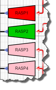
update("RASP1","will retire" );
update("RASP2","milenial" );
In this example two of my nodes are identified as RASP1 and RASP1 and I'm setting the status to "will retire" and "milenial" respectively. The other two nodes are pink as this is the default colour
SVG mask or CSS style to knock out center of svg so its transparent
This is an alternative solution where I'm using a very wide shadow instead of the .container background.
Also I've simplified the svg but you can keep your code here.
*{margin:0;padding:0}

body {
  background: white;
}
.container {
  margin-top: 70px;
  height: 400px;
  margin: 0 auto;
  overflow: hidden;
  opacity: 0.55;
}

#hole {/*I want the hole to be slightly smaller than the svg element hence the calc*/
  width:calc(258px - 8px);
  height:calc(258px - 8px);
  border-radius:20px;
  position: relative;
  top: calc(50px + 4px);
  left: calc(300px + 4px);
  background:transparent;
  box-shadow:0 0 0 200vmax #000;
}

svg{
  width:258px;
  height:258px;
  position: absolute;
  top: 50px;
  left: 300px;
}
<div class="container">
<div id="hole"></div>
</div>
<svg width="258" height="258" viewBox="0 0 258 258" xmlns="http://www.w3.org/2000/svg">
<rect x="1" y="1" width="256" height="256" rx="20" id="r" stroke="white" stroke-width="2" stroke-dasharray="80 168" stroke-dashoffset="58" fill="none" />
</svg>How to draw a circle sector in CSS?
CSS and Multiple Background Gradients
Rather than trying to draw the green portion, you could draw the white portions instead:
pie {
    border-radius: 50%;
    background-color: green;
}

.ten {
    background-image:
        /* 10% = 126deg = 90 + ( 360 * .1 ) */
        linear-gradient(126deg, transparent 50%, white 50%),
        linear-gradient(90deg, white 50%, transparent 50%);
}
pie {
  width: 5em;
  height: 5em;
  display: block;
  border-radius: 50%;
  background-color: green;
  border: 2px solid green;
  float: left;
  margin: 1em;
}

.ten {
  background-image: linear-gradient(126deg, transparent 50%, white 50%), linear-gradient(90deg, white 50%, transparent 50%);
}

.twentyfive {
  background-image: linear-gradient(180deg, transparent 50%, white 50%), linear-gradient(90deg, white 50%, transparent 50%);
}

.fifty {
  background-image: linear-gradient(90deg, white 50%, transparent 50%);
}

/* Slices greater than 50% require first gradient
   to be transparent -> green */

.seventyfive {
  background-image: linear-gradient(180deg, transparent 50%, green 50%), linear-gradient(90deg, white 50%, transparent 50%);
}

.onehundred {
  background-image: none;
}
<pie class="ten"></pie>
<pie class="twentyfive"></pie>
<pie class="fifty"></pie>
<pie class="seventyfive"></pie>
<pie class="onehundred"></pie>Related Topics
Hide Scrollbar and Show on Hover Like Facebook's New Chat Sidebar
Limit Labels Number on Chart.Js Line Chart
Resetting the Opacity of a Child Element - Maple Browser (Samsung Tv App)
Change CSS Properties on Click
Detect CSS Transitions Using JavaScript (And Without Modernizr)
Access CSS File Contents via JavaScript
Get the Size of a CSS Background Image Using JavaScript
How to Check If CSS Value Is Supported by the Browser
Google Maps Not Rendering Completely on Page
How to Detect CSS3 Resize Events
How to Make Jquery UI Tabs Scroll Horizontally If There Are Too Many Tabs
Definitive Way to Trigger Keypress Events With Jquery