customize the style of rc-time-picker
You need to rearrange the order in which you're stylizing your TimePicker component. The styled-components package generates a className that needs to be applied to the TimePicker. In this case, it'll be applied to both its className and its popupClassName
Working example:

components/TimePicker/index.js
import styled from "styled-components";
import TimePicker from "./TimePicker";

const StyledTimePicker = styled(TimePicker)`
  & .rc-time-picker-panel-select-option-selected {
    background-color: #edeffe;
    font-weight: normal;
  }

  & .rc-time-picker-clear,
  & .rc-time-picker-clear-icon:after {
    font-size: 15px;
  }

  & .rc-time-picker-panel-select,
  & .rc-time-picker-input,
  & .rc-time-picker-panel-input {
    font-family: "Consolas", sans-serif;
    font-size: 16px;

    ::-webkit-scrollbar {
      width: 0;
      height: 0;
    }
  }
`;

export default StyledTimePicker;
components/TimePicker/TimePicker.js
import React from "react";
import PropTypes from "prop-types";
import moment from "moment";
import TimePicker from "rc-time-picker";
import "rc-time-picker/assets/index.css";

const DeliTimePicker = ({ className, onChange, value, ...rest }) => (
  <TimePicker
    {...rest}
    className={className}
    popupClassName={className}
    showSecond={false}
    onChange={onChange}
    hideDisabledOptions
    minuteStep={5}
    value={value}
    use12Hours
  />
);

DeliTimePicker.propTypes = {
  className: PropTypes.string.isRequired,
  onChange: PropTypes.func.isRequired,
  value: PropTypes.instanceOf(moment)
};

export default DeliTimePicker;
components/TimeSelectForm/index.js
import React, { Component } from "react";
import moment from "moment";
import TimePicker from "../TimePicker";

class TimeSelectForm extends Component {
  state = {
    value: moment()
  };

  handleChange = value => this.setState({ value });

  handleSubmit = e => {
    e.preventDefault();
    alert(moment(this.state.value).format("hh:mm a"));
  };

  render = () => (
    <form onSubmit={this.handleSubmit}>
      <TimePicker value={this.state.value} onChange={this.handleChange} />
      <br />
      <button type="submit">Submit</button>
    </form>
  );
}

export default TimeSelectForm;
How to add custom style to React Datepicker (HackerOne)?
You can check in the examples the Custom calendar class name.
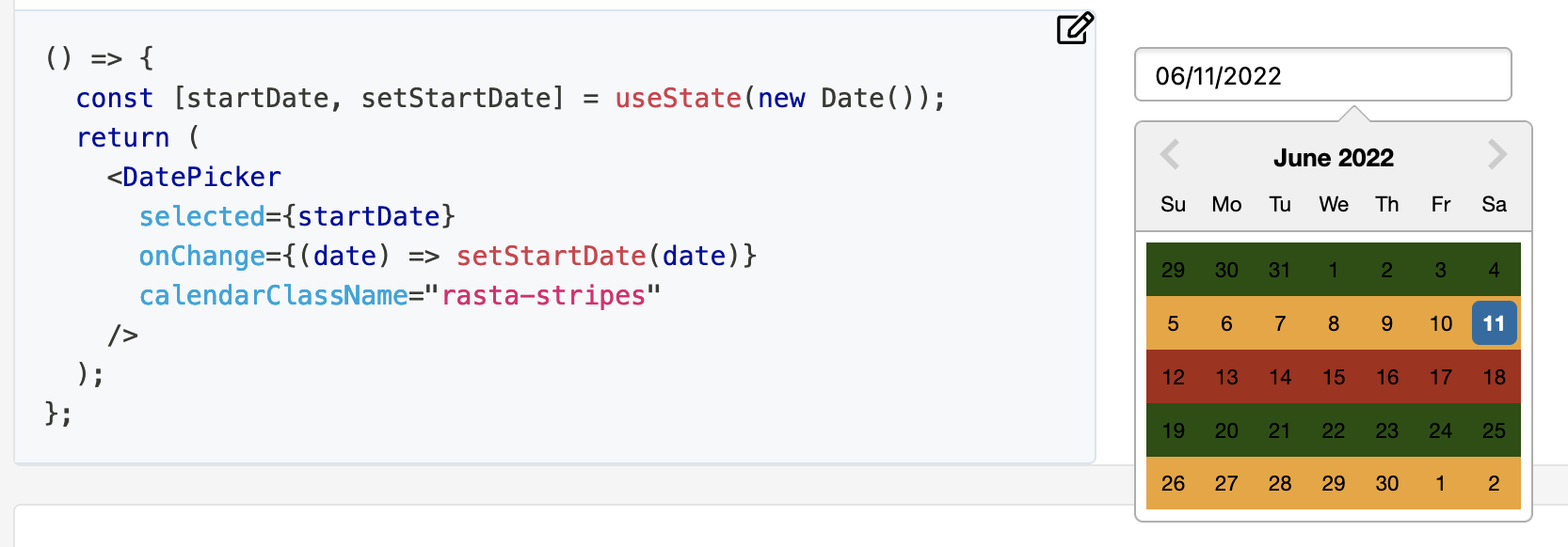
It defines a custom class name with the DatePicker property calendarClassName="rasta-stripes". The class-name rasta-stripes is defined as follow:
.rasta-stripes {
  .react-datepicker__week:nth-child(3n + 1) {
    background-color: #215005;
  }
  .react-datepicker__week:nth-child(3n + 2) {
    background-color: #eea429;
  }
  .react-datepicker__week:nth-child(3n + 3) {
    background-color: #a82a15;
  }
}
So, as you can see, to style some parts just make a reference to the classes React DatePicker uses for itself to override it. You can check which classes exist by inspecting the sources with the browser of your preference.
To make it full screen for example just override the react-datepicker-popper class-name by removing transform and adding left: 0; right: 0; top: 0; bottom: 0; and then change every fixed size child to your needs.
Can't get the value from rc-time-picker
Value
The timePicker's value it's provide as an argument
by theOnChange event.
It should be:
onChange={ function(value){console.log(value)} }
Example
// Display seconds
const showSecond = true;

//Format string
const str = showSecond ? 'HH:mm:ss' : 'HH:mm';

//Handle onChange event
function handleChange(value) {
    console.log(value && value.format(str));
}
...
onChange={handleChange}
github/example/picktime.js
rc-time-picker not displaying correctly on mobile
A similar fix to Artems, I set the border of the offending input to 0px. This will get rid of it cosmetically for any size phones.

Related Topics
How to Get a Dom Element's ::Before Content with JavaScript
Custom Cursor Interaction Point - CSS/Jquery
Filling an Svg Path with Multiple Colors
Javascript: Scroll from One Div to the Other When Scrolling
How to Open Bootstrap Modal in Ajax Success
Using JavaScript Calculated Values in Less
Detect and Log When External JavaScript or CSS Resources Fail to Load
How to Color Specific Letters in HTML Element Text
Change the :Before Selector from JavaScript
How to Add a Drop Shadow to Chart.Js Line Chart
How to Scroll Draw Each Svg Path One at a Time (Chronologically)
Bootstrap 3 > Trying to Create Columns with Equal Heights
Javascript/Jquery Toggle Active Class Between 2 Buttons on a Button Group
Convert Gulp Watch in Gulp@3.9.1 to Gulp@4
How to Detect Internet Explorer (Ie) and Microsoft Edge Using JavaScript
Bug with Chrome's Localstorage Implementation