How can I change the arrow style in a JComboBox
You can override createArrowButton() in BasicComboBoxUI. BasicArrowButton is a convenient starting point.
class ColorArrowUI extends BasicComboBoxUI {

    public static ComboBoxUI createUI(JComponent c) {
        return new ColorArrowUI();
    }

    @Override protected JButton createArrowButton() {
        return new BasicArrowButton(
            BasicArrowButton.SOUTH,
            Color.cyan, Color.magenta,
            Color.yellow, Color.blue);
    }
}
Then install it.
JComboBox combo = new JComboBox();
combo.setUI(ColorArrowUI.createUI(combo));
JComboBox changing drop down arrow image not working
Your problem is the line
JButton arrowButton = super.createArrowButton();
you should change it to
JButton arrowButton = new JButton();
Background: super.createArrowButton() return an instance of the ArrowButton class, that provides custom arrow painting and does not support setIcon method.
JComboBox setBackground() without changing the color of the arrow
Your approach is correct, but BasicComboBoxUI put a spoke in your wheel. Fortunately I have a trick for you, which helps to avoid this problem.
import java.awt.Color;
import java.awt.Component;
import java.awt.Font;

import javax.swing.JComboBox;
import javax.swing.JFrame;
import javax.swing.JList;
import javax.swing.UIManager;
import javax.swing.WindowConstants;
import javax.swing.plaf.basic.BasicComboBoxRenderer;

@SuppressWarnings("unchecked")
public class ComboBgTest {

    private static final String[] VALUES = {"One", "Two", "Three"};
    @SuppressWarnings("serial")
    public static void main(String[] args) {
        JComboBox<String> cb = new JComboBox<>(VALUES);
        cb.setSelectedItem(null);
        cb.setRenderer(new BasicComboBoxRenderer() {
            boolean ignoreBG = true;
            @Override
            public Component getListCellRendererComponent(JList list, Object value, int index, boolean isSelected,
                    boolean cellHasFocus) {
                ignoreBG = false;
                Component c = super.getListCellRendererComponent(list, value, index, isSelected, cellHasFocus);
                if (index == -1) { // check whether we are render the item shown at top
                    if (VALUES[0].equals(value)) {
                        c.setBackground(Color.RED);
                    } else if (VALUES[1].equals(value)) {
                        setBackground(Color.GREEN);
                    } else if (VALUES[2].equals(value)) {
                        setBackground(Color.BLUE);
                    }
                }
                ignoreBG = true;
                return this;
            }

            @Override
            public void setBackground(Color bg) {
                // ignore all BG which is set from outside.
                if (!ignoreBG) {
                    super.setBackground(bg);
                }
            }
        });
        JFrame frm = new JFrame("Combo test");
        frm.add(cb);
        frm.pack();
        frm.setLocationRelativeTo(null);
        frm.setDefaultCloseOperation(WindowConstants.EXIT_ON_CLOSE);
        frm.setVisible(true);
    }
}
P.S. The same approach works also for font and foregorund.
Customize position of arrow on JComboBox (place centered on bottom)
The appearance of a JComboBox is determined by the chosen Look & Feel's UI delegate, typically a subclass of BasicComboBoxUI. You can replace the delegate, as shown here, and paint the arrowButton where you want it. Related examples may be found here.
How to replace down arrow with text in a combobox in JavaFX
If you want to completely elimnate the arrow & arrow button space, you can try with the below custom ComboBox.
The below code is setting the arrow button and arrow nodes size to 0 and asking to rerender the comboBox. The null check is to let this changes apply only once.
public class MyComboBox<T> extends ComboBox<T>{
    Region arrowBtn ;

    @Override
    protected void layoutChildren() {
        super.layoutChildren();
        if(arrowBtn==null){
            arrowBtn= (Region)lookup(".arrow-button");
            arrowBtn.setMaxSize(0,0);
            arrowBtn.setMinSize(0,0);
            arrowBtn.setPadding(new Insets(0));

            Region arrow= (Region)lookup(".arrow");
            arrow.setMaxSize(0,0);
            arrow.setMinSize(0,0);
            arrow.setPadding(new Insets(0));

            // Call again the super method to relayout with the new bounds.
            super.layoutChildren();
        }
    }
}
UPDATE :
Based on the suggestion of @kleopatra, we can get the same behaviour using css as well (without the need to create a new class for ComboBox).
.combo-box .arrow-button,
.combo-box .arrow{
   -fx-max-width:0px;
   -fx-min-width:0px;
   -fx-padding:0px;
}
The below image will tell you the difference of a normal combox box and this custom combo box. The left one is the normal comboBox, you can see the list cell when inspecting with ScenicView. The right one is the custom one. The list cell is completely occupied suppressing the arrow space.

Is there any way to change combo box arrow button color in javafx?
Using css selectors you can change the arrow, and arrow button color however you want
.combo-box .arrow {
    -fx-background-color: black;
}

.combo-box .arrow-button {
    -fx-background-color: white;
    -fx-size: 5;
}
to do this in code without editing the .css file, assuming your ComboBox is named comboBox
comboBox.lookup(".arrow").setStyle("-fx-background-color: black;");
comboBox.lookup(".arrow-button").setStyle("-fx-background-color: white;");
Styling of combobox arrow button in synth
Correct binding:
<bind style="arrowButton" key="ComboBox.arrowButton" type="name"/>
So far I haven't found how to use colors and states to style combobox arrow button, but predefined image works and is sufficient for my needs:
<imagePainter method="arrowButtonBackground" path="/controls/combobox_arrow_button.jpg" sourceInsets="8 8 8 8"/>
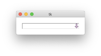
Tkinter how to change combobox widget arrow image
You're very close, you just need to use your element in your custom style. Notice in the following example how Mystyle.TCombobox.downarrow is used as one of the children in the combobox:
style.element_create('Mystyle.TCombobox.downarrow', 'image', photo)
style.layout(
    'Mystyle.TCombobox', [(
        'Combobox.field', {
            'sticky': NSEW,
            'children': [(
                'Mystyle.TCombobox.downarrow', {
                    'side': 'right',
                    'sticky': NS
                }
            ), (
                'Combobox.padding', {
                    'expand': '1',
                    'sticky': NSEW,
                    'children': [(
                        'Combobox.textarea', {
                            'sticky': NSEW
                        }
                    )]
                }
            )]
        }
    )]
)
Related Topics
Multiple Runnable Classes Inside Jar, How to Run Them
Org.Glassfish.Jersey.Servlet.Servletcontainer Classnotfoundexception
Why Does This Generic Code Compile in Java 8
Java - Convert Image to Base64
Double Calculation Producing Odd Result
"Non-Static Variable This Cannot Be Referenced from a Static Context" When Creating an Object
Passing Command Line Unicode Argument to Java Code
Comparing Arrays in Junit Assertions, Concise Built-In Way
Java: Starting a New Thread in a Constructor
Why Are Getter and Setter Method Important in Java
Call a Method of Subclass in Java
Missing Return Statement in a Non-Void Method Compiles
In a Switch Statement, Why Are All the Cases Being Executed
Is Calling Static Methods via an Object "Bad Form"? Why
Singleton Design Pattern: Pitfalls
Validation of a List of Objects in Spring
Getting the Inputstream from a Classpath Resource (Xml File)
Java.Lang.Illegalstateexception: Not on Fx Application Thread; Currentthread = Thread-4