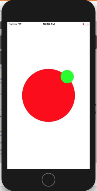
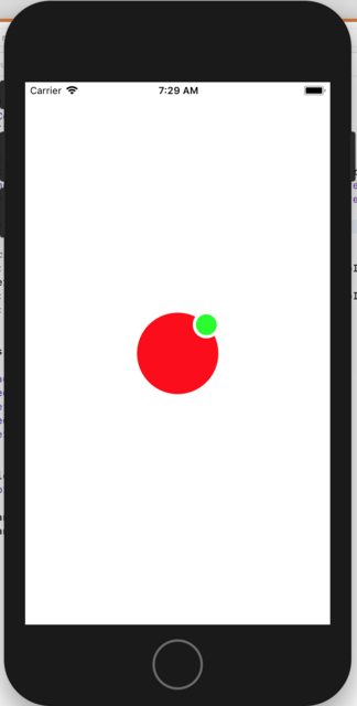
Position a subview on the edge of a circular shaped view
To place the small green circle in the upper right corner of the big circle:
- Make the small circle a subview of the big circle.
- Add a constraint with the
.centerXof the small circle equal to the.trailingof the big circle with amultiplierof0.8536. - Add a constraint with the
.centerYof the small circle equal to the.bottomof the big circle with amultiplierof0.1464.
Note: The two multipliers were computed using Trigonometry by looking at the unit circle and computing the ratios: (distance from top of square containing unit circle)/(height of unit circle) and (distance from left edge of square containing unit circle)/(width of unit circle). In the sample code below, I have provided a func called computeMultipliers(angle:) which computes the multipliers for any angle in degrees. Avoid angles exactly 90 and 180 because that can create multipliers of 0 which Auto Layout does not like.
Here is standalone example:
class ViewController: UIViewController {

    var bigCircle: UIView!
    var littleCircle: UIView!

    override func viewDidLoad() {
        super.viewDidLoad()

        bigCircle = UIView()
        bigCircle.translatesAutoresizingMaskIntoConstraints = false
        bigCircle.backgroundColor = .red
        view.addSubview(bigCircle)

        bigCircle.widthAnchor.constraint(equalToConstant: 240).isActive = true
        bigCircle.heightAnchor.constraint(equalToConstant: 240).isActive = true

        littleCircle = UIView()
        littleCircle.translatesAutoresizingMaskIntoConstraints = false
        littleCircle.backgroundColor = .green
        bigCircle.addSubview(littleCircle)

        bigCircle.centerXAnchor.constraint(equalTo: view.centerXAnchor).isActive = true
        bigCircle.centerYAnchor.constraint(equalTo: view.centerYAnchor).isActive = true

        littleCircle.widthAnchor.constraint(equalToConstant: 60).isActive = true
        littleCircle.heightAnchor.constraint(equalToConstant: 60).isActive = true

        let (hMult, vMult) = computeMultipliers(angle: 45)

        // position the little green circle using a multiplier on the right and bottom
        NSLayoutConstraint(item: littleCircle!, attribute: .centerX, relatedBy: .equal, toItem: bigCircle!, attribute: .trailing, multiplier: hMult, constant: 0).isActive = true
        NSLayoutConstraint(item: littleCircle!, attribute: .centerY, relatedBy: .equal, toItem: bigCircle!, attribute: .bottom, multiplier: vMult, constant: 0).isActive = true

    }

    override func viewDidLayoutSubviews() {
        super.viewDidLayoutSubviews()

        bigCircle.layer.cornerRadius = 0.5 * bigCircle.frame.height

        littleCircle.layoutIfNeeded()
        littleCircle.layer.cornerRadius = 0.5 * littleCircle.frame.height
    }

    func computeMultipliers(angle: CGFloat) -> (CGFloat, CGFloat) {
        let radians = angle * .pi / 180

        let h = (1.0 + cos(radians)) / 2
        let v = (1.0 - sin(radians)) / 2

        return (h, v)
    }
}
Here is a modified version of your code. I added constraints to set the size of the small circle and moved the code which sets the cornerRadius to layoutSubviews():
class ProfilePictureView: UIView {
    var bigCircle: UIView!
    var borderCircle: UIView!
    var littleCircle: UIView!

    override init(frame: CGRect) {
        super.init(frame: frame)
        initialize()
    }

    required init?(coder aDecoder: NSCoder) {
        super.init(coder: aDecoder)
        initialize()
    }

    private func initialize() {
        bigCircle = UIView(frame: bounds)
        bigCircle.backgroundColor = .red
        addSubview(bigCircle)

        borderCircle = UIView()
        borderCircle.translatesAutoresizingMaskIntoConstraints = false
        borderCircle.backgroundColor = .white
        bigCircle.addSubview(borderCircle)

        borderCircle.widthAnchor.constraint(equalTo: bigCircle.widthAnchor, multiplier: 1/3).isActive = true
        borderCircle.heightAnchor.constraint(equalTo: bigCircle.heightAnchor, multiplier: 1/3).isActive = true

        littleCircle = UIView()
        littleCircle.translatesAutoresizingMaskIntoConstraints = false
        littleCircle.backgroundColor = .green
        borderCircle.addSubview(littleCircle)

        littleCircle.widthAnchor.constraint(equalTo: borderCircle.widthAnchor, multiplier: 1/1.3).isActive = true
        littleCircle.heightAnchor.constraint(equalTo: borderCircle.heightAnchor, multiplier: 1/1.3).isActive = true
        littleCircle.centerXAnchor.constraint(equalTo: borderCircle.centerXAnchor).isActive = true
        littleCircle.centerYAnchor.constraint(equalTo: borderCircle.centerYAnchor).isActive = true

        let (hMult, vMult) = computeMultipliers(angle: 45)

        // position the border circle using a multiplier on the right and bottom
        NSLayoutConstraint(item: borderCircle!, attribute: .centerX, relatedBy: .equal, toItem: bigCircle!, attribute: .trailing, multiplier: hMult, constant: 0).isActive = true
        NSLayoutConstraint(item: borderCircle!, attribute: .centerY, relatedBy: .equal, toItem: bigCircle!, attribute: .bottom, multiplier: vMult, constant: 0).isActive = true
    }

    override func layoutSubviews() {
        super.layoutSubviews()
        bigCircle.layer.cornerRadius = bigCircle.frame.height / 2
        borderCircle.layoutIfNeeded()
        borderCircle.layer.cornerRadius = borderCircle.frame.height / 2
        littleCircle.layoutIfNeeded()
        littleCircle.layer.cornerRadius = littleCircle.frame.height / 2
    }

    private func computeMultipliers(angle: CGFloat) -> (CGFloat, CGFloat) {
        let radians = angle * .pi / 180

        let h = (1.0 + cos(radians)) / 2
        let v = (1.0 - sin(radians)) / 2

        return (h, v)
    }
}
Explanation of the math behind computeMultipliers(angle:)
The idea of computeMultipliers(angle:) is that is should compute a multiplier for the horizontal constraint and a multiplier for the vertical constraint. These values are a proportion and will range from 0 to 1 where 0 is the top of the circle for the vertical constraint and 0 is the left edge of the circle for the horizontal constraint. Likewise, 1 is the bottom of the circle for the vertical constraint and 1 is the right edge of the circle for the horizontal constraint.
The multipliers are computed by looking at the unit circle in Trigonometry. The unit circle is a circle of radius 1 centered at (0, 0) on the coordinate system. The nice thing about the unit circle (by definition) is that the point on the circle where a line (starting at the origin) intersects the circle is (cos(angle), sin(angle)) where the angle is measured starting at positive x-axis going counter-clockwise to the line that intersects the circle. Note the the width and height of the unit circle are each 2.
sin(angle) and cos(angle) each vary from -1 to 1.
The equation:
1 + cos(angle)
will vary from 0 to 2 depending on the angle. Since we're looking for a value from 0 to 1, we divide this by 2:
// compute the horizontal multiplier based upon the angle
let h = (1.0 + cos(radians)) / 2
In the vertical direction, we first note the coordinate system is flipped from the mathematical sense. In iOS, y grows in the downward direction, but in mathematics, y grows in the upward direction. To account for this, the vertical calculation uses minus - instead of +:
1 - sin(angle)
Again, since sin varies from -1 to 1, this calculation will be from 0 to 2, so we divide by 2:
// compute the vertical multiplier based upon the angle
let h = (1.0 - sin(radians)) / 2
This gives us the desired result. When the angle is 90 degrees (or .pi/2 radians), sin is 1, so the vertical multiplier will be 0. When the angle is 270 degrees (or 3*.pi/2 radians), sin is -1 and the vertical multiplier will be 1.
Why use radians? Radians are intuitive once you understand what they are. They are just the length of arc along the circumference of the unit circle. The formula for the circumference of a circle is circumference = 2 * .pi * radius, so for the unit circle, the circumference is 2 * .pi. So 360 degrees is 2 * .pi radians.
UIStackView change item spacing as stack view changes sizes
The general idea is to use centerX constraints on your circle views - I'll call them ShelfItem, and constrain them to an "invisible positioning view."
The reason to do that, is because when the item's centerX is on the leading edge (or trailing edge) half of it will extend to the left or right of the positioning view.
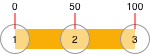
Think about dividing a width into equal parts (all values are in %)...
If we have 3 items, we need 2 equal parts. To get the percentage spacing, we use 1.0 / (numItems - 1):
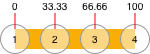
With 4 items, we need 3 equal parts:
With 5 items, we need 4 equal parts:
And with 6 items, we need 5 equal parts:
So, by making the "item" views subviews of the "positioning" view, we can loop through and set their centerX constraints like this:
UIView *thisItem;
CGFloat pct = 1.0 / (CGFloat)([subviews count] - 1);

for (int i = 0; i < subviews.count; i++) {
    thisItem = subviews[i];

    CGFloat thisPCT = pct * i;

    // centerX as a percentage of positionView width
    NSLayoutConstraint *c = [NSLayoutConstraint constraintWithItem:thisItem
                                                         attribute:NSLayoutAttributeCenterX
                                                         relatedBy:NSLayoutRelationEqual
                                                            toItem:positionView
                                                         attribute:NSLayoutAttributeTrailing
                                                        multiplier:thisPCT
                                                          constant:0.0];

    c.active = YES;
}
It's not quite that simple though...
First, auto-layout doesn't like a multiplier: 0.0 ... so the left-most item needs to have centerX equal to positioning view Leading.
The second thing is that your layout requires the item views to be left-aligned when there is enough room, not evenly spaced.
To accomplish that, we'll make each item view's centerX lessThanOrEqualTo the previous item's centerX + itemWidth... and we'll give the "percentage" constraints a less-than-required priority.
So, each time we add (or remove) an item, we'll call a method to update the centerX constraints... it will look about like this:
// clear existing centerX constraints
for (NSLayoutConstraint *oldC in positionView.constraints) {
    if (oldC.firstAttribute == NSLayoutAttributeCenterX) {
        oldC.active = NO;
    }
}

// item views are top-down left-to-right, so reverse the order of the subviews
NSArray *reversedArray = [positionView.subviews.reverseObjectEnumerator allObjects];

// constraints don't like multiplier:0.0
//  so first item centerX will always be equal to positionView's Leading
UIView *thisItem = reversedArray[0];

[NSLayoutConstraint constraintWithItem:thisItem
                             attribute:NSLayoutAttributeCenterX
                             relatedBy:NSLayoutRelationEqual
                                toItem:positionView
                             attribute:NSLayoutAttributeLeading
                            multiplier:1.0
                              constant:0.0].active = YES;

// percentage for remaining item spacing
//  examples:
//      we have 3 items
//          item 0 centerX is at leading
//          item 1 centerX is at 50%
//          item 2 centerX is at 100%
//      we have 4 items
//          item 0 centerX is at leading
//          item 1 centerX is at 33.333%
//          item 2 centerX is at 66.666%
//          item 3 centerX is at 100%

CGFloat pct = 1.0 / (CGFloat)([reversedArray count] - 1);

UIView *prevItem;

for (int i = 1; i < reversedArray.count; i++) {
    prevItem = thisItem;
    thisItem = reversedArray[i];

    CGFloat thisPCT = pct * i;

    // keep items next to each other (left-aligned) when overlap is not needed
    [thisItem.centerXAnchor constraintLessThanOrEqualToAnchor:prevItem.centerXAnchor constant:itemWidth].active = YES;

    // centerX as a percentage of positionView width
    NSLayoutConstraint *c = [NSLayoutConstraint constraintWithItem:thisItem
                                                         attribute:NSLayoutAttributeCenterX
                                                         relatedBy:NSLayoutRelationEqual
                                                            toItem:positionView
                                                         attribute:NSLayoutAttributeTrailing
                                                        multiplier:thisPCT
                                                          constant:0.0];

    // needs less-than-required priority so "left-aligned" constraint can be enforced
    c.priority = UILayoutPriorityRequired - 1;
    c.active = YES;
}
The last task is to add a "framing" view that will match the bounds of the laid-out item views.
Here's a complete example...
ShelfItem.h - a simple round view with a label
#import <UIKit/UIKit.h>
@interface ShelfItem : UIView
@property (strong, nonatomic) UILabel *label;
@end
ShelfItem.m
#import "ShelfItem.h"

@implementation ShelfItem

- (instancetype)initWithFrame:(CGRect)frame
{
    self = [super initWithFrame:frame];
    if (self) {
        [self commonInit];
    }
    return self;
}

- (instancetype)initWithCoder:(NSCoder *)coder
{
    self = [super initWithCoder:coder];
    if (self) {
        [self commonInit];
    }
    return self;
}

- (void) commonInit {
    self.backgroundColor = UIColor.whiteColor;
    _label = [UILabel new];
    _label.font = [UIFont systemFontOfSize:12 weight:UIFontWeightLight];
    _label.translatesAutoresizingMaskIntoConstraints = NO;
    [self addSubview:_label];
    [_label.centerXAnchor constraintEqualToAnchor:self.centerXAnchor].active = YES;
    [_label.centerYAnchor constraintEqualToAnchor:self.centerYAnchor].active = YES;
    self.layer.borderColor = UIColor.blueColor.CGColor;
    self.layer.borderWidth = 1.0;
}

- (void)layoutSubviews {
    [super layoutSubviews];
    self.layer.cornerRadius = self.bounds.size.height * 0.5;
}

@end
ShelfView.h - our view that does all the work
#import <UIKit/UIKit.h>

@interface ShelfView : UIView
- (void)addItem:(NSInteger)n;
- (void)removeItem;
@end
ShelfView.m
#import "ShelfView.h"
#import "ShelfItem.h"

@interface ShelfView () {
    UIView *positionView;
    UIView *framingView;
    CGFloat itemWidth;
    NSLayoutConstraint *framingViewTrailingConstraint;
}

@end

@implementation ShelfView

- (instancetype)initWithFrame:(CGRect)frame
{
    self = [super initWithFrame:frame];
    if (self) {
        [self commonInit];
    }
    return self;
}

- (instancetype)initWithCoder:(NSCoder *)coder
{
    self = [super initWithCoder:coder];
    if (self) {
        [self commonInit];
    }
    return self;
}

- (void) commonInit {

    itemWidth = 60.0;

    // framingView will match the bounds of the items
    //  it will not be their superView, but will look like it
    framingView = [UIView new];
    framingView.translatesAutoresizingMaskIntoConstraints = NO;
    framingView.backgroundColor = UIColor.systemYellowColor;
    [self addSubview:framingView];

    // positionView is used for the item position constraints
    //  but is not seen
    positionView = [UIView new];
    positionView.translatesAutoresizingMaskIntoConstraints = NO;
    positionView.backgroundColor = UIColor.clearColor;
    [self addSubview:positionView];

    // initialize framingView trailing constraint -- it will be updated in updatePositions
    framingViewTrailingConstraint = [framingView.trailingAnchor constraintEqualToAnchor:positionView.leadingAnchor];
    framingViewTrailingConstraint.priority = UILayoutPriorityRequired;

    [NSLayoutConstraint activateConstraints:@[

        // positioning view is at vertical center with no height
        [positionView.centerYAnchor constraintEqualToAnchor:self.centerYAnchor],
        [positionView.heightAnchor constraintEqualToConstant:0.0],
        // leading and trailing are 1/2 the item width
        [positionView.leadingAnchor constraintEqualToAnchor:self.leadingAnchor constant:itemWidth * 0.5],
        [positionView.trailingAnchor constraintEqualToAnchor:self.trailingAnchor constant:-itemWidth * 0.5],

        // framing view leading is at positioning view leading minus 1/2 item width
        [framingView.leadingAnchor constraintEqualToAnchor:positionView.leadingAnchor constant:-itemWidth * 0.5],
        // constrained top and bottom
        [framingView.topAnchor constraintEqualToAnchor:self.topAnchor],
        [framingView.bottomAnchor constraintEqualToAnchor:self.bottomAnchor],

    ]];

}

- (void)updatePositions {

    if ([positionView.subviews count] == 0) {
        // no items, so all we have to do is update the framing view
        framingViewTrailingConstraint.active = NO;
        framingViewTrailingConstraint = [framingView.trailingAnchor constraintEqualToAnchor:self.leadingAnchor];
        framingViewTrailingConstraint.active = YES;
        return;
    }

    // clear existing centerX constraints
    for (NSLayoutConstraint *oldC in positionView.constraints) {
        if (oldC.firstAttribute == NSLayoutAttributeCenterX) {
            oldC.active = NO;
        }
    }

    // item views are top-down left-to-right, so reverse the order of the subviews
    NSArray *reversedArray = [positionView.subviews.reverseObjectEnumerator allObjects];

    // constraints don't like multiplier:0.0
    //  so first item centerX will always be equal to positionView's Leading
    UIView *thisItem = reversedArray[0];

    [NSLayoutConstraint constraintWithItem:thisItem
                                 attribute:NSLayoutAttributeCenterX
                                 relatedBy:NSLayoutRelationEqual
                                    toItem:positionView
                                 attribute:NSLayoutAttributeLeading
                                multiplier:1.0
                                  constant:0.0].active = YES;

    // percentage for remaining item spacing
    //  examples:
    //      we have 3 items
    //          item 0 centerX is at leading
    //          item 1 centerX is at 50%
    //          item 2 centerX is at 100%
    //      we have 4 items
    //          item 0 centerX is at leading
    //          item 1 centerX is at 33.333%
    //          item 2 centerX is at 66.666%
    //          item 3 centerX is at 100%

    CGFloat pct = 1.0 / (CGFloat)([reversedArray count] - 1);

    UIView *prevItem;

    for (int i = 1; i < reversedArray.count; i++) {
        prevItem = thisItem;
        thisItem = reversedArray[i];

        CGFloat thisPCT = pct * i;

        // keep items next to each other (left-aligned) when overlap is not needed
        [thisItem.centerXAnchor constraintLessThanOrEqualToAnchor:prevItem.centerXAnchor constant:itemWidth].active = YES;

        // centerX as a percentage of positionView width
        NSLayoutConstraint *c = [NSLayoutConstraint constraintWithItem:thisItem
                                                             attribute:NSLayoutAttributeCenterX
                                                             relatedBy:NSLayoutRelationEqual
                                                                toItem:positionView
                                                             attribute:NSLayoutAttributeTrailing
                                                            multiplier:thisPCT
                                                              constant:0.0];

        // needs less-than-required priority so "left-aligned" constraint can be enforced
        c.priority = UILayoutPriorityRequired - 1;
        c.active = YES;
    }

    // update the trailing anchor of the framing view to the last shelf item
    framingViewTrailingConstraint.active = NO;
    framingViewTrailingConstraint = [framingView.trailingAnchor constraintEqualToAnchor:thisItem.trailingAnchor];
    framingViewTrailingConstraint.active = YES;

}

- (void)addItem:(NSInteger)n {

    // create a new shelf item
    ShelfItem *v = [ShelfItem new];
    v.translatesAutoresizingMaskIntoConstraints = NO;
    v.label.text = [NSString stringWithFormat:@"%ld", (long)n];

    // add it as a subview of positionView
    //  at index Zero (so it will be underneath existing items)
    [positionView insertSubview:v atIndex:0];

    // width and height
    [v.widthAnchor constraintEqualToConstant:itemWidth].active = YES;
    [v.heightAnchor constraintEqualToAnchor:v.widthAnchor].active = YES;

    // vertically centered on positionView
    [v.centerYAnchor constraintEqualToAnchor:positionView.centerYAnchor constant:0.0].active = YES;

    // update all shelf items
    [self updatePositions];

}
- (void)removeItem {

    // remove the last-added item
    [positionView.subviews[0] removeFromSuperview];

    // update all shelf items
    [self updatePositions];

}

@end
ViewController.h - controller with two ShelfViews and Add / Remove buttons:
#import <UIKit/UIKit.h>

@interface ViewController : UIViewController
@end
ViewController.m
#import "ViewController.h"
#import "ShelfView.h"
@interface ViewController ()
{
ShelfView *shelfViewA;
ShelfView *shelfViewB;
NSInteger counter;
}
@end
@implementation ViewController
- (void)viewDidLoad {
[super viewDidLoad];
counter = 0;
// top shelf view has systemYellow background, so we see its
// full width all the time
shelfViewA = [ShelfView new];
shelfViewA.translatesAutoresizingMaskIntoConstraints = NO;
shelfViewA.backgroundColor = UIColor.systemYellowColor;
[self.view addSubview:shelfViewA];
// second shelf view has clear background, so we only see its
// framing view width when items are added
shelfViewB = [ShelfView new];
shelfViewB.translatesAutoresizingMaskIntoConstraints = NO;
shelfViewB.backgroundColor = UIColor.clearColor;
[self.view addSubview:shelfViewB];
UIButton *addBtn = [UIButton new];
addBtn.translatesAutoresizingMaskIntoConstraints = NO;
addBtn.backgroundColor = UIColor.systemGreenColor;
[addBtn setTitle:@"Add" forState:UIControlStateNormal];
[addBtn setTitleColor:UIColor.whiteColor forState:UIControlStateNormal];
[addBtn setTitleColor:UIColor.lightGrayColor forState:UIControlStateHighlighted];
[addBtn addTarget:self action:@selector(addTapped) forControlEvents:UIControlEventTouchUpInside];
[self.view addSubview:addBtn];
UIButton *removeBtn = [UIButton new];
removeBtn.translatesAutoresizingMaskIntoConstraints = NO;
removeBtn.backgroundColor = UIColor.systemGreenColor;
[removeBtn setTitle:@"Remove" forState:UIControlStateNormal];
[removeBtn setTitleColor:UIColor.whiteColor forState:UIControlStateNormal];
[removeBtn setTitleColor:UIColor.lightGrayColor forState:UIControlStateHighlighted];
[removeBtn addTarget:self action:@selector(removeTapped) forControlEvents:UIControlEventTouchUpInside];
[self.view addSubview:removeBtn];
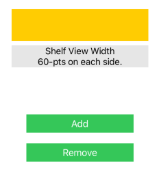
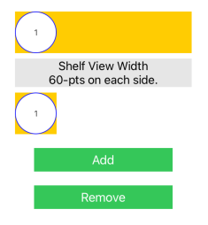
UILabel *info = [UILabel new];
info.translatesAutoresizingMaskIntoConstraints = NO;
info.backgroundColor = [UIColor colorWithWhite:0.90 alpha:1.0];
info.textAlignment = NSTextAlignmentCenter;
info.numberOfLines = 0;
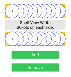
info.text = @"Shelf View Width\n60-pts on each side.";
[self.view addSubview:info];
// respect safeArea
UILayoutGuide *g = self.view.safeAreaLayoutGuide;
[NSLayoutConstraint activateConstraints:@[
[shelfViewA.topAnchor constraintEqualToAnchor:g.topAnchor constant:60.0],
[shelfViewA.leadingAnchor constraintEqualToAnchor:g.leadingAnchor constant:60.0],
[shelfViewA.trailingAnchor constraintEqualToAnchor:g.trailingAnchor constant:-60.0],
[shelfViewA.heightAnchor constraintEqualToConstant:60.0],
[info.topAnchor constraintEqualToAnchor:shelfViewA.bottomAnchor constant:8.0],
[info.leadingAnchor constraintEqualToAnchor:g.leadingAnchor constant:60.0],
[info.trailingAnchor constraintEqualToAnchor:g.trailingAnchor constant:-60.0],
[shelfViewB.topAnchor constraintEqualToAnchor:info.bottomAnchor constant:8.0],
[shelfViewB.leadingAnchor constraintEqualToAnchor:g.leadingAnchor constant:60.0],
[shelfViewB.trailingAnchor constraintEqualToAnchor:g.trailingAnchor constant:-60.0],
[shelfViewB.heightAnchor constraintEqualToConstant:60.0],
[addBtn.topAnchor constraintEqualToAnchor:shelfViewB.bottomAnchor constant:20.0],
[addBtn.centerXAnchor constraintEqualToAnchor:g.centerXAnchor],
[addBtn.widthAnchor constraintEqualToConstant:200.0],
[removeBtn.topAnchor constraintEqualToAnchor:addBtn.bottomAnchor constant:20.0],
[removeBtn.centerXAnchor constraintEqualToAnchor:g.centerXAnchor],
[removeBtn.widthAnchor constraintEqualToConstant:200.0],
]];
}
- (void)addTapped {
++counter;
[shelfViewA addItem:counter];
[shelfViewB addItem:counter];
}
- (void)removeTapped {
if (counter > 0) {
--counter;
[shelfViewA removeItem];
[shelfViewB removeItem];
}
}
@end
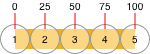
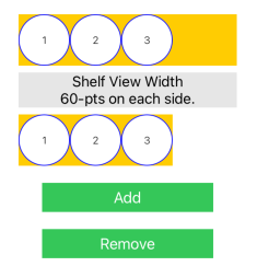
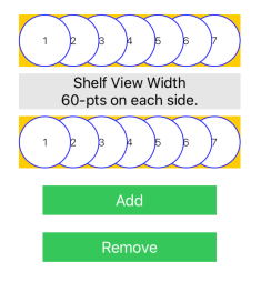
Running that gives us this - note the "top" shelf view shows its frame, the "bottom" shelf view only shows the "framing view":
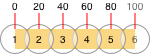
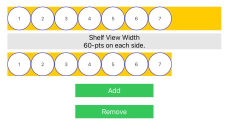
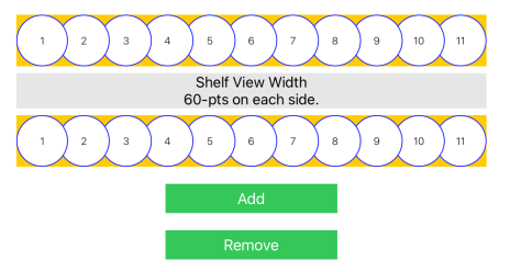
and when the view changes size, such as on device rotation, we don't have to do anything ... auto-layout handles it for us:
How to make a circular UIView
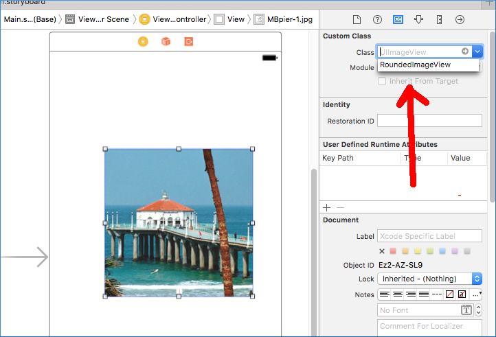
As mentioned in some comments, @IBDesignable makes this much easier now, so you can use Interface Builder to configure your rounded UIImageView.
First create a class named RoundedImageView.swift and paste this code to it:
import UIKit

@IBDesignable public class RoundedImageView: UIImageView {

    override public func layoutSubviews() {
        super.layoutSubviews()

        //hard-coded this since it's always round
        layer.cornerRadius = 0.5 * bounds.size.width
    }
}
Select the UIImageView in InterfaceBuilder and change the class from UIImageView to the custom RoundedImageView:
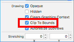
Set Clip to Bounds to true (or the pic will extend beyond the circle):
It should now round itself right there in InterfaceBuilder, which is pretty nifty. Be sure to set the width and height to the same values or it'll be shaped like a zeppelin!
Related Topics
Cashapelayer Animating Path Glitches/Flickers (From Ellipse to Rect and Back)
How to Detect "Clear" Notifications
Segues Initiated Directly from View Controllers Warning in Storyboard Xcode
iOS Autolayout - Frame Size Not Set in Viewdidlayoutsubviews
Programmatically Creating Uinavigationcontroller in iOS
How to Use Phcachingimagemanager
How to Register Undomanager in Swift
Ios: Production Push Notifications, Invalid Token from Apns Server
Gcd - Main VS Background Thread for Updating a Uiimageview
Swift Framework Does Not Include Symbols from Extensions to Generic Structs
How to Check Text Field Input at Real Time
Change Pin Image on Mkmapview in Swift
Remove Uiwebview's Internal Cache
Pass Uicollectionview Touch Event to Its Parent Uitableviewcell
Simple Sprite Kit Scene Setup Going Wrong
How to Change the Height of Uitextfield in Uialertcontroller in Swift
Programmatically Determine Current Target (Run or Test) in iOS Project