iPhone 6 and 6 plus screen sizes in pixels?
If you are upgrading your application to support iPhone6 and iPhone6+ and you do not wish for your application to scale on these devices you need to update your launch images to include:
iPhone Portrait:
- Retina HD 5.5 - 1242x2208px
- Retina HD 4.7 - 750x1334px
and or:
iPhone Landscape
- Retina HD 5.5 - 2208x1242px
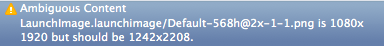
Please note that although the screen size for the iPhone6+ is 1080x1920, it is using downscaled renders: https://twitter.com/stroughtonsmith/status/509438167280549888
iPhone 6 (Plus) screen size
It seems like you didn't provide correct launch images to your app. When there is no correct launch images set, the app will run like on iPhone 5/5S, that's why you are having these confusing results while logging. iPhone 6 screen size is 375x667 px scale x2, iPhone 6+ 414x736 px scale x3. So, if you want to set launch image for iPhone 6 it should have 750x1334 px size, and 1242x2208 for iPhone 6+ respectively. Good Luck!
EDIT:
As rmaddy mentioned in the comments, it's better to use launch screen storyboard with proper layout constraints to fit all screens, than having bunch of images for all screens(which also increases the app size).
iPhone 6 and 6 Plus Media Queries
iPhone 6
Landscape
@media only screen
    and (min-device-width : 375px) // or 213.4375em or 3in or 9cm
    and (max-device-width : 667px) // or 41.6875em
    and (width : 667px) // or 41.6875em
    and (height : 375px) // or 23.4375em
    and (orientation : landscape)
    and (color : 8)
    and (device-aspect-ratio : 375/667)
    and (aspect-ratio : 667/375)
    and (device-pixel-ratio : 2)
    and (-webkit-min-device-pixel-ratio : 2)
{ }
Portrait
@media only screen
    and (min-device-width : 375px) // or 213.4375em
    and (max-device-width : 667px) // or 41.6875em
    and (width : 375px) // or 23.4375em
    and (height : 559px) // or 34.9375em
    and (orientation : portrait)
    and (color : 8)
    and (device-aspect-ratio : 375/667)
    and (aspect-ratio : 375/559)
    and (device-pixel-ratio : 2)
    and (-webkit-min-device-pixel-ratio : 2)
{ }
if you prefer you can use
(device-width : 375px)and(device-height: 559px)in place of themin-andmax-settings.It is not necessary to use all of these settings, and these are not all the possible settings. These are just the majority of possible options so you can pick and choose whichever ones meet your needs.
User Agent
tested with my iPhone 6 (model MG6G2LL/A) with iOS 9.0 (13A4305g)
# Safari
Mozilla/5.0 (iPhone; CPU iPhone OS 9_0 like Mac OS X) AppleWebKit/601.1.39 (KHTML, like Gecko) Version/9.0 Mobile/13A4305g Safari 601.1
# Google Chrome
Mozilla/5.0 (Macintosh; Intel Mac OS X 10_7_3) AppleWebKit/534.53.11 (KHTML, like Gecko) Version/5.1.3 Safari/534.53.10 (000102)
# Mercury
Mozilla/5.0 (iPhone; CPU iPhone OS 7_0_4 like Mac OS X) AppleWebKit/537.51.1 (KHTML, like Gecko) Version/7.0 Mobile/11B554a Safari/9537.53
Launch images
- 750 x 1334 (@2x) for portrait
- 1334 x 750 (@2x) for landscape
App icon
- 120 x 120
iPhone 6+
Landscape
@media only screen
    and (min-device-width : 414px)
    and (max-device-width : 736px)
    and (orientation : landscape)
    and (-webkit-min-device-pixel-ratio : 3)
{ }
Portrait
@media only screen
    and (min-device-width : 414px)
    and (max-device-width : 736px)
    and (device-width : 414px)
    and (device-height : 736px)
    and (orientation : portrait)
    and (-webkit-min-device-pixel-ratio : 3)
    and (-webkit-device-pixel-ratio : 3)
{ }
Launch images
- 1242 x 2208 (@3x) for portrait
- 2208 x 1242 (@3x) for landscape
App icon
- 180 x 180
iPhone 6 and 6+
@media only screen
    and (max-device-width: 640px),
    only screen and (max-device-width: 667px),
    only screen and (max-width: 480px)
{ }
Predicted
According to the Apple website the iPhone 6 Plus will have 401 pixels-per-inch and be 1920 x 1080. The smaller version of the iPhone 6 will be 1334 x 750 with 326 PPI.
So, assuming that information is correct, we can write a media query for the iPhone 6:
@media screen
    and (min-device-width : 1080px)
    and (max-device-width : 1920px)
    and (min-resolution: 401dpi)
    and (device-aspect-ratio:16/9)
{ }

@media screen
    and (min-device-width : 750px)
    and (max-device-width : 1334px)
    and (min-resolution: 326dpi)
{ }
Note that device-aspect-ratio will be deprecated in http://dev.w3.org/csswg/mediaqueries-4/ and replaced with aspect-ratio
Min-width and max-width may be something like 1704 x 960.
Apple Watch (speculative)
Specs on the Watch are still a bit speculative since (as far as I'm aware) there has been no official spec sheet yet. But Apple did mention in this press release that the Watch will be available in two sizes.. 38mm and 42mm.
Further assuming.. that those sizes refer to the screen size rather than the overall size of the Watch face these media queries should work.. And I'm sure you could give or take a few millimeters to cover either scenario without sacrificing any unwanted targeting because..
@media (!small) and (damn-small), (omfg) { }
or
@media
    (max-device-width:42mm)
    and (min-device-width:38mm)
{ }
It's worth noting that Media Queries Level 4 from W3C currently only available as a first public draft, once available for use will bring with it a lot of new features designed with smaller wearable devices like this in mind.
iPhone 6 Plus resolution confusion: Xcode or Apple's website? for development
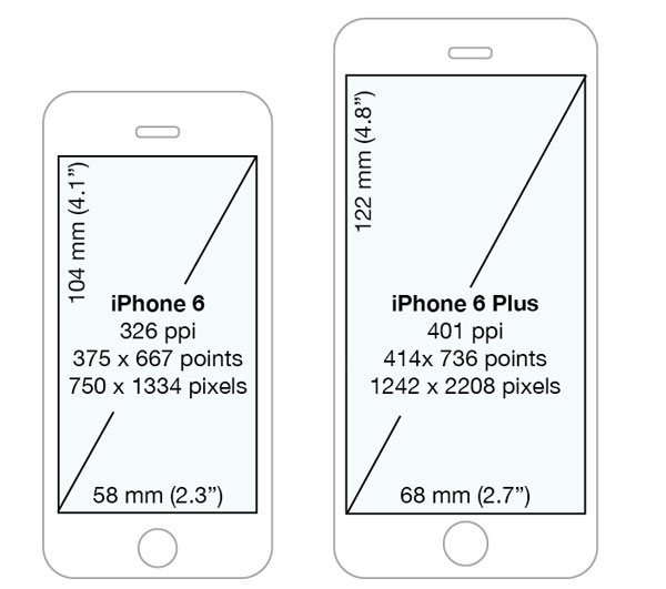
The iPhone 6+ renders internally using @3x assets at a virtual resolution of 2208×1242 (with 736x414 points), then samples that down for display. The same as using a scaled resolution on a Retina MacBook — it lets them hit an integral multiple for pixel assets while still having e.g. 12 pt text look the same size on the screen.
So, yes, the launch screens need to be that size.
The maths:
The 6, the 5s, the 5, the 4s and the 4 are all 326 pixels per inch, and use @2x assets to stick to the approximately 160 points per inch of all previous devices.
The 6+ is 401 pixels per inch. So it'd hypothetically need roughly @2.46x assets. Instead Apple uses @3x assets and scales the complete output down to about 84% of its natural size.
In practice Apple has decided to go with more like 87%, turning the 1080 into 1242. No doubt that was to find something as close as possible to 84% that still produced integral sizes in both directions — 1242/1080 = 2208/1920 exactly, whereas if you'd turned the 1080 into, say, 1286, you'd somehow need to render 2286.22 pixels vertically to scale well.
Detecting iPhone 6/6+ screen sizes in point values
The first screen will be the device screen, Note that a launch images for the new phones have to be added before, otherwise the app is running in Zoomed Mode for older apps :
Here is the code I used to check this out. Note: This only works with version iOS 8 and higher:
UIScreen *mainScreen = [UIScreen mainScreen];
NSLog(@"Screen bounds: %@, Screen resolution: %@, scale: %f, nativeScale: %f",
          NSStringFromCGRect(mainScreen.bounds), mainScreen.coordinateSpace, mainScreen.scale, mainScreen.nativeScale);
Code for detecting iPhone 6 Plus:
#define IS_PAD (UI_USER_INTERFACE_IDIOM() == UIUserInterfaceIdiomPad)
#define IS_PHONE (UI_USER_INTERFACE_IDIOM() == UIUserInterfaceIdiomPhone)

-(BOOL)iPhone6PlusDevice{
    if (!IS_PHONE) return NO;
    if ([UIScreen mainScreen].scale > 2.9) return YES;   // Scale is only 3 when not in scaled mode for iPhone 6 Plus
    return NO;
}
or
-(BOOL) iPhone6PlusUnZoomed{
    if ([self iPhone6PlusDevice]){
        if ([UIScreen mainScreen].bounds.size.height > 720.0) return YES;  // Height is 736, but 667 when zoomed.
    }
    return NO;
}
Note: If you are checking for iPhone 6 Plus, to adjust the user interface then don´t rely on .nativeScale, because the simulator and actual device give different results. Due to the comment below. Scale is a CGFloat and thus, code should not check equality, because some floats values may never be equal.
After adding Launch Screen you can utilise the new iPhone sizes, otherwise your app will still look scaled.
Updated for the new iPhones 11, 11 Pro and 11 Pro Max
Size for iPhone 11 Pro Max with @3x scaling, coordinate space: 414 x 896 points and 1242 x 2688 pixels, 458 ppi, device physical size is 3.06 x 6.22 in or 77.8 x 158.0 mm. 6.5" Super Retina XDR display.
Size for iPhone 11 Pro with @3x scaling, coordinate space: 375 x 812 points and 1125 x 2436 pixels, 458 ppi, device physical size is 2.81 x 5.67 in or 71.4 x 144.0 mm. 5.8" Super Retina XDR display.
Size for iPhone 11 with @2x scaling, coordinate space: 414 x 896 points and 828 x 1792 pixels, 326 ppi, device physical size is 2.98 x 5.94 in or 75.7 x 150.9 mm. 6.1" Liquid Retina HD display.
Size for iPhone X Max with @3x scaling (Apple name: Super Retina HD 6.5 display"), coordinate space: 414 x 896 points and 1242 x 2688 pixels, 458 ppi, device physical size is 3.05 x 6.20 in or 77.4 x 157.5 mm.
let screen = UIScreen.main
print("Screen bounds: \(screen.bounds), Screen resolution: \(screen.nativeBounds), scale: \(screen.scale)")
//iPhone X Max Screen bounds: (0.0, 0.0, 414.0, 896.0), Screen resolution: (0.0, 0.0, 1242.0, 2688.0), scale: 3.0
Size for iPhone X/strong> with @2x scaling (Apple name: Super Retina HD 6.1" display), coordinate space: 414 x 896 points and 828 x 1792 pixels, 326 ppi, device physical size is 2.98 x 5.94 in or 75.7 x 150.9 mm.
let screen = UIScreen.main
print("Screen bounds: \(screen.bounds), Screen resolution: \(screen.nativeBounds), scale: \(screen.scale)")
//iPhone X Screen bounds: (0.0, 0.0, 414.0, 896.0), Screen resolution: (0.0, 0.0, 828.0, 1792.0), scale: 2.0
Size for iPhone X/strong> and iPhone X with @3x scaling (Apple name: Super Retina HD 5.8" display), coordinate space: 375 x 812 points and 1125 x 2436 pixels, 458 ppi, device physical size is 2.79 x 5.65 in or 70.9 x 143.6 mm.
let screen = UIScreen.main
print("Screen bounds: \(screen.bounds), Screen resolution: \(screen.nativeBounds), scale: \(screen.scale)")
//iPhone X and X Screen bounds: (0.0, 0.0, 375.0, 812.0), Screen resolution: (0.0, 0.0, 1125.0, 2436.0), scale: 3.0
Size for iPhone 8, 7, 6 Plus and iPhone 8, 7, 6S Plus with @3x scaling (Apple name: Retina HD 5.5), Coordinate space: 414 x 736 points and 1242 x 2208 pixels, 401 ppi, screen physical size is 2.7 x 4.8 in or 68 x 122 mm:
Screen bounds: {{0, 0}, {414, 736}}, Screen resolution: <UIScreen: 0x7f97fad330b0; bounds = {{0, 0}, {414, 736}};
mode = <UIScreenMode: 0x7f97fae1ce00; size = 1242.000000 x 2208.000000>>, scale: 3.000000, nativeScale: 3.000000
Size for iPhone 6 and iPhone 6S with @2x scaling (Apple name: Retina HD 4.7), Coordinate space: 375 x 667 points and 750 x 1334 pixels, 326 ppi, screen physical size is 2.3 x 4.1 in or 58 x 104 mm:
Screen bounds: {{0, 0}, {375, 667}}, Screen resolution: <UIScreen: 0x7fa01b5182d0; bounds = {{0, 0}, {375, 667}};
mode = <UIScreenMode: 0x7fa01b711760; size = 750.000000 x 1334.000000>>, scale: 2.000000, nativeScale: 2.000000
And iPhone 5 for comparison is 640 x 1136, iPhone 4 640 x 960.
Note: Upload LaunchImages otherwise the app will run scaled and not show correct scaling, or screen sizes.
Why is iPhone 6 Plus' screen size 375x667 on real device?
Check that the device isn't set to the zoomed resolution mode in Settings > Display & Brightness > View.
Setting the phone to a zoomed resolution will result in a different point size to be returned for the screen, which seems to be what you are experiencing.
iPhone 6 plus dimensions showing up as 375.0 x 667.0?
Your device has the Display Zoom set to Zoomed under Settings->Display & Brightness.
Quoting a post from the Apple Developer Forum:
If the phone is set for zoomed mode, you get either the iPhone 5S screen size (on iPhone 6) or the iPhone 6 size (on iPhone 6 Plus). Keep in mind that on iPhone 6 Plus in zoomed mode you still get a 3x screen, and thus your 3x assets are used.
Related Topics
How to Draw on an Image in Swift
How to Ensure to Run Some Code on Same Background Thread
Enable Uialertaction of Uialertcontroller Only After Input Is Validated
Itunes Connect: Can't See Build
iOS 7 Uitoolbar Overriding with Status Bar
How to Change Pagetabview Programmatically in iOS 14, Swiftui 2
Afnetworking 2.2.0 Upload Image on Server Issues
Uipickerview: Nsattributedstring Not Available in iOS 7
Error Setting Text in Collection View Cell
Check If My iOS Application Is Updated
How to Use Multiple Segues with One Uitableviewdelegate
Share Datas Between Two Apps with iOS 8 App Groups (Using Nsuserdefaults)
Uitapgesturerecognizer on Uiimageview Within Uitablevlewcell Not Getting Called
Swift Execute Asynchronous Tasks in Order
How to Segue with Data from One Tab to Another Tab Properly