How do I easily support light and dark mode with a custom color used in my app?
As it turns out, this is really easy with the new UIColor init(dynamicProvider:) initializer.
Update the custom color to:
extension UIColor {
    static var myControlBackground: UIColor {
        if #available(iOS 13.0, *) {
            return UIColor { (traits) -> UIColor in
                // Return one of two colors depending on light or dark mode
                return traits.userInterfaceStyle == .dark ?
                    UIColor(red: 0.5, green: 0.4, blue: 0.3, alpha: 1) :
                    UIColor(red: 0.3, green: 0.4, blue: 0.5, alpha: 1)
            }
        } else {
            // Same old color used for iOS 12 and earlier
            return UIColor(red: 0.3, green: 0.4, blue: 0.5, alpha: 1)
        }
    }
}
That's it. No need to define two separate statics. The control class doesn't need any changes from the original code. No need to override traitCollectionDidChange or anything else.
The nice thing about this is that you can see the color change in the app switcher immediately after changing the mode in the Settings app. And of course the color is up-to-date automatically when you go back to the app.
On a related note when supporting light and dark mode - Use as many of the provided colors from UIColor as possible. See the available dynamic colors from UI Elements and Standard Colors. And when you need your own app-specific colors to support both light and dark mode, use the code in this answer as an example.
In Objective-C, you can define your own dynamic colors with:
UIColor+MyApp.h:
@interface UIColor (MyApp)

@property (class, nonatomic, readonly) UIColor *myControlBackgroundColor;

@end
UIColor+MyApp.m:
+ (UIColor *)myControlBackgroundColor {
    if (@available(iOS 13.0, *)) {
        return [UIColor colorWithDynamicProvider:^UIColor * _Nonnull(UITraitCollection * _Nonnull traits) {
            return traits.userInterfaceStyle == UIUserInterfaceStyleDark ?
                [self colorWithRed:0.5 green:0.4 blue:0.2 alpha:1.0] :
                [self colorWithRed:0.3 green:0.4 blue:0.5 alpha:1.0];
        }];
    } else {
        return [self colorWithRed:0.3 green:0.4 blue:0.5 alpha:1.0];
    }
}
The best way to manage colours in dark or light mode
Do what the asset catalog does, without actually using the asset catalog. Define your colors entirely in code as light / dark mode pairs using the UIColor dynamic provider initializer:
https://developer.apple.com/documentation/uikit/uicolor/3238041-init
Now just go ahead and use those colors throughout the app. No need to know whether you're in light or dark mode. No "overhead" required. Your colors will automatically be always correct for the current mode, and will change automatically when the user changes between light and dark modes.
How to handle custom colors for Dark Mode in Swift
Create the colors in the asset catalog.
Colors in the asset catalog can be created for different Appearances and can be accessed with the UIColor(named:) API
Please see Supporting Dark Mode in Your Interface
having issues regarding custom colors in dark mode in swift
You should use colors from the assets! As you are adding images likewise you can add color set in the Assets. From the Attribute inspector, you can change appearances to Any, Dark or Any, Light, Dark and set color for each. Refer below screenshot for better understanding.

Custom elevated background color for iOS dark mode
Thanks Kurt Revis for pointing my to this. I was able to do this using a special UIColor initializer that Swift provides. The only downside is that this will not work in interface builder (since it is not baked into the Asset itself), but in code this will work perfectly:
class ElevatedColor: UIColor {
    convenience init(regular: UIColor, elevated: UIColor) {
        if #available(iOS 13.0, *) {
            self.init { (traitCollection: UITraitCollection) -> UIColor in
                let isElevated = (traitCollection.userInterfaceLevel == .elevated)
                return isElevated ? elevated : regular
            }
        } else {
            self.init(cgColor: regular.cgColor)
        }
    }
}
This uses UIColor.init(dynamicProvider:). iOS will call the provided block whenever the interface traits change, so the color automatically updates when switching to an elevated context. Unfortunately, because of the way UIColor works, you can only make the initializer a convenience initializer, so technically you could create an ElevatedColor without an elevated version, but for me this is acceptable.
How do I control what colors are used when a user switches between Light and Dark mode in Android
You can override the colors that you use in your layout and put them in values-night/colors.xml. So, in light theme values/colors.xml will be used and in the night theme, values-night/colors.xml will be used.
Let's say you have a color assigned to a button, you write following line, make sure the color name is same:
values/colors.xml
<color name="colorButton">#6d85c9</color>
values-night/colors.xml
<color name="colorButton">@color/colorWhite</color>
And then you can assign the color to the button you do normally.
Let me know if you have more questions.
How can you allow for a user changing to dark or light mode with the app open on iOS?
You don't need all those messy if statements! Just add your colours to your Asset Catalogue and the right one will automatically be selected. This is similar to how you can add x1, x2 and x3 images, and the right one will be selected.
Go to the Asset Catalogue and at the bottom left, click on the plus button, select "New Color Set":

Give the colour a name, and in the property inspector, set "Appearance" to "Any, Dark":

Choose a colour for each appearance:

Finally, use the UIColor(named:) initialiser to initialise the colours and they will automatically change when the device's dark mode settings change:
someView.backgroundColor = UIColor(named: "myColor")
EDIT:
If the colours are only known at runtime, you can use the init(dynamicProvider:) initialiser (iOS 13 only though):
someView.backgroundColor = UIColor {
    traits in
    if traits.userInterfaceStyle == .dark {
        // return color for dark mode
    } else {
        // return color for light mode
    }
}
How to support support dark mode for existing swift app iOS?
if you don't set UIUserInterfaceStyle on info.plist then the App automatically enables dark mode depends on the system. If the system runs with dark mode then the app will start with dark mode.
But to show all the texts or other things you have to use the system color as the background and also for texts. OR you can use a custom color for dark mode or light mode.
How to implement Dark mode and Light Mode in flutter?
The easiest way in my opinion is by using provider to manage the state of your app and shared_preferences to save your theme preference on file system. By following this procedure you can save your theme so the user doesn't have to switch theme every time.
Output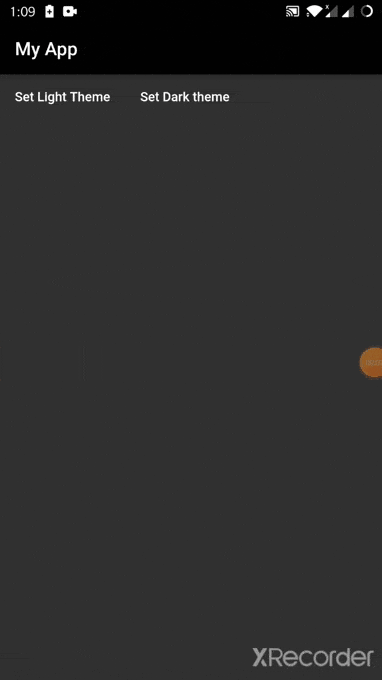
You can easily store your theme preference in form of a string and then at the start of your app check if there is value stored on file system, if so apply that theme as shown below.
StorageManager.dart
import 'package:shared_preferences/shared_preferences.dart';

class StorageManager {
  static void saveData(String key, dynamic value) async {
    final prefs = await SharedPreferences.getInstance();
    if (value is int) {
      prefs.setInt(key, value);
    } else if (value is String) {
      prefs.setString(key, value);
    } else if (value is bool) {
      prefs.setBool(key, value);
    } else {
      print("Invalid Type");
    }
  }

  static Future<dynamic> readData(String key) async {
    final prefs = await SharedPreferences.getInstance();
    dynamic obj = prefs.get(key);
    return obj;
  }

  static Future<bool> deleteData(String key) async {
    final prefs = await SharedPreferences.getInstance();
    return prefs.remove(key);
  }
}
Define your theme properties in a theme variable like below and initialize your _themedata variable on the basis of value inside storage.
ThemeManager.dart
import 'package:flutter/material.dart';
import '../services/storage_manager.dart';

class ThemeNotifier with ChangeNotifier {
  final darkTheme = ThemeData(
    primarySwatch: Colors.grey,
    primaryColor: Colors.black,
    brightness: Brightness.dark,
    backgroundColor: const Color(0xFF212121),
    accentColor: Colors.white,
    accentIconTheme: IconThemeData(color: Colors.black),
    dividerColor: Colors.black12,
  );

  final lightTheme = ThemeData(
    primarySwatch: Colors.grey,
    primaryColor: Colors.white,
    brightness: Brightness.light,
    backgroundColor: const Color(0xFFE5E5E5),
    accentColor: Colors.black,
    accentIconTheme: IconThemeData(color: Colors.white),
    dividerColor: Colors.white54,
  );

  ThemeData _themeData;
  ThemeData getTheme() => _themeData;

  ThemeNotifier() {
    StorageManager.readData('themeMode').then((value) {
      print('value read from storage: ' + value.toString());
      var themeMode = value ?? 'light';
      if (themeMode == 'light') {
        _themeData = lightTheme;
      } else {
        print('setting dark theme');
        _themeData = darkTheme;
      }
      notifyListeners();
    });
  }

  void setDarkMode() async {
    _themeData = darkTheme;
    StorageManager.saveData('themeMode', 'dark');
    notifyListeners();
  }

  void setLightMode() async {
    _themeData = lightTheme;
    StorageManager.saveData('themeMode', 'light');
    notifyListeners();
  }
}
Wrap your app with themeProvider and then apply theme using consumer. By doing so whenever you change the value of theme and call notify listeners widgets rebuild to sync changes.
Main.dart
void main() {
  return runApp(ChangeNotifierProvider<ThemeNotifier>(
    create: (_) => new ThemeNotifier(),
    child: MyApp(),
  ));
}

class MyApp extends StatelessWidget {
  @override
  Widget build(BuildContext context) {
    return Consumer<ThemeNotifier>(
      builder: (context, theme, _) => MaterialApp(
        theme: theme.getTheme(),
        home: Scaffold(
          appBar: AppBar(
            title: Text('Hybrid Theme'),
          ),
          body: Row(
            children: [
              Container(
                child: FlatButton(
                  onPressed: () => {
                    print('Set Light Theme'),
                    theme.setLightMode(),
                  },
                  child: Text('Set Light Theme'),
                ),
              ),
              Container(
                child: FlatButton(
                  onPressed: () => {
                    print('Set Dark theme'),
                    theme.setDarkMode(),
                  },
                  child: Text('Set Dark theme'),
                ),
              ),
            ],
          ),
        ),
      ),
    );
  }
}
Here is the link to github repository.
Related Topics
How to Debug an Issue with a Release Mode Build in iOS
Will Appstore Reviewers Allow Us to Use Dynamic Library in iOS8
Get Tapped Word from Uitextview in Swift
Calayer - Cabasicanimation Not Scaling Around Center/Anchorpoint
Xcode/Swift 'Filename Used Twice' Build Error
Unknown Class in Interface Builder
Uisearchcontroller Not Redisplaying Navigation Bar on Rotate
Alamofire No Such Module (Cocoapods)
Is -[Uitableview Reloaddata] Asynchronous or Synchronous
How to Use Mbprogresshud with Swift
Cllocationmanager Responsiveness
How to Take Screenshot of Portion of Uiview
How to Implement Uitableview's Swipe to Delete for Uicollectionview
Uiimagejpegrepresentation Has Been Replaced by Instance Method Uiimage.Jpegdata(Compressionquality:)
Encryption with Rsa Public Key on iOS
"Unable to Validate Your Application Error" While Uploading a New Version of iOS App
How to Get Change in Network Connection Notification from iOS Reachability Class