Is it possible to create multi line UISegmentedControl?
if you have a standard UISegmentedControl you can use the following idea:
[_segmentedControl.subviews enumerateObjectsUsingBlock:^(UIView * obj, NSUInteger idx, BOOL *stop) {
    [obj.subviews enumerateObjectsUsingBlock:^(id obj, NSUInteger idx, BOOL *stop) {
        if ([obj isKindOfClass:[UILabel class]]) {
            UILabel *_tempLabel = (UILabel *)obj;
            [_tempLabel setNumberOfLines:0];
        }
    }];
}];
you may need to set the height of your instance as well.
NOTE: I need to add a little warning about – as rmaddy has also pointed out correctly – this is a quite fragile solution, because if the segmented control's view hierarchy would be changed in the future iOS versions that code may not work properly anymore.
Swift iOS -How to Achieve Multi line SegmentedControl with different Font Sizes
You'll want to create a custom control by subclassing UIControl. Here's a quick example:
CustomSegmentedControl.swift
import UIKit
import CoreImage

public class CustomSegmentedControl: UIControl {

    public var borderWidth: CGFloat = 1.0
    public var selectedSegementIndex = 0 {
        didSet {
            self.styleButtons()
        }
    }

    public var numberOfSegments: Int {
        return self.segments.count
    }

    private var buttons: [UIButton] = []
    private var stackView = UIStackView(frame: CGRect.zero)
    private var stackBackground = UIView(frame: CGRect.zero)
    private var segments: [NSAttributedString] = [] {
        didSet {
            for subview in self.stackView.arrangedSubviews {
                subview.removeFromSuperview()
            }
            self.buttons = []
            for i in 0..<segments.count {
                let segment = segments[i]
                self.createAndAddSegmentButton(title: segment)
            }
            self.styleButtons()
        }
    }

    override public init(frame: CGRect) {
        super.init(frame: frame)
        self.setup()
    }

    public required init?(coder aDecoder: NSCoder) {
        super.init(coder: aDecoder)
        self.setup()
    }

    private func setup() {

        self.addSubview(stackBackground)
        self.stackBackground.constrainToBounds(of: self)
        self.addSubview(stackView)
        self.stackView.constrainToBounds(of: self)
        self.stackView.axis = .horizontal
        self.stackView.distribution = .fillEqually
        self.stackView.spacing = borderWidth

        self.layer.cornerRadius = 5.0
        self.layer.borderWidth = borderWidth
        self.clipsToBounds = true
        self.stackBackground.backgroundColor = tintColor
    }

    private func createAndAddSegmentButton(title: NSAttributedString) {
        let button = createSegmentButton(title: title)
        self.buttons.append(button)
        self.stackView.addArrangedSubview(button)
    }

    private func createSegmentButton(title: NSAttributedString) -> UIButton {
        let button = UIButton(frame: CGRect.zero)
        button.titleLabel?.numberOfLines = 0
        button.titleLabel?.textAlignment = .center
        button.setAttributedTitle(title, for: .normal)
        button.addTarget(self, action: #selector(self.actSelected(button:)), for: .touchUpInside)
        return button
    }

    override public var tintColor: UIColor! {
        willSet {
            self.layer.borderColor = newValue.cgColor
            self.stackBackground.backgroundColor = newValue
        }
    }

    public func setSegments(_ segments: [NSAttributedString]) {
        self.segments = segments
    }

    @objc private func actSelected(button: UIButton) {
        guard let index = self.buttons.index(of: button) else {
            print("invalid selection should never happen, would want to handle better than this")
            return
        }
        self.selectedSegementIndex = index
        self.sendActions(for: .valueChanged)
    }

    private func styleButtons() {
        for i in 0..<self.buttons.count {
            let button = self.buttons[i]
            if i == selectedSegementIndex {
                button.backgroundColor = self.tintColor
                button.titleLabel?.textColor = self.backgroundColor ?? .white
            } else {
                button.backgroundColor = self.backgroundColor
                button.titleLabel?.textColor = self.tintColor
            }
        }
    }
}

extension UIView {
    func constrainToBounds(of view: UIView) {
        self.translatesAutoresizingMaskIntoConstraints = false
        let attrs: [NSLayoutAttribute] = [.leading, .top, .trailing, .bottom]
        let constraints = attrs.map { (attr) -> NSLayoutConstraint in
            return NSLayoutConstraint(item: self,
                                      attribute: attr,
                                      relatedBy: .equal,
                                      toItem: view,
                                      attribute: attr,
                                      multiplier: 1.0,
                                      constant: 0)
        }
        NSLayoutConstraint.activate(constraints)
    }
}
ViewController.swift
import UIKit

class ViewController: UIViewController {

    @IBOutlet weak var customSegment: CustomSegmentedControl!
    private var segments: [NSAttributedString] = []

    override func viewDidLoad() {
        super.viewDidLoad()
        // Do any additional setup after loading the view, typically from a nib.

        self.customSegment.backgroundColor = .white
        self.customSegment.tintColor = .orange

        let pizza = createText(title: "Pizza", subTitle: "123K")
        let turkey = createText(title: "Turkey Burgers", subTitle: "456.2M")
        let gingerAle = createText(title: "Gingerale", subTitle: "789.3B")
        self.segments = [pizza, turkey, gingerAle]
        self.customSegment.setSegments(self.segments)

        self.customSegment.addTarget(self, action: #selector(self.segmentSelectionChanged(control:)), for: .valueChanged)
    }

    @objc private func segmentSelectionChanged(control: CustomSegmentedControl) {
        let segment = self.segments[control.selectedSegementIndex]
        print("selected segment = \(segment.string)")
    }

    func createText(title: String, subTitle: String) -> NSAttributedString {
        let titleStr = NSMutableAttributedString(string: "\(title)\n", attributes: [NSAttributedStringKey.font: UIFont.systemFont(ofSize: 16)])
        let subStr = NSAttributedString(string: subTitle, attributes: [NSAttributedStringKey.font: UIFont.systemFont(ofSize: 10)])
        titleStr.append(subStr)
        return titleStr
    }

}

Multiline Text On UIsegment Control
Hi friend segment controller already have the label as the subview, so this code is helpful to achieve the multiline text to segment control
for (id segment in [segmentedControl subviews])
{
    for (id label in [segment subviews])
    {
        if ([label isKindOfClass:[UILabel class]])
        {
            //hear u add any of delegate function to increase the height and other label functionality in this
            [label setTextAlignment:UITextAlignmentCenter];
            [label setFont:[UIFont boldSystemFontOfSize:12]];
//to adjust the label size manually with respect to text use below code
  CGSize labelSize = CGSizeMake(100, 80);
  CGSize theStringSize = [label.text sizeWithFont:label.font constrainedToSize:labelSize];
  CGRect frame = label.frame;
  frame.size = theStringSize;

        }
    }
}
Have a Good day
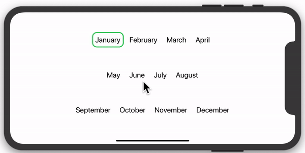
How would I fit all elements into a Segmented Control?
TL;DR
You can't fit all your text "as is" into a segmented picker, because the designers of SwiftUI didn't build segmented pickers to have that many options. You have a couple alternatives.
Images
As dasblinkenlight suggested, you can replace the text with small images, which should fit up to 6 choices:
struct BundleView: View {

    let areas = ["a.circle", "b.circle", "c.circle", "d.circle", "e.circle", "f.circle"]

    @State var selectedArea = 0

    var body: some View {
        Picker(selection: $selectedArea, label: EmptyView()) {
            ForEach(0..<areas.count) { index in
                Image(systemName: self.areas[index]).tag(index)
            }
        }.pickerStyle(SegmentedPickerStyle())
    }
}

Custom Control
You can build a custom control. Here's a cool design with animation from swiftui-lab.com:
But why can't I use Picker?
SwiftUI tends to have two types of Views:
- Those designed to be easily modifiable and composable, providing unlimited customizability for a unique look and feel.
- Those designed to provide a standard, consistent feel to some type of interaction, regardless of what app they are used in.
An example of type 1 would be Text. You can change font size, weight, typeface, color, background, padding, etc. It is designed for you to modify it.
An example of type 2 would be Picker. You are not in direct control of item width, you can't change the padding around views, you can't tell it wrap to multiple lines, etc. They don't want it to be very customizable, because then each app's pickers would behave differently, defeating the purpose of a standard control.
Segmented Pickers work best with 2-4 items, whose descriptions are relatively short. If you want something outside that, you need to make a custom control.
Related Topics
Undefined Symbols for Architecture Arm64 "_Objc_Class_$_Sfsafariviewcontroller"
How to Sign Out of Apple After Being Authenticated
Executefetchrequest Throw Fatal Error: Nsarray Element Failed to Match the Swift Array Element Type
Rotate Image Using Cgcontextdrawimage
Core Data Sum of All Instances Attribute
Does the List in Swiftui Reuse Cells Similar to Uitableview
Safari Web View Opening When Logging to Fb Through iOS 9
How to Create Multi Line Uisegmentedcontrol
How to Capture Taps Ignored by Wkwebview
How We Can Set the Light Content Style of Status Bar in iOS 9 for Whole Application
Page Based "Reloadrootcontrollerswithnames:" on Launch Loop
Fbsdkaccesstoken Currentaccesstoken Is Not Being Updated After Log In
Create Directory in App Group Container Swift
Get the Expiration Date of a Provisioning Profile at Run-Time
Xcode 5 - "No Application Records Were Found" When Trying to Validate an Archive