What is initial scale, user-scalable, minimum-scale, maximum-scale attribute in meta tag?
They are viewport meta tags, and is most applicable on mobile browsers.
width=device-width
This means, we are telling to the browser “my website adapts to your device width”.
initial-scale
This defines the scale of the website, This parameter sets the initial zoom level, which means 1 CSS pixel is equal to 1 viewport pixel. This parameter help when you're changing orientation, or preventing default zooming. Without this parameter, responsive site won't work.
maximum-scale
Maximum-scale defines the maximum zoom. When you access the website, top priority is maximum-scale=1, and it won’t allow the user to zoom.
minimum-scale
Minimum-scale defines the minimum zoom. This works the same as above, but it defines the minimum scale. This is useful, when maximum-scale is large, and you want to set minimum-scale.
user-scalable
User-scalable assigned to 1.0 means the website is allowing the user to zoom in or zoom out.
But if you assign it to user-scalable=no, it means the website is not allowing the user to zoom in or zoom out.
What is initial-scale=1.0?
A usual mobile responsive site would contain a HTML meta tag in the head like the following:
<meta name="viewport" content="width=device-width, initial-scale=1">
Within the tag the width property controls the size of the viewport. It can be set either to a precise number of pixels like width=400 or to the special value device-width value which is the width of the screen in CSS pixels at a scale of 100%. device-width is the most commonly used width for responsive websites that scale across different screen sizes.
When the page is first loaded the initial-scale property controls the initial zoom level ie 1 Viewport pixel = 1 CSS pixel. User-scalable, maximum-scale and minimum-scale properties control how the user is able to zoom the page in or out.
You could setup an example html page and include the viewport tag and change the initial-scale attribute to see the difference. Also try viewing the page on different viewport sizes and orientation.
initial-scale: The initial zoom when visiting the page. 1.0 does not zoom.
To answer what initial-scale=2.0 means here is an example of using 2.0:
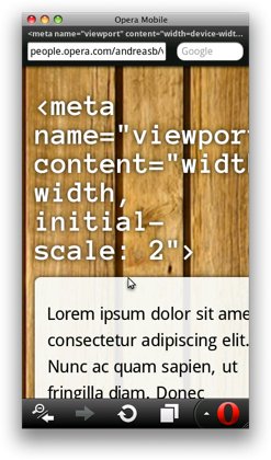
In addition to the above, you may want to specify the initial zoom factor for the viewing area. If you want to set the viewport of your page to be equal to the device’s width and have it zoom in by default with a factor of 2 for example, this property will come in handy. The code for that would look as follows:.
The Image above shows what this would look like — although it is not a particularly practical demonstration of the possibilities the initial scale setting has to offer, the underlying point should be clear: content is blown up with a factor of 2 upon first load.
https://dev.opera.com/articles/an-introduction-to-meta-viewport-and-viewport/#initial-scale
Some good references to checkout:
https://css-tricks.com/snippets/html/responsive-meta-tag/
https://css-tricks.com/probably-use-initial-scale1/
What is the use of user-scalable in this scenario
Yes, you can remove the user-scalable=no.
"minimum-scale=1, maximum-scale=1" and "user-scalable=no" have same effect.
By the way, there will be no performance issues if you keep both attributes
but for cleaner codes just use one not both.
Related Topics
How to Force a Page Break in HTML Printing
HTML Select Box Options on Hover
HTML Ordered List 1.1, 1.2 (Nested Counters and Scope) Not Working
Angularjs: Insert HTML from a String
Prevent Bootstrap Modal from Disappearing When Clicking Outside or Pressing Escape
Multiple Radio Button Groups in One Form
How to Center an Unordered List
:Not(:Empty) CSS Selector Is Not Working
Center Aligning a Fixed Position Div
How to Vertically Center Text in a Dynamically Height Div
Padding the Top and the Bottom of Inline Element
Why Doesn't CSS Ellipsis Work in Table Cell
Adding Line Numbers to HTML Textarea