What does the shrink-to-fit viewport meta attribute do?
It is Safari specific, at least at time of writing, being introduced in Safari 9.0. From the "What's new in Safari?" documentation for Safari 9.0:
Viewport Changes
Viewport meta tags using
"width=device-width"cause the page to scale down to fit content that overflows the viewport bounds. You can override this behavior by adding"shrink-to-fit=no"to your meta tag as shown below. The added value will prevent the page from scaling to fit the viewport.
<meta name="viewport" content="width=device-width, initial-scale=1.0, shrink-to-fit=no">
In short, adding this to the viewport meta tag restores pre-Safari 9.0 behaviour.
Example
Here's a worked visual example which shows the difference upon loading the page in the two configurations.
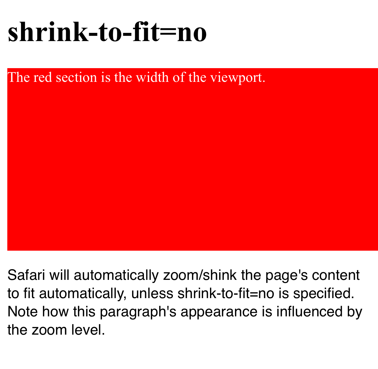
The red section is the width of the viewport and the blue section is positioned outside the initial viewport (eg left: 100vw). Note how in the first example the page is zoomed to fit when shrink-to-fit=no is omitted (thus showing the out-of-viewport content) and the blue content remains off screen in the latter example.
The code for this example can be found at https://codepen.io/davidjb/pen/ENGqpv.
Without shrink-to-fit specified
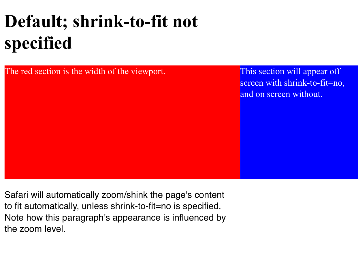
With shrink-to-fit=no
WKWebView viewport shrink-to-fit not working on iOS 9.3
I filed a bug report with Apple, and this is the response:
"No, we don’t want to maintain shrink-to-fit behavior. The workaround is to use a viewport meta tag that correctly describes the width of the content."
I tried this out. If, in the viewport tag, you specify a width of the actual width of the html after it's rendered, it will display properly on your device width. In my example above, with a table width of 700, if you specify: <meta name=\"viewport\" content=\"width=700, shrink-to-fit=YES\">
Then the page will display without horizontal scrollbars.
Note that you can't specify an initial-scale viewport property, though. Then it doesn't display with the proper width.
This is obviously less than ideal, because you generally don't know what the width of your rendered html will be until you render it. My current solution is to render it once with width=device-width, then render it again with width=X, where X is the actual width of the rendered page the first time.
Achieving min-width with viewport meta tag
So you want to change the viewport tag's width dynamicaly .
Here you go :
<meta id="myViewport" name="viewport" content="width = 380">
<script>
window.onload = function () {
    var mvp = document.getElementById('myViewport');
    mvp.setAttribute('content','width=580');
}
</script>
See:http://www.quirksmode.org/mobile/tableViewport.html
Side effects of removing width=device-width from viewport meta tag when initial-scale=1.0 is also set
Before we delve into what you're asking, let's review a little about why the viewport meta tag exists in the first place. Here's what I've gathered.
Why do we need the viewport tag?
A viewport is an area where the web content can be seen. Usually, the rendered page (web content) is bigger than the viewport. As a result, we usually use scrollbars to see the hidden content (because the viewport can't display everything). Quoted from CSS Device Adaptation Module Level 1:
The narrow viewport is a problem for documents designed to look good
in desktop browsers. The result is that mobile browser vendors use a
fixed initial containing block size that is different from the
viewport size, and close to that of a typical desktop browser window.
In addition to scrolling or panning, zooming is often used to change
between an overview of the document and zoom in on particular areas of
the document to read and interact with.
In mobile devices (and other smaller devices), the initial containing block is usually larger than the viewport. For example, a mobile device that has a screen width of 640px might have an initial containing block of 980px. In this case, the initial containing block is shrunk to 640px so that it can be fit into the mobile screen. This 640px width (screen width) is what is called initial-width of the viewport which will be pertinent to our discussion.
So.... Why do we need this viewport tag? Well, nowadays, we have media queries which allows us to design for mobile devices. However, this media query depends on the actual viewport's width. In mobile devices, the user agent automatically styles the initial viewport size to a different fixed one (usually larger than the initial viewport size). So if the viewport's width of a mobile device is fixed, the CSS rules we use in media queries won't be executed simply because the viewport's width never changes. Using the viewport tag, we can control the actual viewport's width (after being styled by the UA). Quoted from MDN:
However, this mechanism is not so good for pages that are optimized for narrow screens using media queries — if the virtual viewport is 980px for example, media queries that kick in at 640px or 480px or less will never be used, limiting the effectiveness of such responsive design techniques.
Note that the viewport tag can change the actual viewport's height too, not just the width
viewport tag's width
The width in a viewport tag is translated to max-width in the @viewport rule. When you declare the width as device-width, it is translated to 100% in the @viewport rule. Percentage value is resolved based on the initial-width of the viewport. So if we're still using the above example, the max-width will resolve to a value of 640px. As you've found out, this only specifies the max-width. The min-width will automatically be extend-to-zoom.
extend-to-zoom
Your question was what exactly is the value of extend-to-zoom? From what I've gathered, it's the value that's used to support the viewport extending itself to fit the viewing area at a given zoom level. In other words, it's a viewport size value that changes based on the zooming value specified. An example? Given that the max-zoom value of the UA stylesheet is 5.0 and the initial-width is 320px, <meta name="viewport" content="width=10"> will resolve to an initial actual width of 64px. This makes sense because if a device only has 320px and can only be zoomed 5x the normal value, then the minimum viewport size would be 320px divided by 5, which means showing only 64px at a time (and not 10px because that would require zooming 32x!). This value will be used by the algorithm to determine how to extend (change) the min-width and max-width values, which will play a role in determining the actual viewport width.
Putting it all together
So essentially, what's the difference between <meta name="viewport" content="width=device-width, initial-scale=1.0"> and <meta name="viewport" content="initial-scale=1.0">? Simply redo the steps of the algorithm (this and this). Let's do the latter (the one without width attribute) first. (We will assume that the initial-width of the viewport is 640px.)
widthis not set, this results inmax-widthandmin-widthbeingextend-to-zoomin the@viewportrule.initial-scaleis1.0. This means that thezoomvalue is also1.0- Let's resolve
extend-to-zoom. Steps:extend-zoom = MIN(zoom, max-zoom). TheMINoperation resolves to the value that is non-auto. Here,zoomis1.0andmax-zoomisauto. This means thatextend-zoomis1.0extend-width = initial-width / extend-zoom. This is easy; divide 640 by 1. You getextend-widthis equal to640- Because
extend-zoomis non-auto, we will skip to the second conditional.max-widthis indeedextend-to-zoom, this means thatmax-widthwill be set toextend-width. Thus,max-width = 640 min-widthis alsoextend-to-zoom, this means settingmin-widthtomax-width. We getmin-width = 640
- After resolving the non-
auto(i.e. theextend-to-zoom) values formax-widthandmin-width. We can proceed to the next procedure. Becausemin-widthormax-widthis notauto, we will use the firstifin the procedure, thus setting the initial actual viewportwidthtoMAX(min-width, MIN(max-width, initial-width)), which equates toMAX(640, MIN(640, 640)). This resolves to640for your initial actual viewportwidth - Moving on to the next procedure. In this step,
widthis notauto. The value isn't changed and we end up with the actual viewportwidthof640px
Let's do the former.
widthis set, this results inmax-widthbeing100%(640pxin our case) andmin-widthbeingextend-to-zoomin the@viewportrule.initial-scaleis1.0. This means that thezoomvalue is also1.0- Let's resolve
extend-to-zoom. If you follow the steps carefully (almost the same as above), you will end up with amax-widthof640pxand amin-widthof640px. - You can probably see the pattern now. We will get the actual viewport width of
640px.
So what's the perceived difference? Essentially none. Both of them do the same thing. Hope my explanation helps ;-) If anything was amiss, do tell me.
Related Topics
Question Mark Characters Display Within Text. Why Is This
Word-Wrap Break-Word Does Not Work in This Example
How to Set The Background Color of <Option> in a <Select> Element
Word Wrap a Link So It Doesn't Overflow Its Parent Div Width
How to Send Mail with a Subject Using a Mailto Url
Django Doesn't Display Newline Character When Rendering Text from Database
Is The Copyright Meta Tag Valid in HTML5
Assigning Multiple Styles on an HTML Element
CSS: Display:Block; Vs Display:Table;
Is Any Way That Is Safe to Display Videos in a Browser
Question Mark in The Middle of a Url Variable
HTML.Beginform() with an Absolute Url
How to Avoid Ie8 Compatibility Button
Div Element Won't Stay at The Bottom When iOS 7 Virtual Keyboard Is Present