Vertically align text within a div
Create a container for your text content, a span perhaps.
#column-content {  display: inline-block;}img {  vertical-align: middle;}span {  display: inline-block;  vertical-align: middle;}
/* for visual purposes */#column-content {  border: 1px solid red;  position: relative;}
<div id="column-content">
<img src="http://i.imgur.com/WxW4B.png"> <span><strong>1234</strong> yet another text content that should be centered vertically</span></div>How do I vertically center text with CSS?
You can try this basic approach:
div { height: 100px; line-height: 100px; text-align: center; border: 2px dashed #f69c55;}<div> Hello World!</div>CSS how to vertically align text within a pseudo element
Easiest way? Add padding top. Little more difficult but better way, use flexbox.
These properties will do
display: -webkit-flex;
display: flex;
-webkit-flex-direction: column;
flex-direction: column;
-webkit-align-items: center;
align-items: center;
-webkit-justify-content: center;
justify-content: center;
text-align: center;
http://jsfiddle.net/6dqxt2r3/4/
Is it possible to vertically align text in a div with `display: -webkit-box;`
The following statement works for me:
-webkit-box-align: center;
https://jsfiddle.net/awt39v5s/1/
For the "old" flexbox definition, https://www.smashingmagazine.com/2011/09/css3-flexible-box-layout-explained/ is a good resource.
Vertically align text next to an image?
Actually, in this case it's quite simple: apply the vertical align to the image. Since it's all in one line, it's really the image you want aligned, not the text.
<!-- moved "vertical-align:middle" style from span to img -->
<div>
  <img style="vertical-align:middle" src="https://via.placeholder.com/60x60" alt="A grey image showing text 60 x 60">
  <span style="">Works.</span>
</div>
How do I vertically align text in a paragraph?
Try these styles:
p.event_desc { font: bold 12px "Helvetica Neue", Helvetica, Arial, sans-serif; line-height: 14px; height:75px; margin: 0px; display: table-cell; vertical-align: middle; padding: 10px; border: 1px solid #f00;}<p class="event_desc">lorem ipsum</p>How can I center text (horizontally and vertically) inside a div block?
If it is one line of text and/or image, then it is easy to do. Just use:
text-align: center;
vertical-align: middle;
line-height: 90px;       /* The same as your div height */
That's it. If it can be multiple lines, then it is somewhat more complicated. But there are solutions on http://pmob.co.uk/. Look for "vertical align".
Since they tend to be hacks or adding complicated divs... I usually use a table with a single cell to do it... to make it as simple as possible.
Update for 2020:
Unless you need make it work on earlier browsers such as Internet Explorer 10, you can use flexbox. It is widely supported by all current major browsers. Basically, the container needs to be specified as a flex container, together with centering along its main and cross axis:
#container {
  display: flex;
  justify-content: center;
  align-items: center;
}
To specify a fixed width for the child, which is called a "flex item":
#content {
  flex: 0 0 120px;
}
Example: http://jsfiddle.net/2woqsef1/1/
To shrink-wrap the content, it is even simpler: just remove the flex: ... line from the flex item, and it is automatically shrink-wrapped.
Example: http://jsfiddle.net/2woqsef1/2/
The examples above have been tested on major browsers including MS Edge and Internet Explorer 11.
One technical note if you need to customize it: inside of the flex item, since this flex item is not a flex container itself, the old non-flexbox way of CSS works as expected. However, if you add an additional flex item to the current flex container, the two flex items will be horizontally placed. To make them vertically placed, add the flex-direction: column; to the flex container. This is how it works between a flex container and its immediate child elements.
There is an alternative method of doing the centering: by not specifying center for the distribution on the main and cross axis for the flex container, but instead specify margin: auto on the flex item to take up all extra space in all four directions, and the evenly distributed margins will make the flex item centered in all directions. This works except when there are multiple flex items. Also, this technique works on MS Edge but not on Internet Explorer 11.
Update for 2016 / 2017:
It can be more commonly done with transform, and it works well even in older browsers such as Internet Explorer 10 and Internet Explorer 11. It can support multiple lines of text:
position: relative;
top: 50%;
transform: translateY(-50%);
Example: https://jsfiddle.net/wb8u02kL/1/
To shrink-wrap the width:
The solution above used a fixed width for the content area. To use a shrink-wrapped width, use
position: relative;
float: left;
top: 50%;
left: 50%;
transform: translate(-50%, -50%);
Example: https://jsfiddle.net/wb8u02kL/2/
If the support for Internet Explorer 10 is needed, then flexbox won't work and the method above and the line-height method would work. Otherwise, flexbox would do the job.
How do I vertically align text in a div?
The correct way to do this in modern browsers is to use Flexbox.
See this answer for details.
See below for some older ways that work in older browsers.
Vertical Centering in CSS
http://www.jakpsatweb.cz/css/css-vertical-center-solution.html
Article summary:
For a CSS 2 browser, one can use display:table/display:table-cell to center content.
A sample is also available at JSFiddle:
div { border:1px solid green;}<div style="display: table; height: 400px; overflow: hidden;">
<div style="display: table-cell; vertical-align: middle;">
<div>
everything is vertically centered in modern IE8+ and others.
</div>
</div>
</div>Vertical align text in block element
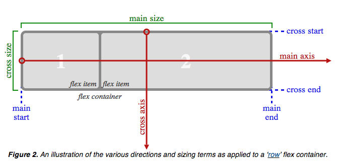
According to the CSS Flexible Box Layout Module, you can declare the a element as a flex container (see figure) and use align-items to vertically align text along the cross axis (which is perpendicular to the main axis).
All you need to do is:
display: flex;
align-items: center;
See this fiddle.
Related Topics
Wrapping Two Columns of Text Around an Image/Shape from Both Sides HTML CSS
Difference Between "Lang" and "Type" Attributes in a Script Tag
Image Behavior Within Flexbox (Rows Embedded in Columns)
Conditionally-Rendering CSS in HTML Head
Why Is Using Tables for Website Layout Such an Evil
CSS Height Working But Min-Height Doesn't Work
Cascading Style Sheets Use "Id" or "Class"
How to Display HTML Tags as Text
A Regular Expression to Remove a Given (X)HTML Tag from a String
Pure CSS 3 Image Slider - Without JavaScript or Radio Inputs
Button Is an Inline Element But Width Is Working
Center Text Vertically Within <Div>
Having Trouble with Attribute != Selector
Page-Break-Inside Doesn't Work in Chrome
Does CSS Grid Have a Flex-Grow Function
Why People Minify Assets and Not The HTML
Website Response Time: Difference Between 'Load' and 'Finish'