Does CSS Grid have a flex-grow function?
CSS Grid offers the fr unit, which functions similarly to flex-grow.
While flex-grow distributes free space in the container among flex items, the fr unit distributes free space in the container among rows / columns.
From the spec:
7.2.3. Flexible Lengths: the
fr
unitA flexible length or
<flex>is a dimension with thefrunit, which
represents a fraction of the free space in the grid container.
(Note that flex-grow is applied to flex items, while fr lengths are applied to grid containers.)
So in your grid, you have three rows:
The first row is the header. You want the content to set its height. So its height is set to
auto.The last row is the footer. You want the content to set its height. So its height is set to
auto.The middle row contains the
navandmainelements. You want this row to occupy all remaining vertical space. So its height is set to1fr.
.ctnr {  display: grid;  grid-template-rows: auto 1fr auto;  /* key rule */  grid-template-columns: 1fr 1fr;  height: 100vh;  grid-template-areas: "header header"                          "nav main"                        "footer footer";}
header {  grid-area: header;  background: turquoise;}
nav {  grid-area: nav;  background: grey;}
main {  grid-area: main;  background: orange;}
footer {  grid-area: footer;  background: yellow;}
body {  margin: 0;}
<div class="ctnr"> <header>header</header> <nav>nav</nav> <main>main</main> <footer>footer</footer></div>Grid Property Similar to Flex-Grow
You can rely on 1fr to fill the remaining space:
body {  display: grid;  grid-template-rows: auto 1fr auto;  margin: 0;  height: 100vh;}
header {  padding: 15px;  font-size: 1rem;  background: red;}
main {  background: green;  overflow:auto;  padding:10px;}
footer {  padding: 15px;  font-size: 1rem;  background: blue;}
<header>this is a header</header><main>Lorem ipsum dolor sit amet, consectetur adipiscing elit. Aenean enim nulla, tincidunt at laoreet sed, sodales a arcu. Cras cursus diam eget diam venenatis egestas. Sed in massa pharetra, malesuada felis et, posuere nisl. Etiam eget mauris suscipit, consequat leo in, tincidunt lectus. Morbi pellentesque accumsan lectus sed finibus. Vivamus eros mi, eleifend vitae nibh id, vulputate posuere nulla. Integer dictum justo non nunc tincidunt, lacinia faucibus nisl vestibulum. Mauris luctus ultrices diam, at malesuada sem. Curabitur auctor, mauris in fermentum vestibulum, libero velit molestie leo, ut placerat velit ligula vel mauris. Integer tortor purus, sagittis vel libero sed, egestas vehicula velit. Mauris ullamcorper, arcu at facilisis vehicula, lectus lacus scelerisque felis, ut mattis dolor justo ac tellus.
Fusce porttitor turpis eget felis vestibulum viverra. Sed hendrerit nisl interdum tortor suscipit convallis. Donec aliquet massa sapien, ac congue lacus ullamcorper sed. Donec felis lectus, fermentum ut vestibulum sit amet, mattis ac ipsum. Etiam ut purus libero. Mauris maximus sem at ex posuere, at venenatis nisi sollicitudin. Vestibulum consequat sem risus, vitae sodales augue rutrum venenatis. Vivamus varius, lectus consequa</main><footer>this is a footer</footer>css grid vs flexbox : why does css grid cause repaints and flexbox not
I've been able to reproduce the problem locally (almost at least). As you can see in the following image, in my browser (Chromium v92.0.4488.0) only an area on the far right of the column is repainted - exactly the area where the scrollbar will be displayed when it is used.
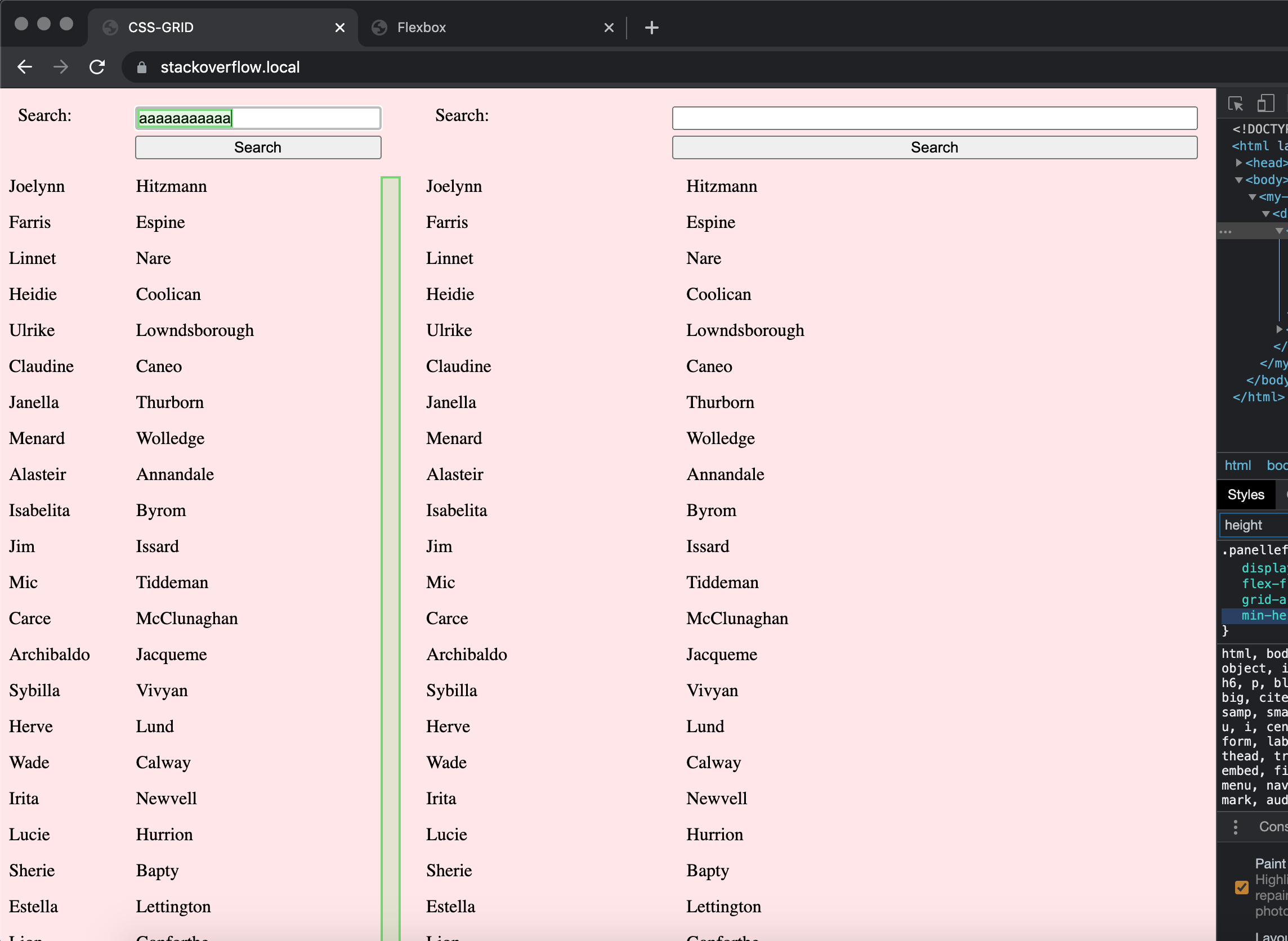
Using Firefox (v88.0) or Safari (v14.0.3), on the other hand, neither in the Flexbox nor the grid example anything other than the input is being repainted.
Since you don't use absolute values for the height of the containers, I suspect it happens due to the calculation of the height and whether the scrollbar needs to be displayed. Chrome seems to behave differently here than other browsers.
A simple fix seems to be to define an absolute height for the containers (vh, although it's a relative unit, seems to work too):
.panelleft,
.panelright {
  height: 100vh;
}
In CSS3, should a flex item with flex-grow 0.1 be taking all the extra space or just 10%?
However, in practice on Chrome and Firefox it only took 10% of the extra space.
This is correct behaviour.
Find the ratio of the item’s flex grow factor to the sum of the flex grow factors of all unfrozen items on the line. Set the item’s target main size to its flex base size plus a fraction of the remaining free space proportional to the ratio. flexbox-ref
From the above, the flex-grow value effectively indicates the percentage of the free space, and flex-grow: 1 represents 100% of the free space. Also, the size after flex-grow is added is derived by such an equation.
flex item's base size + (remaining free space * (flex item's flex factors / unfrozen flex item's flex factors))
If you specify 0.1 for flex-grow in the context of the question, remaining free space will be 0.1 times the initial free space:
If the sum of the unfrozen flex items’ flex factors is less than one, multiply the initial free space by this sum. If the magnitude of this value is less than the magnitude of the remaining free space, use this as the remaining free space. flexbox-ref
So, using the above formula, the size of the third flex item can be derived as follows:
flex item's base size + (initial free space * 0.1 * (0.1 / 0.1))
= flex item's base size + (initial free space * 0.1)
So the result of flex-grow: 0.1 is 10% of the initial remaining free space.
Areas covered by Flexbox which are difficult or impossible to achieve with Grid
Advantage Flexbox
Here are 13 areas where flexbox comes out ahead of Grid (Level 1):
Centering wrapped items. Imagine five elements. Only four per row. The fifth one wraps. In a flex container, that fifth one can be easily aligned across the entire row with
justify-content. Try centering this fifth item in a grid container. Not a simple matter.Aligning grid items across the entire row/column (like flex items can)
How to center elements on the last row in CSS Grid?
How to offset a grid item, also shifting its siblings?
Can I have a varying number of columns per row in a CSS grid?
Wrapping. Flex items of variable lengths have no problem wrapping. Try getting grid items of variable lengths to wrap. Not possible.
- How to get grid items of different lengths to wrap?
- Can grid items wrap?
Auto margins. Flex items can be placed, packed and spaced away throughout their container with
automargins. Grid items, however, are confined to their tracks, greatly diminishing the utility ofautomargins.- Can auto margins work in CSS Grid like they do in Flexbox?
Min, Max, Default – all in one. Setting the
min-width,max-widthand defaultwidthof a flex item is easy. How can all three lengths be set on a grid column or row? They can't.- Setting the minimum, maximum and default length of a grid column / row
- Set minimum and maximum widths to grid column using percentages (related, but not exactly the same problem)
Sticky footer / header. It's just so much simpler and easier to pin a footer or header with flexbox.
- How can I have a sticky footer with my CSS Grid layout?
Consuming remaining space. A flex item can consume remaining space with
flex-grow. Grid items have no such function.Aligning grid items across the entire row/column (like flex items can)
Make grid item use remaining space like flex item with flex-grow: 1
How to make the items in the last row consume remaining space in CSS Grid?
How to make CSS Grid last row to take up remaining space
Hiding a left column in CSS Grid
How to get the effect of grid layout's grid-template-columns with a variable number of columns?
CSS fr / fractional units minimum too large
Shrinking. Flex has
flex-shrink. Grid has... nothing.- Shrink grid items just like flex items in css
Limiting the column count in a dynamic layout. With flexbox, creating a wrapping two-column grid that remains fixed at two-columns across screen sizes is no problem. In Grid, despite having all these great functions, such
repeat(),auto-fillandminmax(), it can't be done.Make CSS Grid auto-fill only 2 columns
CSS grid - maximum number of columns without media queries
Creating space between first and last items. In a grid container with a variable number of columns, it's not easy to add an empty first and last column. Margins, padding, columns and pseudo elements each have their limitations. It's simple and easy with flexbox.
- Add space before and after first and last grid items
An important benefit of the inline-level container is lost in some cases. If you have a Grid layout with a dynamic number of columns – meaning you cannot set the number of columns or a width for the container – then
display: inline-griddoesn't work. All items stack in a single column. This is because the default setting ongrid-auto-columnsis one column. In at least some cases, flexbox fixes the problem.- How to make a grid container shrink to fit the content?
Getting columns with author-defined grid areas to wrap without media queries. Let's say you have a two-column grid containing grid areas that have set locations, and want the grid to automatically transition to a single column (with the second column wrapping below the first) on smaller screens. With grid, you would need a media query. The
auto-fillandauto-fitfunctions will not work because the locations of grid areas have been specified. If you want to avoid a media query, flexbox'sflex-wrapfunction may be useful.- Two-Column grid should wrap into One-Column grid
There is no
column-reversefunction in CSS Grid. Getting items to populate a container starting from the bottom isn't possible with a single rule applied to the grid container. With flexbox, however, the task is simple withflex-direction: column-reverse.Filling cells starting from the bottom in CSS Grid
https://stackoverflow.com/q/67620185/3597276
The
resizeproperty on a grid item has no effect on the track. Unless a column or row track is set toauto(content-based sizing), resizing a grid item will overflow the track. Since flexbox doesn't have column and row tracks, it may be a useful alternative.- Resize property on grid items results in overlap of other grid items
Related Topics
How to Get a Div to Resize Its Height to Fit Container
How to Put Text Over an Image Without Absolute Positioning or Setting The Image as Backbround
Align Div's to Bottom or Baseline
Flex Items Create Space Between Them When They Wrap
How to Remove This Horizontal Scrollbar in Bootstrap 3
Why Td Width Is Not Working or Not Followed
How to Style and Align Forms Without Tables
CSS: How to Create a Gap Between Rows in a Table
Where Is Data Stored When Using an HTML 5 Web SQL Database
HTML 5 Input Type='Date' Disable Keyboard Input
Using Cm/Mm on The CSS of a Web App That Replicates Paper Interaction Is a Good Practice
How to Allow Text to Wrap Inside a Word If Necessary
HTML Input Range Step as an Array of Values
Maximum Number of Parameter Passed in a Post
Equal Height Columns with Centered Content in Flexbox
No Video with Supported Format and Mime Type Found. What Does This Mean and How to Change This