Using CSS td width absolute, position
This may not be what you want to hear, but display: table-cell does not respect width and will be collapsed based on the width of the entire table. You can get around this easily just by having a display: block element inside of the table cell itself whose width you specify, e.g
<td><div style="width: 300px;">wide</div></td>
This shouldn't make much of a difference if the <table> itself is position: fixed or absolute because the position of the cells are all static relative to the table.
http://jsfiddle.net/ExplosionPIlls/Mkq8L/4/
EDIT: I can't take credit, but as the comments say you can just use min-width instead of width on the table cell instead.
CSS Absolute Positioned Table Row and Cell Width with Divs
You shouldn't have to use position: absolute to position items inside a table. Instead, set the divs to display: block and simply place them inside the second td of your first row like the following.
Also, try not to set styles using inline CSS. This becomes very hard to maintain when changes happen. An immediate example is your having to type style:150px; three times for the rows.
You might have noticed the CSS style: box-sizing: border-box. This must be added so that the schedule items in the table is displayed still within the table, but expanding its full length. I recommend reading more about border-box here.
* {  box-sizing: border-box;}
table {  border-collapse: collapse;  width: 100%;  border-color: #dddddd;  position: relative;}
table td {  border: 1px solid #dddddd;}
.wrapper {  display: table-cell;  min-width: 800px;}
.time {  height: 150px;  width: 90px;  vertical-align: middle;  text-align: center;}
.schedule-item {  margin: 2px 0;  background-color: #e8effc;  font-size: 10pt;  padding: 5px 0 0 5px;  width: 100%;  display: block;}
<div class="wrapper"> <table> <tbody> <tr class="row"> <td class="time">8:00 AM</td> <td> <div class="schedule-item" style="height:47.5px"> 8:00 AM Amateur Adult Bronze International Standard W/Q Semifinal </div> <div class="schedule-item" style="height:23.75px"> 8:04 AM Amateur Adult Bronze International Standard Tango Semifinal </div> <div class="schedule-item" style="height:25px"> 8:05 AM Amateur Adult Newcomer International Standard Waltz Final </div> <div class="schedule-item" style="height:47.5px"> 8:07 AM Amateur Adult Bronze International Standard W/Q Final </div> </td> </tr> <tr class="row"> <td class="time">8:10 AM</td> <td></td> </tr> <tr class="row"> <td class="time">8:20 AM</td> <td></td> </tr> </tbody> </table></div>Using Position Relative/Absolute within a TD?
This is because according to CSS 2.1, the effect of position: relative on table elements is undefined. Illustrative of this, position: relative has the desired effect on Chrome 13, but not on Firefox 4. Your solution here is to add a div around your content and put the position: relative on that div instead of the td. The following illustrates the results you get with the position: relative (1) on a div good), (2) on a td(no good), and finally (3) on a div inside a td (good again).
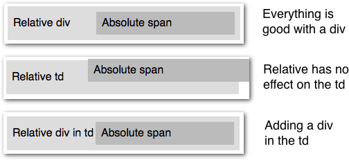
<table> <tr> <td> <div style="position:relative;"> <span style="position:absolute; left:150px;"> Absolute span </span> Relative div </div> </td> </tr></table>Width of table cell with absolute content
I found out that it's not possible for div to keep absolute content within, absoulte content will always overflow and doesn't affect parent div size
div leaving space when positioned absolute in td
The default vertical-align for table cells is baseline. The effect of this can be seen in the first <table> below.
This causes the table contents, text or <div>, to be placed around the vertical center.
If you want to move the <div> to the top, vertical-align: top; will do the trick. Or a top: 0;.
div#div1 {  position: absolute;  left: 0;  right: 0;  height: 100px;  border: 1px solid green;  background-color: green;  width: 100%;  box-sizing: border-box;}
td {  position: relative;  border: 1px solid blue;  height: 100px;  width: 100%;}
table {  width: 100%;}
<!DOCTYPE html><html>
<body> <table> <tr> <td> Some text </td> </tr> </table>
<table> <tr> <td> <div id="div1">This is a heading with an absolute position</div> </td> </tr> </table></body>
</html>CSS full width of absolute element
It is bad practice to used div with in table. and the table should style like this <table style="width:100%">
For your question, It because you add padding in dropdown-content, so the total width is: 100% + 32px(padding left & right), So
Add box-sizing:border-box (it includes the content, padding and border within the width) in dropdown-content, So it was fixed issue with padding and 100% width.
Here is link for more clarification:
.dropdown {  position: relative;  display: block;}
.dropdown-content {  display: block;  position: absolute;  background-color: #f9f9f9;  box-shadow: 5px 8px 16px 5px rgba(0, 0, 0, 0.2);  padding: 12px 16px;  z-index: 1;  margin-top: -15px;  box-sizing: border-box; /* Add this*/  width: 100%; /* Add this*/}
.dropdown:hover .dropdown-content {  display: block;}
<table style="width:100%"> <div *ngIf="filtering" class="dropdown"> <span></span> <div class="dropdown-content" flex layout="row" layout-wrap> <mat-form-field class="searchFields" flex> <input name="test" flex type="number" matInput [(ngModel)]="test" placeholder="test"> </mat-form-field> </div> </div> <tr> <th>test</th> <th>test</th> <th>test</th> <th>test</th> <th>test</th> <th>test</th> <th>test</th> <th>test</th> <th>test</th> </tr> <tr> <td>test</td> <td>test</td> <td>test</td> <td>test</td> </tr> <tr> <td>test</td> <td>test</td> <td>test</td> <td>test</td> </tr> <tr> <td>test</td> <td>test</td> <td>test</td> <td>test</td> </tr></table>How can i center div with position absolute inside td
td{ position: relative; width:100px; height:100px; border:1px solid grey; } div{ position: absolute; width:70px; height:70px; border:1px solid green; right: 15px; bottom:15px; }<script src="https://ajax.googleapis.com/ajax/libs/jquery/2.1.1/jquery.min.js"></script><table> <tr> <td><div></div></td> </tr></table>Positioning top of element relative to table cell when position is absolute
First, for position: absolute to achieve your desired effect, you'd need to have positioned parent it can relate to (anything that is not position: static).
That means setting position: relative on the containing <td> should work. But alas, it doesn't. :( That is because relative position on table cells is undefined and most browser don't handle it very well. Bummer.
So, your best bet is to wrap your image with a <div> (or something similar) with position: relative set like in the following example.
table {  border-collapse: collapse;}
table th,table td {  padding: 5px;}
table td {  border-top: 1px solid;}
div {  height: 100px;  position: relative;  width: 100px;}
img {  border: 1px solid transparent;  height: auto;  position: absolute;  transition: width .2s linear;  width: 100px;  z-index: 100;}
img:hover {  border-color: #000;  box-shadow: 5px 5px 10px grey;  width: 400px;  z-index: 110;}
<table> <tr> <th>Name</th> <th>Image</th> <th>Description</th> </tr> <tr> <td>Name</td> <td> <div> <img src="https://dummyimage.com/400x400/f48224/fff" alt> </div> </td> <td>Description</td> </tr> <tr> <td>Name</td> <td> <div> <img src="https://dummyimage.com/400x400/f48224/fff" alt> </div> </td> <td>Description</td> </tr> <tr> <td>Name</td> <td> <div> <img src="https://dummyimage.com/400x400/f48224/fff" alt> </div> </td> <td>Description</td> </tr></table>Related Topics
What Is the Best Practice to Parse HTML in Swift
Use Font Awesome Icon in Placeholder
What Is "X-Content-Type-Options=Nosniff"
Text-Overflow Is Not Working When Using Display:Flex
How to Position Two Elements Side by Side Using Css
Pseudo Class :Hover Does Not Work in IE7
Drawing Text to <Canvas> with @Font-Face Does Not Work at the First Time
Display HTML Child Element When Parent Element Is Display:None
Is an Anchor Tag Without the Href Attribute Safe
Wcf Service to Accept a Post Encoded Multipart/Form-Data
How to Turn Off Word Wrapping in Html
How to Display the Checkbox Over the Images For Selection
What Is Use of 'Initial' Value in Css
Why Aren't My Bootstrap 4 Columns the Same Height