html/css hexagon with image inside
With CSS3 almost everything is possible: http://jsfiddle.net/kizu/bhGn4/
There I used different rotations with overflow: hidden, so you can get a cross-browser (well, modern cross-broser) masks that even can be coverable and clickable on the masked area.
How can i create a hexagon shape with an image inside?
You need to increase the border thickness ----> border-left: 103px solid transparent; and border-right: 100px solid transparent; and do some positioning adjustments. For displaying a specific region of an image, you can use clip
property. For this to work you have to use position: absolute;
How clip works?
It creates a rectangular region that reveals part of an element.
Values:
clip: rect(top offset, visible width, visible height, left offset)
- The first number indicates the top offset - the top edge of the clipping window.
- The last number indicates the left offset - the left edge of the clipping window.
- The second number is the width of the clipping window plus the left offset(last number).
- The third number is the height of the clipping window plus the top offset(first number).
Demo on dabblet
.hexagon {
    position: relative;
    top: 50px;
    width: 150px;
    height: 86.60px;
    margin: 43.30px 0;
    float:left;
    margin-right:10px;
}
img {
    position: absolute;
    clip: rect(43px,200px,157px,0px);
}
.hexagon:before, .hexagon:after {
    content:"";
    position: absolute;
    border-left: 101px solid transparent;
    border-right: 100px solid transparent;
}
.hexagon:before {
    top: 0px;
    border-bottom: 43.30px solid #64C7CC;
}
.hexagon:after {
    top: 100%;
    top: 157px;
    border-top: 43.30px solid #64C7CC;
}
#hexagons-1 {
    display: table;
    margin: 0 auto;
    margin-top: 100px;
}
#hexagons-2 {
    display: table;
    margin: 0 auto;
    margin-top:-28px;
}
Images inside of css-based hexagons
Alrighty, well I couldn't do it with your way of making hexagons, since it is just a hole bunch-a borders (background-image doesn't work with borders). But I found another way, using @geoffrey_crofte's solution on codepen.
To start, here is the JSFiddle with the working example.
And here is the updated code.
HTML:
<div id="wrap">
<div class="hex-row">
    <a href="http://www.google.ca" class='hexaHolder'>
        <div class="hexa">
            <div class="hex1">
                <div class="hex2">
                    <img src="http://farm3.staticflickr.com/2788/4392569951_8bcec3b3ed_z.jpg?zz=1" alt="Sample Image" />
                </div>
            </div>
        </div>
    </a>
    <a href="http://www.google.ca" class='hexaHolder even'>
        <div class="hexa">
            <div class="hex1">
                <div class="hex2">
                    <img src="http://farm3.staticflickr.com/2441/3657346647_a11111ed39_z.jpg?zz=1" alt="Sample Image" />
                </div>
            </div>
        </div>
    </a>
    <a href="http://www.google.ca" class='hexaHolder'>
        <div class="hexa">
            <div class="hex1">
                <div class="hex2">
                    <img src="http://farm3.staticflickr.com/2178/3531465579_8bff044e9b_z.jpg?zz=1" alt="Sample Image" />
                </div>
            </div>
        </div>
    </a>
    <a href="http://www.google.ca" class='hexaHolder even'>
        <div class="hexa">
            <div class="hex1">
                <div class="hex2">
                    <img     src="http://farm3.staticflickr.com/2441/3657346647_a11111ed39_z.jpg?zz=1" alt="Sample Image" />
                </div>
            </div>
        </div>
    </a>
    <a href="http://www.google.ca" class='hexaHolder'>
        <div class="hexa">
            <div class="hex1">
                <div class="hex2">
                    <img src="http://farm4.staticflickr.com/3637/3658139504_c33433f163_z.jpg?zz=1" alt="Sample Image" />
                </div>
            </div>
        </div>
    </a>
</div>
</div>
CSS:
.hexaHolder{
    height: 115px;
    width: 99px;
    float: left;
}
.hexa img{
    width:100%;
    margin-top: -5px;
}
.hexa, .hexa div {
    margin: 0 auto;
    transform-origin: 50% 50%;
    overflow: hidden;
}
.hexa {
    text-align: center;
    margin: 0;
    width: 135px;
    height: 115px;
}
.hexa div {
  width: 100%;
  height: 100%;
}
.hexa {
  transform: rotate(120deg);
}
.hex1 {
  transform: rotate(-60deg);
}
.hex2 {
  transform: rotate(-60deg);
}

.hex-row {
    clear: left;
}

.hexaHolder.even {
    margin-top: 57.5px;
}

#wrap {
    min-width:600px;
}
Alrighty, so basically what I did was use the code from CodePen as a starting block since it already put an image inside of an hexagon. However, I modified the CSS a HTML a tad just so that you could float the hexagons and position them so that they looked like your example. All of the credit needs to go to @geoffrey_crofte for being the genius behind the hexagon. I just positioned and resized.
Cheers!
html/css: how to create a hexagonal image-placeholder
Important Note
Be informed that this solution does not work for those who want to create something similar supported by all browsers as for the time being IE does not support the clip-path-property used in this example!!
I've found a way to do it thanks to @SahilDhir although it's more of a workaround:
HTML
<div class="poligon">
  <img src="http://lorempixel.com/g/600/400/">
</div>
CSS
.poligon {
  display: inline-block;
  position: relative;
  width: 200px;
  height: 180px;
  background: red;
  box-sizing: border-box;
  -webkit-clip-path: polygon(0% 50%, 25% 0%, 75% 0%, 100% 50%, 75% 100%, 25% 100%);
  -moz-clip-path: polygon(0% 50%, 25% 0%, 75% 0%, 100% 50%, 75% 100%, 25% 100%);
}

.poligon img {
  position: absolute;
  top: 2px; /* equal to border thickness */
  left: 2px; /* equal to border thickness */
  width: 196px; /* container height - (border thickness * 2) */
  height: 176px; /* container height - (border thickness * 2) */
  -webkit-clip-path: polygon(0% 50%, 25% 0%, 75% 0%, 100% 50%, 75% 100%, 25% 100%);
  -moz-clip-path: polygon(0% 50%, 25% 0%, 75% 0%, 100% 50%, 75% 100%, 25% 100%);
}
Note that I did not calculate much here, but rather tried achieving a six-sided figure.
I will have the problem that my picture will have a transparent background, but I thought that I might produce a linear gradient to fill the background polygon. I will have to try that out first though ^^
I will not mark this as the final answer as my questions have not yet been answered truly. I still want to be able to create a hexagon as the one in the example I gave above where I would be able to adapt the heights and widths as well as the border thicknesses the way I want.
EDIT
As I did not find a better solution I have improved the one here and figured out the calculations needed:
HTML
<div class="poligon">
  <div class="hex-background">
    <img src="https://img.clipartfest.com/953d8641fe933437bbc41d48e6fc8492_yellow20stars20clipart-christmas-stars-clipart-without-background_532-506.png">
  </div>
</div>
CSS
.poligon {
  display: inline-block;
  position: relative;
  width: 120px;
  height: 103.92px; /* width * 0.866 */
  background: red;
  box-sizing: border-box;
  -webkit-clip-path: polygon(0% 50%, 25% 0%, 75% 0%, 100% 50%, 75% 100%, 25% 100%);
  -moz-clip-path: polygon(0% 50%, 25% 0%, 75% 0%, 100% 50%, 75% 100%, 25% 100%);
}

.hex-background {
  position: absolute;
  background-color: white;
  top: 2px; /* equal to border thickness */
  left: 2px; /* equal to border thickness */
  width: 116px; /* container width - (border thickness * 2) */
  height: 99.92px; /* container height - (border thickness * 2) */
  -webkit-clip-path: polygon(0% 50%, 25% 0%, 75% 0%, 100% 50%, 75% 100%, 25% 100%);
  -moz-clip-path: polygon(0% 50%, 25% 0%, 75% 0%, 100% 50%, 75% 100%, 25% 100%);
}

.poligon img {
  position: absolute;
  width: 116px; /* container width - (border thickness * 2) */
  height: 99.92px; /* container height - (border thickness * 2) */
  -webkit-clip-path: polygon(0% 50%, 25% 0%, 75% 0%, 100% 50%, 75% 100%, 25% 100%);
  -moz-clip-path: polygon(0% 50%, 25% 0%, 75% 0%, 100% 50%, 75% 100%, 25% 100%);
}
The clip-path part is correct if you want a same-sided hexagon.
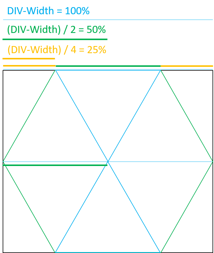
With the picture above you can see how I found those numbers ;) If you have further questions about this, don't hesitate to ask. I'll try to explain it the best I can.
CSS: hexagon with text on div with background-image
A more versatile solution than CSS shape hacks is to use SVG. For example:
<svg xmlns="http://www.w3.org/2000/svg" version="1.1" width="100%" height="300" xmlns:xlink="http://www.w3.org/1999/xlink"> <polygon class="hex" points="300,150 225,280 75,280 0,150 75,20 225,20" fill="#fa5" stroke="blue" stroke-width="5" transform="translate(10)"></polygon> <text x="160" y="160" font-family="Verdana" font-size="30" text-anchor="middle" > Any Text Here </text> </svg>How can you join CSS hexagon elements in a custom layout?
The problem you're going to run into is that using CSS triangles to create a hexagon actually yields square boxes with one or two borders filled in (and the rest transparent). This has two effects:
- You can't easily put an image into the filled border so that it's clipped.
- You can't make the hexagon - and only the hexagon - clickable: the whole set of rectangles will always be clickable, which will make your layout tricky where they overlap.
You're going to need something that can produce an actual hexagon. Inline SVG with a clip-path is a good fit - unlike clip-path in CSS, it's supported pretty much wherever SVG is. Here's an example:
<svg class="svg-graphic" width="300" height="300" viewBox="0 0 300 300" xmlns="http://www.w3.org/2000/svg" xlink="http://www.w3.org/1999/xlink" version="1.1"> <defs> <clipPath id="hexagonal-mask"> <polygon points="300,150 225,280 75,280 0,150 75,20 225,20" /> </clipPath> </defs> <image clip-path="url(#hexagonal-mask)" height="100%" width="100%" xlink:href="https://i.imgur.com/grp9BU1.png" preserveAspectRatio="xMidYMin slice"/></svg>Related Topics
Unwanted Margin in Inline-Block List Items
Calling Wkhtmltopdf to Generate Pdf from Html
What Values Can Appear in the "Selected" Attribute of the "Option" Tag
Why Can't Radio Buttons Be "Readonly"
Using HTML5, How to Use Contenteditable Fields in a Form Submission
Bootstrap Accordion Button Toggle "Data-Parent" Not Working
Text-Overflow: Ellipsis Not Working
Div 100% Height Works on Firefox But Not in Ie
Using "Margin: 0 Auto;" in Internet Explorer 8
How to Tell If a Browser Is in "Quirks" Mode
Curved Div With Transparent Top
Assign an Initial Value to Radio Button as Checked
Style Input Element to Fill Remaining Width of Its Container
Html5 New Elements (Header, Nav, Footer, ..) Not Working in Ie
Android: How to Use the HTML.Taghandler
How to Make a Display:Flex Container Expand Horizontally with Its Wrapped Contents