Textarea to fill a parent container exactly, with padding
Use width: 100%; height: 100%; to make the <textarea> fill up the wrapping <div>. Unfortunately, you won't be able to put on margins/padding, as they get ADDED to the 100%, so the right/bottom edges will overflow.
Edit: To use width: 100%; along with padding, you can change the box sizing model:
    width: 100%;
    height: 100%;
    box-sizing: border-box;
With this change, 100% now refers to the distance between the outsides of the borders, instead of the distance between the outside of the content.
How can I make a TextArea 100% width without overflowing when padding is present in CSS?
Why not forget the hacks and just do it with CSS?
One I use frequently:
.boxsizingBorder {
    -webkit-box-sizing: border-box;
       -moz-box-sizing: border-box;
            box-sizing: border-box;
}
See browser support here.
Textarea inside fieldset results in different margin/padding
Solution (browser-specific rules): https://stackoverflow.com/a/6796064/1619432
box-sizing: border-box;
Seems to work for Firefox, too.
How to set textarea to 100% width and height?
The issue is the common white space issue of inline-block/inline element due to vertical alignment. If you check dev tools of google you will see this:
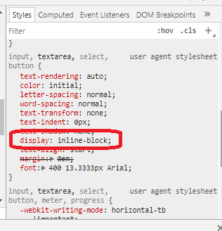
So to fix it you simply need to adjust vertical alignment or make the textarea a block element (like provided in the other answers):
html, body, textarea { margin: 0; padding: 0; border: 0; width: 100%; height: 100%;}textarea { vertical-align:top;}<textarea>Text goes here</textarea>Padding-bottom for textarea isn't considered
Chrome, Safari and Internet Explorer render the textarea paddings differently to Firefox and Opera. Now which of them render the textareas incorrectly? That depends on what you are trying to achieve because in truth none of them render it wrongly, they all add padding it just comes down to how they interpretated the spec.
No CSS property will fix this 'issue' so the only way you can get around this 'problem' is to add a container element to the textarea and give that a padding instead.
How to make CSS width to fill parent?
EDIT:
Those three different elements all have different rendering rules.
So for:
table#bar you need to set the width to 100% otherwise it will be only be as wide as it determines it needs to be. However, if the table rows total width is greater than the width of bar it will expand to its needed width. IF i recall you can counteract this by setting display: block !important; though its been awhile since ive had to fix that. (im sure someone will correct me if im wrong).
textarea#bar i beleive is a block level element so it will follow the rules the same as the div. The only caveat here is that textarea take an attributes of cols and rows which are measured in character columns. If this is specified on the element it will override the width specified by the css.
input#bar is an inline element, so by default you cant assign it width. However the similar to textarea's cols attribute, it has a size attribute on the element that can determine width. That said, you can always specifiy a width by using display: block; in your css for it. Then it will follow the same rendering rules as the div.
td#foo will be rendered as a table-cell which has some craziness to it. Bottom line here is that for your purposes its going to act just like div#foo as far as restricting the width of its contents. The only issue here is going to be potential unwrappable text in the column somewhere which would make it ignore your width setting. Also all cells in the column are going to get the width of the widest cell.
Thats the default behavior of block level element - ie. if width is auto (the default) then it will be 100% of the inner width of the containing element. so in essence:
#foo {width: 800px;}
#bar {padding-left: 2px; padding-right: 2px; margin-left: 2px; margin-right: 2px;}
will give you exactly what you want.
Textarea don't make parent grow
Here is a working fiddle
height can be adjusted by changing the css.
Hope it may help.
How to make div 100% width when parent tag has padding?
You could apply a negative margin to the inside container to negate the padding
<body style="padding:0 40px">
<div style="width:100%;margin:0 -40px"> </div>
</body>
Related Topics
Relative Urls and Trailing Slashes
100% Width Background Image with an 'Auto' Height
CSS: Responsive Way to Center a Fluid Div (Without Px Width) While Limiting The Maximum Width
Making a Div Fit The Initial Screen
How to Safely Render HTML in React
CSS How to Make <Td> a Fixed Height
Images Not Displaying in Github Pages
Jquery Datepicker Won't Work on a Ajax Added HTML Element
Cascading Style Sheets Use "Id" or "Class"
Why Are 3-Digit Hex Color Code Values Interpreted Differently in Internet Explorer
How to Serve HTML File from Another Directory as Actionresult
Unicode Character as Bullet for List-Item in CSS
Necessary to Add Link Tag for Favicon.Ico
Brackets Displays Wrongly for Right to Left Display Style
Enable Vertical Scrolling on Textarea