Make TBODY scrollable in Webkit browsers
Here is a working example:
http://www.imaputz.com/cssStuff/bigFourVersion.html
You have to add the display:block to the thead > tr and tbody
HTML table with 100% width, with vertical scroll inside tbody
In order to make <tbody> element scrollable, we need to change the way it's displayed on the page i.e. using display: block; to display that as a block level element.
Since we change the display property of tbody, we should change that property for thead element as well to prevent from breaking the table layout.
So we have:
thead, tbody { display: block; }

tbody {
    height: 100px;       /* Just for the demo          */
    overflow-y: auto;    /* Trigger vertical scroll    */
    overflow-x: hidden;  /* Hide the horizontal scroll */
}
Web browsers display the thead and tbody elements as row-group (table-header-group and table-row-group) by default.
Once we change that, the inside tr elements doesn't fill the entire space of their container.
In order to fix that, we have to calculate the width of tbody columns and apply the corresponding value to the thead columns via JavaScript.
Auto Width Columns
Here is the jQuery version of above logic:
// Change the selector if needed
var $table = $('table'),
    $bodyCells = $table.find('tbody tr:first').children(),
    colWidth;

// Get the tbody columns width array
colWidth = $bodyCells.map(function() {
    return $(this).width();
}).get();

// Set the width of thead columns
$table.find('thead tr').children().each(function(i, v) {
    $(v).width(colWidth[i]);
});
And here is the output (on Windows 7 Chrome 32):

Working demo.
Full Width Table, Relative Width Columns
As the original poster needed, we could expand the table to 100% of width of its container, and then using a relative (Percentage) width for each columns of the table.
table {
    width: 100%; /* Optional */
}

tbody td, thead th {
    width: 20%;  /* Optional */
}
Since the table has a (sort of) fluid layout, we should adjust the width of thead columns when the container resizes.
Hence we should set the columns' widths once the window is resized:
// Adjust the width of thead cells when *window* resizes
$(window).resize(function() {
    /* Same as before */
}).resize(); // Trigger the resize handler once the script runs
The output would be:

Working demo.
Browser Support and Alternatives
I've tested the two above methods on Windows 7 via the new versions of major Web Browsers (including IE10+) and it worked.
However, it doesn't work properly on IE9 and below.
That's because in a table layout, all elements should follow the same structural properties.
By using display: block; for the <thead> and <tbody> elements, we've broken the table structure.
Redesign layout via JavaScript
One approach is to redesign the (entire) table layout. Using JavaScript to create a new layout on the fly and handle and/or adjust the widths/heights of the cells dynamically.
For instance, take a look at the following examples:
- jQuery .floatThead() plugin (a floating/locked/sticky table header plugin)
- jQuery Scrollable Table plugin. (source code on github)
- jQuery .FixedHeaderTable() plugin (source code on github)
- DataTables vertical scrolling example.
Nesting tables
This approach uses two nested tables with a containing div. The first table has only one cell which has a div, and the second table is placed inside that div element.
Check the Vertical scrolling tables at CSS Play.
This works on most of web browsers. We can also do the above logic dynamically via JavaScript.
Table with fixed header on scroll
Since the purpose of adding vertical scroll bar to the <tbody> is displaying the table header at the top of each row, we could position the thead element to stay fixed at the top of the screen instead.
Here is a Working Demo of this approach performed by Julien.
It has a promising web browser support.
And here a pure CSS implementation by Willem Van Bockstal.
The Pure CSS Solution
Here is the old answer. Of course I've added a new method and refined the CSS declarations.
Table with Fixed Width
In this case, the table should have a fixed width (including the sum of columns' widths and the width of vertical scroll-bar).
Each column should have a specific width and the last column of thead element needs a greater width which equals to the others' width + the width of vertical scroll-bar.
Therefore, the CSS would be:
table {
    width: 716px; /* 140px * 5 column + 16px scrollbar width */
    border-spacing: 0;
}

tbody, thead tr { display: block; }

tbody {
    height: 100px;
    overflow-y: auto;
    overflow-x: hidden;
}

tbody td, thead th {
    width: 140px;
}

thead th:last-child {
    width: 156px; /* 140px + 16px scrollbar width */
}
Here is the output:

WORKING DEMO.
Table with 100% Width
In this approach, the table has a width of 100% and for each th and td, the value of width property should be less than 100% / number of cols.
Also, we need to reduce the width of thead as value of the width of vertical scroll-bar.
In order to do that, we need to use CSS3 calc() function, as follows:
table {
    width: 100%;
    border-spacing: 0;
}

thead, tbody, tr, th, td { display: block; }

thead tr {
    /* fallback */
    width: 97%;
    /* minus scroll bar width */
    width: -webkit-calc(100% - 16px);
    width:    -moz-calc(100% - 16px);
    width:         calc(100% - 16px);
}

tr:after {  /* clearing float */
    content: ' ';
    display: block;
    visibility: hidden;
    clear: both;
}

tbody {
    height: 100px;
    overflow-y: auto;
    overflow-x: hidden;
}

tbody td, thead th {
    width: 19%;  /* 19% is less than (100% / 5 cols) = 20% */
    float: left;
}
Here is the Online Demo.
Note: This approach will fail if the content of each column breaks the line, i.e. the content of each cell should be short enough.
In the following, there are two simple example of pure CSS solution which I created at the time I answered this question.
Here is the jsFiddle Demo v2.
Old version: jsFiddle Demo v1
tabletbody scrollable?
You have taken on a task that, if you succeed, will make you a hero. I tried this and the straightforward thing -- to position:fixed; the <thead> -- is impossible. I had to copy all of the <thead> into a new object. But when you do that, the horizontal spacing of the <th> elements all goes away so the headings don't line up with the <td>s anymore. I ended up doing something like this:
First of all, abandon ie6 and ie7. There's no hope for those guys.
Make two copies of the table, one where the body is invisible and the <thead> is visible, and the other where it's vice-versa.
Give z-index:1; to the table with the visible <thead>.
Give z-index:0; to the table with the visible <tbody>.
Deal with horizontal scrolling, but not until after you find that onScroll isn't an ie8 event (not to mention ie6), so that you have to take a setInterval break every tenth of a second or so just to handle scrolling the <thead> left and right in ie8.
This will give you a table body of infinite scroll in both axes, with a table head that scrolls in the x axis only. Pretty much works in FF, Chrome, and Safari. But is shaky in ie8. A real pita.
Good luck, and please write if you get this to work!
How to set tbody height with overflow scroll
If you want tbody to show a scrollbar, set its display: block;.
Set display: table; for the tr so that it keeps the behavior of a table.
To evenly spread the cells, use table-layout: fixed;.
DEMO 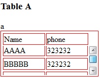
CSS:
table, tr td {
    border: 1px solid red
}
tbody {
    display: block;
    height: 50px;
    overflow: auto;
}
thead, tbody tr {
    display: table;
    width: 100%;
    table-layout: fixed;/* even columns width , fix width of table too*/
}
thead {
    width: calc( 100% - 1em )/* scrollbar is average 1em/16px width, remove it from thead width */
}
table {
    width: 400px;
}
If tbody doesn't show a scroll, because content is less than height or max-height, set the scroll any time with: overflow-y: scroll;. DEMO 2
<editS/updateS> 2019 - 04/2021
- Important note: this approach to making a table scrollable has drawbacks in some cases. (See comments below.) some of the duplicate answers in this thread deserves the same warning by the way
WARNING: this solution disconnects the thead and tbody cell grids; which means that in most practical cases, you will not have the cell alignment you expect from tables. Notice this solution uses a hack to keep them sort-of aligned: thead { width: calc( 100% - 1em ) }
Anyhow, to set a scrollbar, a display reset is needed to get rid of the table-layout (which will never show scrollbar).
Turning the
<table>into a grid viadisplay:grid/contentswill also leave a gap in between header and scrollable part, to mind about. (idem if built from divs)overflow:overlay;has not yet shown up in Firefox ( keep watching it)position:stickywill require a parent container which can be the scrolling one. make sure yourtheadcan be sticky if you have a few rows androwspan/colspanheaders in it (it does not with chrome).
So far, there is no perfect solution yet via CSS only. there is a few average ways to choose along so it fits your own table (table-layout:fixed; is .. fixing table and column's width, but javascript could probably be used to reset those values => exit pure CSS)
table with fixed thead and scrollable tbody
This solution fulfills all 5 requirements:
table {  width: 100%;}
table, td {  border-collapse: collapse;  border: 1px solid #000;}
thead {  display: table; /* to take the same width as tr */  width: calc(100% - 17px); /* - 17px because of the scrollbar width */}
tbody {  display: block; /* to enable vertical scrolling */  max-height: 200px; /* e.g. */  overflow-y: scroll; /* keeps the scrollbar even if it doesn't need it; display purpose */}
th, td {  width: 33.33%; /* to enable "word-break: break-all" */  padding: 5px;  word-break: break-all; /* 4. */}
tr {  display: table; /* display purpose; th's border */  width: 100%;  box-sizing: border-box; /* because of the border (Chrome needs this line, but not FF) */}
td {  text-align: center;  border-bottom: none;  border-left: none;}
<table> <thead> <tr> <th>Table Header 1</th> <th>Table Header 2</th> <th>Table Header 3</th> </tr> </thead> <tbody> <tr> <td>Data1111111111111111111111111</td> <td>Data</td> <td>Data</td> </tr> <tr> <td>Data</td> <td>Data2222222222222222222222222</td> <td>Data</td> </tr> <tr> <td>Data</td> <td>Data</td> <td>Data3333333333333333333333333</td> </tr> <tr> <td>Data</td> <td>Data</td> <td>Data</td> </tr> <tr> <td>Data</td> <td>Data</td> <td>Data</td> </tr> <tr> <td>Data</td> <td>Data</td> <td>Data</td> </tr> <tr> <td>Data</td> <td>Data</td> <td>Data</td> </tr> <tr> <td>Data</td> <td>Data</td> <td>Data</td> </tr> <tr> <td>Data</td> <td>Data</td> <td>Data</td> </tr> <tr> <td>Data</td> <td>Data</td> <td>Data</td> </tr> </tbody></table>Table fixed header and scrollable body
Here is the working solution:
table {    width: 100%;}
thead, tbody, tr, td, th { display: block; }
tr:after {    content: ' ';    display: block;    visibility: hidden;    clear: both;}
thead th {    height: 30px;
    /*text-align: left;*/}
tbody {    height: 120px;    overflow-y: auto;}
thead {    /* fallback */}

tbody td, thead th {    width: 19.2%;    float: left;}
<link href="http://netdna.bootstrapcdn.com/bootstrap/3.0.3/css/bootstrap.min.css" rel="stylesheet"/>
<table class="table table-striped"> <thead> <tr> <th>Make</th> <th>Model</th> <th>Color</th> <th>Year</th> </tr> </thead> <tbody> <tr> <td class="filterable-cell">Ford</td> <td class="filterable-cell">Escort</td> <td class="filterable-cell">Blue</td> <td class="filterable-cell">2000</td> </tr> <tr> <td class="filterable-cell">Ford</td> <td class="filterable-cell">Escort</td> <td class="filterable-cell">Blue</td> <td class="filterable-cell">2000</td> </tr> <tr> <td class="filterable-cell">Ford</td> <td class="filterable-cell">Escort</td> <td class="filterable-cell">Blue</td> <td class="filterable-cell">2000</td> </tr> <tr> <td class="filterable-cell">Ford</td> <td class="filterable-cell">Escort</td> <td class="filterable-cell">Blue</td> <td class="filterable-cell">2000</td> </tr> </tbody></table>Related Topics
Remove .HTML and .PHP Extensions with .Htaccess
How to Vertical Center Text Next to an Image in HTML/CSS
Make Index.HTML Default, But Allow Index.PHP to Be Visited If Typed In
How Move 'Nav' Element Under 'Navbar-Brand' in My Navbar
Wrapping Text Around an Image with Indentation and Justify
At The End of The Day, Why Choose Xhtml Over HTML
Background Video with 100% Width and Fixed Height
How to Get the Browser's Default Font Family in CSS
Regex to Match All HTML Tags Except <P> and </P>
Centering an Image Within a Div
How to Send HTML Email Using R
Link to an Element Within The Current Page
Paragraph of Text in Circle Using CSS
How to Customize the In-Browser Tool Tip Bubble
HTML5 Canvas Slows Down with Each Stroke and Clear