Skewed Borders on a Div
I was able to make something very similar.. it works in all modern browsers.
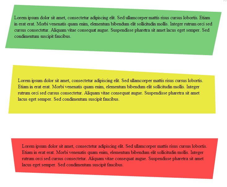
HTML - Pretty simple
div:nth-child(1) {  background: rgb(122, 206, 122);  height: 140px;  transform: skew(-10deg) rotate(2deg);  -webkit-transform: skew(-10deg) rotate(2deg);  -moz-transform: skew(-10deg) rotate(2deg);}
div:nth-child(1) p {  transform: skew(10deg) rotate(-2deg);  -webkit-transform: skew(10deg) rotate(-2deg);  -moz-transform: skew(10deg) rotate(-2deg);  padding: 3% 2%;}
div:nth-child(2) {  border-bottom: 180px solid rgb(233, 233, 65);  border-left: 8px solid transparent;  border-right: 14px solid transparent;  height: 0;  margin-top: 60px;  transform: rotate(3deg);  -webkit-transform: rotate(3deg);  -moz-transform: rotate(3deg);}
div:nth-child(2) p {  transform: rotate(-3deg);  -webkit-transform: rotate(-3deg);  -moz-transform: rotate(-3deg);  padding: 3.5% 3%;}
div:nth-child(3) {  border-top: 140px solid rgb(253, 74, 74);  border-left: 23px solid transparent;  border-right: 14px solid transparent;  height: 0;  margin-top: 20px;  transform: rotate(2deg);  -webkit-transform: rotate(2deg);  -moz-transform: rotate(2deg);}
div:nth-child(3) p {  transform: rotate(-2deg);  -webkit-transform: rotate(-2deg);  -moz-transform: rotate(-2deg);  position: absolute;  top: -140px;  padding: 3% 3%;}
div:nth-child(3):before {  content: '';  width: 124%;  height: 80px;  background: white;  position: absolute;  left: -20%;  bottom: 120px;  transform: rotate(-2deg);  -webkit-transform: rotate(-2deg);  -moz-transform: rotate(-2deg);}
<div> <p>text..</p></div>
<div> <p>text..</p></div>
<div> <p>text..</p></div>Skewed Borders on 2 Div
All you gotta do is add transform: translateY(10%); and z-index: 999; in your .img-box class, and it should work, let me know if it doesn't !
By the way, z-index doesn't strictly gotta be 999, I put the highest number just in case that something wont get over it later on if you decide to add more things to your code, you can put z-index: 1;, it will also work, or any number higher then 0 really :)
Just replace your css with this one :
.img-box {
  background: url("https://via.placeholder.com/2560x2000/0000000") no-repeat;
  background-size: cover;
  background-position: center center;
  position: relative;
  min-height: 100vh;
  transform: translateY(10%);
  z-index: 999;
  clip-path: polygon(0 0, 100% 10%, 100% 90%, 0 100%);
}

.map-box {
  background: url("https://via.placeholder.com/2560x600/DDDDDD") no-repeat;
  background-size: cover;
  background-position: center center;
  overflow: hidden;
  position: relative;
  height: 600px;
  display-block;
}

footer{
  height:100px;
  background-color: #4D4E4C;
}
Skew div border of one side only using one div only
I believe this is what you want:
http://jsfiddle.net/5a7rhh0L/3/
CSS:
#a {
    position: relative;
    width: 120px;
    padding: 10px 20px;
    font-size: 20px;
    position: relative;

    color: #2E8DEF;
    background: #333333;
    border-bottom: 3px solid #2E8DEF;
}
#a:after {
    content: " ";
    position: absolute;
    display: block;
    width: 100%;
    height: 100%;
    top: 0;
    left: 0;
    z-index: -1;

    background: #333333;
    border-bottom: 3px solid #2E8DEF;
    border-right: 20px solid #2E8DEF;

    transform-origin: bottom left;
    -ms-transform: skew(-30deg, 0deg);
    -webkit-transform: skew(-30deg, 0deg);
    transform: skew(-30deg, 0deg);
}
How can i make a skewed slanting div box
As the comments mention, you can achieve that kind of slant by using clip-path. You just need to make sure to match the path on both your inner + outer elements in order for the border to line up correctly.
.outside {
  position: relative;
  width: 70vmin;
  height: 70vmin;
  background: red;
  -webkit-clip-path: polygon(0 0, 100% 10%, 100% 100%, 0% 100%);
  clip-path: polygon(0 0, 100% 10%, 100% 100%, 0% 100%);
}

.inside {
  position: absolute;
  top: 5px;
  left: 5px;
  right: 5px;
  bottom: 5px;
  background: black;
  -webkit-clip-path: polygon(0 0, 100% 10%, 100% 100%, 0% 100%);
  clip-path: polygon(0 0, 100% 10%, 100% 100%, 0% 100%);
}
<div class="outside">
<div class="inside"></div>
</div>Side by side skewed divs
The width of the floated, skewed elements is the same as the original width. I added a container within the section, set overflow:hidden; on the section, and made the container larger than the section and centered. This means that the whole "triangle" created by the skew is hidden. You may have to play with the numbers, I just arbitrarily added 10% width on each side.
Also, your left:50% rule on the content wasn't doing anything because that element isn't relatively or absolutely positioned.
.apartments-showCase-content {  width: 50%;  background: grey;  height: 30em;  float: left;  box-sizing: border-box;  transform: skew(6deg);}
.apartments-showCase-image {  width: 50%;  background: #222;  height: 30em;  float: right;  background: url(https://i.picsum.photos/id/1003/800/800.jpg);  background-size: cover;  transform: skew(6deg);}
.apartments-section {  overflow: hidden;}
.apartments-section-container { width: 120%; position: relative; left: -10%;}
<section class="apartments-section"> <div class="apartments-section-container"> <div class="apartments-showCase-content"></div> <div class="apartments-showCase-image"></div> </div></section>Skewed div outside its parent container
This should do the trick. When you skew the div and img you have to think about what happens to the shape.
.wrapper {  -webkit-transform: skew(-35deg);  transform: skew(-35deg);  overflow: hidden;  -o-object-fit: cover;  object-fit: cover;  border: 2px green solid;  width:100%;  margin:0 auto;}
img {  -webkit-transform: skew(35deg) scale(1.5);  transform: skew(35deg) scale(1.5);  height: auto;  width: 100%;}
div{border:black 1px solid;}
.container-fluid{  overflow: hidden;}
<div class="container-fluid"> <div class="row no-gutters"> <div class="col-2 wrapper"> <img src="https://cdn.pixabay.com/photo/2016/12/13/05/15/puppy-1903313__340.jpg" alt="Sample Image" srcset=""> </div> ... </div>css div with one diagonal border
As the outline is just visual rather than having meaning we can add it without adding extra elements in the DOM. We can do this with CSS pseudo elements which paint the border - the top one being skewed, the bottom one not.
Essentially this snippet is using a combination of your two methods - skew and clip-path - to give this:
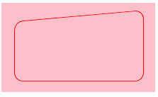
.container {
  background-color: pink;
  display: inline-block;
  padding: 2vmin;
}

.container>* {
  width: 20vmin;
  height: 10vmin;
  position: relative;
}

.container>*::before,
.container>*::after {
  content: '';
  top: 0;
  left: 0;
  border: 1px red solid;
  border-radius: 10px;
  width: 100%;
  height: 100%;
  position: absolute;
}

.container>*::before {
  transform: skew(0, -5deg);
  clip-path: polygon(0 0, 100% 0, 100% 80%, 0 80%);
}

.container>*::after {
  clip-path: polygon(0 50%, 100% 50%, 100% 100%, 0 100%);
}
<div class="container">
<div></div>
</div>Related Topics
CSS Calc Not Working in Safari and Fallback
How to Show Three Columns Per Row
Stripping Out HTML Tags from a String
An Url to a Windows Shared Folder
CSS Overflow Hidden with Absolute Position
Items That Span All Columns/Rows Using CSS Grid Layout
Table with Table-Layout: Fixed; and How to Make One Column Wider
How to Write Text on a HTML5 Canvas Element
Are Multi-Line Options in HTML Select Tags Possible
Anchor <A> Tags Not Working in Chrome When Using #
Height: 100% for <Div> Inside <Div> with Display: Table-Cell
Removing Unwanted Table Cell Borders with CSS
How to Use a Grammar with The HTML 5 Speech Input API
What Is The Purpose for HTML's Tbody
Set a Form's Action Attribute When Submitting