Make a perfect circle around a div of variable height
Clip-path can easily do this if you consider solid coloration.
Resize the element and the circle will follow:
.box {
  width: 200px;
  height: 200px;
  overflow: hidden;
  resize: both;
  background: blue;
  box-shadow: 0 0 0 200vmax red;
  clip-path: circle(71%);
  margin: 100px auto;
}
<div class="box"></div>Div with content inside a perfect circle
There are a lot of little elements here. First of all, don't be afraid to use multiple wrapping divs when you have a lot of behaviors to handle rather than trying to put too many responsibilities on too few elements.
- You already have the width set using flex-basis.
- To make the circles have a fixed 1:1 width to height ratio you can use 50% border, height of 0, and padding-top 100%. That last bit is tricky but padding top or bottom with a percentage is a percentage of the width.
- To center the squares, use another div with absolute position, top 50% and left 50% and then translate:transform( -50%, -50% ). The translate values are a percentage of the element itself and the top and left positioning percentages are percentages of the parent.
- To add padding to the square without affecting it's size, use box-sizing: border-box
- Finally, I used width and height of 72% to get the squares to contact the circles. That's pretty close to the ( square root of 2 ) / 2 * 100% which is 70.7% but it worked for me with your border thicknesses.
.action-selection {  display: flex;  justify-content: space-between;}
.action {  flex: 0 1 30%;  text-align: center;}
.action img {  width: 30px;}
.action__container-circle {  border-radius: 50%;  border: 2px solid orange;  height: 0;  padding-top: 100%;  position: relative;}
.action__content-square {  border: 2px dashed black;  height: auto;  position: absolute;  top: 50%;  left: 50%;  transform: translate( -50%, -50%);  width: 72%;  height: 72%;  box-sizing: border-box;  padding: 5px;  overflow: hidden;}
<div class="action-selection"> <div class="action"> <div class="action__container-circle"> <div class="action__content-square"> <img src="img/phone.png"> <p>I'm already lincenced and I want to join BeUrban</p> </div> </div> </div> <div class="action"> <div class="action__container-circle"> <div class="action__content-square"> <img src="img/phone.png"> <p>I'm licensed but I'd like to know more about BeUrban</p> </div> </div> </div> <div class="action"> <div class="action__container-circle"> <div class="action__content-square"> <img src="img/phone.png"> <p>I'm ready to start my career with BeUrban</p> </div> </div> </div></div>Creating a circle in a container, according to height. CSS, HTML
Have a look at this codesandbox
The element with class circle will get the height of the container element always.
CSS
container {
  border: 1px solid #000000;
  width: 600px;
  height: 400px;
}

.circle {
  height: 100%;
  /*width: 100%;  You no longer need it when using aspect-ratio*/
  aspect-ratio: 1 / 1;
  background: red;
  border-radius: 100%;
}
HTML
    <div class="container">
      <div class="circle"></div>
    </div>
Create a perfect circle with CSS
In order to achieve a perfectly round shape you'll need to have perfect square to begin with. So, for instance, your button will need to have dimensions like width: 32px; height: 32px. To turn a square into a circle you'll have to apply a border radius of 50% e.g. border-radius: 50%.
CSS circle without using fixed width and height
See this CSS only solution. Set the same value of min-width and min-height for 1 digit number. Use a pseudo element for vertical alignment and to maintain the square shape. With border-radius applies to the container for the circle.
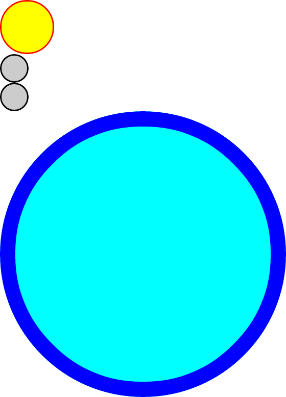
.circle { display: inline-block; border-radius: 50%; min-width: 20px; min-height: 20px; padding: 5px; background: red; color: white; text-align: center; line-height: 1; box-sizing: content-box; white-space: nowrap;}.circle:before { content: ""; display: inline-block; vertical-align: middle; padding-top: 100%; height: 0;}.circle span { display: inline-block; vertical-align: middle;}<div class="circle"><span>8</span></div><div class="circle"><span>64</span></div><div class="circle"><span>512</span></div><div class="circle"><span>4096</span></div>Easier way to create circle div than using an image?
Here's a demo: http://jsfiddle.net/thirtydot/JJytE/1170/
CSS:
.circleBase {
    border-radius: 50%;
    behavior: url(PIE.htc); /* remove if you don't care about IE8 */
}

.type1 {
    width: 100px;
    height: 100px;
    background: yellow;
    border: 3px solid red;
}
.type2 {
    width: 50px;
    height: 50px;
    background: #ccc;
    border: 3px solid #000;
}
.type3 {
    width: 500px;
    height: 500px;
    background: aqua;
    border: 30px solid blue;
}
HTML:
<div class="circleBase type1"></div>

<div class="circleBase type2"></div><div class="circleBase type2"></div>

<div class="circleBase type3"></div>
To make this work in IE8 and older, you must download and use CSS3 PIE. My demo above won't work in IE8, but that's only because jsFiddle doesn't host PIE.htc.
My demo looks like this:
Small circle div - CSS
If you really want to get a circle, you need an equal amount of height and width on your div.
That way you get a square.
Then you add a border-radius of 50% for the perfect circle.
You're less likely to get a perfect circle if the height and width of the div are not the same.
Maintain Perfectly Circular Corners on Variable-Height Element
Just set the border-radius to something high, like 360px.
div {
    height:50px;
    width:500px;
    background:red;
    border-radius:360px;
}
Look at this jsFiddle example to see what I mean.
Related Topics
Prevent Floated Divs from Wrapping to New Line
How to Replace The File Browse Button in HTML
Default Width/Height of an Iframe
HTML Form Redirect After Submit
Symetric Div with Background Image Without Clip-Path
"Break-Inside: Avoid-Column" Doesn't Work in Firefox
Use The HTML <Img> Tag as a Background Image Instead of The CSS Background-Image Property
HTML5 Standards of Nesting Div in Li or Dl
Embed Youtube Code Is Not Working in HTML
What Does The Shrink-To-Fit Viewport Meta Attribute Do
Internet Explorer 8 Ignores Width for 'Display: Table-Cell' Element
Purpose of The Crossorigin Attribute...
Gradient Colors in Internet Explorer
Display: Flex Not Working on Internet Explorer
How to Display an Image Inside Svg Circle in HTML5
Valid Order for Attributes of Input Type Tag
Angular Performance: Dom Event Causes Unnecessary Function Calls