How to make this arrow in CSS only?
If the space between the arrows does not need to be transparent (it is solid color) you can use the :before and :after to create the edges (without new elements in DOM)
Basically, it creates rotated squares with the borders we want and places them accordingly
#flowBoxes {    margin:auto;    padding:20px;    min-width:700px;
}#flowBoxes div {    display:inline-block;    position:relative;    height:25px;    line-height:25px;    padding:0 20px;    border:1px solid #ccc;    margin-right:2px;    background-color:white;}
#flowBoxes div.right:after{    content:'';    border-top:1px solid #ccc;    border-right:1px solid #ccc;    width:18px;    height:18px;    position:absolute;    right:0;    top:-1px;    background-color:white;    z-index:150;        -webkit-transform: translate(10px,4px) rotate(45deg);       -moz-transform: translate(10px,4px) rotate(45deg);        -ms-transform: translate(10px,4px) rotate(45deg);         -o-transform: translate(10px,4px) rotate(20deg);             transform: translate(10px,4px) rotate(45deg);}
#flowBoxes div.left:before{    content:'';    border-top:1px solid #ccc;    border-right:1px solid #ccc;    width:18px;    height:18px;    position:absolute;    left:0;    top:-1px;    background-color:white;    z-index:50;        -webkit-transform: translate(-10px,4px) rotate(45deg);       -moz-transform: translate(-10px,4px) rotate(45deg);        -ms-transform: translate(-10px,4px) rotate(45deg);         -o-transform: translate(-10px,4px) rotate(20deg);            transform: translate(-10px,4px) rotate(45deg);}#flowBoxes .active{    background-color:green;    color:white;}#flowBoxes div.active:after{    background-color:green;}
<div id="flowBoxes"> <div class="right">Diersoort / I&R</div> <div class="left right active">Model</div> <div class="left right">Varianten</div> <div class="left right">Bedrukkingen</div> <div class="left">Bevestiging</div></div>How can I create an arrow using only CSS?
I didn't know this trick before, but I think I understand it. The bottom border isn't square, it's beveled on the sides. A left border would be beveled on the top and bottom. This is so borders of different colors meet cleanly. Because the arrow element has 0 height and width, the border segment is as wide on the bottom as you specify in the border rule, but narrows to a width of 0px (the size of the container).
You can play with the effect by setting different border thicknesses or changing the "side" of the border rule. The "arrow" always points opposite of the direction set in the rule. The bottom border "points" up; a right border "points" left.
Here's a quick diagram:
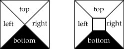
Left is the arrow trick. Right is a more typical border where the container has some dimensions.
How to create the UP Arrow using only HTML and CSS?
You can try this for Up arrow. More click Here
  .arrow-up {    width: 0;     height: 0;     border-left: 15px solid transparent;    border-right: 15px solid transparent;
    border-bottom: 15px solid blue;  }
<div class="arrow-up"></div> create an arrow using css
Already there is way through which you could achieve this i.e. suggested by James, but you could even do this using pseudo selectors or using pre-defined icons using font awesome to get an arrow icon next to some tag, as below.
Solution 1:
#box{ width:100px; height:50px; background:blue; position:relative;} #box:before{ top: 20px; right:10px; content: ""; display: inline-block; width: 0.5em; height: 0.5em; border-right: 0.1em solid white; border-top: 0.1em solid white; transform: rotate(45deg); position:absolute;}#box > p:after{ content:''; width:20px; height:1px; background:white; right:10px; top:24px; position:absolute;}#box > p{ font-size:24px; color:#fff; padding:10px; box-sizing:border-box;}<div id="box"><p>Next</p></div>How to create 'greater than' arrow using CSS only?
I think background images are your only real pure-CSS option, since content isn't well-supported (or supported at all) on earlier browsers.
If you're okay with it not being a pure CSS solution, you can fake it with Javascript, but of course that violates the "using CSS only" part of your question :-) (and requires that your site visitors have Javascript enabled). For instance, using Prototype:
document.observe("dom:loaded", handleDividers);
function handleDividers() {
    $$('nearly any CSS3 selector').invoke('insert', {
        bottom: ">"
    });
}
...puts a > at the end of any element matching the selector. You could do the same with jQuery, Closure, ... I think the quasi-equivalent jQuery would be:
$.ready(handleDividers);
function handleDividers() {
    $('nearly any CSS3 selector').append(">");
}
how to create arrow down/up in css
My proposal is:
.triangle_down { width: 0; height: 0; border-left: 15px solid transparent; border-right: 15px solid transparent; border-top: 15px solid #2f2f2f; font-size: 0; line-height: 0; float: left;}.triangle_down1 { position: relative; top: -5px; content: ""; display: inline-block; width: 15px; height: 15px; border-right: 0.2em solid black; border-top: 0.2em solid black; transform: rotate(135deg); margin-right: 0.5em; margin-left: 1.0em;} .triangle_up1 { position: relative; top: -5px; content: ""; display: inline-block; width: 15px; height: 15px; border-right: 0.2em solid black; border-top: 0.2em solid black; transform: rotate(-45deg); margin-right: 0.5em; margin-left: 1.0em; }<div id="dialog1" class="triangle_down"></div><div id="dialog2" class="triangle_down1"></div><div id="dialog3" class="triangle_up1"></div>How can I make a pointy arrow with a div in CSS
Here is an arrow with pure CSS. Supported by all browsers. It took me less than a minute to make..

jsFiddle
.arrow {  width: 120px;}
.line {  margin-top: 14px;  width: 90px;  background: blue;  height: 10px;  float: left;}
.point {  width: 0;  height: 0;  border-top: 20px solid transparent;  border-bottom: 20px solid transparent;  border-left: 30px solid blue;  float: right;}
<div class="arrow"> <div class="line"></div> <div class="point"></div></div>How to code an arrow using css
For arrow and lines i have use border
.content {  margin-top: 30px;  position: relative;  border: 2px solid black;  border-bottom: 2px;  border-radius: 5px;  width: 200px;  height: 40px;}
.content:before,.content:after,.center:before {  content: '';  width: 0;  height: 0;  border-width: 8px 8px;  border-color: #000 transparent transparent transparent;  border-style: solid;  position: absolute;}
.content:before {  left: -8px;  top: 36px;}
.content:after {  right: -8px;  top: 36px;}
.center:before {  right: -8px;  top: 60px;}
.center {  position: absolute;  height: 60px;  top: -24px;  left: 50%;  margin-left:-2px;  border: 1px solid black;}
<div class="content"> <div class="center"> </div></div>Is it possible to make these arrows with html and css?
[Edit] After looking at your image again, I failed to account for the first element being flat. I have updated my answer.
Using before,after, and nth-child selectors, you can achieve what you showed in your image. The before and after pseudo elements are used to create the top and bottom half of the arrows while the nth-child selectors are used to make the arrows appear to be progressively closer together.
.steps-list {  display: flex;  list-style: none;}
.steps-list .step-item {  position: relative;  display: flex;  align-items:center;  text-align: center;  width: 25%;}
.steps-list .step-item .step-link {  font-weight: bold;  width: 100%;  display: inline-block;  padding:10px 5px;  box-sizing:border-box;}
.step-link::before {  content: "";  display: block;  position: absolute;  transform: skew(-40deg, 0);  background: #e2e3e4;  height: 50%;  bottom: 0;  z-index: -1;  left:5px;}.step-link::after {  content: "";  display: block;  position: absolute;  transform: skew(40deg, 0);  background: #e2e3e4;  height: 50%;  top: 0;  z-index: -1;  left:5px;}.step-item:nth-child(1){  overflow:hidden;}.step-item:nth-child(1) .step-link::after {  width:95%;  left:-15px;}
.step-item:nth-child(1) .step-link::before {  width: 95%;  left:-15px;}
.step-item:nth-child(2) .step-link::after {  width: 90%;}
.step-item:nth-child(2) .step-link::before {  width: 90%;}
.step-item:nth-child(3) .step-link::after {  width: 95%;}
.step-item:nth-child(3) .step-link::before {  width: 95%;}
.step-item:nth-child(4) .step-link::after {  width: 100%;}
.step-item:nth-child(4) .step-link::before {  width: 100%;}
<ul class="steps-list"> <li class="step-item"> <a href="#" class="step-link">Contact us</a> </li> <li class="step-item"> <a href="#" class="step-link">Consult with RCIC</a> </li> <li class="step-item"> <a href="#" class="step-link">Apply via your pathway</a> </li> <li class="step-item"> <a href="#" class="step-link">Settle in Canada</a> </li></ul>How to make a box with arrow in CSS?
Like this :
.arrow {
    border: solid 10px transparent;
    border-right-color: #FFF;
}
Demo : http://jsfiddle.net/sparkup/edjdxjf2/
UPDATE :
It can also be achieved without empty elements with the css property :before
element:before {
    content: "";
    position: absolute;
    top: 50%;                         // half way down (vertical center).
    margin-top: -15px;                // adjust position, arrow has a height of 30px.
    left:-30px;
    border: solid 15px transparent;
    border-right-color: #FFF;
    z-index: 1;
}
Demo : http://jsfiddle.net/sparkup/y89f1te0/
hope it helps
Related Topics
How to Set Input Type Date'S Default Value to Today
How Does the "Position: Sticky;" Property Work
Change Select List Option Background Colour on Hover
Centered Elements Inside a Flex Container Are Growing and Overflowing Beyond Top
Get the Value in an Input Text Box
Can HTML Checkboxes Be Set to Readonly
How to Prevent Column Break Within an Element
Generate an HTML Response in a Java Servlet
Create HTML Table With SQL For Xml
Force Ie Compatibility Mode Off Using Tags
Why Are My Css3 Media Queries Not Working on Mobile Devices
Css Vertical Alignment of Inline/Inline-Block Elements
How to Create Download Link in Html
Equal Width Flex Items Even After They Wrap
How to Make Css3 Rounded Corners Hide Overflow in Chrome/Opera