How to make a radio button look like a toggle button
Depending on which browsers you aim to support, you could use the :checked pseudo-class selector in addition to hiding the radio buttons.
Using this HTML:
<input type="radio" id="toggle-on" name="toggle" checked
><label for="toggle-on">On</label
><input type="radio" id="toggle-off" name="toggle"
><label for="toggle-off">Off</label>
You could use something like the following CSS:
input[type="radio"].toggle {
  display: none;
}

input[type="radio"].toggle:checked + label {
  /* Do something special with the selected state */
}
For instance, (to keep the custom CSS brief) if you were using Bootstrap, you might add class="btn" to your <label> elements and style them appropriately to create a toggle that looks like:
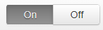
...which just requires the following additional CSS:
input[type="radio"].toggle:checked + label {
  background-image: linear-gradient(to top,#969696,#727272);
  box-shadow: inset 0 1px 6px rgba(41, 41, 41, 0.2),
                    0 1px 2px rgba(0, 0, 0, 0.05);
  cursor: default;
  color: #E6E6E6;
  border-color: transparent;
  text-shadow: 0 1px 1px rgba(40, 40, 40, 0.75);
}

input[type="radio"].toggle + label {
  width: 3em;
}

input[type="radio"].toggle:checked + label.btn:hover {
  background-color: inherit;
  background-position: 0 0;
  transition: none;
}

input[type="radio"].toggle-left + label {
  border-right: 0;
  border-top-right-radius: 0;
  border-bottom-right-radius: 0;
}

input[type="radio"].toggle-right + label {
  border-top-left-radius: 0;
  border-bottom-left-radius: 0;
}
I've included this as well as the extra fallback styles in a radio button toggle jsFiddle demo. Note that :checked is only supported in IE 9, so this approach is limited to newer browsers.
However, if you need to support IE 8 and are willing to fall back on JavaScript*, you can hack in pseudo-support for :checked without too much difficulty (although you can just as easily set classes directly on the label at that point).
Using some quick and dirty jQuery code as an example of the workaround:
$('.no-checkedselector').on('change', 'input[type="radio"].toggle', function () {
    if (this.checked) {
        $('input[name="' + this.name + '"].checked').removeClass('checked');
        $(this).addClass('checked');
        // Force IE 8 to update the sibling selector immediately by
        // toggling a class on a parent element
        $('.toggle-container').addClass('xyz').removeClass('xyz');
    }
});
$('.no-checkedselector input[type="radio"].toggle:checked').addClass('checked');
You can then make a few changes to the CSS to complete things:
input[type="radio"].toggle {
  /* IE 8 doesn't seem to like to update radio buttons that are display:none */
  position: absolute;
  left: -99em;
}

input[type="radio"].toggle:checked + label,
input[type="radio"].toggle.checked + label {
  /* Do something special with the selected state */
}
*If you're using Modernizr, you can use the :selector test to help determine if you need the fallback. I called my test "checkedselector" in the example code, and the jQuery event handler is subsequently only set up when the test fails.
How to make an input (radio?) look like a toggle/slider between two choices?
I assumed it is a radio button that’s made to look like a toggle
You're right (at least to think of using radio buttons), these are two inputs of type radio with an associated label for each one that are (the labels) styled using CSS.
To be short, here's a live demo of the end result :
.wrapper {
  display: flex;
  padding: 4px;
  background-color: #24ef43;
}

.custom-input {
  flex-grow: 1;
}

.custom-input input[type=radio] {
  display: none;
}

.custom-input label {
  display: block;
  padding: 6px 8px;
  color: #fff;
  font-weight: bold;
  text-align: center;
  transition : all .4s 0s ease;
}

.custom-input input[type=radio]:checked + label {
  background-color: #f5f5f5;
  color: #000;
  border-radius: 4px;
}
<div class="wrapper">
<div class="custom-input">
<input type="radio" id="female" name="gender">
<label for="female">Female</label>
</div>
<div class="custom-input">
<input type="radio" id="male" name="gender">
<label for="male">Male</label>
</div>
</div>How to make a radio buttons look like a toggle buttons
Is This what you wanted?
http://jsfiddle.net/aS69U/7/
.form-radios {
display: block;
float: left;
-moz-border-radius: 6px;
-webkit-border-radius: 6px;
border-radius: 6px;
font-weight: bold;
text-transform: uppercase;
background: #eee;
border: 1px solid #aaa;
padding: 2px;
box-shadow: inset 0 2px 5px rgba(0,0,0,0.2);
margin-left: 20px;
}
.form-radios input[type=radio] {
display: none;
}
.form-radios label {
display: block;
float: left;
padding: 3px 6px;
-moz-border-radius: 5px;
-webkit-border-radius: 5px;
border-radius: 5px;
color: #aaa;
cursor: pointer;
}
.form-radios label:hover {
text-shadow: 0 0 2px #fff;
color: #888;
}
.form-radios label.checked {
background: #8fc800;
color: #eee;
text-shadow: 0 -1px 1px rgba(0,0,0,0.5);
background: -webkit-linear-gradient(top, #8fc800, #438c00);
background: -moz-linear-gradient(top, #8fc800, #438c00);
background: -ms-linear-gradient(top, #8fc800, #438c00);
cursor: default;
}
Design Toggle button using Radio buttons
This will work for you:
Input can't be styled so, it's better to hide them and style there label as per your need.
.btn {  display: inline-block;  margin-bottom: 0;  text-align: center;  cursor: pointer;  background-image: none;  border: 1px solid transparent;  white-space: nowrap;  padding: 3px 16px;  font-family: ABBvoice;  font-size: 13px;  font-weight: 500;  border-radius: 0;  height: 30px;  padding-bottom: 7px;}
.btn-default-toggle-ghost,.btn-default-toggle-ghost:focus {  background: transparent;  border: 1px solid rgba(160, 160, 160, 0.6);  color: #464646;  outline: none;  text-align: center;  font-size: 16px;  line-height: 30px;  position: relative;  float: left;}
.btn-group [type="radio"] {  display: none;}
[type="radio"]:checked+.btn-default-toggle-ghost {  background: #DEDEDE;}
[type="radio"]:checked+.btn-default-toggle-ghost:after {  content: '';  position: absolute;  top: 0px;  height: 3px;  background: #0093F6;  left: 0px;  right: 0px;}
.btn-default-toggle-ghost+[type="radio"]+.btn-default-toggle-ghost{ border-left:0px;/*for removing the extra border between the buttons*/}
<div class="btn-group" data-toggle="buttons"> <input type="radio" id="one" name="test-toggle" checked="checked"> <label for="one" class="btn btn-default-toggle-ghost active"> Option 1 </label> <input type="radio" id="two" name="test-toggle"> <label for="two" class="btn btn-default-toggle-ghost active"> Option 2 </label></div>Best way to render radio buttons as toggle-able buttons in a web form
I've figured out, for the most part, how to accomplish what I want. Without manually coded Jquery, I just had to integrate more bootstrap functionality (following the examples linked in my question) like so:
an ugly clump of src tags in base.html:
<script src="https://ajax.googleapis.com/ajax/libs/jquery/3.5.1/jquery.min.js"></script>
<link rel="stylesheet" href="https://cdn.jsdelivr.net/npm/bootstrap@4.6.0/dist/css/bootstrap.min.css" integrity="sha384-B0vP5xmATw1+K9KRQjQERJvTumQW0nPEzvF6L/Z6nronJ3oUOFUFpCjEUQouq2+l" crossorigin="anonymous">
<script src="https://cdnjs.cloudflare.com/ajax/libs/popper.js/1.14.7/umd/popper.min.js"></script>
<script src="https://stackpath.bootstrapcdn.com/bootstrap/4.5.0/js/bootstrap.min.js"></script>
and the Bootstrap/jinja2 medley in the page being displayed:
{{ form.setting.label }}<br>
<div class="btn-group-toggle" data-toggle="buttons">
    {% for subfield in form.setting %}
        <label class="btn btn-primary">
            {{ subfield}} {{ subfield.label(style="cursor:pointer;") }}
        </label>
    {% endfor %}<br>
    {% for error in form.setting.errors %}
        <span style="color: red;">[{{ error }}]</span>
    {% endfor %}
</div>
The buttons, when clicked, look activated. I say for the most part because there are some weird rendering features:
- I have to manually input
style="cursor:pointer;"tosubfield.labelbecause otherwise the cursor will be the default one when hovering over the button's label, and slightly around that label will default to the button's pointer cursor. - The buttons themselves are awkwardly taller than they should be. This can be fixed with CSS but I'm not sure why this happens.
- Part of my form is dynamic and updates based on radio button values using jquery. With these Bootstrap styles however, my script is only detecting when the first button in the div gets clicked and not the others. Edit: I've solved this using this
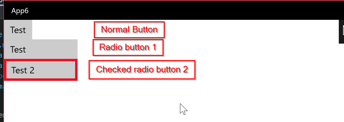
Make radio button appear as toggle button in UWP
With XAML this is very easy to do.
Here is what I did:
- Create a button and right click on it, select Edit Template then Edit Copy.
- Create a Radio Button, right click on it, select Edit Template then edit copy.
- now replace the style of the radio button style with the XAML from the Button Style.
- only keep the radio button specific visual states: Checked, Unchecked, etc..
- now make sure the animations reference the right UIElements. you can modify how the radio button will look like when checked however you want.
this will give you a radio button that look like a toggle button.
here is how it looks like:
and here is the Radio Button style:
<Style TargetType="RadioButton">
        <Setter Property="Background" Value="{ThemeResource ButtonBackground}" />
        <Setter Property="Foreground" Value="{ThemeResource ButtonForeground}" />
        <Setter Property="BorderBrush" Value="{ThemeResource ButtonBorderBrush}" />
        <Setter Property="BorderThickness" Value="{ThemeResource ButtonBorderThemeThickness}" />
        <Setter Property="Padding" Value="8,4,8,4" />
        <Setter Property="HorizontalAlignment" Value="Left" />
        <Setter Property="VerticalAlignment" Value="Center" />
        <Setter Property="FontFamily" Value="{ThemeResource ContentControlThemeFontFamily}" />
        <Setter Property="FontWeight" Value="Normal" />
        <Setter Property="FontSize" Value="{ThemeResource ControlContentThemeFontSize}" />
        <Setter Property="UseSystemFocusVisuals" Value="True" />
        <Setter Property="FocusVisualMargin" Value="-3" />
        <Setter Property="Template">
            <Setter.Value>
                <ControlTemplate TargetType="RadioButton">
                    <Grid x:Name="RootGrid" Background="{TemplateBinding Background}">
                        <ContentPresenter
                            x:Name="ContentPresenter"
                            Padding="{TemplateBinding Padding}"
                            HorizontalContentAlignment="{TemplateBinding HorizontalContentAlignment}"
                            VerticalContentAlignment="{TemplateBinding VerticalContentAlignment}"
                            AutomationProperties.AccessibilityView="Raw"
                            BorderBrush="{TemplateBinding BorderBrush}"
                            BorderThickness="{TemplateBinding BorderThickness}"
                            Content="{TemplateBinding Content}"
                            ContentTemplate="{TemplateBinding ContentTemplate}"
                            ContentTransitions="{TemplateBinding ContentTransitions}" />
                        <VisualStateManager.VisualStateGroups>
                            <VisualStateGroup x:Name="CommonStates">
                                <VisualState x:Name="Normal">
                                    <Storyboard>
                                        <PointerUpThemeAnimation Storyboard.TargetName="RootGrid" />
                                    </Storyboard>
                                </VisualState>
                                <VisualState x:Name="PointerOver">
                                    <Storyboard>
                                        <ObjectAnimationUsingKeyFrames Storyboard.TargetName="RootGrid" Storyboard.TargetProperty="Background">
                                            <DiscreteObjectKeyFrame KeyTime="0" Value="{ThemeResource ButtonBackgroundPointerOver}" />
                                        </ObjectAnimationUsingKeyFrames>
                                        <ObjectAnimationUsingKeyFrames Storyboard.TargetName="ContentPresenter" Storyboard.TargetProperty="BorderBrush">
                                            <DiscreteObjectKeyFrame KeyTime="0" Value="{ThemeResource ButtonBorderBrushPointerOver}" />
                                        </ObjectAnimationUsingKeyFrames>
                                        <ObjectAnimationUsingKeyFrames Storyboard.TargetName="ContentPresenter" Storyboard.TargetProperty="Foreground">
                                            <DiscreteObjectKeyFrame KeyTime="0" Value="{ThemeResource ButtonForegroundPointerOver}" />
                                        </ObjectAnimationUsingKeyFrames>
                                        <PointerUpThemeAnimation Storyboard.TargetName="RootGrid" />
                                    </Storyboard>
                                </VisualState>
                                <VisualState x:Name="Pressed">
                                    <Storyboard>
                                        <ObjectAnimationUsingKeyFrames Storyboard.TargetName="RootGrid" Storyboard.TargetProperty="Background">
                                            <DiscreteObjectKeyFrame KeyTime="0" Value="{ThemeResource ButtonBackgroundPressed}" />
                                        </ObjectAnimationUsingKeyFrames>
                                        <ObjectAnimationUsingKeyFrames Storyboard.TargetName="ContentPresenter" Storyboard.TargetProperty="BorderBrush">
                                            <DiscreteObjectKeyFrame KeyTime="0" Value="{ThemeResource ButtonBorderBrushPressed}" />
                                        </ObjectAnimationUsingKeyFrames>
                                        <ObjectAnimationUsingKeyFrames Storyboard.TargetName="ContentPresenter" Storyboard.TargetProperty="Foreground">
                                            <DiscreteObjectKeyFrame KeyTime="0" Value="{ThemeResource ButtonForegroundPressed}" />
                                        </ObjectAnimationUsingKeyFrames>
                                        <PointerDownThemeAnimation Storyboard.TargetName="RootGrid" />
                                    </Storyboard>
                                </VisualState>
                                <VisualState x:Name="Disabled">
                                    <Storyboard>
                                        <ObjectAnimationUsingKeyFrames Storyboard.TargetName="RootGrid" Storyboard.TargetProperty="Background">
                                            <DiscreteObjectKeyFrame KeyTime="0" Value="{ThemeResource ButtonBackgroundDisabled}" />
                                        </ObjectAnimationUsingKeyFrames>
                                        <ObjectAnimationUsingKeyFrames Storyboard.TargetName="ContentPresenter" Storyboard.TargetProperty="BorderBrush">
                                            <DiscreteObjectKeyFrame KeyTime="0" Value="{ThemeResource ButtonBorderBrushDisabled}" />
                                        </ObjectAnimationUsingKeyFrames>
                                        <ObjectAnimationUsingKeyFrames Storyboard.TargetName="ContentPresenter" Storyboard.TargetProperty="Foreground">
                                            <DiscreteObjectKeyFrame KeyTime="0" Value="{ThemeResource ButtonForegroundDisabled}" />
                                        </ObjectAnimationUsingKeyFrames>
                                    </Storyboard>
                                </VisualState>
                            </VisualStateGroup>
                            <VisualStateGroup x:Name="CheckStates">
                                <VisualState x:Name="Checked">
                                    <Storyboard>
                                        <ObjectAnimationUsingKeyFrames Storyboard.TargetName="ContentPresenter" Storyboard.TargetProperty="BorderBrush">
                                            <DiscreteObjectKeyFrame KeyTime="0" Value="{ThemeResource SystemControlBackgroundAccentBrush}" />
                                        </ObjectAnimationUsingKeyFrames>
                                        <ObjectAnimationUsingKeyFrames Storyboard.TargetName="ContentPresenter" Storyboard.TargetProperty="BorderThickness">
                                            <DiscreteObjectKeyFrame KeyTime="0" Value="4" />
                                        </ObjectAnimationUsingKeyFrames>
                                    </Storyboard>
                                </VisualState>
                                <VisualState x:Name="Unchecked" />
                                <VisualState x:Name="Indeterminate" />
                            </VisualStateGroup>
                        </VisualStateManager.VisualStateGroups>
                    </Grid>
                </ControlTemplate>
            </Setter.Value>
        </Setter>
    </Style>
Hopefully this answers your question.
How to toggle a radio button with a label
After many attempts I finally managed to code a working solution with some javascript.
The problem is that as soon as the radio button is clicked its state changes. the previous value needs to be stored in order to know if it has to be unselected or not.
<main id="form">
    <label >
      <input type="radio" name="rad" id="Radio0" />Learn Html
    </label>
    <br><br>
    <label>
      <input type="radio" name="rad" id="Radio1" />Learn CSS
    </label>
    <br><br>
    <label>
      <input type="radio" name="rad" id="Radio2" />Learn Java
    </label>
</main>

<script>
    let buttons = document.querySelectorAll('#form input');
    for (button of buttons){
        button.dataset.waschecked="false";
        button.addEventListener('click', myFunction, false);
    }

function myFunction(e) {
  if (e.originalTarget.dataset.waschecked == "false"){

    for (button of document.querySelectorAll('#form input')){
        button.dataset.waschecked = "false";
    }
    e.originalTarget.dataset.waschecked = "true";
    e.originalTarget.checked =true;
  }else {
    for (button of document.querySelectorAll('#form input')){
        button.dataset.waschecked = "false";
    }
    e.originalTarget.checked =false;
  }
}
</script>
Any suggestion to improve this code is welcome.
How can I make a ToggleButton look like a RadioButton without changing its behavior?
You don't need this style manipulations. RadioButton class extends ToggleButton, so you can just do this:
ToggleButton button = new RadioButton("Toggle me!");
Edit
To keep ToggleButton behavior in ToggleGroup(be able to unselect), you can use your implementation of RadioButton with overriden fire() method with logic like in ToggleButton class:
public static class MyRadioButton extends RadioButton {
    public MyRadioButton() {
    }

    public MyRadioButton(String text) {
        super(text);
    }
    @Override
    public void fire() {
        if (!isDisabled()) {
            setSelected(!isSelected());
            fireEvent(new ActionEvent());
        }
    }
}
Related Topics
Add External CSS File to Blogger Template
How Move 'Nav' Element Under 'Navbar-Brand' in My Navbar
Ie Compatibility Mode: 'X-Ua-Compatible' Tag 'Edge'
How to Print a Portion of an HTML Page
An Url to a Windows Shared Folder
What Is Aria-Label and How to Use It
How Is The Meta Viewport Tag Used, and What Does It Do
How to Display Alt Text for an Image in Chrome
Difference Between Onblur and Onchange Attribute in HTML
Table Overflowing Outside of Div
Why Are Only Some of My CSS Grid Boxes Expanding When I Hover Over Them
Change Bootstrap Input Focus Blue Glow