Is the viewport meta tag really necessary?
On desktop operating systems, browser viewports are a fixed number of pixels wide, and web page content is rendered into them as-is.
Starting with Safari on iOS (or whatever we were supposed to be calling iOS back then), mobile browser viewports have been "virtual". Although the viewport may only take up (for example) 320 physical pixels-worth of space in the interface, the browser creates a "virtual" viewport that's larger (980 pixels wide by default on iOS, I think) and renders content in there, then zooms that virtual viewport out until it fits into the actual physical pixels available on the device’s screen.
The viewport meta tag allows you to tell the mobile browser what size this virtual viewport should be. This is often useful if you're not actually changing your site's design for mobile, and it renders better with a larger or smaller virtual viewport. (I believe 980 pixels was chosen as the default because it did a good job of rendering lots of high-profile sites in 2007; for any given site, a different value might be better.)
Personally, I always use <meta name="viewport" content="width=device-width, initial-scale=1"> so that the virtual viewport matches the device dimensions. (Note that initial-scale=1 seems to be necessary to make the virtual viewport adapt to landscape mode on iOS.) That makes mobile browsers behave like desktop browsers always have, which is what I'm used to.
Without a viewport meta tag, your site will be rendered into the device's default virtual viewport. I don't think that's necessarily a problem, especially if all your units are ems or percentages as you say. But it might be a bit confusing if you need to think in pixels at any point, especially as different browsers could have differently-sized default virtual viewports. It also might be confusing for subsequent maintainers if they don't understand the approach.
I imagine you set your base font size quite large, so that it's legible? Could you link to one of the websites you've created like this, so we can see an example?
How is the meta viewport tag used, and what does it do?
- The
name="viewport"property of the<meta>tag is well-supported on major browsers. - You include the attribute like any other on a
<meta>element. Put the element straight up in the<head>. - It depends on which
contentattribute values you provide. This tag instructs the browser to use some default for zoom values on a web page to ensure you don't end up initially displaying only a small portion of the top-right corner of the page on small devices. I'd advise reading some articles on it or, better yet, reading the W3 mobile best practices for mobile web design. Generally, you will only want to setcontent="width=device-width, initial-scale=1.0to fit your web page to the device regardless of scale or orientation. I would recommend care if you choose to use themaximum-scaleanduser-scalableproperties as they can cause users to not be able to zoom in on your page. (These properties can, however, be useful when developing full-screen apps or other interactive style apps where you would not want zooming to be applied)
In short, adding this line to a website that should implement viewport scaling should fix most problems.
<meta name="viewport" content="width=device-width, initial-scale=1.0">
P.S. Quirksmode has a wonderful article describing the issue of viewport size relating to page sizing that's worth reading to understand why this tag might be helpful.
What exactly viewport meta tag does in html?
The browser's viewport is the area of the window in which web content can be seen.
The width property controls the size of the viewport. It can be set to a specific number of pixels like width=600 or to the special value device-width, which is the width of the screen in CSS pixels at a scale of 100%.
The initial-scale property controls the zoom level when the page is first loaded.
Now, for images to be responsive in nature, we should always use viewport-relative units i.e %
so, you should add
img {
  width: 100%;
  height: auto;
}
for the image to resize along with screen size. Hope it clarifies your doubt!
Do we need meta name=viewport content=width=device-width, initial-scale=1.0 without Bootstrap?
YES. <meta name="viewport" content="width=device-width, initial-scale=1.0"> is completely unrelated to the Bootstrap framework, and should be on every webpage, regardless of what framework you're using.
The viewport META tag allows device width to map to the width CSS property, which essentially means that device pixels correctly map to CSS pixels, allowing elements and fonts to correctly scale on mobile devices. Without this, a pixel is not a pixel in the traditional sense.
Without the viewport META tag, you will have an incredibly hard time ensuring that your website looks the same across various different mobile devices, as most mobile devices have different viewports. Fonts may seem much too big on one device, and much too small on another, even when using percentage-based units of measurement. Apple has great documentation showcasing this in Safari.
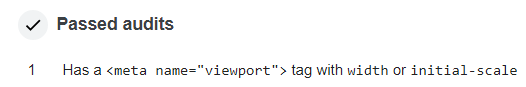
In addition to this, Google now audits websites for the viewport META tag through Lighthouse, and making use of it will improve your SEO:
To ensure that your website displays correctly on all mobile devices, make sure to use the viewport META tag with content containing either width, initial-scale or both. Also make use of media queries to fine-tune responsive designs.
CSS Tricks has a helpful list of breakpoints that kick in for specific devices, if you're looking for detailed mobile optimisation, and ViewportSizes has a sheet showcasing 286 different mobile devices and their respective viewport sizes for reference.
Related Topics
Select First Occurring Element After Another Element
HTML Maxlength Attribute Not Working on Chrome and Safari
How to Use Access-Control-Allow-Origin? Does It Just Go in Between The HTML Head Tags
Is Form Enctype "Application/JSON" Available
Ckeditor Strips Inline Attributes
How to Force Inline Divs to Stay on Same Line
Adding Icon to Rails Application
How to Create a Teardrop in HTML
CSS Box Shadow Around a Custom Shape
CSS Margin: 0 Is Not Setting to 0
How to Include Special Characters in Query Strings
How to Have Quotation Marks in HTML Input Values
Alternate Background Colors for List Items
How to Have a Video with Transparent Background Using HTML5 Video Tag