How to change bootstrap select arrows to glyphicon?
Only add pointer-events:none; to .select-side. This prevent mouse events in this div and you do click in the select behind:
http://codepen.io/blonfu/pen/EyyPpJ
How to use a Bootstrap 3 glyphicon in an html select
I don't think the standard HTML select will display HTML content. I'd suggest checking out Bootstrap select: http://silviomoreto.github.io/bootstrap-select/
It has several options for displaying icons or other HTML markup in the select.
<select id="mySelect" data-show-icon="true">
  <option data-content="<i class='glyphicon glyphicon-cutlery'></i>">-</option>
  <option data-subtext="<i class='glyphicon glyphicon-eye-open'></i>"></option>
  <option data-subtext="<i class='glyphicon glyphicon-heart-empty'></i>"></option>
  <option data-subtext="<i class='glyphicon glyphicon-leaf'></i>"></option>
  <option data-subtext="<i class='glyphicon glyphicon-music'></i>"></option>
  <option data-subtext="<i class='glyphicon glyphicon-send'></i>"></option>
  <option data-subtext="<i class='glyphicon glyphicon-star'></i>"></option>
</select>
Here is a demo: https://www.codeply.com/go/l6ClKGBmLS
How to remove arrow from dropdown in Bootstrap
You can check this css:
select {
   appearance: none;
   -webkit-appearance: none;
   -moz-appearance: none;
   text-indent: 1px;
   text-overflow: '';
   background: url("custom image") no-repeat right center;
}

select::-ms-expand {
    display: none;
}
Change in bootstrap-select position of check-mark or 'glyphicon-ok' icon
Try overwriting the CSS:
.bootstrap-select.btn-group.show-tick .dropdown-menu li.selected a span.check-mark {
    position: relative;
}
Note that the .check-mark has an position: absolute which are placing the element on the extreme right of the dropdown list.
bootstrap (4) How to amend custom select arrow to change colour
The arrows are SVG being used as the background image. You just need to override it with your own CSS by specifying the fill color (the important part below being what you enter in fill='something').
For example:
.custom-select {
    background-image: url("data:image/svg+xml;charset=utf8,%3Csvg xmlns='http://www.w3.org/2000/svg' viewBox='0 0 4 5'%3E%3Cpath fill='red' d='M2 0L0 2h4zm0 5L0 3h4z'/%3E%3C/svg%3E")
}
Bootply example
Twitter Bootstrap Select Arrow Missing
TL;DR: you can't use CSS to change the icon. You'll have to use a library that implements a select-like control using HTML and JavaScript (at the expense of mobile-friendly selects on iOS and Android).
The icon displayed in <select> is determined by the user's browser or operating system. You can't change it using CSS.
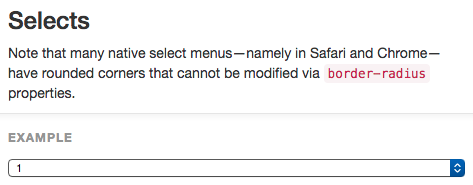
Select display in Chrome on a Mac:
Select display in Chrome on a Mac with some styles removed:
I removed line-height, background-color, border, border-radius, and box-shadow. Note that the arrow has changed even though I didn't change any related style.
Select display in Chrome on Windows:
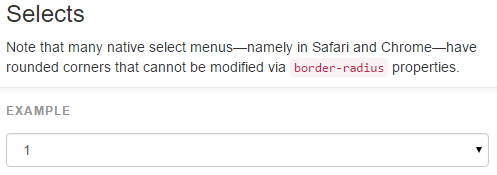
Notice that the icons are different, even though the code is the same.
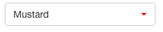
Now what?
Although select isn'g very styleable, there are many libraries that provide a very customizable implementation of a select-like control. I like to use Bootstrap-select.
This library creates a <div class="caret"></div> that can be styled to change the icon. For example after including the Bootstrap-select JavaScript, the following code:
HTML
<select class="selectpicker">
    <option>Mustard</option>
    <option>Ketchup</option>
    <option>Relish</option>
</select>
CSS
.caret{
    color: red;
}
Gives me this display:
You'll lose mobile display, though:
Using a custom library will disable the mobile-friendly way iOS and Android implement selects, so make sure a custom icon is important enough to you before proceeding.
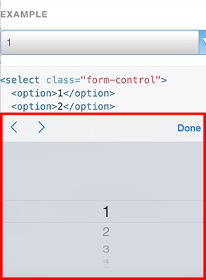
Remove arrows from form element select in Bootstrap 3
Try this using the appearance property:
The appearance property allows you to make an element look like a standard user interface element.
select.form-control {
  -moz-appearance: none;
   -webkit-appearance: none;
   appearance: none;
}
Change caret icon
It depends on what you want to change it to, but currently the caret comes from this CSS which gives it zero size but applies a border to mimic the down arrow:
.caret {
  display: inline-block;
  width: 0;
  height: 0;
  margin-left: 2px;
  vertical-align: middle;
  border-top: 4px dashed;
  border-top: 4px solid\9;
  border-right: 4px solid transparent;
  border-left: 4px solid transparent;
}
You could change it to a green square for example:
.bootstrap-select.btn-group .dropdown-toggle .caret {
  width: 10px;
  height: 10px;
  border: none;
  background-color: green;
}
Demonstration fiddle: http://jsfiddle.net/pvT8Q/460/
Or you could use the Bootstrap Glyphicons:
.bootstrap-select.btn-group .dropdown-toggle .caret {
  width: 10px;
  height: 10px;
  border: none;
  font-family: 'Glyphicons Halflings';
}

.bootstrap-select.btn-group .dropdown-toggle .caret:before {
  content: "\e003";
}
Demonstration fiddle: http://jsfiddle.net/pvT8Q/461/
(I leave the positioning up to you)
bootstrap-select library using font-awsome for dropdown icon
bootstrap 4 adds its dropdown icon using the border trick, So after adding my own icon using dropdown ::after, I had to override all border to none to remove the default icon. You can do the same for the drop up.
.dropdown-toggle::after {
    font-family: "Ionicons";
    /* display: inline-block; */
    content: '\f123';
    /* width: 0;
    height: 0;
    margin-left: 0.255em;
    vertical-align: 0.255em; */
    border-top: none;
    border-right: none;
    border-bottom: none;
    border-left: none;
    margin-right: 1rem;
}

.dropup .dropdown-toggle::after {
    /*display: inline-block;
    width: 0;
    height: 0;
    margin-left: .255em;
    vertical-align: .255em;*/
    font-family: "Ionicons";
    content: "\f126";
    border-top: 0;
    border-right: 0;
    border-bottom: 0;
    border-left: 0;
}
Related Topics
Image Label for Input in a Form Not Clickable in Ie11
CSS Filter:Invert Not Working with Background-Color
Creating a Sidebar Within a Flexbox with CSS
Equal Width Using Flex and Border-Box
Why Do Overflow Clear Margin of P-Tag
Font-Family Is Not Inherited to the Form Input Fields
How to Preload a Page Using HTML5
Font Awesome Is Not Showing Icon
How to Add Background Image for Input Type="Button"
How Remove Border Around Image in CSS
When I Try to Shift the Image Upwards Using Negative Margin the Whole Container Is Moved Upwards