Equal width using flex and border-box
The box-sizing: border-box is used to change the default CSS box model used to calculate width and height of the elements.
So would be like this:
total width=border+padding+content widthand
total height=border+padding+content height
But that doesn't happen in flex-grow, but in flex-basis
Here is a good tutorial about flexbox
So you can use flex:0 20% instead of flex:1,
.container {

  display: flex;

  flex-direction: row;

  align-items: center;

  width: 100px;

}

.container .block {

  height: 28px;

  flex: 0 20%;

  border: 1px solid black;

  box-sizing: border-box;

}

.container .block.selected {

  border: 3px solid blue;

}
<div class="container">
<span class="block">0</span>
<span class="block">1</span>
<span class="block selected">2</span>
<span class="block">3</span>
<span class="block">4</span>
</div>Maintain equal width on flexbox columns when adding a margin
Maybe flex-basis can help:
body {

  margin: 0;

}

html {

 box-sizing: border-box;

}

.grid {

  display: flex;

}

.column {

  display: flex;

  flex-direction: column;

  justify-content: center;

}

.one {

  flex-basis: 50%

}

.two {

  flex: 1;

  margin: 0 10vw;

}

img {

  display: block;

  /* Site wide to make images responsive */

  max-width: 100%;

  height: auto;

  /* Cover column */

  width: 100%;

  height: 100%;

  object-fit: cover;

  object-position: right center;

}

h2 {

  margin: 0 0 24px;

}

p {

  margin: 0 0 24px;

}

a,

a:hover,

a:visited,

a:focus {

  color: #000;

}
<div class="grid">
<div class="column one">
<img src="https://hackernoon.com/hn-images/1*mONNI1lG9VuiqovpnYqicA.jpeg" alt="Bad Ass Cat">
</div>
<div class="column two">
<h2>Here's a Heading</h2>
<p>Lorem ipsum dolor sit amet, consectetur adipiscing elit. Vestibulum aliquam ut ex at fermentum. Proin nec eros at elit mollis porttitor. Vivamus vestibulum luctus metus, ac gravida felis varius nec. Praesent non mauris et tortor lacinia cursus quis at turpis. Nullam scelerisque vitae leo nec convallis. Proin volutpat, est non iaculis facilisis, tellus tortor pulvinar lectus, eu porttitor diam dui eget enim. Praesent non ipsum dui.</p>
<a href="#">Click Me</a>
</div>
</div>Flexbox not giving equal width to elements
There is an important bit that is not mentioned in the article to which you linked and that is flex-basis. By default flex-basis is auto.
From the spec:
If the specified flex-basis is auto, the used flex basis is the value of the flex item’s main size property. (This can itself be the keyword auto, which sizes the flex item based on its contents.)
Each flex item has a flex-basis which is sort of like its initial size. Then from there, any remaining free space is distributed proportionally (based on flex-grow) among the items. With auto, that basis is the contents size (or defined size with width, etc.). As a result, items with bigger text within are being given more space overall in your example.
If you want your elements to be completely even, you can set flex-basis: 0. This will set the flex basis to 0 and then any remaining space (which will be all space since all basises are 0) will be proportionally distributed based on flex-grow.
li {
    flex-grow: 1;
    flex-basis: 0;
    /* ... */
}
This diagram from the spec does a pretty good job of illustrating the point.
And here is a working example with your fiddle.
creating equal width flex items
flex-basis: auto vs flex-basis: 0
You're sizing your flex items with flex: 1 1 auto.
However, if you want to distribute space evenly among items, you need to use flex: 1 1 0.
The difference is the flex-basis component.
With flex-basis: 0, every item is considered to have a zero width and flex-grow distributes container space equally among them. This results in all items having the same length.
With flex-basis: auto, the size of the item is factored into the flex-grow calculation and container space is distributed proportionally among items.
So when you want equal length items use flex: 1 1 0, which is the same as flex: 1.
Here's a more detailed explanation: Make flex-grow expand items based on their original size
Default rules on button elements
Browsers apply styles to elements by default. For instance, Chrome adds padding and border widths to button elements.
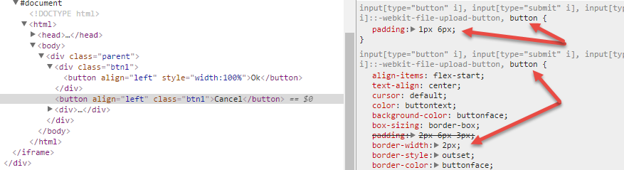
Reset those defaults.
Now you have two equal width flex items. (Additional styling is up to you.)
.parent {

  display: flex;

  width: 200px;

}

.btn1 {

  flex: 1;

}

button {

  padding: 1px 0;

  border-left-width: 0;

  border-right-width: 0;

}
<div class="parent">
<div class="btn1">
<button align="left" style="width:100%">Ok</button>
</div>
<button align="left" class="btn1">Cancel</button>
<div>Flex with equal width and margin
Set width: calc(100% + 18px); to ul and remove margin/padding-left from odd li
#inline {

  display: flex;

}

.group input,

.group {

  width: 100%;

}

div#box {

  padding: 40px;

}

.group:first-child {

  margin-right: 50px;

}

.group ul {

  display: flex;

  flex-wrap: wrap;

  padding: 0;

  margin: 0;

  position: relative;

width: calc(100% + 18px);

}

.group ul li {

  width: calc(50% - 20px);

  background: gray;

  list-style: none;

  margin: 5px;

  padding: 5px;

}

.group ul li:nth-child(odd)  {

padding-left: 0px;

margin-left: 0px;

}

/* guide */

.group ul::after {

  content: "";

  display: block;

  width: 1px;

  height: 173px;

  background: red;

  position: absolute;

  right: 4px;

  top: -36px;

}

.group ul::before {

  content: "";

  display: block;

  width: 1px;

  height: 173px;

  background: green;

  position: absolute;

  right: -4px;

  top: -36px;

}
<div id="box">
<div id="inline">
<div class="group"><input type="text" />
<ul>
<li>1</li>
<li>2</li>
<li>3</li>
<li>4</li>
<li>5</li>
<li>6</li>
</ul>
</div>
<div class="group"><input type="text" />
<ul>
<li>1</li>
<li>2</li>
<li>3</li>
<li>4</li>
<li>5</li>
<li>6</li>
</ul>
</div>
</div>
</div>equal width flex items
The problem you're having is mostly the third item on the second row.
An initial setting on flex items is min-width: auto, which means the item will have a minimum width based on its content. This could be a fixed-width element or, in your case, the longest word.
Since your content in that item has one long string of text with no space characters, it's forcing the item to expand, throwing off the column alignments.
Simply use a space character to break that string of text and the issue is resolved.
I would also set the item widths to 20% and override the min-width: auto
default for more stability.
More details here: Why doesn't flex item shrink past content size?
* {

  box-sizing: border-box;

}

.container {

  display: flex;

  flex-direction: column;

  text-align: center;

}

.first,.second {

  display: flex;

  /* flex-wrap: wrap; <-- removed for demo */

}

p {

  padding: 1em .5em;

  flex: 0 0 20%;     /* adjustment */

  overflow: hidden;  /* adjustment */

  border: 1px dashed green;

}

p::before {

  content: '✔';

}
<div class="container">
<div class="first">
<p> Lorem ipsum dolor sit amet imsppmfmmfmfmfmfmfmfm</p>
<p> Lorem ipsum dolor sit ametlorem lorem lorem lorem lorem lorem, </p>
<p> Lorem ipsum dolor sit amet,</p>
<p> Lorem ipsum dolor sit amet, lorem ipsum</p>
<p> Lorem ipsum dolor sit amet,</p>
</div>
<div class="second">
<p> Lorem ipsum dolor sit amet,</p>
<p> Lorem ipsum dolor sit amet,</p>
<p> Lorem ipsum dolor sit amet, jkdasnjdcmx,cnc,mncn,mn,mcmn</p>
<p> Lorem ipsum dolor sit amet, </p>
<p> Lorem ipsum dolor sit amet,dddddd </p>
</div>
</div>
Equal size of flex item while breaking the last item to next line
You should set flex-grow:0 and should be calc(100% / 6) instead of calc(100% / 7). Also I added box-sizing:border-box; for borders to be included in width.
ul {

  padding: 0;

  margin: 0;

  list-style-type: none;

  display: flex;

  flex-flow: row wrap;

}

li {

  flex: 1;

  border: solid 1px;

  text-align: center;

  flex-basis: calc(100% / 6);

  box-sizing: border-box;

}

.keep-next-line {

  flex-grow: 0;

}
<ul>
<li>1</li>
<li>2</li>
<li>3</li>
<li>4</li>
<li>5</li>
<li>6</li>
<li class="keep-next-line">7</li>
<!--Kepp this next line, but size should be equal to other item-->
</ul>How to make flexbox items the same size?
Set them so that their flex-basis is 0 (so all elements have the same starting point), and allow them to grow:
flex: 1 1 0px
Your IDE or linter might mention that the unit of measure 'px' is redundant. If you leave it out (like: flex: 1 1 0), IE will not render this correctly. So the px is required to support Internet Explorer, as mentioned in the comments by @fabb;
How to make flexbox items of equal width and height
You are almost good, the li are equal height but not their content. Simply add height: 100%;
body {

  font-family: Lucida, sans-serif;

}

nav ul {

  list-style-type: none;

  margin: 0;

  padding: 0;

  display: flex;

  justify-content: space-between;

  /*align-items: stretch;  not needed, it's by default*/

}

nav li {

  flex-grow: 1;

  flex-shrink: 1;

  flex-basis: 0;

  text-align: center;

}

nav a {

  text-decoration: none;

  color: #000;

  border: 2px solid rgb(20, 60, 168);

  background-color: rgba(20, 60, 168, .2);

  padding: 10px 10px 8px;

  display: block;

  height:100%;

  box-sizing:border-box; /*Don't forget this*/

}
<nav>
<ul>
<li><a href="#">First</a></li>
<li><a href="#">Second</a></li>
<li><a href="#">The third seems to be quite long</a></li>
<li><a href="#">Fourth</a></li>
</ul>
</nav>Related Topics
Darken a Background Image Without Affecting the Text
How to Force Chapters to Start on Odd Pages (HTML and Epub)
Float Multiple Fixed-Width/Varible-Height Boxes into 2 Columns
3 Column Layout (Fixed, Fluid, Fixed) with Minimum Width
Animating a CSS Gradient Background on the Hover Event
Absolute Positioning Ignoring Padding
CSS Import or <Link Rel...> with "Media" Attribute
Enforce a "Min-Margin" for a Fluid Layout
Stray Vertical Line Above 965 Pixels with Border Radius in Safari
Fill Svg Element with With a Background-Image with an Offset
HTML and CSS: Using Background Image as a Clickable Link
Remove Value Attribute of Input Element Using CSS Only
External Style Sheets, Specifying Absolute or Relative Paths