Is there any way to add padding to select options via CSS?
Styling to select option is very much limited as to maintain a coherence and consistency among all the application in the operating system thus the browser are ought to restrict the style of some basic elements like in your case option tag.
The restriction depends browser to browser, like padding and even margin of option tag works in the Mozilla Firefox while it doesn't work with Chrome.
If it is very much necessary in you website to style the option tag then I suggest you to use some jQuery plugin (you can also make a drop down of your own, its simple).
How to add padding to the arrow present in html select?
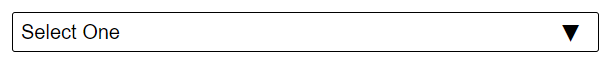
Perhaps something like this could help:
CSS:
select {
    -webkit-appearance: none;
    appearance: none;
    border: none;
}
.blood-type {
    position: relative;
    border: 1px solid black;
    border-radius: 2px;
    padding: 5px;
}
.blood-type::after {
    content: "▼";
    font-size: 1rem;
    right: 10px;
    position: absolute;
}
.rectangle {
    width: 100%;
}
HTML:
<div class="blood-type">
    <select class="rectangle">
        <option value="" disabled selected>Select One</option>
        <option *ngFor="let bg of bgList" [value]="bg.id">{{bg.name}}</option>
    </select>
</div>
Preview:
Let me know if you have any questions.
How to add padding to form select element?
In order to be able to style the select element how you'd like you need to use the appearance CSS property for the select and set it's value to none. This is because by default it uses the native styling of the platform that the select is being rendered in.
From MDN:
The appearance CSS property indicates whether to display an element
using platform-native styling based on the operating system's theme or
not.
If you set the property to none, we are telling the rendering engine not to use the native styles so it will then inherit all of your custom styles.
Heres an example of setting the styles:
select {
  cursor: pointer;
  margin-bottom: 40px;
  -webkit-appearance: none;
  -moz-appearance: none;
  appearance: none;
}
@import url('https://fonts.googleapis.com/css?family=Roboto:300,400,500');body {  margin: 0;}

/*General styling*/
button:focus,.inputfile:focus+label,select:focus,input:focus {  outline: white auto 5px;}
.form-screen {  background: #3472FF;  color: white;  font-family: 'Roboto', 'sans-serif';}
.close {  position: absolute;  top: 20px;  right: 20px;  font-size: 2em;  color: white;}
.close:hover {  color: #d8d8d8;}
.form-wrapper {  padding-top: 5%;  padding-bottom: 5%;}
.form-wrapper h1 {  text-transform: uppercase;  font-weight: 500;  text-align: center;  font-size: 3em;}

/*Style input file*/
.box {  text-align: center;  margin-bottom: 35px;}
.inputfile {  width: 0.1px;  height: 0.1px;  opacity: 0;  overflow: hidden;  z-index: -1;}
.inputfile+label {  max-width: 80%;  font-size: 1.4em;  font-weight: 500;  text-transform: uppercase;  text-overflow: ellipsis;  white-space: nowrap;  cursor: pointer;  display: inline-block;  overflow: hidden;  padding: 20px 20px 20px 20px;  border-radius: 5px;}
.inputfile+label svg {  width: 1em;  height: 1em;  vertical-align: middle;  fill: currentColor;  margin-top: -0.25em;  /* 4px */  margin-right: 0.25em;  /* 4px */}
.inputfile+label {  color: #3472FF;  background-color: white;}
.inputfile:focus+label,.inputfile.has-focus+label,.inputfile+label:hover {  background-color: #d8d8d8;}

/*Form input elemnts*/
input[type="text"],.submit,select {  display: block;  margin: 0 auto;}
input[type="text"] {  cursor: text;}
select {  cursor: pointer;  margin-bottom: 40px;  -webkit-appearance: none;  -moz-appearance: none;  appearance: none;}
input[type="text"],select {  border: none;  font-family: 'Roboto', sans-serif;  font-weight: 300;  color: #3472FF;  font-size: 2em;  padding: 20px 20px 20px 20px;  margin-bottom: 40px;  width: 60%;}
input[type="text"]::-webkit-input-placeholder {  font-family: 'Roboto', sans-serif;  font-weight: 300;  color: #3472FF;  font-size: 1em;}
input[type="text"]:-ms-input-placeholder {  font-family: 'Roboto', sans-serif;  font-weight: 400;  color: #3472FF;  font-size: 1em;}
input[type="text"]:-moz-placeholder {  font-family: 'Roboto', sans-serif;  font-weight: 400;  color: #3472FF;  font-size: 1em;}
input[type="text"]::-moz-placeholder {  font-family: 'Roboto', sans-serif;  font-weight: 400;  color: #3472FF;  font-size: 1em;}
.submit:hover {  background-color: #d8d8d8;}
.submit {  background-color: white;  color: #3472FF;  font-size: 2em;  text-transform: uppercase;  padding: 20px 20px 20px 20px;  border-radius: 7px;  border: none;}

/*Datepicker styling*/

/*Set datepicker’s width, position it to the center and add drop shadow*/
.ui-datepicker {  width: auto;  height: auto;  margin: 5px auto 0;  font: .7em 'Roboto', sans-serif;  -webkit-box-shadow: 0px 0px 10px 0px rgba(0, 0, 0, .10);  -moz-box-shadow: 0px 0px 10px 0px rgba(0, 0, 0, .10);  box-shadow: 0px 0px 10px 0px rgba(0, 0, 0, .10);  background-color: #fafafb;}

/*Remove the default underline decoration from every anchor tag*/
.ui-datepicker a {  text-decoration: none;}

/*add 100% width for the table, so it will have the same maximum width as the wrapper above (i.e. widith: auto)*/
.ui-datepicker table {  width: 100%;}

/*style header*/
.ui-datepicker-header {  text-transform: uppercase;  background-color: #fafafb;  font-size: 1.2em;  color: #555555;  font-weight: bold;  line-height: 30px;}

/*center the Month position.*/
.ui-datepicker-title {  text-align: center;}

/*Set up arrows*/
.ui-datepicker-prev,.ui-datepicker-next {  display: inline-block;  width: 30px;  height: 30px;  text-align: center;  cursor: pointer;  background-repeat: no-repeat;  line-height: 600%;  overflow: hidden;}

/*Replace the Next and Prev text with the sprite arrow images and adjust arrow position*/
.ui-datepicker-prev {  float: left;  background-position: center 10px;  background-image: url('../images/arrow_prev.png');  /*Images created by me (Monica Ong)*/}
.ui-datepicker-next {  float: right;  background-position: center 10px;  background-image: url('../images/arrow_next.png')}

/*Set colors of day names*/
.ui-datepicker thead {  background-color: #efefef;}
.ui-datepicker th {  text-transform: uppercase;  font-size: .7em;  padding: 5px 0;  color: #666666;}

/*Style dates*/
.ui-datepicker tbody td {  padding: 0;}
.ui-datepicker tbody td {  padding: 0;}

/*Style default,  hover, and active state*/
.ui-datepicker td span,.ui-datepicker td a {  display: inline-block;  font-weight: bold;  text-align: center;  width: 30px;  height: 30px;  line-height: 30px;  color: #666666;}
.ui-datepicker-calendar .ui-state-default {  background: #ededed;}
.ui-datepicker-unselectable .ui-state-default {  background: #f4f4f4;  color: #949496;}
.ui-datepicker-calendar .ui-state-hover {  background: #f7f7f7;}
.ui-datepicker-calendar .ui-state-active {  background: #666666;  color: #efefef;  position: relative;  margin: -1px;}
.ui-datepicker-calendar td:first-child .ui-state-active {  width: 29px;  margin-left: 0;}
.ui-datepicker-calendar td:last-child .ui-state-active {  width: 29px;  margin-right: 0;}
.ui-datepicker-calendar tr:last-child .ui-state-active {  height: 29px;  margin-bottom: 0;}
<div class="form-screen"> <button class="close"><span class="icon-x"></span></button> <form method="post" enctype="multipart/form-data"> <div class="form-wrapper"> <h1>Upload Photo</h1> <div class="box"> <input type="file" name="file[]" id="file" class="inputfile" data-multiple-caption="{count} files selected" multiple /> <label for="file"> <svg xmlns="http://www.w3.org/2000/svg" width="20" height="17" viewBox="0 0 20 17"> <path d="M10 0l-5.2 4.9h3.3v5.1h3.8v-5.1h3.3l-5.2-4.9zm9.3 11.5l-3.2-2.1h-2l3.4 2.6h-3.5c-.1 0-.2.1-.2.1l-.8 2.3h-6l-.8-2.2c-.1-.1-.1-.2-.2-.2h-3.6l3.4-2.6h-2l-3.2 2.1c-.4.3-.7 1-.6 1.5l.6 3.1c.1.5.7.9 1.2.9h16.3c.6 0 1.1-.4 1.3-.9l.6-3.1c.1-.5-.2-1.2-.7-1.5z" /> </svg> <span>Choose a file…</span> </label> </div> <select name="image-album" class="col"> <option value="" selected>Add to album</option> <option value="1">Beauty Gurus</option> <option value="2">Cute Food</option> </select> <input type="text" name="photo-title" placeholder="Title" required> <input type="text" name="date-created" class="date" placeholder="Date Created" required> <input type="text" name="caption" placeholder="Caption"> <input type="text" name="credt" placeholder="Credit*"> <button type="submit" class="field submit" name="submit" value="submit">Upload Photo</button> </div> </form></div>How to add padding to the default arrow in a select dropdown list?
For those who have the same question, I found a work around how to style the default select "arrow" which is by replacing it with generated content.
Step 1: Hiding the default arrow
select {
  -webkit-appearance: none;
  appearance: none;
}
Step 2: Create extra wrapper around select, because ::before/::after doesn't work this way.
<div class="select-wrapper"><select id="select" name="select">
  <option>Banana</option>
  <option>Cherry</option>
  <option>Lemon</option>
</select></div>
Step 3: Apply generated content
.select-wrapper {
  position: relative;
}

.select-wrapper::after {
  content: "▼";
  font-size: 1rem;
  top: 6px;
  right: 10px;
  position: absolute;
}
Codes above originated from
Advanced form styling | MDN
Related Topics
Progress Bar with HTML and CSS
Can HTML5 Websockets Connect 2 Clients (Browsers) Directly Without Using a Server? (P2P)
How to Make a Cell of Table Hyperlink
How to Detect Only with CSS Mobile Screens
HTML5 Autoplay Video in Mobile Device
Question Mark in The Middle of a Url Variable
Custom Pinterest Button for Custom Url (Text-Link, Image, or Both)
Has Anyone Gotten HTML Emails Working with Twitter Bootstrap
Websocket Server Implementations for Delphi
Redirect Mobile Devices to Alternate Version of My Site
Poor Anti-Aliasing of Text Drawn on Canvas
"Break-Inside: Avoid-Column" Doesn't Work in Firefox
Insert HTML with Scripts That Should Run
How Might I Force a Floating Div to Match The Height of Another Floating Div