How does this CSS produce a circle?
How does a border of 180 pixels with height/width-> 0px become a circle with a radius of 180 pixels?
Let's reformulate that into two questions:
Where do width and height actually apply?
Let's have a look at the areas of a typical box (source):
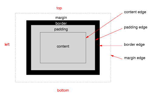
The height and width apply only on content, if the correct box model is being used (no quirks mode, no old Internet Explorer).
Where does border-radius apply?
The border-radius applies on the border-edge. If there is neither padding nor border it will directly affect your content edge, which results in your third example.
What does this mean for our border-radius/circle?
This means that your CSS rules result in a box that only consists of a border. Your rules state that this border should have a maximum width of 180 pixels on every side, while on the other hand it should have a maximum radius of the same size:
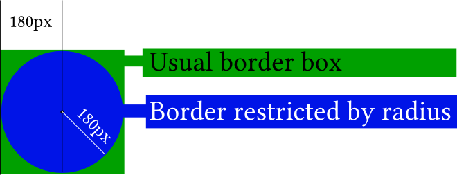
In the picture, the actual content of your element (the little black dot) is really non-existent. If you didn't apply any border-radius you would end up with the green box. The border-radius gives you the blue circle.
It gets easier to understand if you apply the border-radius only to two corners:
#silly-circle{
    width:0; height:0;
    border: 180px solid red;
    border-top-left-radius: 180px;
    border-top-right-radius: 180px;
}
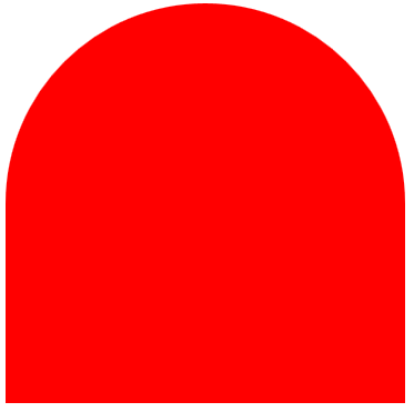
Since in your example the size and radius for all corners/borders are equal you get a circle.
Further resources
References
- W3C: CSS Backgrounds and Borders Module Level 3 (esp. 5. Rounded Corners)
Demonstrations
- Please open the demo below, which shows how the
border-radiusaffects the border (think of the inner blue box as the content box, the inner black border as the padding border, the empty space as the padding and the giant red border as the, well, border). Intersections between the inner box and the red border would usually affect the content edge.
var all = $('#TopLeft, #TopRight, #BottomRight, #BottomLeft');
all.on('change keyup', function() {  $('#box').css('border' + this.id + 'Radius', (this.value || 0) + "%");  $('#' + this.id + 'Text').val(this.value + "%");});
$('#total').on('change keyup', function() {  $('#box').css('borderRadius', (this.value || 0) + "%");  $('#' + this.id + 'Text').val(this.value + "%");  all.val(this.value);  all.each(function(){$('#' + this.id + 'Text').val(this.value + "%");})});
#box { margin:auto; width: 32px; height: 32px; border: 100px solid red; padding: 32px; transition: border-radius 1s ease; -moz-transition: border-radius 1s ease; -webkit-transition: border-radius 1s ease; -o-transition: border-radius 1s ease; -ms-transition: border-radius 1s ease;}#chooser{margin:auto;}#innerBox { width: 100%; height: 100%; border: 1px solid blue;}<script src="https://ajax.googleapis.com/ajax/libs/jquery/2.1.1/jquery.min.js"></script><div id="box"> <div id="innerBox"></div></div><table id="chooser"> <tr> <td><label for="total">Total</label></td> <td><input id="total" value="0" type="range" min="0" max="100" step="1" /></td> <td><input readonly id="totalText" value="0" type="text" /></td> </tr> <tr> <td><label for="TopLeft">Top-Left</label></td> <td><input id="TopLeft" value="0" type="range" min="0" max="100" step="1" /></td> <td><input readonly id="TopLeftText" value="0" type="text" /></td> </tr> <tr> <td><label for="TopRight">Top right</label></td> <td><input id="TopRight" value="0" type="range" min="0" max="100" step="1" /></td> <td><input readonly id="TopRightText" value="0" type="text" /></td> </tr> <tr> <td><label for="BottomRight">Bottom right</label></td> <td><input id="BottomRight" value="0" type="range" min="0" max="100" step="1" /></td> <td><input readonly id="BottomRightText" value="0" type="text" /></td> </tr> <tr> <td><label for="BottomLeft">Bottom left</label></td> <td><input id="BottomLeft" value="0" type="range" min="0" max="100" step="1" /></td> <td><input readonly id="BottomLeftText" value="0" type="text" /></td> </tr> <caption><code>border-radius</code> values. All values are in percent.</caption></table><p>This demo uses a box with a <code>width/height</code> of 32px, a <code>padding</code> of 32px, and a <code>border</code> of 100px.</p>Draw Circle using css alone
You could use a .before with a content with a unicode symbol for a circle (25CF).
.circle:before { content: ' \25CF'; font-size: 200px;}<span class="circle"></span>How to make a border to circle in css
Set width and height to an equal value und add border-radius: 50%;.
.circle {width: 60px;height:60px;border-radius: 50%;background-color: #bada55;}<div class="circle"></div>How to draw circle in html page?
You can't draw a circle per se. But you can make something identical to a circle.
You'd have to create a rectangle with rounded corners (via border-radius) that are one-half the width/height of the circle you want to make.
#circle { width: 50px; height: 50px; -webkit-border-radius: 25px; -moz-border-radius: 25px; border-radius: 25px; background: red; }<div id="circle"></div>Create a perfect circle with CSS
In order to achieve a perfectly round shape you'll need to have perfect square to begin with. So, for instance, your button will need to have dimensions like width: 32px; height: 32px. To turn a square into a circle you'll have to apply a border radius of 50% e.g. border-radius: 50%.
How can I make a circle using css and apply it to my header?
You're correct in using the :after pseudo-class. My assumption is that you possibly forgot to specify the content: '' attribute.
So first, you're going to want to create a block and position it at the bottom of your header:
header { position: relative; }
header:after {
    content: '';
    display: block;
    height: 44px;
    margin-left: -22px;
    position: absolute;
        left: 50%;
        bottom: -22px; // Pull it out to half of its size for the semi-circle look
    width: 44px;
}
Then make it circular using border-radius:
-webkit-border-radius: 44px;
   -moz-border-radius: 44px;
        border-radius: 44px;
Final code:
header:after {
    content: '';
    display: block;
    height: 44px;
    margin-left: -22px;
    position: absolute;
        left: 50%;
        bottom: -22px; // Pull it out to half of its size for the semi-circle look
    width: 44px;

    -webkit-border-radius: 44px;
       -moz-border-radius: 44px;
            border-radius: 44px;
}
How to draw a circle with text in the middle?
Setting a line-height the same value as the height of the div will show one line of text vertically centered. In this example the height and line-height are 500px.
Example
JSFiddle
.circle {
  width: 500px;
  height: 500px;
  line-height: 500px;
  border-radius: 50%;
  font-size: 50px;
  color: #fff;
  text-align: center;
  background: #000
}
<div class="circle">Hello I am A Circle</div>Create css circles connected by line
Sidenote: This is why I would never use tailwindcss or the likes. You don't need it, and it totally ruins the HTML.
Now compare the markup you have with the markup below - which is a) much, much more concise, b) using only a single CSS class and c) using the proper semantic elements for the job.
It also works for 2 or 4 or 7 items. Sure it needs some refinement regarding size and color of the active circle, but that should be an easy adjustment for you.
The only restriction of this solution is that your page background-color needs to be solid and be matched by the background-color of the ::after elements.
document.querySelectorAll('.steplist').forEach(steplist => {
  steplist.addEventListener('click', function(event) {
    if (event.target.nodeName !== 'LI') return;
    const items = event.target.closest('.steplist').querySelectorAll('li');
    for (const item of items) {
      item.classList.toggle('active', item === event.target);
    }
  });
});
*, ::after, ::before { box-sizing: border-box; }
.steplist {
border-top: 2px solid #ccc;
display: inline-flex;
font-family: 'Gill Sans', 'Gill Sans MT', Calibri, 'Trebuchet MS', sans-serif;
list-style-type: none;
gap: 7em;
margin: 0;
padding: 0;
--circle-radius: 8px;
}
.steplist li {
color: #999;
cursor: pointer;
padding: calc(5px + var(--circle-radius)) 0 0;
margin: 0;
position: relative;
text-align: center;
}
.steplist li::before {
background-color: #ccc;
border-radius: 50%;
content: '';
position: absolute;
height: calc(2 * var(--circle-radius));
width: calc(2 * var(--circle-radius));
top: 0;
left: 50%;
transform: translate(-50%, -50%);
transition: all 0.3s ease;
}
.steplist .active {
color: black;
}
.steplist .active::before {
background-color: green;
box-shadow: 0 0 0 3px rgba(0,255,0,.25);
}
.steplist li:first-child::after {
background-color: white;
content: '';
position: absolute;
height: 2px;
width: 100%;
top: -2px;
left: calc(-50% - var(--circle-radius));
}
.steplist li:last-child::after {
background-color: white;
content: '';
position: absolute;
height: 2px;
width: 100%;
top: -2px;
left: calc(50% + var(--circle-radius));
}
.circle-big {
--circle-radius: 12px;
}<ol class="steplist">
<li>Point 1<br>whatever</li>
<li>Point 2<br>whatever</li>
<li>Point 3<br>whatever</li>
</ol>
<br><br><br>
<ol class="steplist circle-big">
<li>Point 1<br>whatever</li>
<li>Point 2<br>whatever</li>
<li>Point 3<br>whatever</li>
<li>Point 4<br>whatever</li>
</ol>Related Topics
Elongated Hexagon Shaped Button Using Only One Element
Changing the Color of an Hr Element
Best Way to Include Css? Why Use @Import
Html Inside Twitter Bootstrap Popover
Switching the Order of Block Elements With Css
When Should One Use HTML Entities
Is an Anchor Tag Without the Href Attribute Safe
Embed Image in a ≪Button≫ Element
Closing HTML ≪Input≫ Tag Issue
Colspan/Rowspan For Elements Whose Display Is Set to Table-Cell
Setting the Character Encoding in Form Submit For Internet Explorer
Regex Replace Text Outside HTML Tags
Is Html5 Localstorage Asynchronous
How to Correctly Select the First or the Last Child With Css
How to Install a Custom Font on an HTML Site