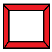
Elongated hexagon shaped button using only one element
Here is another alternate way to get this done with only one element.
This approach works like below:
- Two pseudo-elements
:beforeand:afterwhich are about half the size (includingborders) of the main.buttonelement. The height of each pseudo-element is 34px + 4px border on one side (top/bottom) and 2px on the other side. - The top half of the shape is achieved using the
:beforeelement whereas the bottom half is achieved using the:afterelement. - Using a
rotateXwithperspectiveto achieve the tilted effect and positioning to place the two elements such that they form the expected shape.
/* General Button Style */
.button {  position: relative;  display: block;  background: transparent;  width: 300px;  height: 80px;  line-height: 80px;  text-align: center;  font-size: 20px;  text-decoration: none;  text-transform: uppercase;  color: #e04e5e;  margin: 40px auto;  font-family: Helvetica, Arial, sans-serif;  box-sizing: border-box;}.button:before,.button:after {  position: absolute;  content: '';  width: 300px;  left: 0px;  height: 34px;  z-index: -1;}
.button:before {  transform: perspective(15px) rotateX(3deg);}.button:after {  top: 40px;  transform: perspective(15px) rotateX(-3deg);}
/* Button Border Style */
.button.border:before,.button.border:after {  border: 4px solid #e04e5e;}.button.border:before {  border-bottom: none; /* to prevent the border-line showing up in the middle of the shape */}.button.border:after {  border-top: none; /* to prevent the border-line showing up in the middle of the shape */}
/* Button hover styles */
.button.border:hover:before,.button.border:hover:after {  background: #e04e5e;}.button.border:hover {  color: #fff;}
<!-- Library included to avoid browser prefixes --><script src="https://cdnjs.cloudflare.com/ajax/libs/prefixfree/1.0.7/prefixfree.min.js"></script>
<a href="#" class="button ribbon-outset border">Click me!</a>Elongated hexagon shaped button for Bootstrap 4
As said in a comment by @chriskirknielsen, please understand code first and changes the code by your need.
body {    /* JUST FOR STYLING */    background-color: #3c93af !important;}
.custom_btn {    position: relative;    display: block;    background: transparent;    width: 300px;    height: 80px;    line-height: 80px;    text-align: center;    font-size: 20px;    text-decoration: none;    color: #ffdc01;    margin: 40px auto;    font-family: Helvetica, Arial, sans-serif;    box-sizing: border-box;}
.custom_btn:hover {    text-decoration: none;}
.custom_btn:before,.custom_btn:after {    position: absolute;    content: '';    width: 300px;    left: 0px;    height: 34px;    z-index: -1;    box-sizing: content-box;}
.custom_btn:before {    transform: perspective(15px) rotateX(3deg);}
.custom_btn:after {    top: 40px;    transform: perspective(15px) rotateX(-3deg);}
.custom_btn.custom_btn--border:before,.custom_btn.custom_btn--border:after {    border: 4px solid #ffdc01;}
.custom_btn.custom_btn--border:before {    border-bottom: none;}
.custom_btn.custom_btn--border:after {    border-top: none;}
.custom_btn.custom_btn--border:hover:before,.custom_btn.custom_btn--border:hover:after {    background: #ffdc01;}
.custom_btn.custom_btn--border:hover {    color: #fff;}
<link rel="stylesheet" href="https://stackpath.bootstrapcdn.com/bootstrap/4.4.1/css/bootstrap.min.css">
<a href="#" class="custom_btn custom_btn--border">Click me!</a>Is it possible to have an Hexagon Button CSS
You can accomplish this by creating a button with a ::before element, style that ::before element as a hexagon and position it infront of the button.
This is what I've made using the pseudo element ::before, styling it as a hexagon using clip-path.
div.wrapper {
  margin: 100px;
  height: 500px;
  width: 500px;
}
html,
body {
  width: 100%;
  height: 100%;
}

a.button {
  z-index: 1;
  background-color: #883333;
  padding: 25px 50px;
  position: relative;
}

a.button::before {
  z-index: 0;
  content: "";
  background-color: #ff3333;
  left: -50px;
  top: -18px;
  position: absolute;
  width: 100px;
  height: 100px;
  clip-path: polygon(50% 0%, 100% 25%, 100% 75%, 50% 100%, 0% 75%, 0% 25%);
}
<div class="wrapper">
<a href="#" class="button">FUZIION</a>
</div>Creating hexagon shapes with list items
You can create a triangle with the border property. You see a normal box like this if it has i.e 30px height 30px width and some border, lets give it 5px border
Now you see how the edges of the borders take form, then you can just give it height 0 and width 0 and you will have one side of the trapezium made by the borders to have length 0 so you have a triangle. Like this
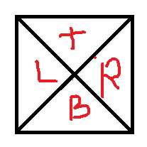
Tha T is for top border, B for bottom border, R for fight border, and L for left bortder. Now you just give border color. You ca have R with color red and the other ones white and you will have a triangle pointing to the left. Same way with the L border.
Now you can use a div to be a normal rectangle and use pseudoselectors, :after and :before to give it some border and make your two triangles at the beginning and the end and you will have your hexagon
See the jsfiddle, I created an exagon for you with the border black to notice where the border is: http://jsfiddle.net/carloscalla/o742jd86/
See the borders in #hexagon:after and #hexagon:before
This is the result:
UPDATE: If you want the borders you can just overlap one Hexagon with another one like in this jsfiddle in pure CSS: http://jsfiddle.net/carloscalla/o742jd86/1/

Here are two other options you can get that working with only one element. I took them from other answer to show better options here
http://codepen.io/hari_shanx/pen/tsLza
http://codepen.io/anon/pen/sKamk
Hexagon shape btn-group
This approach allows a quick insight as to how you possibly could approach this task, although it is far from complete.
$('.start').click(function() { $('.start, .added').removeClass("startActive").removeClass("addedActive"); $(this).toggleClass("startActive");});$('.added').click(function() { $('.start, .added').removeClass("startActive").removeClass("addedActive"); $(this).toggleClass("addedActive");});div { display: inline-block; height: 100px; width: 200px; border-top: 5px solid gray; border-bottom: 5px solid gray; position: relative; text-align: center; margin-left: -4px;}.start { margin-left: 45px;}.start:before,.startActive:before { content: ""; position: absolute; height: 70px; width: 70px; top: 12px; left: -38px; border-bottom: 5px solid gray; border-left: 5px solid gray; transform: rotate(45deg);}.startActive,.addedActive { border-top: 5px solid red; border-bottom: 5px solid red;}.startActive:before { border-bottom: 5px solid red; border-left: 5px solid red;}.added:before,addedActive:before { content: ""; position: absolute; height: 70px; width: 70px; top: 12px; left: -38px; border-top: 5px solid gray; border-right: 5px solid gray; transform: rotate(45deg);}.start:after,.added:after,.addedActive:after,.startActive:after { content: ""; position: absolute; height: 70px; width: 70px; top: 12px; right: -38px; border-top: 5px solid gray; border-right: 5px solid gray; transform: rotate(45deg);}.startActive:after { border-top: 5px solid red; border-right: 5px solid red; z-index: 8;}.addedActive:before { border-top: 5px solid red; border-right: 5px solid red; z-index: 8;}.addedActive:after { border-top: 5px solid red; border-right: 5px solid red; z-index: 8;}<script src="https://ajax.googleapis.com/ajax/libs/jquery/2.1.1/jquery.min.js"></script><div class="start">start</div><div class="added">middle</div><div class="added">end</div>CSS hexagonal button with rounded corners
I am not saying that this cannot be achieved with CSS but doing this with CSS would be a tedious job. SVG is always the recommended tool for creating complex shapes like this (and this particular shape is tough to create even using SVG).
SVGs are:
- scalable and so they help in responsive design, the shape can stretch to match the content
- allows us more control over the shape
- are easy to maintain
- allow us to use even gradient or non-solid color backgrounds for the element like done in this answer (which was for a regular hexagon with rounded corners
In SVG, it just requires a path to be created in the form of a rounded hexagon and then for that path image to be placed behind the container.
Below is some explanation about the various commands used in the path element's d attribute (but I'd strongly advise you to learn SVG commands - here is a tutor from the MDN):
M- moves the imaginary pen to the point specified by the coordinates.L- draws a straight line from the point represented by the previous coordinate to current one.Q- Draws a quadratic curve from the current position of the pen to the point that is indicated by the second set of coordinates that follow theQcommand. The first set of coordinates represent the control point. This control point determines the slope of the curve.z- Closes the shape by drawing a straight line from the current pen position to the starting point.
.hex { position: relative; height: 100px; min-width: 100px; padding: 12px 24px; margin: 4px; float: left; font-weight: bold; font-size: 20px; text-align: center; color: white;}.hex svg { position: absolute; height: 100%; width: 100%; top: 0px; left: 0px; z-index: -1;}path { fill: rgb(251, 208, 0);}.hex.border path { stroke: red; stroke-width: 4;}span { display: block; margin-top: 50px; padding: 8px; transform: translateY(-50%);}<div class='hex'> <svg viewBox='0 0 100 100' preserveAspectRatio='none'> <path d='M27,7 L72,7 Q76,7 78,11 L95,46 Q97,50 95,54 L78,91 Q76,95 72,95 L28,95 Q24,95 22,91 L5,54 Q3,50 5,46 L22,11 Q24,7 28,7z' vector-effect='non-scaling-stroke' /> </svg> <span>Some text</span></div>
<div class='hex'> <svg viewBox='0 0 100 100' preserveAspectRatio='none'> <path d='M27,7 L72,7 Q76,7 78,11 L95,46 Q97,50 95,54 L78,91 Q76,95 72,95 L28,95 Q24,95 22,91 L5,54 Q3,50 5,46 L22,11 Q24,7 28,7z' vector-effect='non-scaling-stroke' /> </svg> <span>Some lengthy text without line break.</span></div>
<div class='hex border'> <svg viewBox='0 0 100 100' preserveAspectRatio='none'> <path d='M27,7 L72,7 Q76,7 78,11 L95,46 Q97,50 95,54 L78,91 Q76,95 72,95 L28,95 Q24,95 22,91 L5,54 Q3,50 5,46 L22,11 Q24,7 28,7z' vector-effect='non-scaling-stroke' /> </svg> <span>Some very lengthy text</span></div>
<div class='hex border'> <svg viewBox='0 0 100 100' preserveAspectRatio='none'> <path d='M27,7 L72,7 Q76,7 78,11 L95,46 Q97,50 95,54 L78,91 Q76,95 72,95 L28,95 Q24,95 22,91 L5,54 Q3,50 5,46 L22,11 Q24,7 28,7z' vector-effect='non-scaling-stroke' /> </svg> <span>Some very lengthy text <br>with line break.</span></div>CSS: Responsive elongated hexagon with text and gradient background/border
Using CSS Clip Path:
The main platform for this project is Safari on an iPad2.
Since, your main platform is Safari and it does support CSS clip-path with shapes, you can make use of that feature to create the elongated hexagons like in the below demo.
Output produced by this approach will support (a) gradient backgrounds (b) a gradient border which is mimicked by placing a pseudo-element with a very similar clip-path but smaller dimensions (c) two lines of text (d) also maintain the angles of the corners because the points are at a fixed px distance.
.hex { position: relative; float: left; height: 100px; min-width: 100px; padding: 12px; margin: 4px; font-weight: bold; text-align: center; background: linear-gradient(to right, rgb(199, 41, 41), rgb(243, 67, 54)); -webkit-clip-path: polygon(25px 0px, calc(100% - 25px) 0px, 100% 50%, calc(100% - 25px) 100%, 25px 100%, 0px 50%);}.hex.gradient-bg { color: white;}.hex.gradient-border { color: rgb(199, 41, 41);}.hex:before { position: absolute; content: ''; height: calc(100% - 14px); /* 100% - 2 * border width */ width: calc(100% - 14px); /* 100% - 2 * border width */ left: 7px; /* border width */ top: 7px; /* border width */ -webkit-clip-path: polygon(22px 0px, calc(100% - 22px) 0px, 100% 50%, calc(100% - 22px) 100%, 22px 100%, 0px 50%); z-index: -1;}.hex.gradient-bg:before { background: linear-gradient(to right, rgb(199, 41, 41), rgb(243, 67, 54));}.hex.gradient-border:before { background: rgb(245, 246, 248);}span { display: block; margin-top: 50px; padding: 8px; transform: translateY(-50%);}<div class='hex gradient-border'> <span>Some text</span></div><div class='hex gradient-bg'> <span>Some very lengthy text</span></div><div class='hex gradient-bg'> <span>Some very lengthy text <br/>with line break</span></div><div class='hex gradient-bg'> <span>Some very lengthy text without line break</span></div>Single div horizontal CSS hexagon button
try this example: http://jsbin.com/ipaked/6
(tested on Fx and Chrome)
relevant CSS
.hexagon {
  position: relative;
  width: 124px;
  height: 100px;
  background: #d8d8d8;
}

.hexagon:after,
.hexagon:before {
  position: absolute;
  content: "";
  z-index: 1;
  top: 0;
  width: 0px;
  background: #fff;
  border-top: 50px transparent solid;
  border-bottom: 50px transparent solid;
}

.hexagon:before {
    left: 0;
    border-right: 30px #d8d8d8 solid;
}
.hexagon:after {
    right: 0;
    border-left: 30px #d8d8d8 solid;
}
(Adjust border-width and size of the hexagon so it can look as you prefer.)
As alternative you can also use a single pseudoelement in which you could show the black hexagon unicode character U+2B21, like in this example: http://jsbin.com/ipaked/7
CSS
.hexagon {
  position: relative;
  width: 120px;
  height: 100px;
  line-height: 100px;
  text-align: center;
}

.hexagon:before {
  position: absolute;
  content: "\2B21";
  font-size: 160px;
  z-index: 1;
  width: 100%;
  height: 100%;
  left: 0;
  top: 0;
}
This is probably a better choice (if using a relative font size) so the hexagon can adjust itself when the user increase or decrease the base font-size on his browser.
Hexagon with information?
*, *:before, *:after {    box-sizing: border-box;    -moz-box-sizing: border-box;    -webkit-box-sizing: border-box;}
.css-shapes-preview {    position: relative;    height: 0px;    width: 200px;    border-left: 0px solid transparent;    border-right: 60px solid transparent;    border-bottom: 100px solid #428BCA;}
<div class="css-shapes-preview"></div>Related Topics
Why Media Queries Has Less Priority Than No Media Queries Css
Setting the Character Encoding in Form Submit For Internet Explorer
Css Background Color With Floating Elements
How to Make ≪Div≫ Fill ≪Td≫ Height
Regex Replace Text Outside HTML Tags
How to Get the HTML Source of a Page from a HTML Link in Android
Responsive Separator For Horizontal List
Is Html5 Localstorage Asynchronous
Extend Bootstrap Row Outside the Container
Ellipsis For Overflow Text in Dropdown Boxes
How to Correctly Select the First or the Last Child With Css
Grid Areas Not Laying Out Properly in CSS Grid
Position an Element Relative to Its Container
How to Create Links With 'Target="_Blank"' in Markdown