display: flex not working on Internet Explorer
Internet Explorer doesn't fully support Flexbox due to:
Partial support is due to large amount of bugs present (see known
issues).
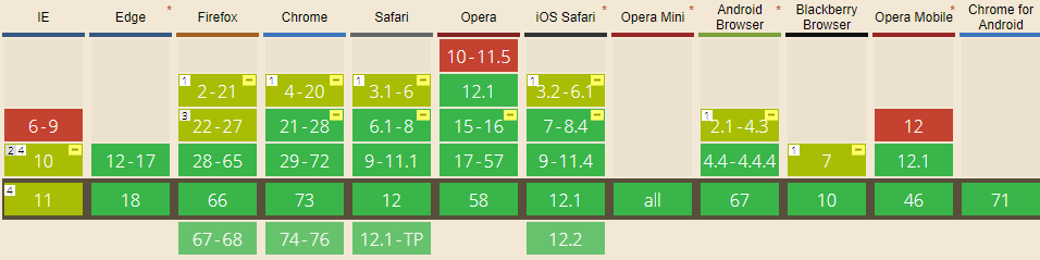
Screenshot and infos taken from caniuse.com
Notes
Internet Explorer before 10 doesn't support Flexbox, while IE 11 only supports the 2012 syntax.
Known issues
- IE 11 requires a unit to be added to the third argument, the flex-basis property see MSFT documentation.
- In IE10 and IE11, containers with
display: flexandflex-direction: columnwill not properly calculate their flexed childrens' sizes if the container hasmin-heightbut no explicitheightproperty. See bug. - In IE10 the default value for
flexis0 0 autorather than0 1 autoas defined in the latest spec. - IE 11 does not vertically align items correctly when
min-heightis used. See bug.
Workarounds
Flexbugs is a community-curated list of Flexbox issues and cross-browser workarounds for them. Here's a list of all the bugs with a workaround available and the browsers that affect.
- Minimum content sizing of flex items not honored
- Column flex items set to
align-items: centeroverflow their container min-heighton a flex container won't apply to its flex itemsflexshorthand declarations with unitlessflex-basisvalues are ignored- Column
flexitems don't always preserve intrinsic aspect ratios - The default flex value has changed
flex-basisdoesn't account forbox-sizing: border-boxflex-basisdoesn't supportcalc()- Some HTML elements can't be flex containers
align-items: baselinedoesn't work with nested flex containers- Min and max size declarations are ignored when wrapping flex items
- Inline elements are not treated as flex-items
- Importance is ignored on flex-basis when using flex shorthand
- Shrink-to-fit containers with
flex-flow: column wrapdo not contain their items - Column flex items ignore
margin: autoon the cross axis flex-basiscannot be animated- Flex items are not correctly justified when
max-widthis used
Internet Explorer 11 flexbox issues
Simply adding 100% width to the body fixed my problem.
Flexbox not working in Internet Explorer 11
According to Flexbugs:
In IE 10-11,
min-heightdeclarations on flex containers work to size the containers themselves, but their flex item children do not seem to know the size of their parents. They act as if no height has been set at all.
Here are a couple of workarounds:
1. Always fill the viewport + scrollable <aside> and <section>:
html {
  height: 100%;
}

body {
  display: flex;
  flex-direction: column;
  height: 100%;
  margin: 0;
}

header,
footer {
  background: #7092bf;
}

main {
  min-height: 0; /* added 2021*/
  flex: 1;
  display: flex;
}

aside, section {
  overflow: auto;
}

aside {
  flex: 0 0 150px;
  background: #3e48cc;
}

section {
  flex: 1;
  background: #9ad9ea;
}
<header>
<p>header</p>
</header>
<main>
<aside>
<p>aside</p>
</aside>
<section>
<p>content</p>
<p>content</p>
<p>content</p>
<p>content</p>
<p>content</p>
<p>content</p>
<p>content</p>
<p>content</p>
<p>content</p>
<p>content</p>
</section>
</main>
<footer>
<p>footer</p>
</footer>Flexbox centering not working in IE 11
Flexbox is pretty buggy when it comes to IE per CanIUse, 2 of which that are mentioned:
- In IE10 and IE11, containers with display: flex and flex-direction: column will not properly calculate their flexed childrens' sizes if the container has min-height but no explicit height property. See bug.
- IE 11 does not vertically align items correctly when min-height is used see bug
This being said, add explicit heights as a fallback on .score-wrapper for IE11.
.box {
  align-items: center;
  display: flex;
  flex-direction: column;
  justify-content: center;
  text-align: center;
}

.score-wrapper {
  align-items: center;
  display: flex;
  justify-content: center;
  min-height: 280px;
  height: 280px;
}

.overlay-circle {
  border-radius: 100px;
  border: 1px solid red;
  fill: transparent;
  height: 200px;
  position: absolute;
  width: 200px;
}

.center-circle {
  border-radius: 90px;
  border: 1px solid blue;
  height: 180px;
  position: absolute;
  width: 180px;
}
flexbox text wrap on Internet Explorer 11 (IE11)
You're running up against a couple of problems involving flex and/or IE11.
Try this:
.container-1 {  display: flex;  justify-content: flex-end;  border: 1px solid red;}
.fix {  display: flex;}
.container-2 {  width: 100%;  display: flex;  flex-direction: column;  text-align: center;  border: 1px solid blue;}
<div class='container-1'> <div class='fix'> <div class='container-2'> <p>Center Aligned Content</p> <p>Some content goes here. Some content goes here. Some content goes here. </p> </div> </div></div>max-width of image not working in flexbox for IE 11 but works on google chrome
IE browser has some issues with Flex. It is not able to calculate the values properly with flex.
(1) I suggest you replace max-width with width in .detail img class.
(2) I suggest you replace flex: 1 0 0; with flex: 0 0 auto; in .detail class.
Edit:-
Added img tag inside one extra div solved the issue as informed by @Xegara. It also worked with max-width For IE 11 browser.
Modified code:
<!DOCTYPE html><html>
<head>    <script src="script.js"></script>    <style>        body {          width: 100%;        }         .extra_div{          width: 100%;        }
        .element {            display: flex;            flex-direction: row;            width: 100%;          }                .name {            display: flex;            align-items: center;            justify-content: center;            flex: 0 0 100px;              font-weight: bolder;        }                .detail-wrapper {            display: flex;            flex-direction: column;           /*flex: 0 0 auto;*/              width: 100%;        }                .detail {            display: flex;            /*flex: 1 0 0;*/            flex: 0 0 auto; /*-------------------------made change here */            align-items: center;            justify-content: center;            flex-wrap: wrap;        }                .detail img {            max-width: 100%;   /*-------------------------made change here */        }                .name, .detail {            border: 1px solid;            margin: 8px;            padding: 8px;            text-align: center;            word-break: break-word;        }    </style></head>
<body>    <div class="element">        <div class="name">name</div>        <div class="detail-wrapper">            <div class="detail">  <div class="extra_div">                 <img src="https://miro.medium.com/max/1200/1*y6C4nSvy2Woe0m7bWEn4BA.png" />  </div>            </div>            <div class="detail">                <a href="#">url</a>            </div>        </div>    </div></body>
</html>
Justify-content in flexbox not working in IE 11
You need to add flex-direction: column; to the parent element in order to justify-content in IE11
.align-right {
  display: -webkit-box;
  display: -ms-flexbox;
  display: flex;
  -webkit-box-align: center;
    -ms-flex-align: center;
        align-items: center;
  -webkit-box-pack: right;
    -ms-flex-pack: right;
        justify-content: right;
  text-align:right;
  flex-direction: column; }
Related Topics
Nested Sticky Element with Zero Left Does Not Sticky
Fixed Positioning/Z-Index Issue in Mobile Safari
Difference Between HTML and Dom
CSS After Element to Insert Mailto Link
Ie Offsetting and Ignoring Height/Width of Anchor Focus Outlines
Giving Background-Color to Body Applying Whole Page. Why
How to Reuse HTML Like a Template on Multiple Pages
Overlapping CSS Flexbox Items in Safari
Placing an Image to The Top Right Corner - CSS
Vertical Align Text After Font Icon
CSS How to Make <Td> a Fixed Height
CSS Right Margin Does Not Work Inside a Div with Overflow Scroll
CSS Flexbox | Reordering Elements in Mobile
Align Div's to Bottom or Baseline
Difference Between Phrasing Content and Flow Content
Bootstrap 3 Truncate Long Text Inside Rows of a Table in a Responsive Way