Flexbox make one item 4x bigger than other items
I want to make the bigitem 4x bigger than the smallitem, not 2x as big, but I cannot figure out how to do that?!
Don't use flex-grow for this task. Use flex-basis.
.bigitem { flex: 0 0 80%; } /* flex-grow, flex-shrink, flex-basis */

.smallitem { flex: 0 0 20%; }
The flex-grow property does not actually size flex items. It distributes free space in the container.
So flex: 4 0 0 on one item, and flex: 1 0 0 on the other item, means the following:
- Determine the amount of free space on the main axis line (the row, in this case)
- Divide that amount by five.
- One item consumes four parts.
- The other item consumes one part.
Because you're dealing only with free space, the 4 vs 1 flex-grow doesn't necessarily mean one item will be 4x the size of the other. It means that one item will consume 4x more free space than the other.
It also means that flex-grow values of 8 vs 2, 16 vs 4, 20 vs 5, etc., will yield the exact same result, because the proportions are the same.
See here for more details:
- flex-grow not sizing flex items as expected
- Make div fill remaining *horizontal* space in flexbox
CSS flexbox child behavior
You can define a more specific behavior. Note offtopic: you should not use more than 1 <h1>, make them <h2> or something. Several <h1> will confuse screenreaders.
.parent{
  display: flex;
  flex-flow: row nowrap;
  background-color: rgb(77, 77, 255);
  /*height and Width, padding and margin for display example, you can set that how you need*/
  height: 100vh;
  max-width: 100vw;
  padding: 0;
  margin: 0;
}
.child1{
  /*Aligning the headings inside the divs*/
  display: flex;
  justify-content: center;
  align-items: center;
  background-color: rgb(240, 104, 104);
  width: 40%;
}
.child2{
  /*Aligning the headings inside the divs*/
  display: flex;
  justify-content: center;
  align-items: center;
  background-color: rgb(115, 243, 115);
  width: 60%;
}
<div class="parent">
<div class="child1">
<h1>Child 1</h1>
</div>
<div class="child2">
<h1>Child 2</h1>
</div>
</div>How do I make a div stretch in a flexbox of dynamic height?
I think this is answering your question using the flex-grow: 1;. hope it helps
https://jsfiddle.net/BradChelly/ck72re3a/
.container {

  width: 100px;

  height: 150px;

  background: #444;

  display: flex;

  flex-direction: column;

  align-content: stretch;

}

.box1 {

  width: 100%;

  background: steelblue;

  flex-grow: 1;

}

.box2 {

  height: 50px;

  width: 100%;

  background: indianred;

}
<div class="container">
<div class="box1"></div>
<div class="box2"></div>
</div>Flexbox child shrinks beyond set minimum width
Adding flex-shrink: 0 to the aside (.playlist-box) solves the problem.
You should probably add the same rule to the other aside (.weather-box), even though you don't need it, just in case the type of content in that container ever changes. As you can see, images and videos make a difference.
How to vertically position 2x divs using flexbox
I created this example with a smaller amount of HTML and, hopefully, greater semantic meaning.
Let's make this:
The HTML
The
<section>element for the flex containerThe
<nav>element is a good container for the actions.The description list element —
<dl>— is a good wrapper for the stats. They have two children:- The Description Term element —
<dt>— is used for the stat headings - The Description element —
<dd>— is used for the stat value
- The Description Term element —
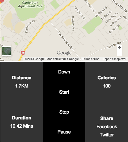
<section class="control-container">
  <dl class="distance">
    <dt>Distance</dt>
    <dd>1.7KM</dd>
  </dl>
  <dl class="duration">
    <dt>Duration</dt>
    <dd>10.42 Mins</dd>
  </dl>
  <dl class="calories">
    <dt>Calories</dt>
    <dd>100</dd>
  </dl>
  <nav class="actions">
    <a href="">Down</a>
    <a href="">Start</a>
    <a href="">Stop</a>
    <a href="">Pause</a>
  </nav>
  <div class="share">
    <h2>Share</h2>
    <a href="">Facebook</a>
    <a href="">Twitter</a>
  </div>
</section>
The Flex
The flex
<section>container hasdisplay: flexandflex-flow: column wrapso its children will layout in columns and wrap when pushed outside.The flex items are also given
display: flex,flex-flow: column wrapandjustify-content: center;so that the text is vertically centered. The nav is givenflex-direction: rowso that its links can be evenly centered vertically withalign-items: centerThe 4 sections which take up half of the height are given
flex: 1 1 50%; they will each get half of a column heightThe navigation is given
flex: 1 1 100%so it will take up an entire column on its own
.control-container {
  display: flex;
  flex-flow: column wrap;
}
.control-container > * {
  display: flex;
  flex-flow: column wrap;
  justify-content: center;
  flex: 1 1 50%;
  width: 33.33%;
  text-align: center;
}
.control-container > nav {
  flex-direction: row;
  align-items: center;
  flex: 1 1 100%;
}
.control-container > nav a {
  flex: 1 1 100%;
}
Complete Example
* {

  margin: 0;

  padding: 0;

  font: 100% arial;

}

.control-container {

  display: flex;

  flex-flow: column wrap;

  height: 40vh;

  min-height: 250px;

  min-width: 300px;

  margin: 0 auto;

}

.control-container > * { /* target all direct children */

  display: flex;

  flex-flow: column wrap;

  justify-content: center;

  flex: 1 1 50%;

  width: 33.33%;

  text-align: center;

  background: #333;

  color: #FFF;

}

.control-container > nav {

  flex-direction: row;  /* allows vertical centering with align-items: center; */

  align-items: center;

  flex: 1 1 100%;  /* take up entire column */

  background: #000;

}

.control-container > nav a {

  flex: 1 1 100%;  /* 100% pushes each link so they wrap  */

}

/*Change the order of the flex items so the stats can be kept together in the HTML*/

.distance,

.duration,

.actions {

  order: 1;

}

.calories {

  order: 3;

}

.share {

  order: 4;

}

.wrapper {

  max-width: 1200px;

  margin: 0 auto;

}

.control-container dt,

.control-container h2 {

  font-weight: bold;

}

.share h2 {

  margin-top: calc(1em + 15px);  /*push "share" down so it aligns with "duration" 1em accounts for the extra line of text */

}

.control-container a {

  color: #FFF;

  text-decoration: none;

}

dt,

dd,

.share * {

  padding: 5px;

}

iframe {

  width: 100%;

  height: calc(60vh - 104px);

  /*  viewport height minus flex container height and header height ( + there is a stray 4px somewhere)*/

  min-height: 300px;

}

header {

  height: 100px;

  text-align: center;

  background: #000;

}
<div class="wrapper">
<header>
<img src="http://www.placehold.it/100" />
</header>
<iframe src="https://www.google.com/maps/embed?pb=!1m14!1m12!1m3!1d11564.804405086046!2d172.59430635!3d-43.56069255!2m3!1f0!2f0!3f0!3m2!1i1024!2i768!4f13.1!5e0!3m2!1sen!2snz!4v1418977732755" frameborder="0" style="border:0"></iframe>
<section class="control-container">
<dl class="distance">
<dt>Distance</dt>
<dd>1.7KM</dd>
</dl>
<dl class="duration">
<dt>Duration</dt>
<dd>10.42 Mins</dd>
</dl>
<dl class="calories">
<dt>Calories</dt>
<dd>100</dd>
</dl>
<nav class="actions">
<a href="">Down</a>
<a href="">Start</a>
<a href="">Stop</a>
<a href="">Pause</a>
</nav>
<div class="share">
<h2>Share</h2>
<a href="">Facebook</a>
<a href="">Twitter</a>
</div>
</section>
</div>Vertically center, right align, multi-line text in absolutely positioned div with flexbox parent
Here is a sample how to center using display: flex
Stack snippet
body {

  margin: 0;

}

.overlay {

  width: 300px;

  margin-top: 5vh;

  height: 90vh;

  border: 1px solid;


  display: flex;

  flex-direction: column;

  justify-content: center;

  align-items: center;

}
<div class = "overlay overlay-2">
<h2>Recent Work</h2>
<p>Lorem ipsum dolor</p>
</div> <!-- /overlay -->How to make height same as sibling height
Add height: 100%; to .card and move the min-height to the outer container.
.user-panel {

  min-height: 170px;

}

.user-panel, .user-panel .card {

  display: flex;

  border: 1px solid #ccc;

  height: 100%;

}

.user-panel,

.user-panel .card .item {

  height: inherit;

  text-align: center;

}
<div class="row no-padding user-panel">
<div class="col col-33 no-padding">
<div class="card no-padding">
<div class="item item-text-wrap">
<span>
<div>
<div class="row"><i class="user-profile-icon"></i> </div>
<div>{{data}}</div>
<div>(015106)</div>
<div>(015106)</div>
<div>(015106)</div>
<div>(015106)</div>
<div>(015106)</div>
<div>(015106)</div>
<div>(015106)</div>
<div>(015106)</div>
<div>(015106)</div>
<div>(015106)</div>
<div>(015106)</div>
</div>
</span>
</div>
</div>
</div>
<div class="col col-33 no-padding">
<div class="card no-padding">
<div class="item item-text-wrap">
<span>
<div>
<div>MY ACCESSES</div>
</div>
</span>
</div>
</div>
</div>
<div class="col col-33 no-padding">
<div class="card no-padding">
<div class="item item-text-wrap">
<span>
<div>
<div>MY ACCESSES</div>
</div>
</span>
</div>
</div>
</div>
</div>
<div class="row no-padding user-panel">
<div class="col col-33 no-padding">
<div class="card no-padding">
<div class="item item-text-wrap">
<span>
<div>
<div class="row"><i class="user-profile-icon"></i> </div>
<div>{{data}}</div>
<div>(015106)</div>
</div>
</span>
</div>
</div>
</div>
<div class="col col-33 no-padding">
<div class="card no-padding">
<div class="item item-text-wrap">
<span>
<div>
<div>MY ACCESSES</div>
</div>
</span>
</div>
</div>
</div>
<div class="col col-33 no-padding">
<div class="card no-padding">
<div class="item item-text-wrap">
<span>
<div>
<div>MY ACCESSES</div>
</div>
</span>
</div>
</div>
</div>
</div>Related Topics
How to Change Bootstrap Select Arrows to Glyphicon
How Does the "Display: Contents" Property Value Work
Arabic Characters from HTML Content to PDF Using Itext
How to Do Tag Wrapping in VS Code
Understanding Grid Negative Values
How to Apply a Border Only Inside a Table
How to Change the Inner White Color of Font Awesome's Exclamation Triangle Icon
Are Self-Closing Input Tags Valid in HTML 4
How to Move Placeholder to Top on Focus and While Typing
Open a Direct File on the Hard Drive from Firefox (File:///)
Dropdown with a Form Inside with Twitter-Bootstrap
Why Should One Add Id to Their HTML Tags
CSS - Hide Options from Select Menu on iPhone & Safari
Convert Attributed String, To, "Simple" Tagged HTML
Stray Vertical Line Above 965 Pixels with Border Radius in Safari