CSS grids: align square cells with container edges with consistent grid gap?
The issue is that the grid cells are fine but the content inside (li) is not matching them.
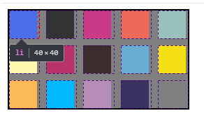
Instead of using fixed width/height on the li you can consider percentage value and they will be a bit bigger in some cases but will remain square elements:
ul {  display: grid;  width: 260px;  grid-template-columns: repeat(auto-fit, minmax(40px, 1fr));  grid-auto-rows: 1fr;  grid-gap: 10px;  list-style-type: none;  border: 2px solid black;  box-sizing: border-box;  margin: 0;  padding: 0;  background: gray;  animation:change 5s linear alternate infinite;}
li {  width: 100%;  padding-top:100%;}
@keyframes change {  to {width:120px}}
<ul class="palette"> <li style="background-color: rgb(0, 0, 255);"></li> <li style="background-color: rgb(51, 51, 51);"></li> <li style="background-color: rgb(203, 58, 135);"></li> <li style="background-color: rgb(237, 106, 90);"></li> <li style="background-color: rgb(155, 193, 188);"></li> <li style="background-color: rgb(255, 247, 174);"></li> <li style="background-color: rgb(184, 51, 106);"></li> <li style="background-color: rgb(61, 44, 46);"></li> <li style="background-color: rgb(105, 173, 212);"></li> <li style="background-color: rgb(245, 223, 22);"></li> <li style="background-color: rgb(252, 186, 86);"></li> <li style="background-color: rgb(0, 185, 252);"></li> <li style="background-color: rgb(181, 141, 182);"></li> <li style="background-color: rgb(58, 50, 96);"></li></ul>How to get a grid-gap between the grid item and the container?
The grid-gap property applies only between grid items. It never applies between a grid item and the grid container.
If you want a gap between the item and the container, then use padding on the container.
.wrapper {
    display: grid;
    grid-template-columns: repeat(4, 1fr);
    grid-auto-rows: minmax(95px, auto);
    grid-gap: 1em;
    padding: 1em; /* NEW */
}
https://jsfiddle.net/Ldtcqdtb/3/
A grid layout with responsive squares
The padding-bottom trick is the most used to accomplish that.
You can combine it with both Flexbox and CSS Grid, and since using percent for margin/padding gives inconsistent result for flex/grid items (on older browser versions, see edit note below), one can add an extra wrapper, or like here, using a pseudo, so the element with percent is not the flex/grid item.
Edit: Note, there's an update made to the specs., that now should give consistent result when used on flex/grid items. Be aware though, the issue still occurs on older versions.
Note, if you will add content to the content element, it need to be position absolute to keep the square's aspect ratio.
Fiddle demo - Flexbox
Edit 2: In a comment I were asked how to have a centered text, so I added that in below snippet.
.square-container {
  display: flex;
  flex-wrap: wrap;
}

.square {
  position: relative;
  flex-basis: calc(33.333% - 10px);
  margin: 5px;
  border: 1px solid;
  box-sizing: border-box;
}

.square::before {
  content: '';
  display: block;
  padding-top: 100%;
}

.square .content {
  position: absolute;
  top: 0; left: 0;
  height: 100%;
  width: 100%;

  display: flex;               /* added for centered text */
  justify-content: center;     /* added for centered text */
  align-items: center;         /* added for centered text */
}
<div class="square-container">
<div class="square">
<div class="content">
<span>Some centered text</span>
</div>
</div>
<div class="square">
<div class="content spread">
</div>
</div>
<div class="square">
<div class="content column">
</div>
</div>
<div class="square">
<div class="content spread">
</div>
</div>
<div class="square">
<div class="content column">
</div>
</div>
</div>Align overflowing container to right of grid cell, not grid row
Now that i understood this really should fix your problem, it works in your codepen for me.
.month-title-grid {
  display: grid;
  /*this will help to keep the columns even*/
  grid-template-columns: repeat( 12, minmax(50px, 1fr) );
  grid-template-rows: repeat(2, auto);
  column-gap: 10px;
}

.col-1
{
/*this will force the overflow to the left*/
direction: rtl;
grid-column-end: span 1;
}
<div class="month-title-grid">
<div class="col-12"><h3 class="lightbrown">January</h3></div>
<div class="col-1"><div class="date-container"><h1 class="lightbrown">01</h1></div></div>
<div class="col-11"><h2 class="darkbrown">IT'S COMPLICATED</h2>In Chrome Bootstrap keeps changing vertical gap between images in a grid
If you remove display: flex; on .gallery-items the margin is consistent.
Seems ok in chrome, ff and edge.
Related Topics
Show My Location on Google Maps API V3
Horizontal Line and Right Way to Code It in HTML, CSS
How to Vertically Align Both Image and Text in a Div Using CSS
Multi-Coloured Circular Div Using Background Colours
How to Style Unordered Lists in CSS as Comma Separated Text
Nested Sticky Element with Zero Left Does Not Sticky
Svg Foreignobject Contents Do Not Display Unless Plain Text
With HTML5 Url Input Validation Assume Url Starts with Http://
Link External CSS File Only for Specific Div
Apply Different CSS Stylesheet Depending on Browser Window Size - I Can't Find Anything Definitive
Why Does Border: 5Px Dashed Not Come Out as Dashed in Firefox
Ie Offsetting and Ignoring Height/Width of Anchor Focus Outlines
How Could I Play a Shoutcast/Icecast Stream Using HTML5
Break Long Word in Table Cell with Percentage Widths