Add padding at the beginning and end of each line of text
I've tested this in IE8 (doesn't look too bad in IE7) and recent versions of Chrome, Firefox, Opera, Safari.
Live Demo
Screenshot from Chrome:

It got a bit silly and, to be honest, probably more complicated than it's worth - a JS based solution would definitely be easier to understand.
There are so many gotchas with this technique.
CSS:
#titleContainer {
    width: 520px
}
h3 {
    margin:0;
    font-size: 42px;
    font-weight: bold;
    font-family: sans-serif
}
h3 .heading {
    background-color: #000;
    color: #00a3d0;
}
h3 .subhead {
    background-color: #00a3d0;
    color: #000;
}

div {
    line-height: 1.1;
    padding: 1px 0;
    border-left: 30px solid #000;
    display: inline-block;
}
h3 {
    background-color: #000;
    color: #fff;
    display: inline;
    margin: 0;
    padding: 0
}
h3 .indent {
    position: relative;
    left: -15px;
}
h3 .subhead {
    padding: 0 15px;
    float: left;
    margin: 3px 0 0 -29px;
    outline: 1px solid #00a3d0;
    line-height: 1.15
}
HTML:
<div id="titleContainer">
    <h3><span class="indent">

        <span class="heading">THE NEXT GENERATION OF CREATIVE TALENT</span><br /><span class="subhead">IT'S RIGHT HERE</span>

    </span></h3>
</div>

<!--[if IE]><style>
h3 .subhead {
    margin-left: -14px
}
</style><![endif]-->
How to apply padding to every line in multi-line text?
You could use box-decoration-break property with value of clone.
box-decoration-break: clone;Each box fragment is rendered independently with the specified border, padding and margin wrapping each fragment. The border-radius, border-image and box-shadow, are applied to each fragment independently. The background is drawn independently in each fragment which means that a background image with background-repeat: no-repeat may be repeated multiple times. - MDN
See the current browser support tables at caniuse.com
jsFiddle example
h1 { font-weight: 800; font-size: 5em; line-height: 1.35em; margin-bottom: 40px; color: #fff;}h1 span { background-color: rgba(0, 0, 0, 0.5); padding: 0 20px; -webkit-box-decoration-break: clone; box-decoration-break: clone;}<h1><span>The quick brown fox jumps over the lazy dog.</span></h1>Same padding at start and end of each line
This can be done without using JavaScript or an extra element for each line.
HTML
<span class="marker"><span class="marker"><span class="marker">
    consectetur adipiscing elit. Nam at sem eu ligula porttitor iaculis volutpat
    non lacus.
</span></span></span>
CSS
.marker {
    background: #f77;
    padding: 3px 0;
    position: relative;
    left: -10px;
    line-height: 30px;
}

.marker .marker { left: 20px; }

.marker .marker .marker { left: -10px; }
See how it works on fiddle 3tP8m.
Note: An ancestor of .marker element should have proper padding to contain this element correctly.
All credits of this technic goes to Artem Polikarpov. See his original advice: “How to mark up the text on flexible bottom layer” (in Russian).
How to add horizontal padding to every line in one multi-line wrapped sentence?
After struggling for some time I found a non-quirky solution with a decent fallback for older browsers – adding two CSS3-shadows to the lines of text:
span {
background:#ff0;color:#000;
box-shadow:0.2em 0 0 #ff0,-0.2em 0 0 #ff0;
-moz-box-shadow:0.2em 0 0 #ff0,-0.2em 0 0 #ff0;
-webkit-box-shadow:0.2em 0 0 #ff0,-0.2em 0 0 #ff0;
}
How can I apply padding to the end of a line?
From here:
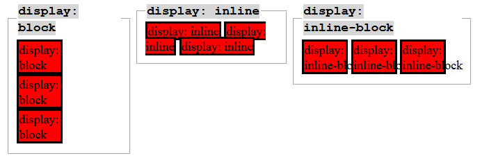
display: inline-block
An inline block is placed inline (ie. on the same line as adjacent content), but it behaves as a block.
span {
    font-size: 25px;
    line-height: 28px;
    color: white;
    background-color: #2EC6C6;
    padding-right: 5px;
    padding-left: 5px;
    display: inline-block
}
http://jsfiddle.net/DsqY2/
source
Padding for two-lined headline
I recently found another sollution. It works in almost every browser (No IE8 and down), is easily adjustable and looks like this:
HTML
<h1>
    <span class="wrap">
        <span class="inner">Du texte HTML dynamique sur plusieurs lignes avec un fond qui suit bien et des marges autour.</span>
    </span>
</h1>
CSS
h1 {
    color:#fff;
}

.wrap {
    box-shadow: -10px 0 0 10px #000, 10px 0 0 10px #000;
}

.inner {
    background: #000;
    position:relative;
}
text background new line padding issue
You could apply display: inline-block but that will turn the background color into an ugly box which doesn't look as nice as having an exact width background for each line. Unfortunately CSS doesn't let us target individual lines except for the first one.
If you don't mind getting a little "creative" (or hacky) you could wrap each word in its own element in the backend or using JavaScript and apply the background color to those elements. Adjust the parent's word-spacing accordingly to eliminate gaps.
.main {  font-family: sans-serif;  font-weight: bold;  background-color: #99c;  display: flex;  height: 400px;  flex-direction: row;  align-items: center;}
.text-container {  max-width: 500px;  display: inline-block;  word-spacing: -15px;  position: relative;  padding-left: 20px;  overflow: hidden;}
.text-container::before {  content: '';  background-color: black;  position: absolute;  top: 0;  left: 0;  width: 20px;  height: 100%;  z-index: 1;}
span {  font-size: 36px;  line-height: 1.5em;  color: white;  background-color: black;  padding: 0.25em 0.5em 0.25em 0;  max-width: 360px;}
<div class="main"> <div class="text-container"> <span>A</span> <span>Movie</span> <span>in</span> <span>the</span> <span>park:</span> <span>Kung</span> <span>Fu</span> <span>Panda</span> </div></div>Related Topics
How to Use Tel: With * (Star, Asterisk) or # (Hash, Pound) on Ios
What Characters Can Be Used For Up/Down Triangle (Arrow Without Stem) For Display in Html
How to Force a Long String Without Any Blank to Be Wrapped
How to Prevent Scrollbar from Repositioning Web Page
Unwanted Margin in Inline-Block List Items
How to Remove the Underline For Anchors(Links)
How to Support Placeholder Attribute in Ie8 and 9
Make a Div Fill Up the Remaining Width
Using CSS :Before and :After Pseudo-Elements With Inline Css
How to Make a ≪Ul≫ Display in a Horizontal Row
Having Google Chrome Repeat Table Headers on Printed Pages
How to Get the HTML Source of a Page from a HTML Link in Android
Grid Areas Not Laying Out Properly in CSS Grid
Why Display Grid with 100% in Grid-Template-Columns Goes Out of Body
Font Rendering/Line-Height Issue on MAC/Pc (Outside of Element)